
![[VIP] Unlimited Pass 2026.03.27](https://i.pinimg.com/1200x/d2/f8/2e/d2f82e903b9ca33b0f13704cc85a3d8a.jpg)


![[LS] ls.graphics Pass 2026.02.16](https://i.pinimg.com/1200x/8d/ca/7f/8dca7ff72d8b698f955649340d0ff398.jpg)

![[PRO] Craftwork Pass 2025.06.11](https://i.pinimg.com/1200x/98/d2/f0/98d2f0169226b431f4727441ecc6aa06.jpg)


![[VIP] Creovo: Creative Portfolio](https://i.pinimg.com/1200x/92/5d/39/925d39b614ae4e39adda25b73837f82b.jpg)


![[VIP] Voltz: Electric Car Website Template](https://i.pinimg.com/1200x/03/ba/41/03ba41513483727fcd26b95349750783.jpg)
![[VIP] Zyra: Coded Chat AI Dashboard](https://i.pinimg.com/1200x/ce/7b/92/ce7b926f22423fc046659dfe1dd7a604.jpg)
![[$] AlignUI: Code Library](https://i.pinimg.com/1200x/8d/91/1c/8d911c0a22483842cff69c130e80c37b.jpg)
![[VIP] The Grid Deck Template](https://i.pinimg.com/1200x/f2/df/6d/f2df6d865d31ed4400ddd74137a5a79e.jpg)

![[VIP] Solaris: Sales Forecast & Pipeline Review Deck](https://i.pinimg.com/1200x/ba/7c/48/ba7c485ac40a51054cf9074aead204e2.jpg)
![[VIP] Brand Guideline Presentation](https://i.pinimg.com/1200x/64/87/a7/6487a7c4da21072150a1664f83a6a234.jpg)


![[VIP] 44 Device Mockups: Metal Scene Pack](https://i.pinimg.com/1200x/96/0c/c4/960cc4d39f6f9f08c4ba4a40ae740a65.jpg)
![[LS] iPhone 17 Mockup](https://i.pinimg.com/1200x/18/42/c1/1842c11e3da971765bdcfbc5315f3df8.jpg)
![[LS] iPhone 17 Pro Max Mockups](https://i.pinimg.com/1200x/f0/2a/72/f02a724ed9f52ac4a1c66b5614809111.jpg)
![[LS] AE-Mockups, Apple Devices](https://i.pinimg.com/1200x/03/04/9b/03049ba79acaa546ae6389639f89bcc1.jpg)


![[VIP] Volnitsa: BLNDR MINI (2025)](https://i.pinimg.com/1200x/c3/f7/0a/c3f70ae1126be5c0af1977e58b56ba7a.jpg)

![[VIP] React Three Fiber: The Ultimate Guide to 3D Web Development](https://i.pinimg.com/1200x/78/02/1f/78021ffdfc8113cc8caba5b2c563ead4.jpg)
![[VIP] Ryan Hayward: Ultimate Framer Masterclass 3.0](https://i.pinimg.com/1200x/48/d6/3f/48d63f9723d7c49e6c34c182557c7431.jpg)


![[VIP] Whoooa! 156 vector Lottie animations](https://design.rip/uploads/cover/blog/whoooa-156-vector-animations.webp)


![[VIP] Staff Product Designer (ENG, RUS)](https://i.pinimg.com/1200x/0c/52/a0/0c52a08d8b0a25329806437933cf538f.jpg)


100 Practical UI/UX Tips
A collection of actionable ideas to make your interfaces easy to use.

Document Outline
- Intro
- Typography
- Place headings close to their paragraphs
- Avoid text justification
- Make text easy to scan
- Make links look like links
- Use proper line height
- Don't make lines too lengthy
- Use different techniques to hierarchy
- Do not over-emphasize
- Keep an eye on contrast
- Don't use pure black color
- Handle text on images properly
- Use modular type scale
- Proportional vs tabular figures
- Forms
- Have enough space between inputs
- Don't hide form tips
- Show password rules right away
- Use labels, not placeholders
- Avoid multicolumn layouts
- Be careful with dropdowns
- Replace default file inputs
- Autofocus the first input
- Use reasonable input width
- Don't erase credentials after unsuccessful login
- Remember email in forgot password page
- Dividing form into multiple steps
- Use correct input type
- Marking required/optional fields
- Progressive disclosure
- Collapsing checkboxes
- Validation
- Landing pages
- Usability
- Place inputs where users expect them
- Delaying the welcome email on mobile
- Place labels above sliders
- Verification code push notification/SMS
- Don't put dangerous actions near frequent onces
- False bottom effect (another example)
- Put frequent options first
- Avoid using carousels
- Consider allowing undo instead of confirmation
- Label your icons
- Instantly check the verification code
- Provide further instructions
- Use a separate area for toggle password icon
- Visuals
- Animation speed
- Normalize charts
- Label country flags
- Low detail vs high detail map
- Buttons / tags confusion
- Modal depth
- Styling icons that have different size
- Overlapping trick
- Similarity law
- Groupping piecharts sections
- Styling images
- Overusing primary color
- Color saturation in dark mode
- Harsh colored table borders
- Watch your shadows
- Icon consistency
- Empty/loading states
- Focus and user attention
- Navigation
- Misc
- Color blindness & icons
- Use empty alt tag for decorative images
- Aligning items using baseline
- Show the number of votes along with rating
- Instantly show how many goods were found
- Filters indicator trick
- How to make tables responsive
- Group elements logically
- Don't forget to put the post date
- Remember that data can be large
- Afterward

Intro
Hello, and thank you for purchasing this book!
My name is Victor.
For the whole year, I've been tweeting UI/UX tips, threads, curating resources. Some of them got positive comments. Some didn't.
In total, I made around 120 tips. Then I went through them, removed those that weren't that good, enhanced the rest and made a book out of them.
For most of the tips, I made illustrations and tried to find some additional links that prove every tip or provide further explanations.
Every page contains exactly one tip. I removed all the useless fluff. And I sincerely hope that you'll find this book helpful.
By the way, I'll dedicate the following year to YouTube, where I have so many plans: Make UI/UX reviews
Make videos about UX Laws
Cover those topics that cannot be represented as 1-2 tweets And much, much more
It's going to be an exciting journey! So don't forget to check it out!

Typography
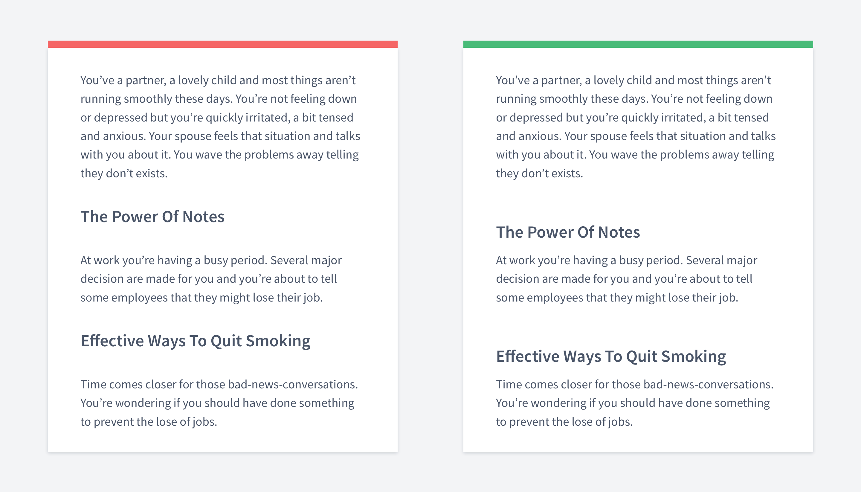
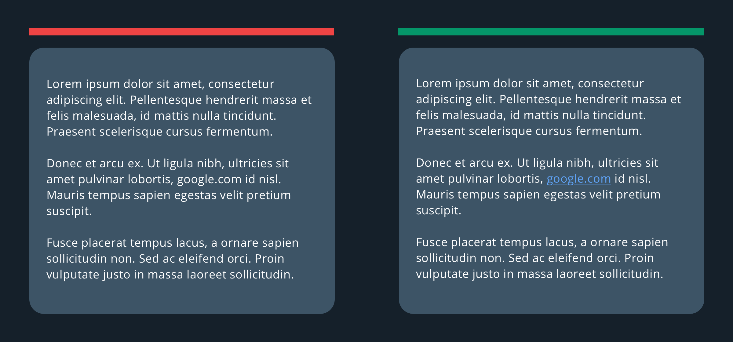
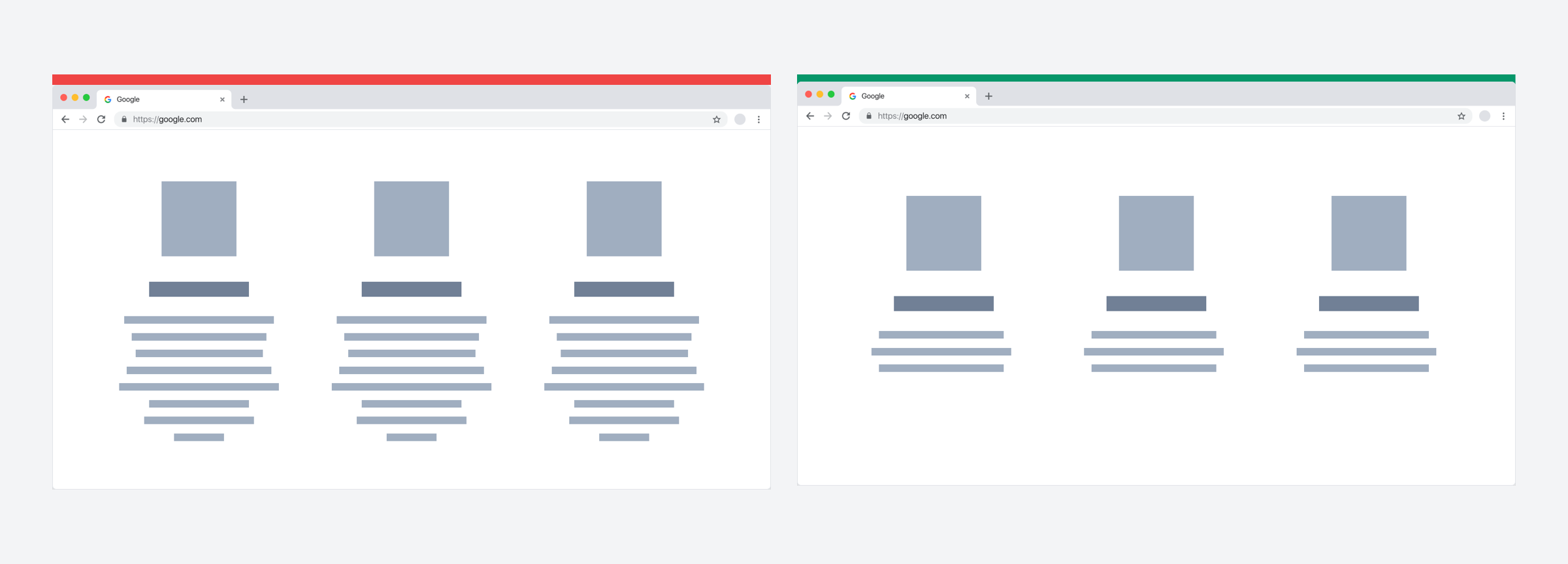
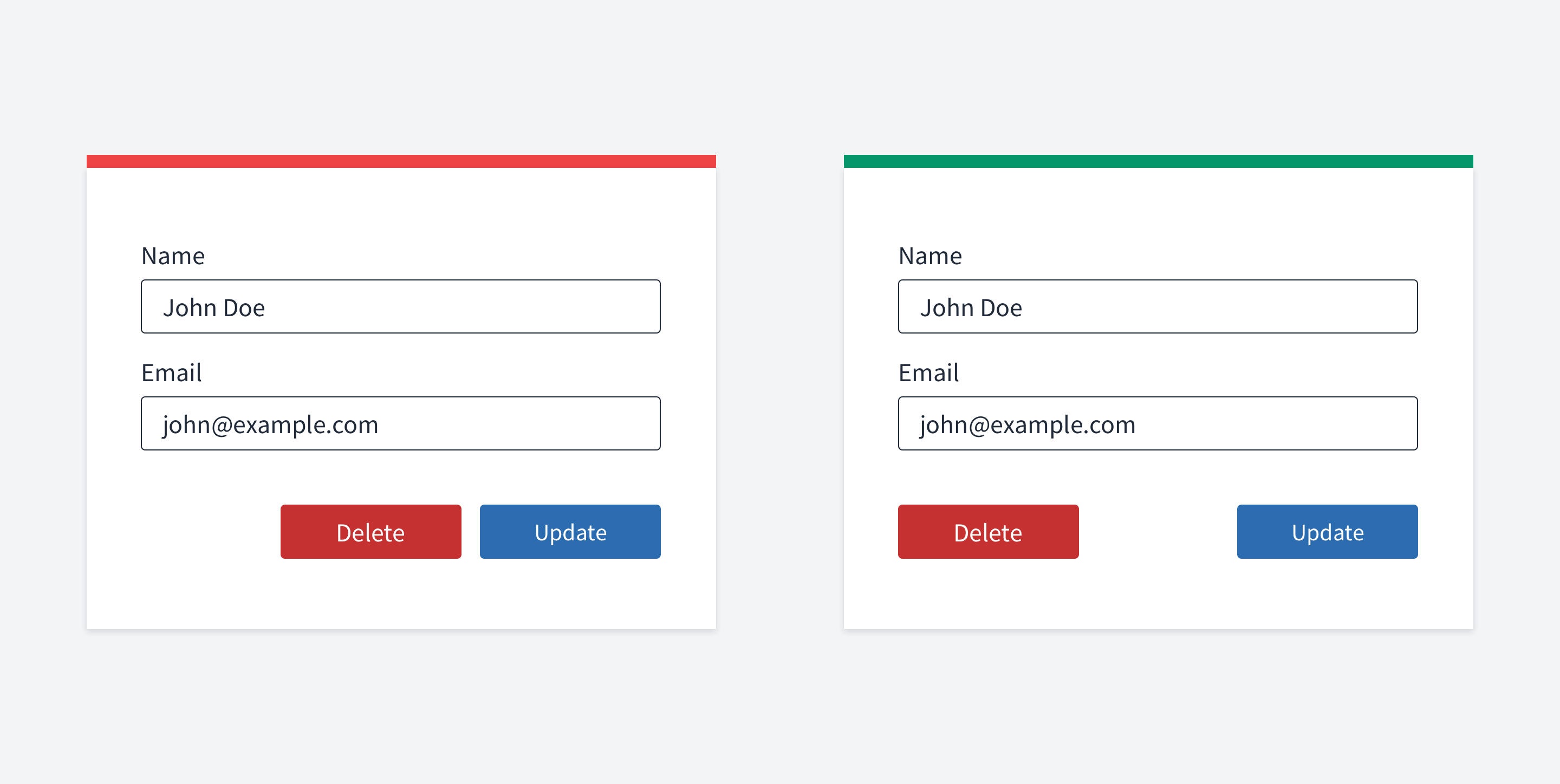
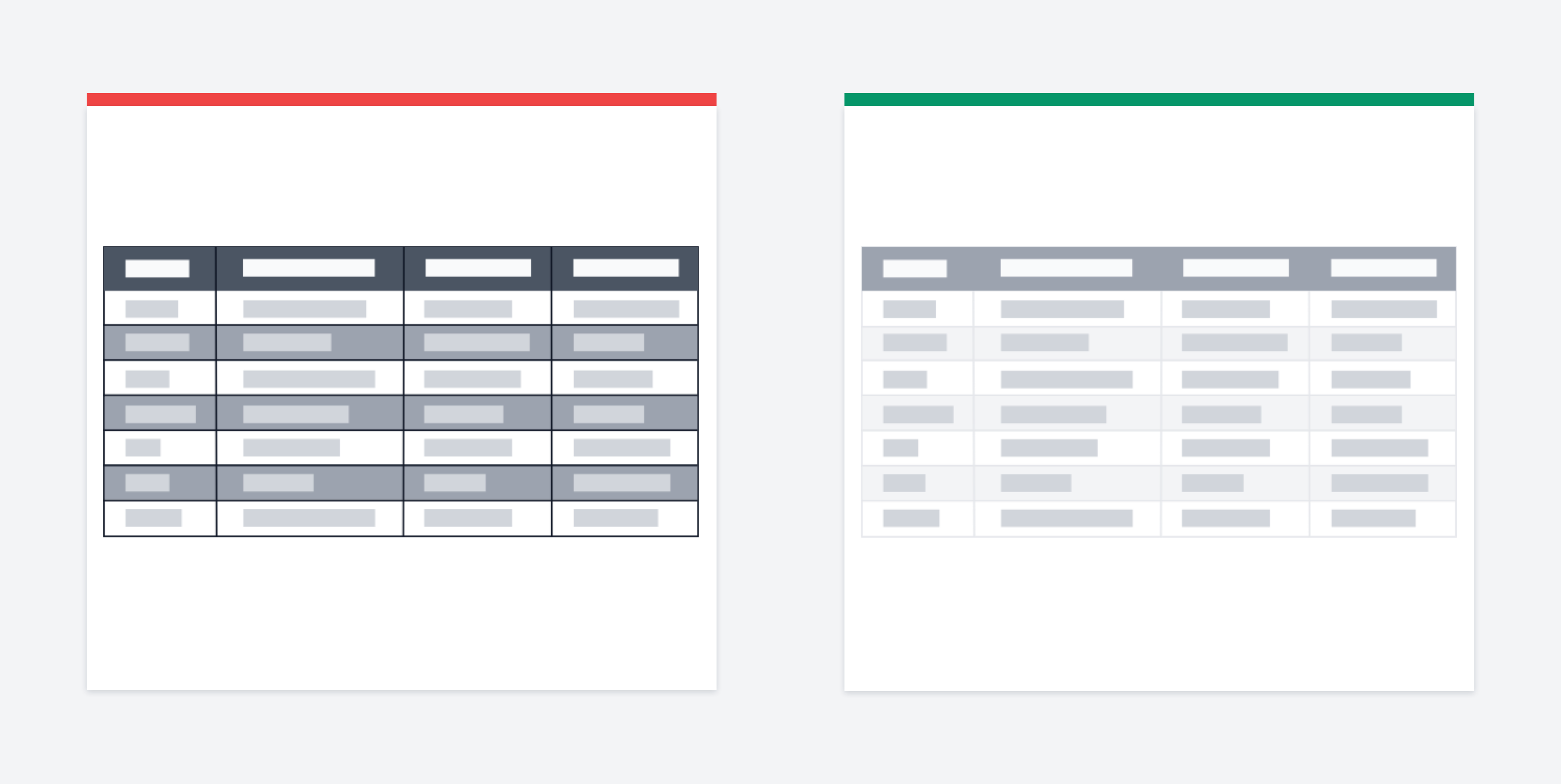
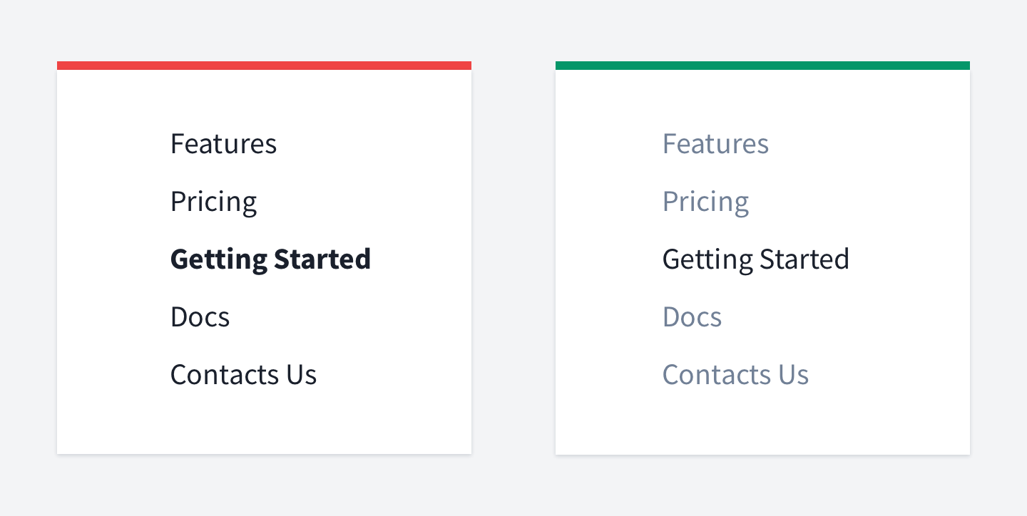
Place headings close to their paragraphs
The proximity principle states that items close together are likely to be perceived as part of the same group — sharing similar functionality or traits.
This is one of the most used laws across user interfaces, in typography as well.
In the first picture, the headings have the same whitespace between the first and the second paragraph. In this case, you don't have clearly separated paragraphs, and it would be hard to say what heading belongs to what paragraph. At least it will take some time to figure it out.
In the second picture, the headings are placed closer to the paragraphs to which they belong.

Avoid text justification
Justifying text is usually considered a bad practice.
The reason is that it tends to create rivers in text. Rivers are the white gaps in the text when there is too much space between words on consecutive text lines.
First of all, the text looks unbalanced and hard to read.
But what's might be more important is that it affects users with dyslexia.
There are many studies and articles on the Internet related to this issue. For example, the British Dyslexia association advises aligning text to the left side.

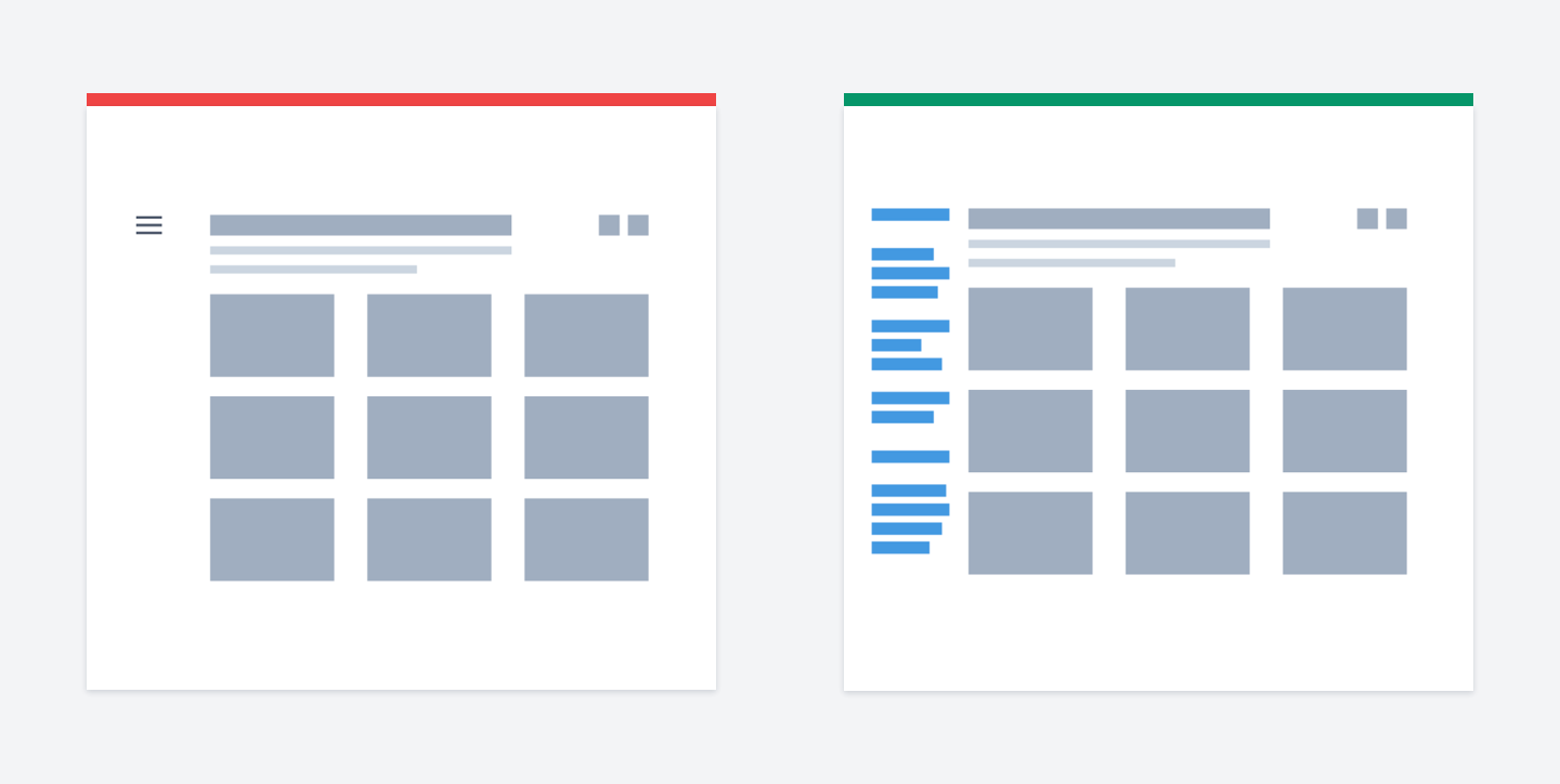
Make text easy to scan
Almost nobody reads text on the Web word by word.
Nowadays, people can barely focus their attention for a few minutes. Same for videos. If you take a look at YouTube analytics, you'll see that a huge number of viewers stop watching videos in the first 30 seconds.
Instead of reading, we scan sites. All you can do is hook user attention by making the text concise and making the layout scannable.
One of the lovely tricks to make your layout scannable is to use lists. You should list what is "listable". This way, you can also reduce the amount of text by removing commas, conjunctions etc. Bonus if you use icons, for example - ticks.

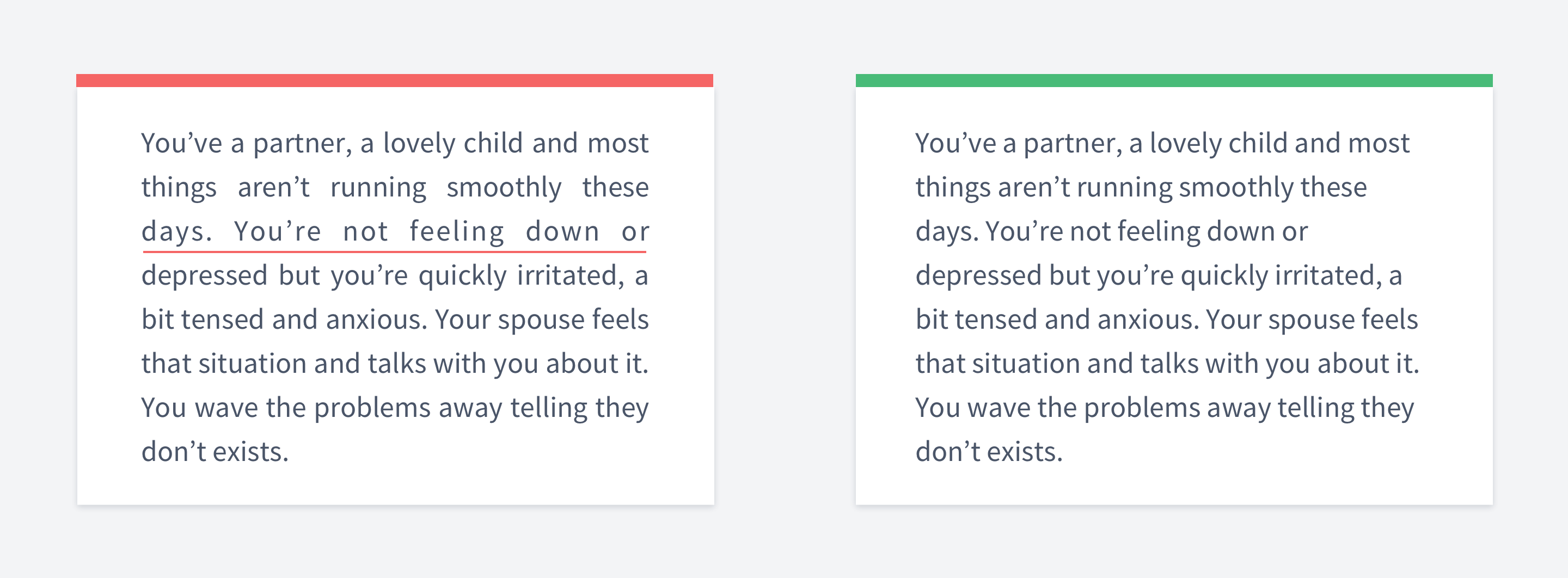
Make links look like links
While this might seem obvious, even big companies like Twitter make this mistake.
Here is a screenshot from Twitter analytics.
Can you guess if there is a link to the tweet? When I started using analytics, one of the biggest drawbacks was that I couldn't open any tweet. But later on, I found out that you actually can.
The link is the date of the tweet, which is impossible to guess.
First, when you click on a date, you probably expect to get all tweets you had that day.
Second, the link doesn't look like a link. It's gray and small.
Make sure users understand what links are without hovering them.
Another example from Twitter appears in direct messages in dark mode. It’s impossible to quickly find a link in this text because it does not stand out. Why not make it blue and underlined instead?

Use proper line height
Line height is crucial when we speak about readability. Especially for large text.
Line height depends on two factors:
Font size. The smaller the font size is, the bigger the light height should be.
Line length. The longer text lines are, the bigger the light height should be.
The reason is that you won't have any difficulties reading text with huge font size.
But it becomes hard to read text with small font size and long lines if the space between lines (=line-height) is small.
For headings, the line-height multiplier should be 1 - 1.4, while for general text it should be around 1.3 - 1.6.
For example, if your font size is 16px, then the light height should be 16px*1.5 24px.
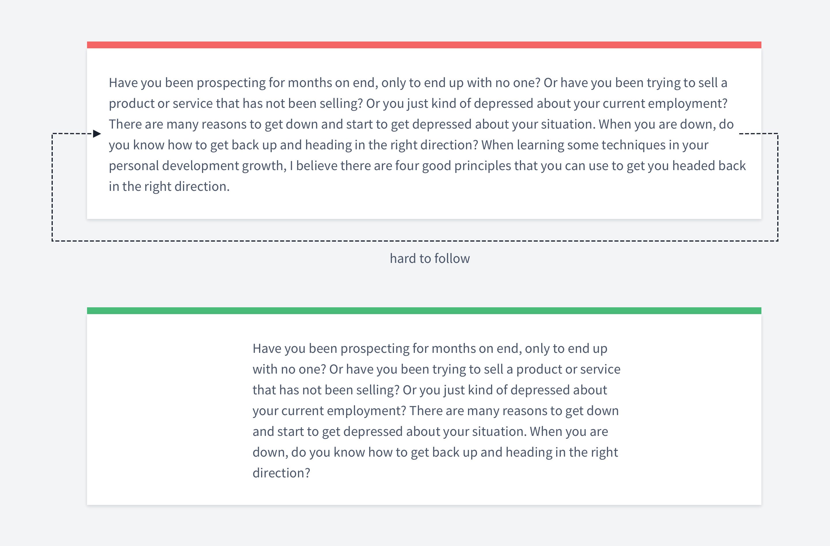

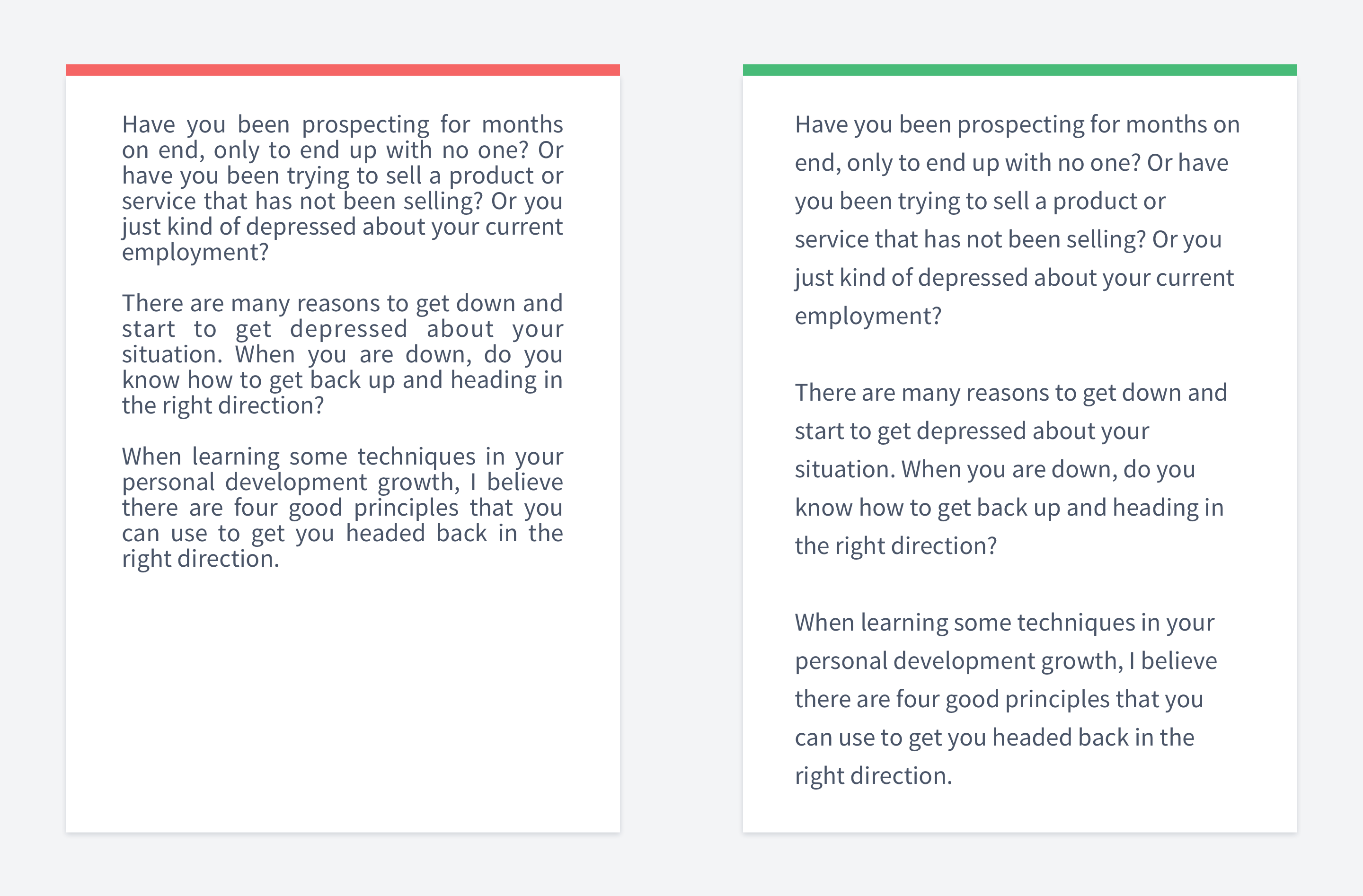
Don't make lines too lengthy
It's very important to have an optimal line length.
If your text is too wide, it won't be easy to gauge where the line starts and ends. Furthermore, it can be difficult to continue onto the correct line in large blocks of text.
If a line is too short, the eye will have to travel back too often, breaking the reader's rhythm.
Different sources propose different numbers of how many characters there should be per line.
Baymard Institute suggests 50-60 characters, while webtypography 45-75.
Those numbers are not that different though. The idea is more important than the exact number.
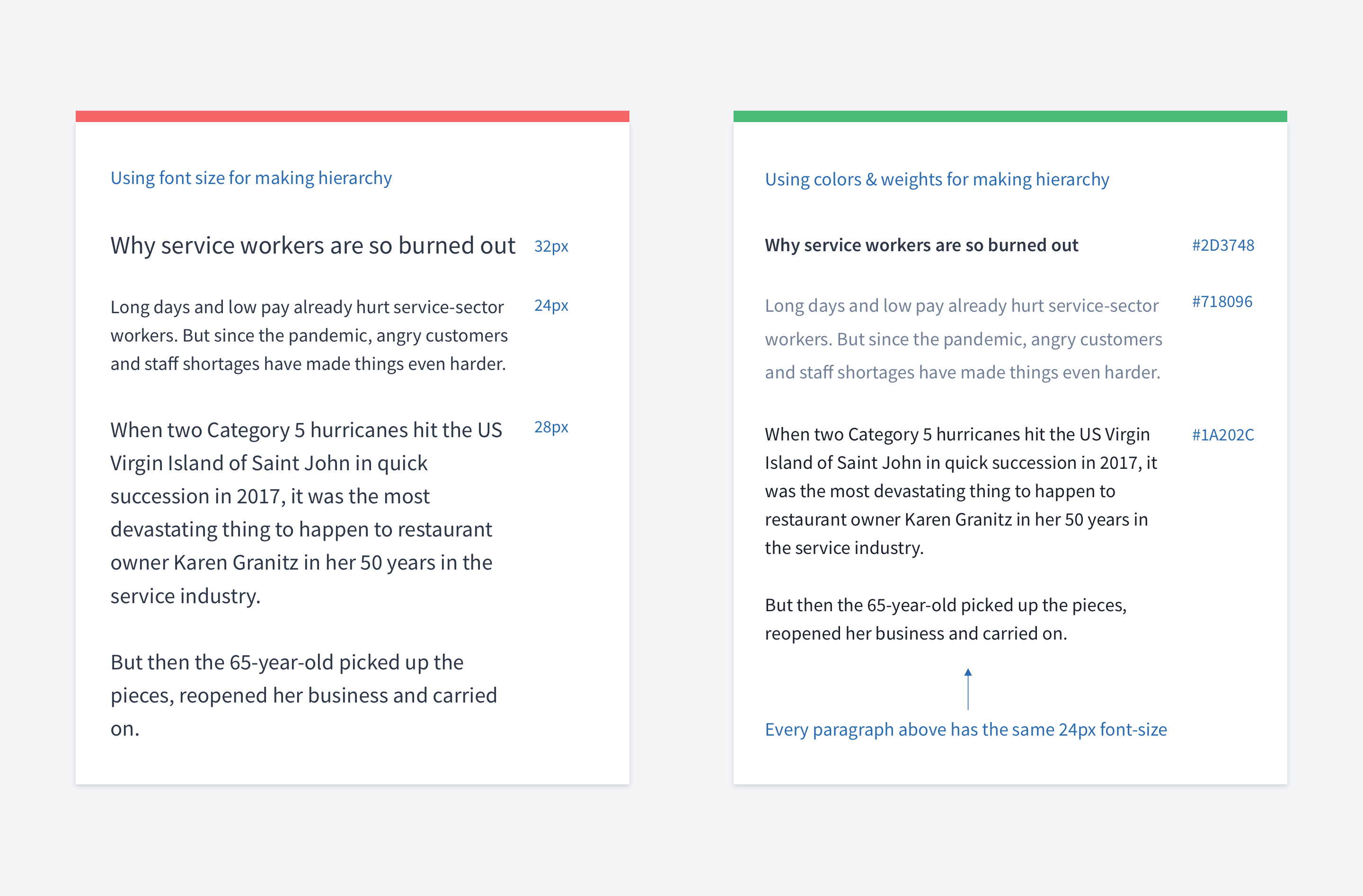

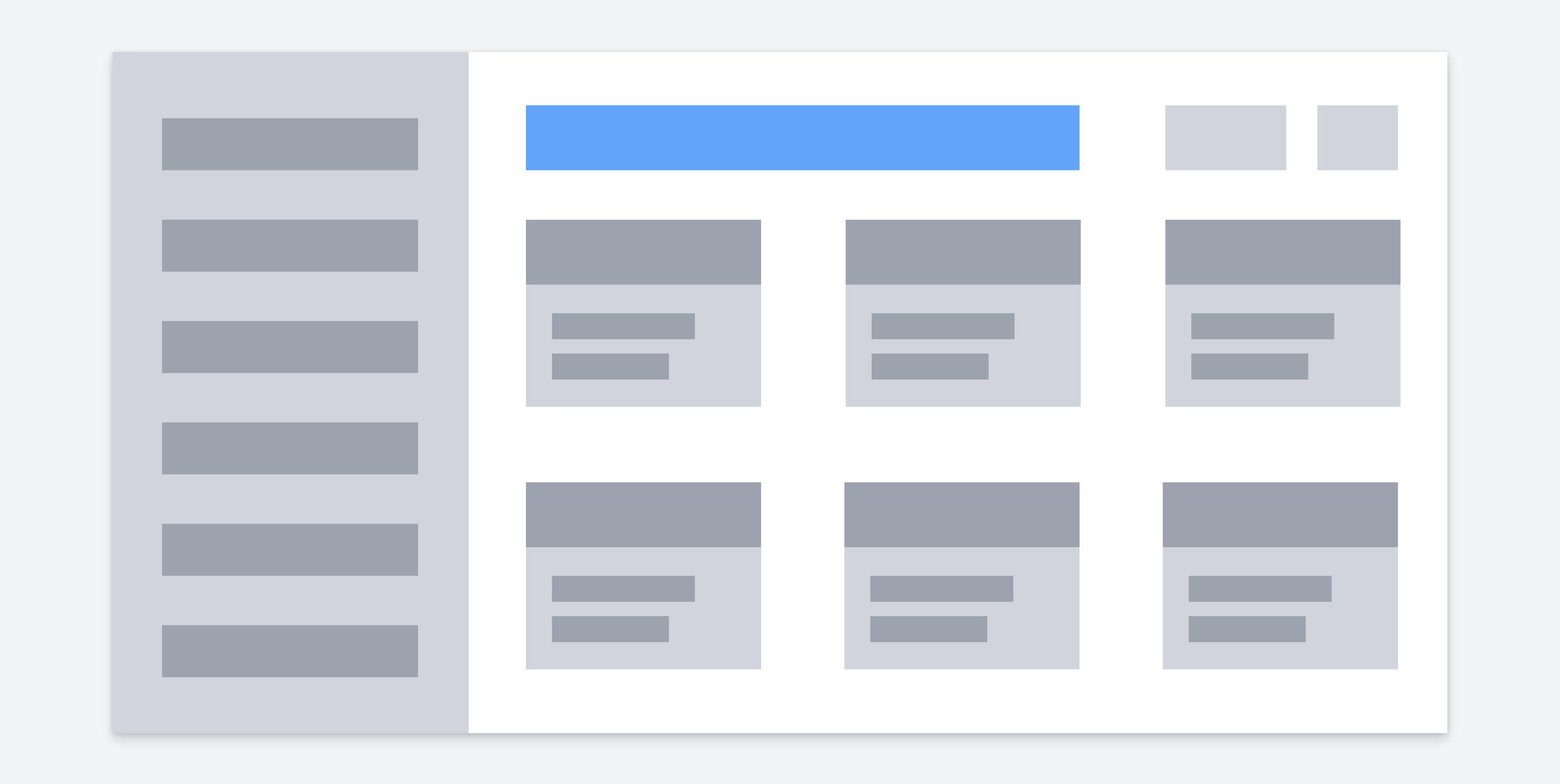
Use different techniques to make hierarchy
Hierarchy is one of the most essential aspects of making your text scannable and easy to read.
Usually, the first thing that comes to our mind is using different font sizes to make the hierarchy. But font size is one of the possible ways. You can use: Font size
Font weight
Color
Position
Using contrasting fonts
A common mistake is to use only font size. That can lead to not very well-designed interfaces.
Sometimes you simply cannot make the font bigger because you don't have enough space. This might happen in cards for example, when the space is limited.
You can refer to this article to get more infromation about text hierarchy.
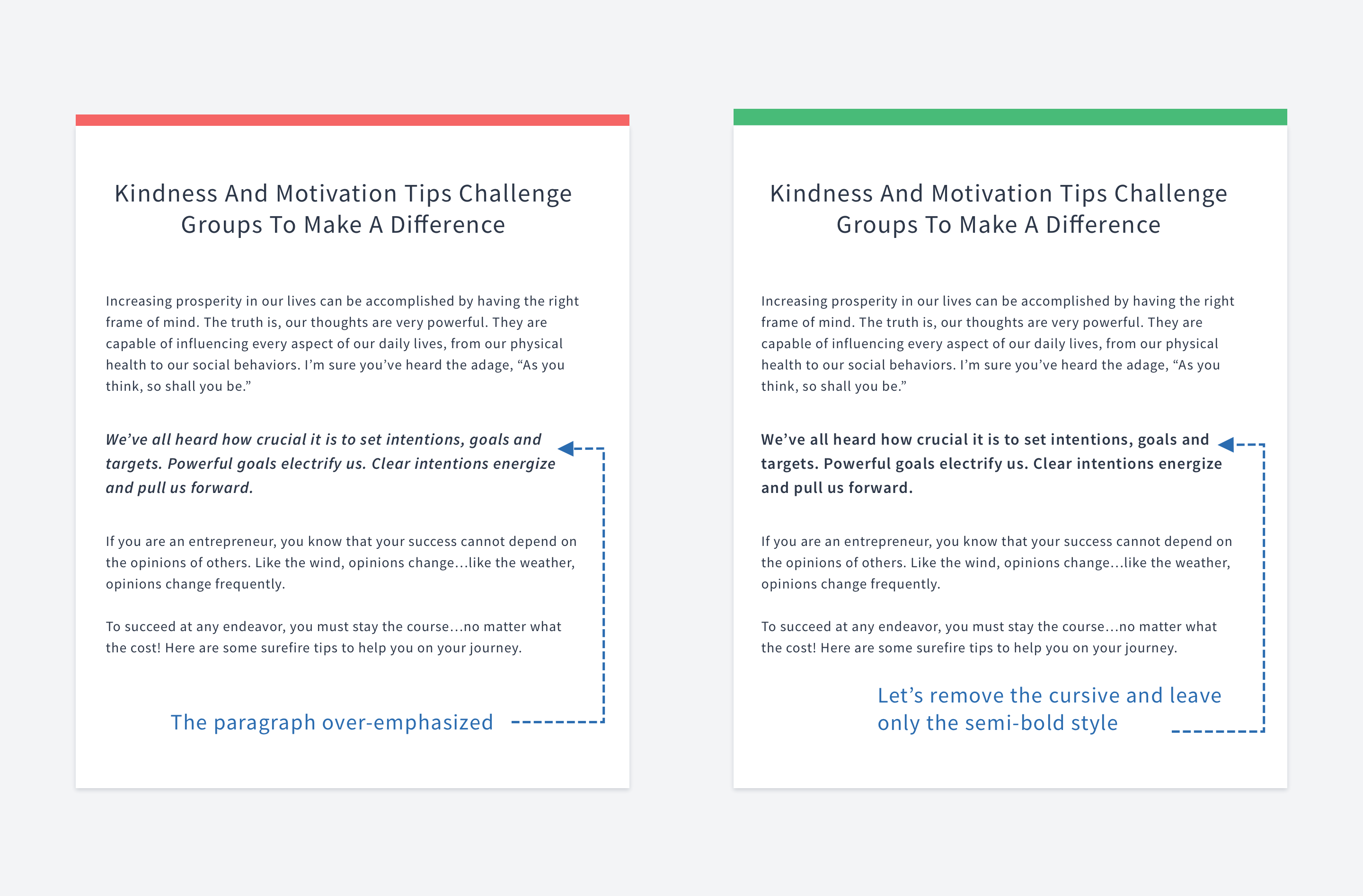

Do not over-emphasize
You can emphasize text by using different techniques. For example, you may change color, weight, size, style.
Once you emphasize a paragraph by applying one of these techniques, there is no need to use others since the text is already emphasized.
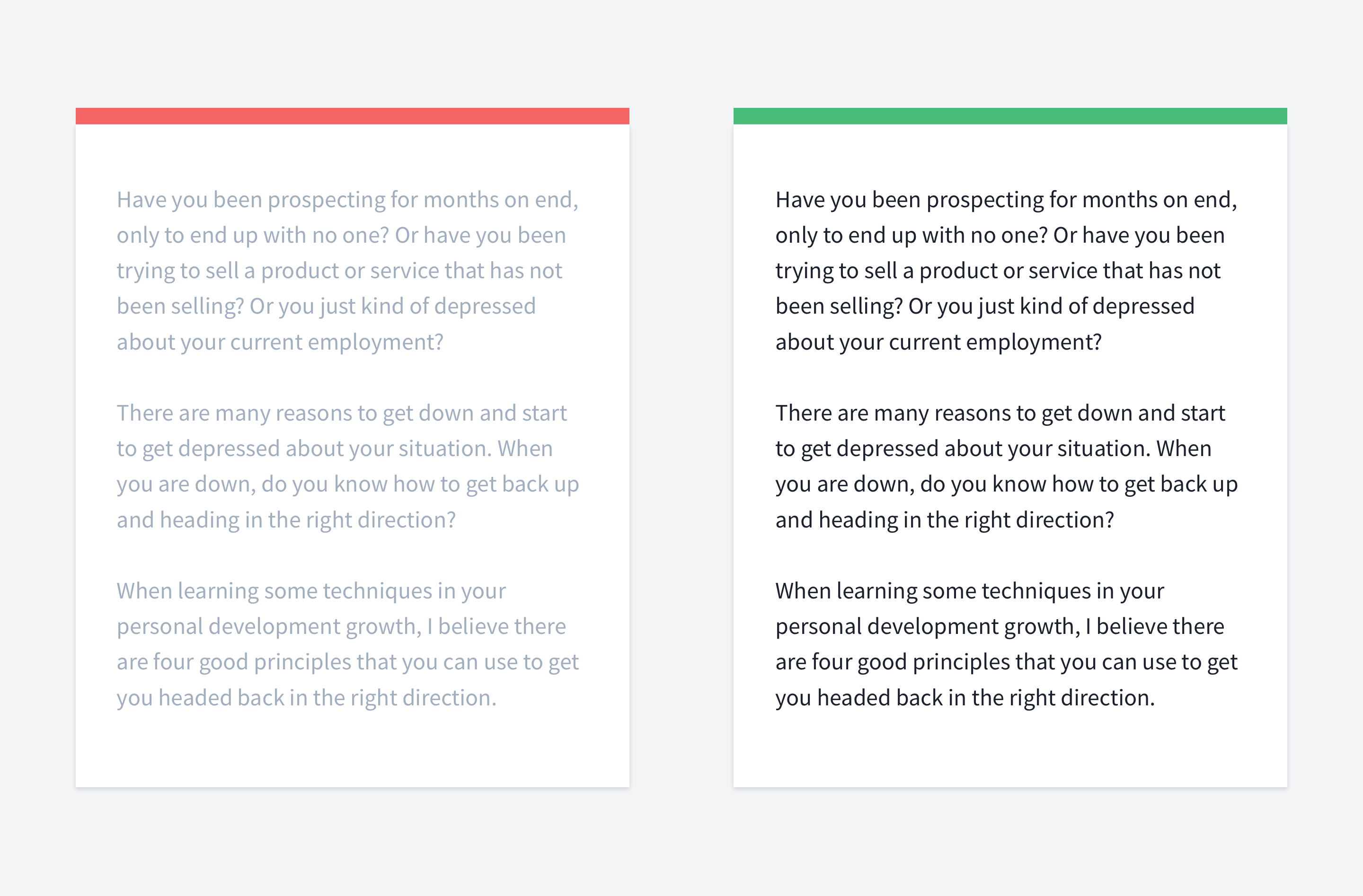
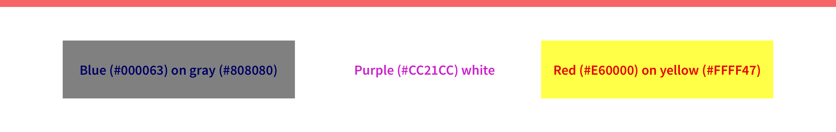

Keep an eye on contrast
Contrast is a very tricky and not obvious thing in UI/UX design.
In WCAG 2, contrast is a measure of the difference in perceived "luminance" or brightness between two colors.
There are three WCAG contrast levels A, AA, and AAA. Usually, you're good if your text has AA or AAA levels.
To check text level, you can use the contrast checker.
But.
I found quite a few articles saying that this test fails for the text that is even more readable for people with and without color blindness disease.
You can read a case study by Ericka Seastrand, an article from ux movement and
Usually, there are contrast problems with gray text on white background. To de-emphasize text, designers might fall into the trap of contrast.
Also, take a look at this example. Every sentence passes the AA test, but the text is still hard to read.

Don't use pure black color
Don't use pure black color on a white background because it causes eye strain.
Here is a quote from colorsonweb.com that describes it perfectly: "Simply put, contrast is the difference between two colors. On a web page, the amount of contrast required varies with different parts of the page. You usually want a high contrast between text and its background color. But too high contrast between design elements might give an unsettled and messy impression. Black and white create the highest contrast possible."
Give preference to a slightly gray color instead. If you are curious, here is a research
Also, here are some references about this topic:
Why You Should Never Use Pure Black for Text or Backgrounds
Why not use pure black (#000) and pure white (#FFF)?
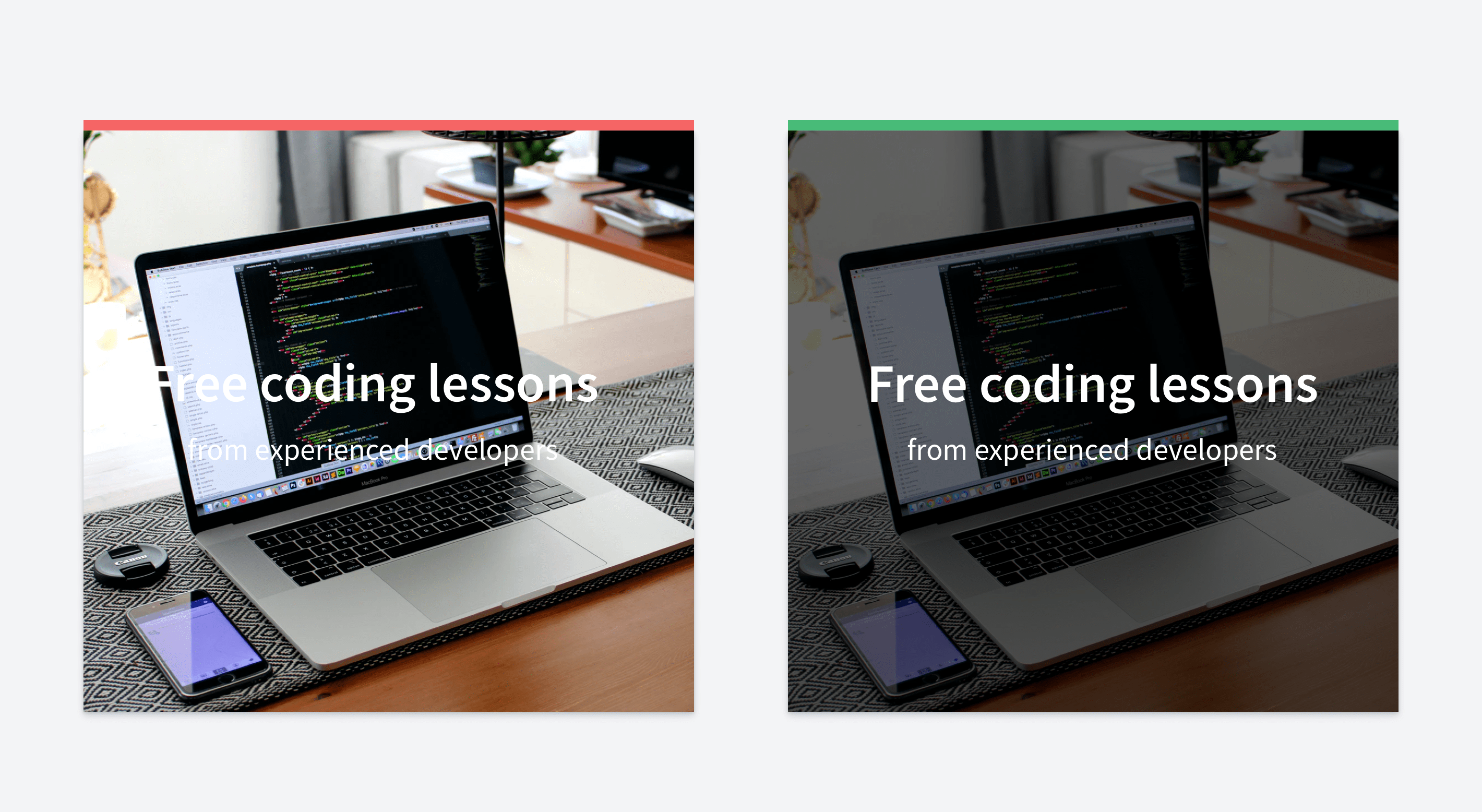

Handle text on images properly
When you put text on top of an image, pay special attention to its readability. A very common problem is that the text is not easy to read, usually due to contrast issues.
For example, if your image is not very dark and the text color is white. There are a few techniques to fix this issue:
Tinting
Put text in a box
Blurring
Fading
You can find how to implement all of them in this article.
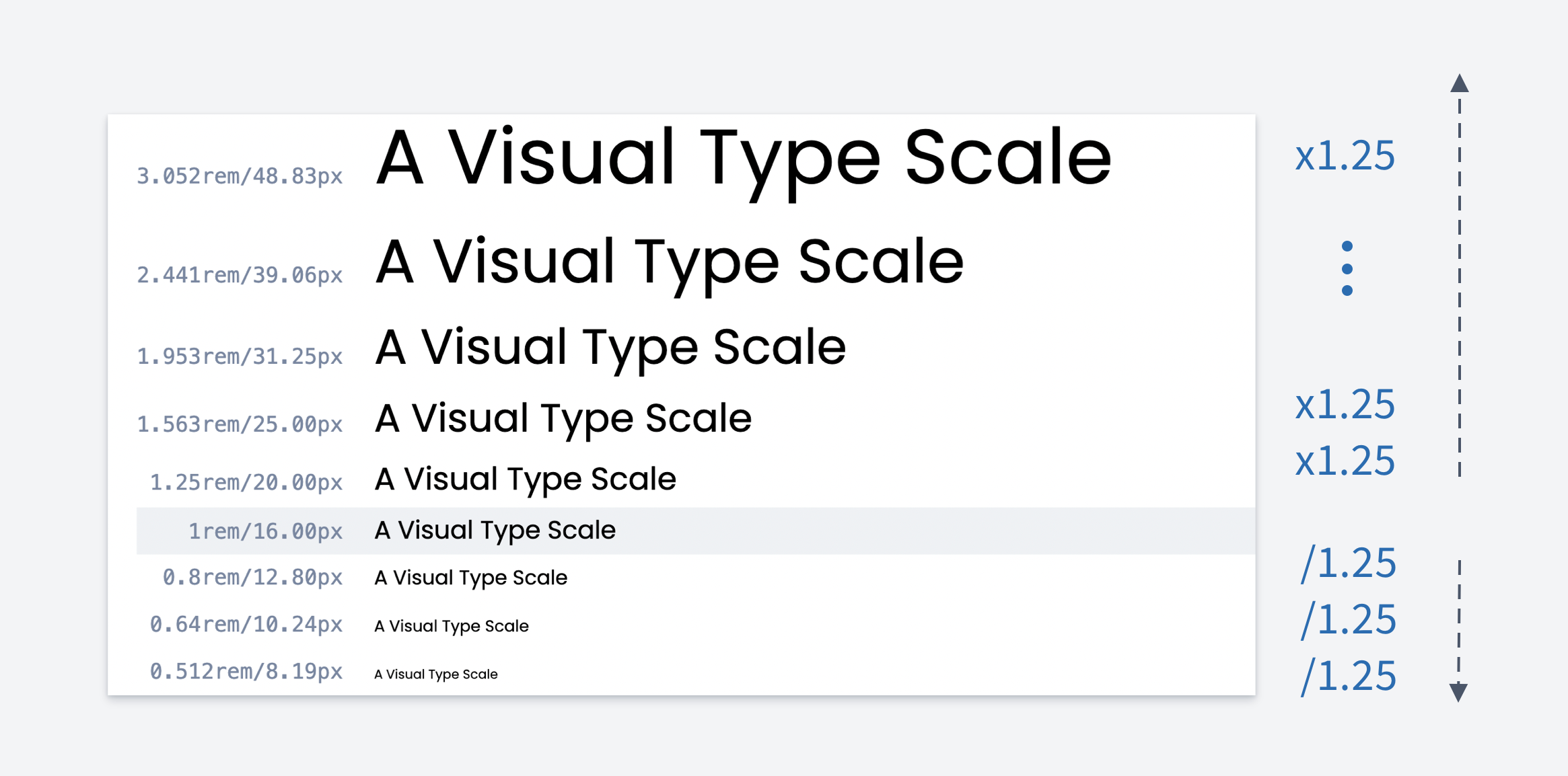

Use modular type scale
A modular scale is a sequence of numbers that relate to one another in a meaningful way. A modular scale in Typography is used to generate a visual rhythm in font sizes.
It's a nice way to make text hierarchy. How to do that:
Select base font size (usually 16px)
Select ratio. Common onces are:
Perfect Fifth (1.5)
Augmented Fourth (1.414)
Major Third (1.250)
Multiply/Divide by the ratio
Below there is an example of making a type scale using Major Third.
Here is a tool that simplifies this process.
One of the most detailed articles written about this topic is "More Meaningful
Typography" by Tim Brown.
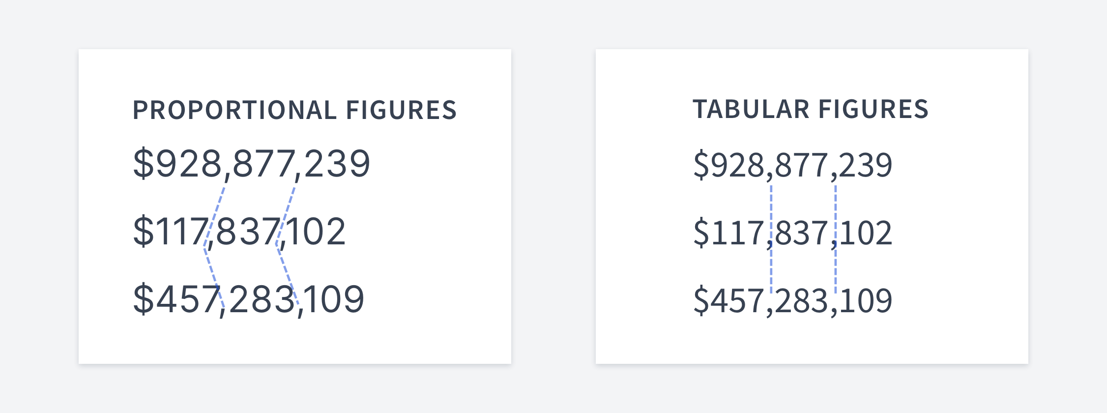

Proportional vs tabular figures
Proportional figures have variable spacing. In contrast, tabular figures each have the same width.
Proportional figures are appropriate when numerals are read in the text, and tabular figures are preferable when numerals are read in columns. Tabular figures are especially easier to scan in tables.

Forms
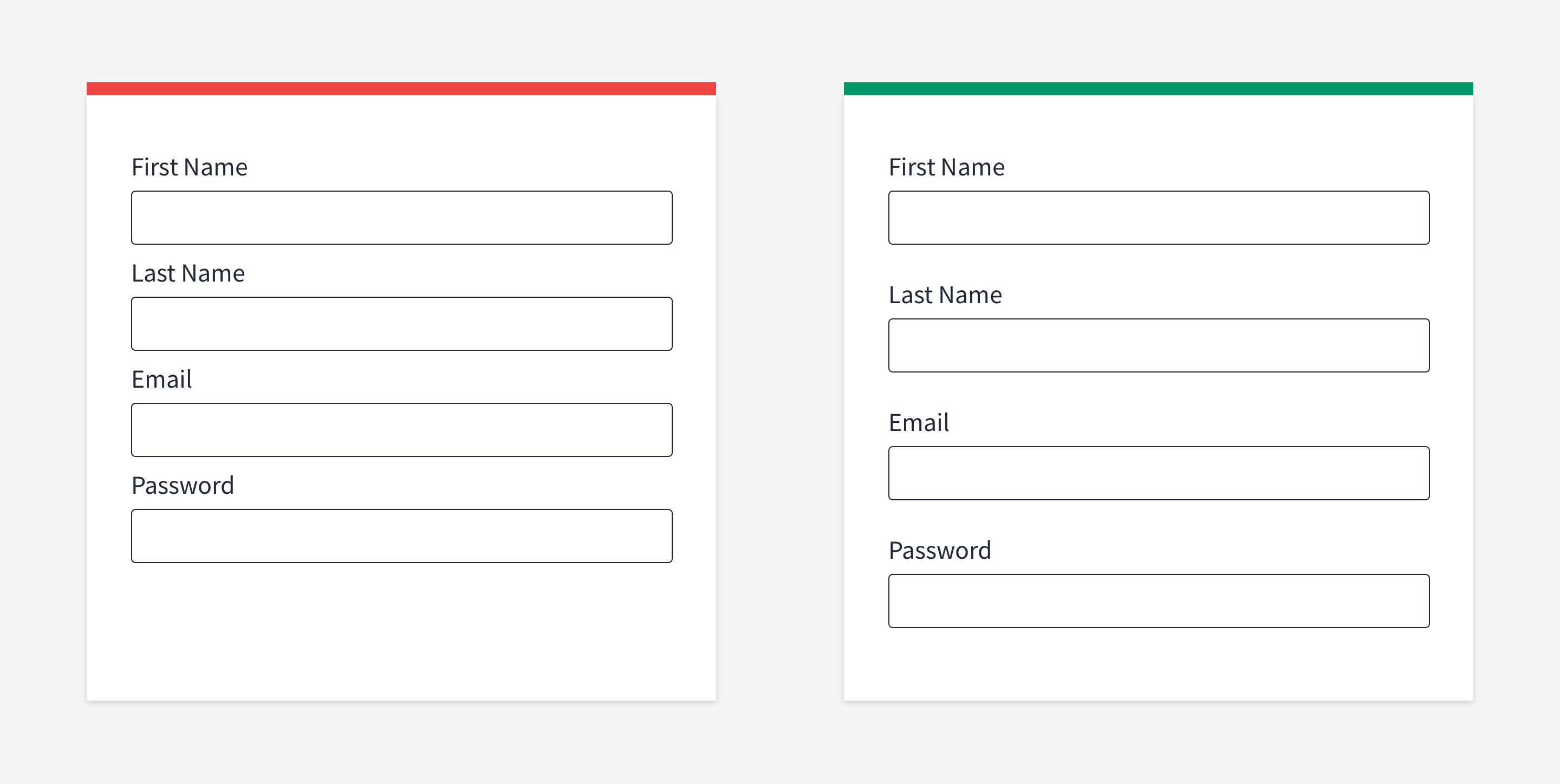
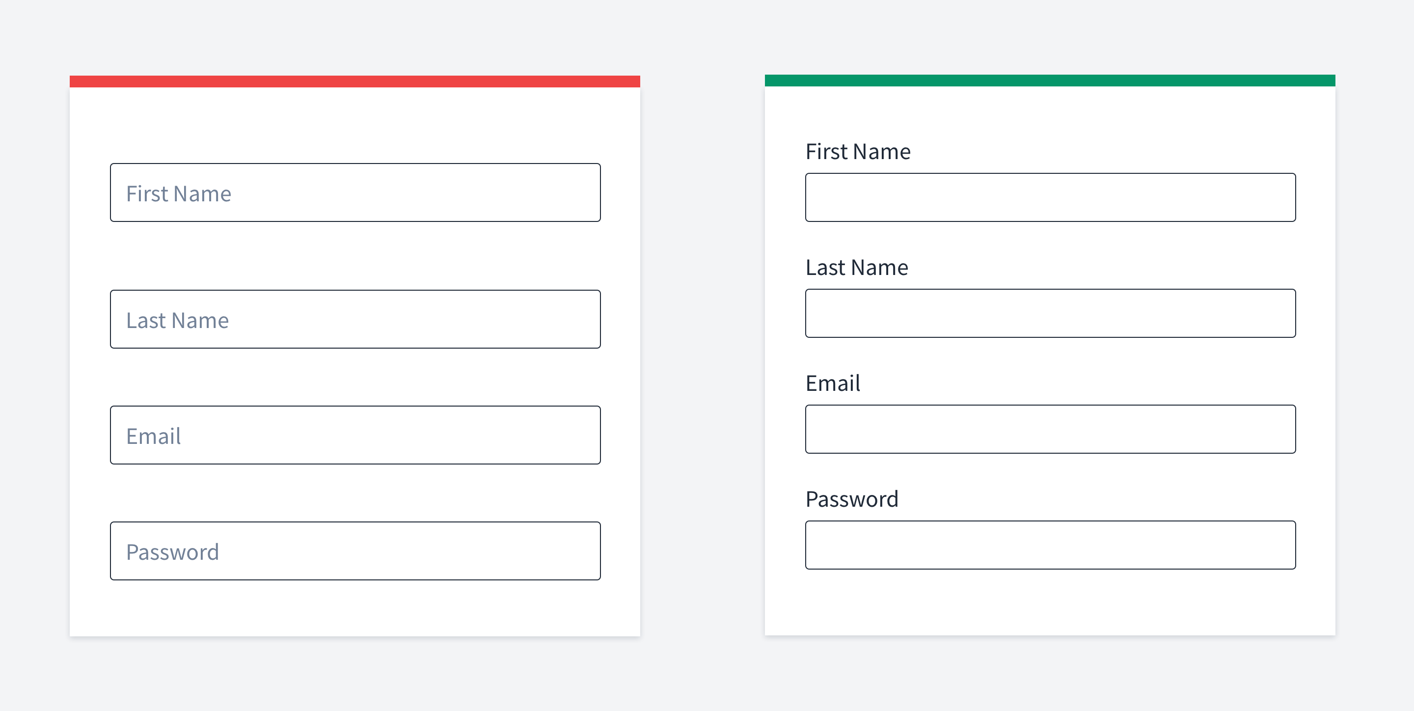
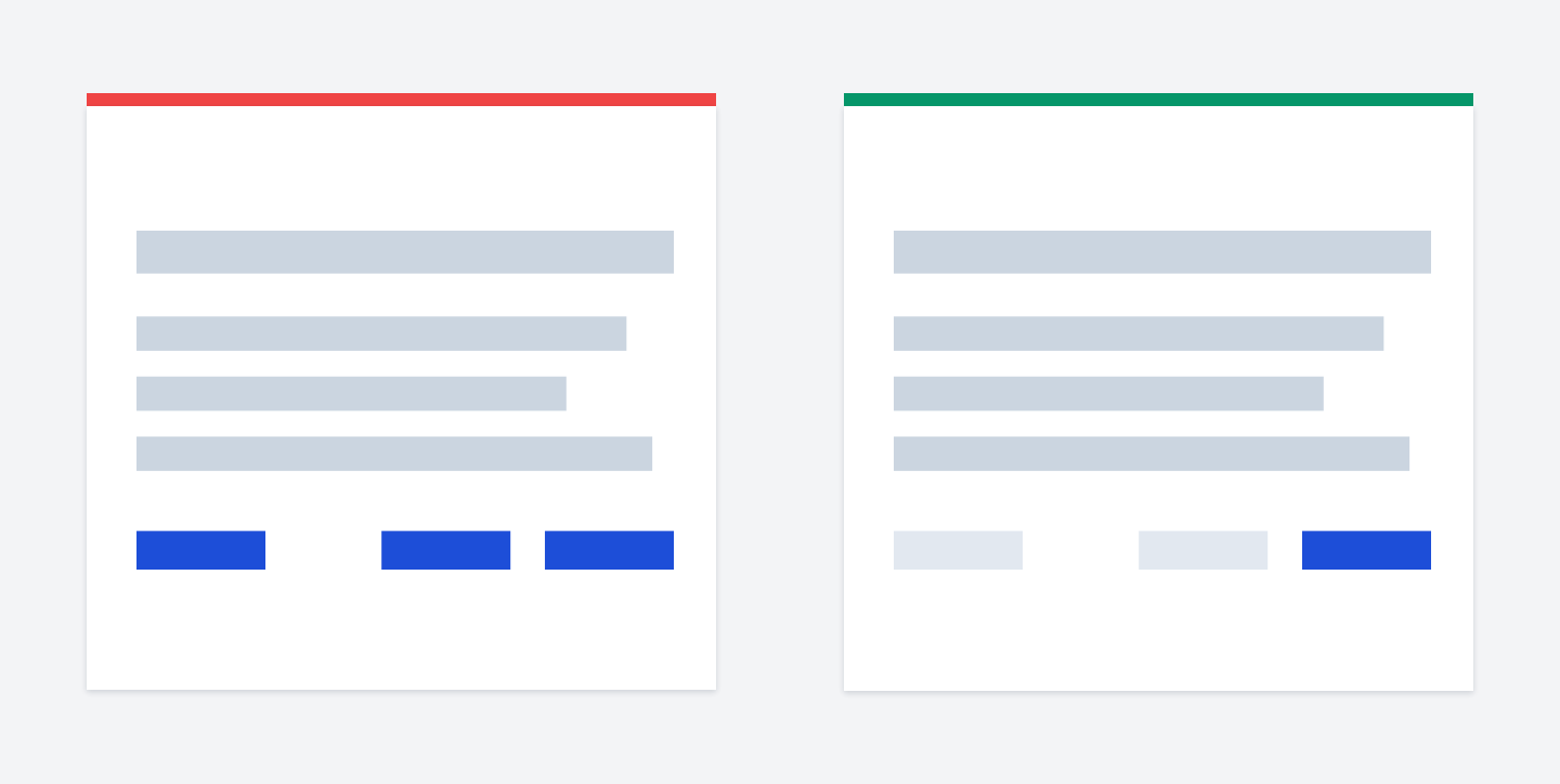
Have enough space between inputs
The proximity law we talked about earlier can also be applied to form elements.
A common mistake is when input labels have the same spacing between inputs.
Without additional effort, you cannot easily say to which input the label belongs.
Remember: "Whitespace is like air: it is necessary for design to breathe." Wojciech Zieliński
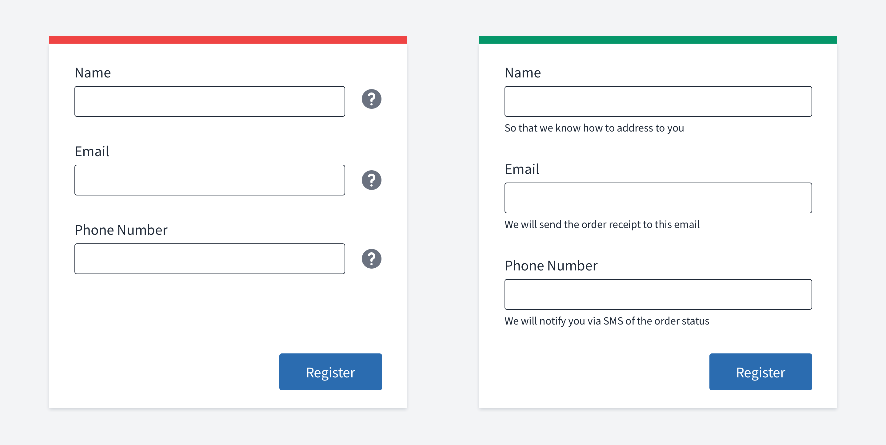

Don't hide form tips
It looks like a good solution to hide hints under an icon because we can save some space. The UI will look cleaner.
But. If the information hidden under a tooltip is vital for completing the form, don't
The reason is that in order to complete the form, users will need to hover over the tooltips constantly. Instead, it would be much better to show the hint right away.
For example, below inputs.
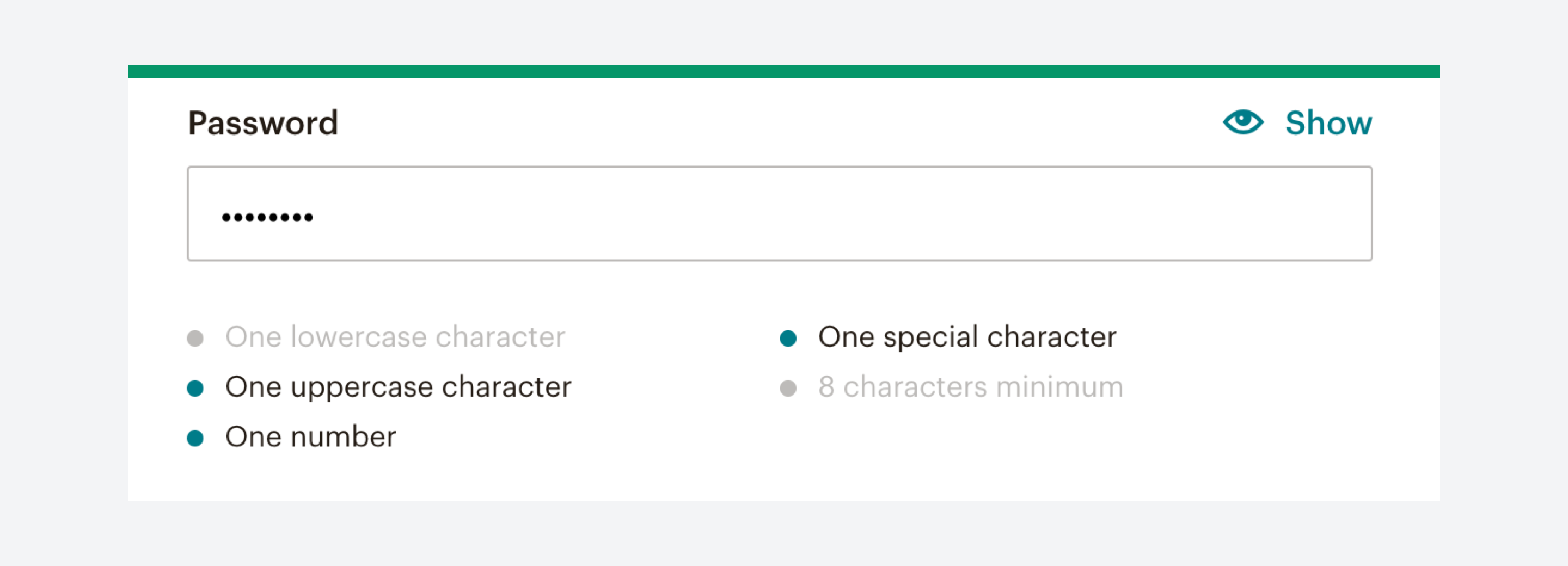

Show password rules right away
This is a particular case of hiding form tips.
If your password should conform to quite a few rules, show what you require from the user right away. Do not wait until the user hits the submit button to show him a set of errors.
Also, showing the requirements is not enough. When the user fills the password form, highlight the satisfied rules.
One of the good examples is the Mailchimp sign-up form.
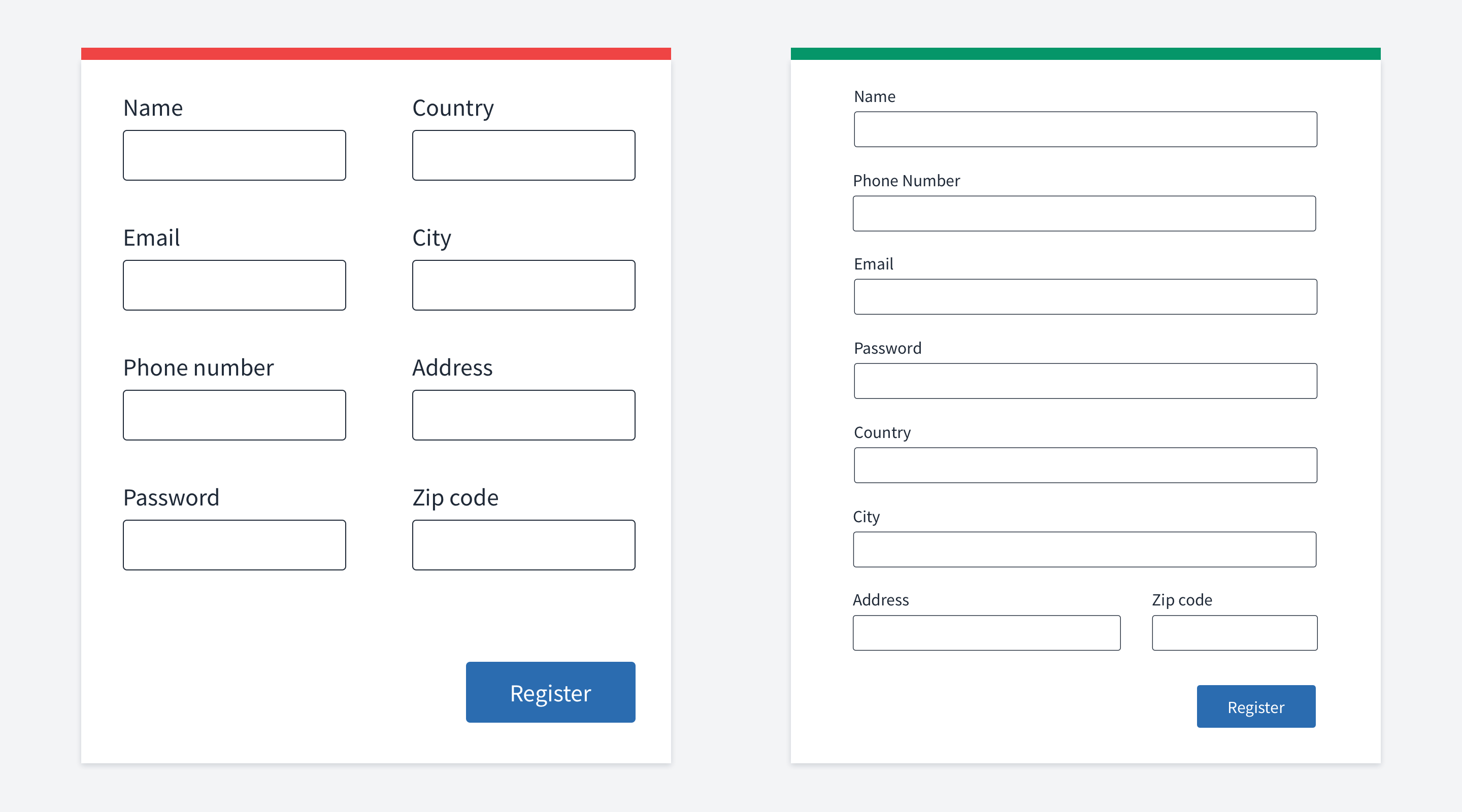

Avoid multicolumn layouts
Numerous researches say that it wouldn't be the best solution to put your inputs into two or more columns. Baymard have a very thorough explanation of this.
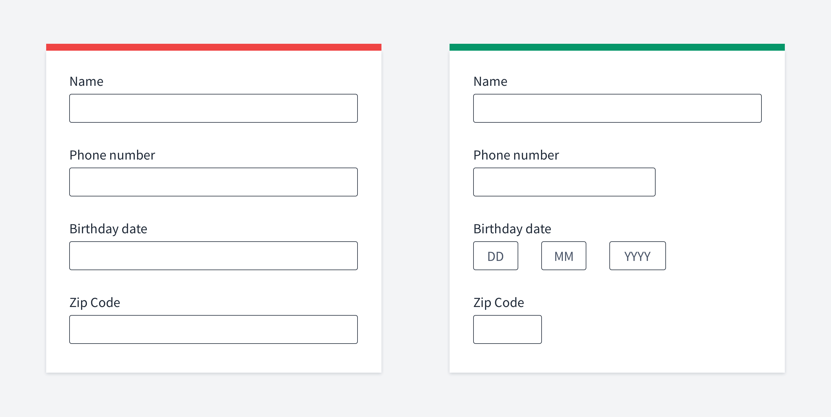
But there is an exception. If the inputs are tightly related to each other (e.g. first name and last name, or birthday day, month and year), it's totally okay to place them in a few "columns".
In this case, the whole form will still be perceived as one column. Just some of the inputs are broken into multiple "parts". If you have a birthday input consisting of three smaller inputs placed inline, it doesn't mean you have three separate columns.
You have one input composed of three parts.

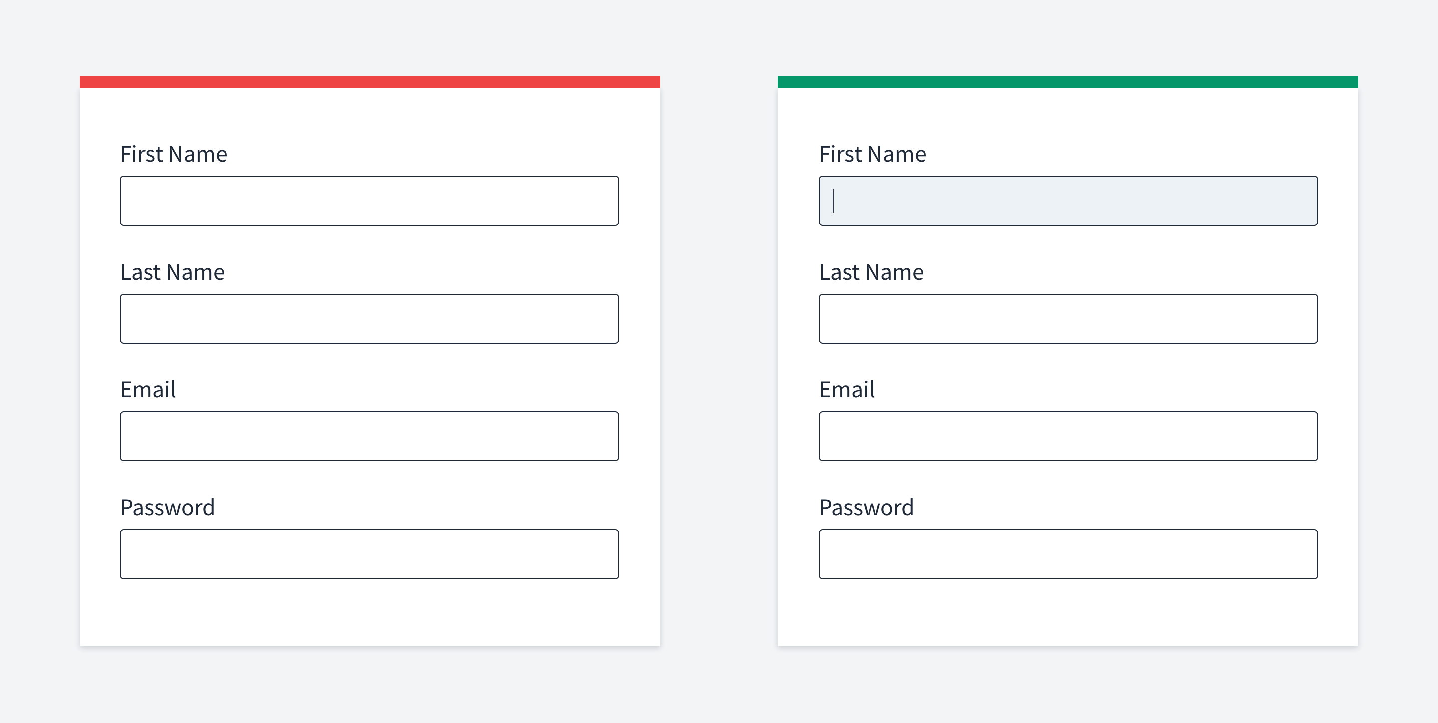
Use labels, not placeholders
Don’t use placeholders as labels
While the user is filling the form, he might forget what you asked him. To see the placeholder text, the user has to erase the content in the input. Plus, having labels is better for accessibility reasons. It's much safer to keep labels.
Maybe in rare cases, like in a sign-in form where you have only two inputs, you can skip them. But still, be very careful.
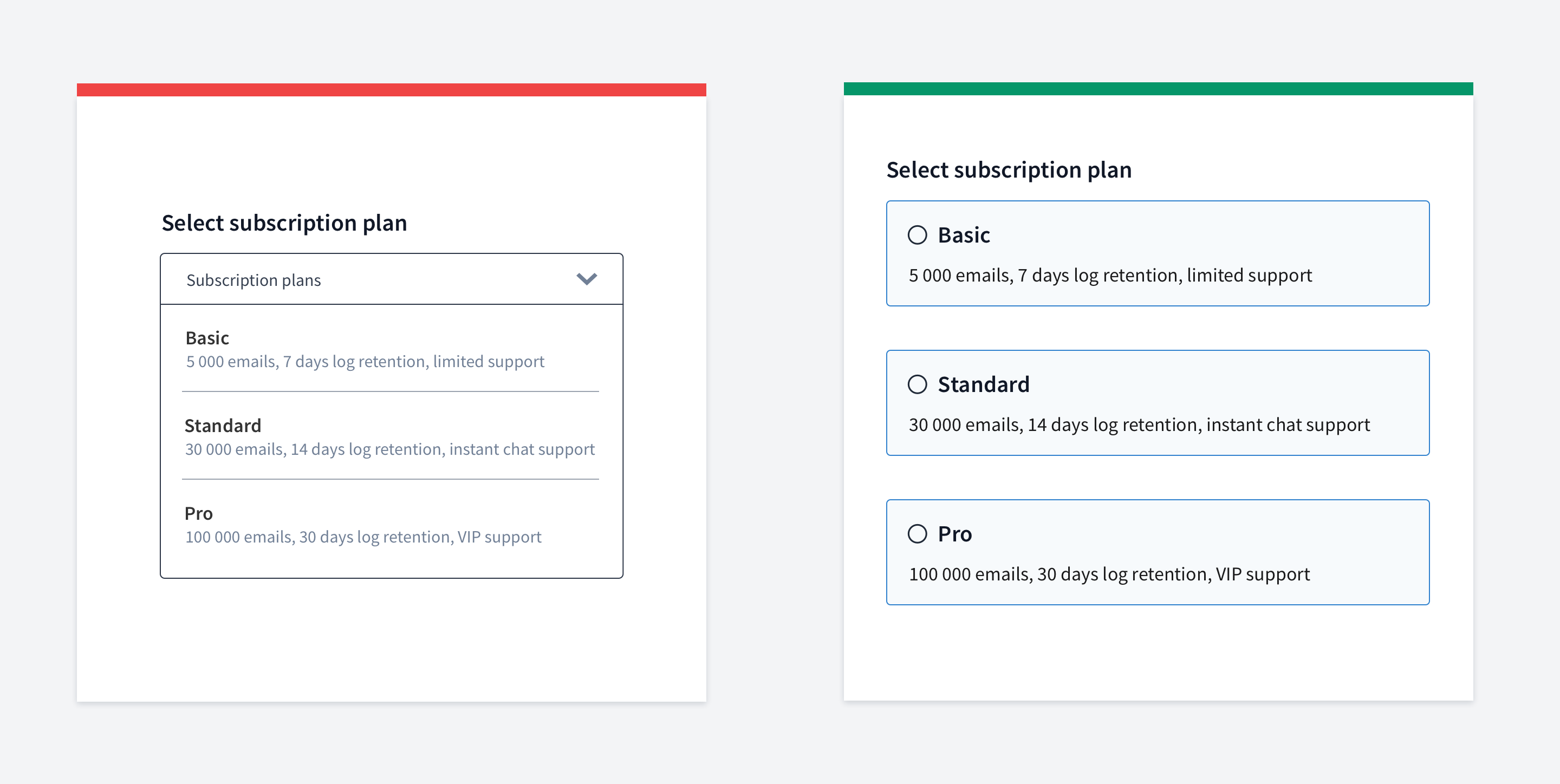

Be careful with dropdowns
While dropdowns can be useful in helpful situations, they are widely overused.
If you have a dropdown with up to 5-7 options, then display all the options right away. Do not hide them under a dropdown because users will need to make more clicks to select the option they need. You can use other techniques (radio buttons, tags, clickable cards, checkboxes etc.)
Don't use dropdowns if it's easier to type than select an option, especially if the data is familiar to users. A perfect example is the year of birth.
Some of good resources to read about dropdowns are Baymard and NNGroup
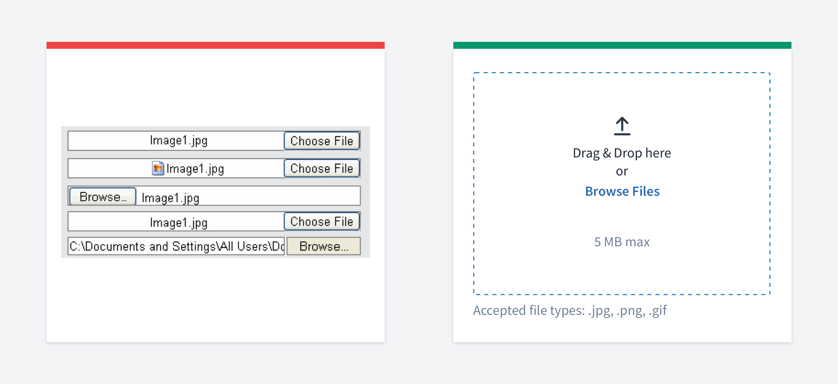

Replace default file inputs
Default file inputs look different in different browsers.
Plus, they have poor usability. They don't have many things like image preview, size validation, asynchronous uploading, etc.
Instead of using inconsistent default browser inputs, you should use a custom one.
.

Autofocus the first input
When building a user-friendly interface, we aim to reduce the number of actions users need to take.
Ideally, we shouldn’t have any interface at all.
A simple but nice trick is to autofocus the first input in the form. This way users won’t need to do it manually, and you encourage them to start typing right away.

Use reasonable input width
You shouldn't try to fill the remaining space on your screen. Your inputs don't have to be 100% wide.
The size of an input can. The size of inputs can determine what type of content you expect from the user. For example, a zip code or phone number cannot have a hundred characters.
There is an excellent explanation of this from Baymard
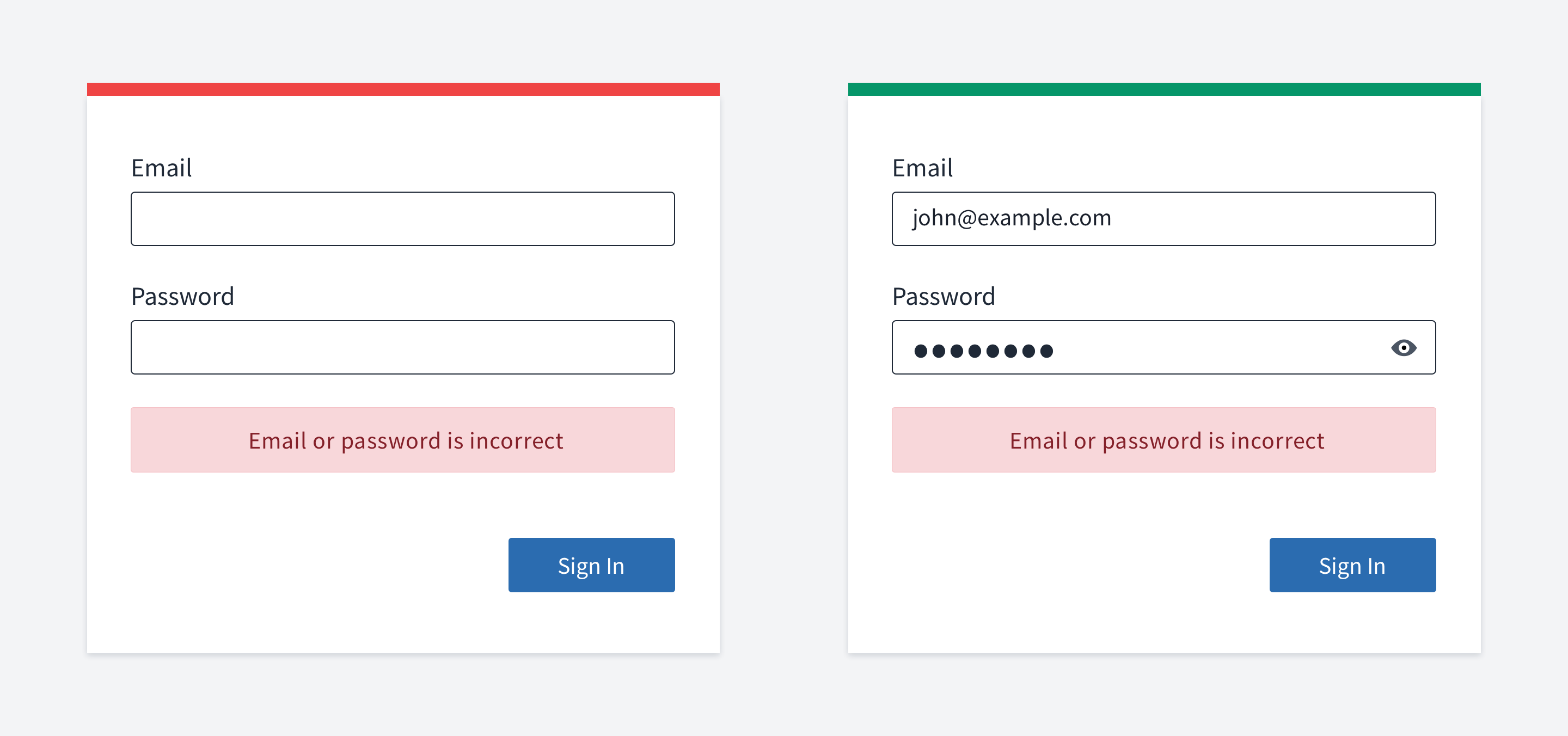

Don't erase credentials after unsuccessful login
If a user put wrong credentials and pressed the login button, it'd be very bad practice to erase email and login values. In case of a mistake, the user will not be able to fix it. Instead, they will need to re-type their credentials one more time.
Even for the password input, you should have a way to reveal its value so that users can fix a small TYPO in it.
Note about security: it's the responsibility of the server to prevent password brute force, not an interface one.
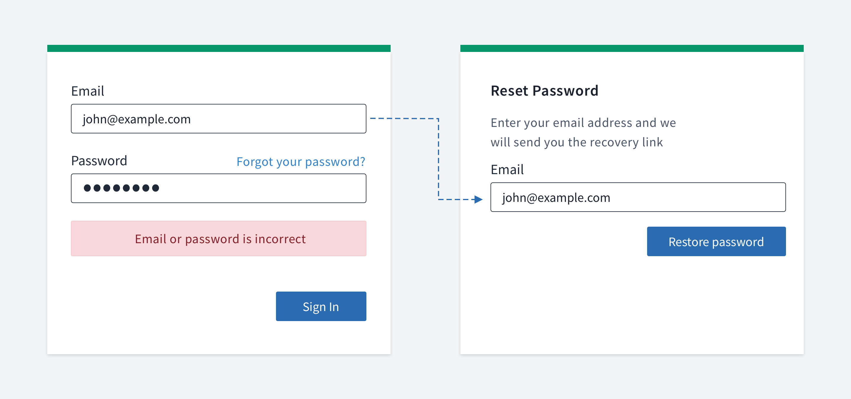

Remember email in forgot password page
Imagine a user tried to log in, and the login attempt was not successful. Then they realize that they've forgotten their password.
So, they head to the page where they can restore their password via email. A user-friendly approach, in this case, would be to auto-fill the email address so that they don't have to type it again.

Dividing form into multiple steps
There is no universal way of how to deal with large forms. But you should consider the following points:
When you see a large form, chances are that you won't be willing to fill it out.
When you see a form that has many steps, well, chances are that you won't be willing to do it as well
We need to strike a balance between the complexity of every single step and the number of steps.
What I would recommend:
Require fewer fields, eliminate those that you don't need
Group form elements effectively using white space
If your form creates an entity with subentities, you might want to make a separate form for adding subentities. Let me explain. If a user has profile information and an avatar, you may consider having a separate form for uploading the avatar. It depends very much, but the idea is that "don't put everything in one place". Similar to the single responsibility principle in OOP.
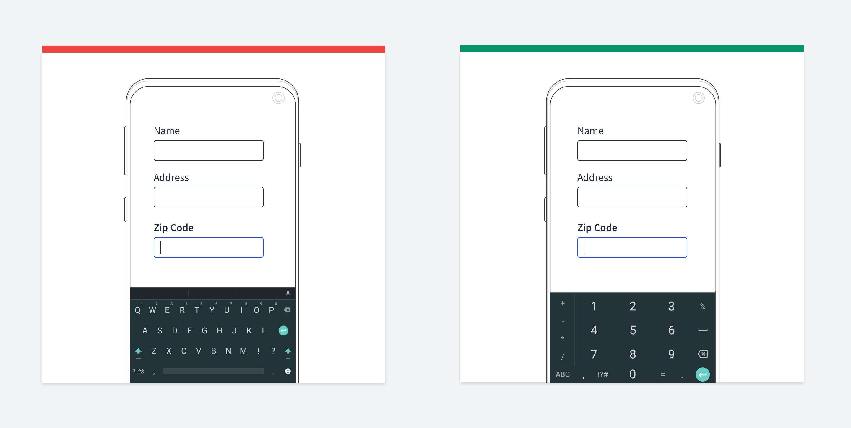

Use correct input type
Input HTML elements have a type attribute. It's essential that you have the correct types for your input when we talk about mobile usability.
When a user needs to fill in the email field, just by setting input type to "email", the mobile keyboard will have special email signs, like "@".
There is even a dedicated site for this issue.

Marking required/optional fields
This is somewhat a complicated topic. I saw both pros and cons for marking fields as required or optional.
Imagine we have a large form where almost all fields are required. So if you mark every field with an asterisk, it wouldn't look like the cutest thing in the world.
But NNGroup has some arguments that defend this point of view. Let's see how we usually deal with this issue.
We put a label at the beginning of a section of the form, saying that the following fields are required.
We mark only optional fields (assuming that their number is fewer) We can completely omit any marking and rely on validation So what's the problem with these approaches?
People don’t read instructions at the top of forms
Even if people read instructions, they may forget them
People have to scan the form to determine if the field is required So it looks like marking every required field with an asterisk is a good idea. The only exception is the login form because it's self-evident that every input is required there.
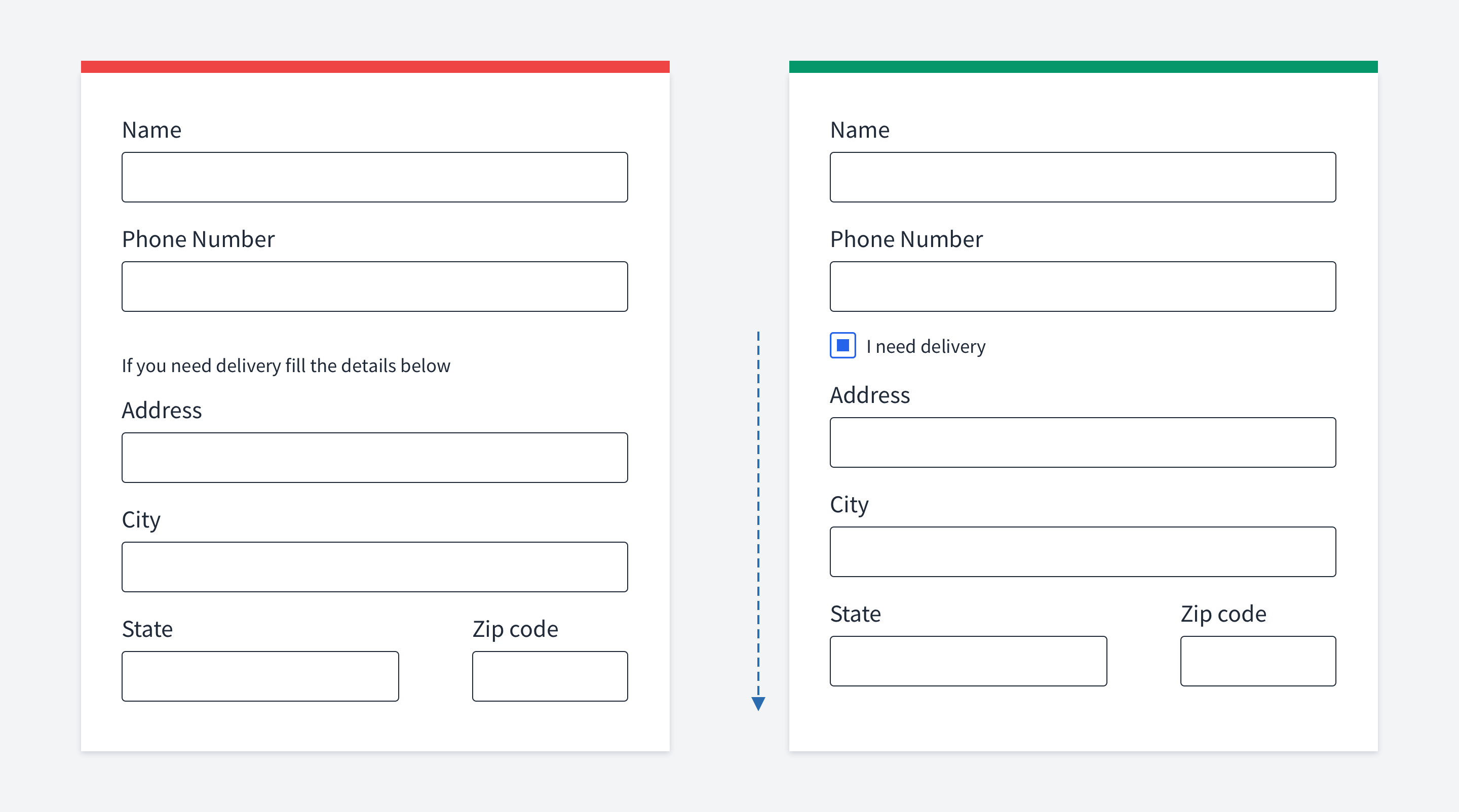

Progressive disclosure
Progressive disclosure defers advanced or rarely used features to a secondary screen, making applications easier to learn and less error-prone.
The idea is that initially, you show users only a few of the most important fields. To display a bigger set of options, you provide a link or a button or any other trigger element.
These links or buttons usually have text similar to "Advanced", or "More options". So, by using progressive discosure, you don't show all scary fields right away but give users the ability to use them if they need them.
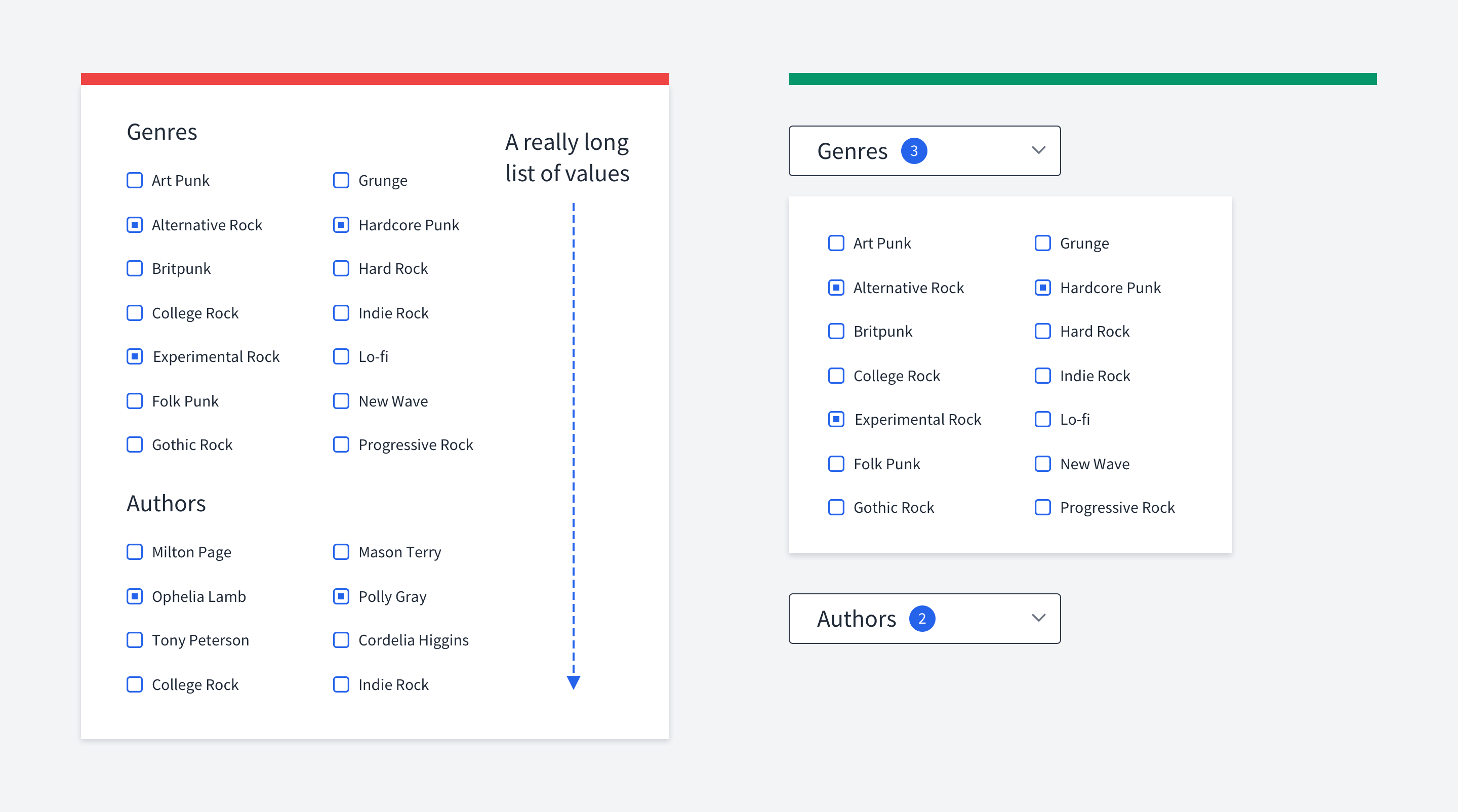

Collapsing checkboxes
If you have a long list of filters, they may occupy too much space.
In that case, hide them under a dropdown with a clear indication if some of them have been applied.
This is a typical pattern for E-Commerce filters when you have dozens of possible values.

Validation
Autoscroll to the first error
Sometimes the size of a form can exceed the monitor viewport.
Now imagine the following situation. A user fills the form, hits the submit buttons, and nothing happens for them. However, the problem is that they've just made a mistake but couldn't see it because the incorrect fields are not in the viewport.
You have a couple of options.
The first one is to display validation errors next to the submit button. But this is considered a bad practice.
A great alternative is to scroll users up to the first invalid field. Remember that it's crucial that you have the scroll animation. Otherwise, if the screen suddenly changes without any animation, it'd confuse users.

Help users to fill forms without mistakes
Even though you should have form validation, it'd be the best case if your users filled the form correctly on the first try. There are a few ways how you can do it.
Reduce the number of fields
Pre-fill data if you can do so. For example, you can guess such data as the user's country, language, location, device, etc.
In login/signup forms provide social authentication methods so that users don't have to type anything at all
Use masks for such fields as dates and phone numbers so that users don't guess the correct format.
Visually show how long the content should be. For example, don't make the input very wide for zip codes since it's not realistic.
Limit the symbols that the input accepts. For zip code, it's reasonable to allow inputting only numbers.
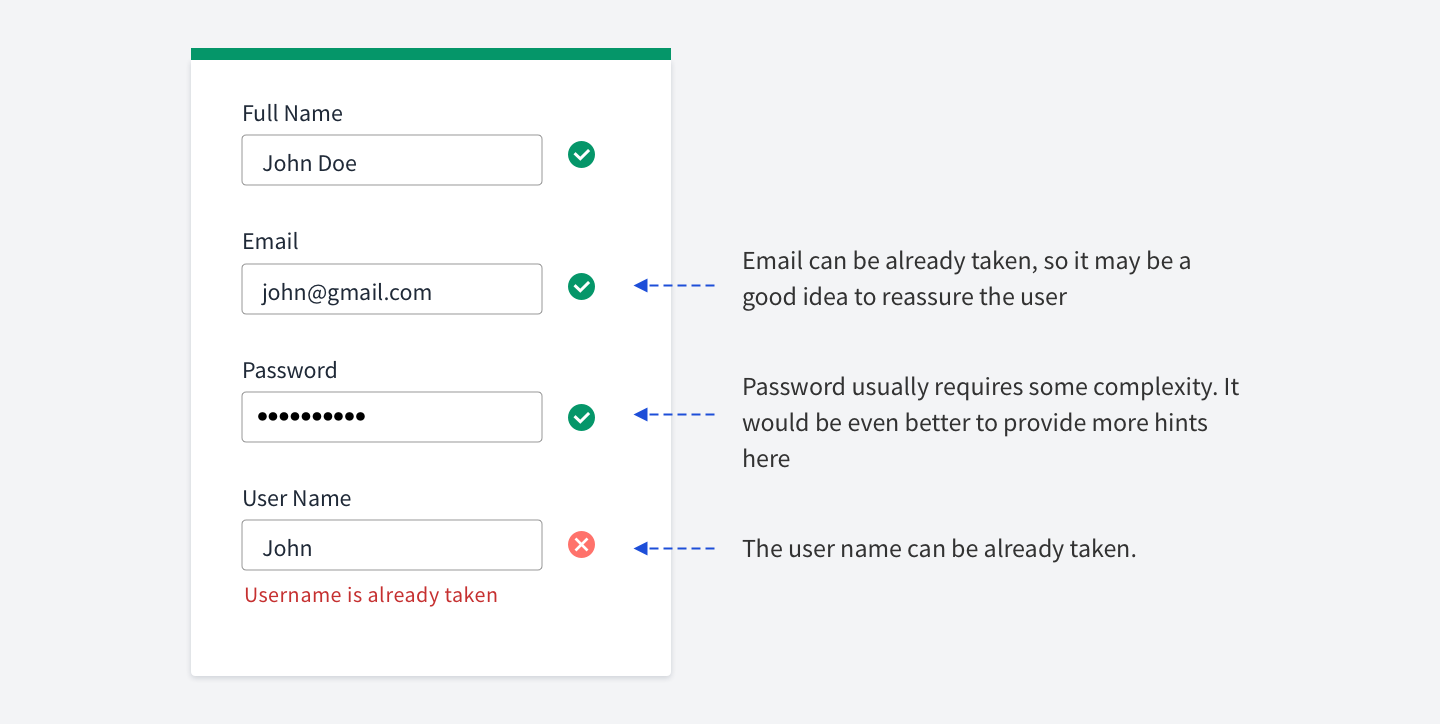

Consider positive feedback as well
If you have a complex form, it might be a good idea to show users when they fill an input correctly.
It gives users some assurance. It might not be necessary for small forms like login.
But if the form consists of dozens of inputs with some tricky data required, it might be a good idea to show a green tick if the field is filled correctly.
Imagine you have a checkout form that has the credit card number field. It's easy to make a mistake here. Even if the user has filled 16 digits, the number still might be incorrect. Providing a nice green tick might verify that everything is fine.
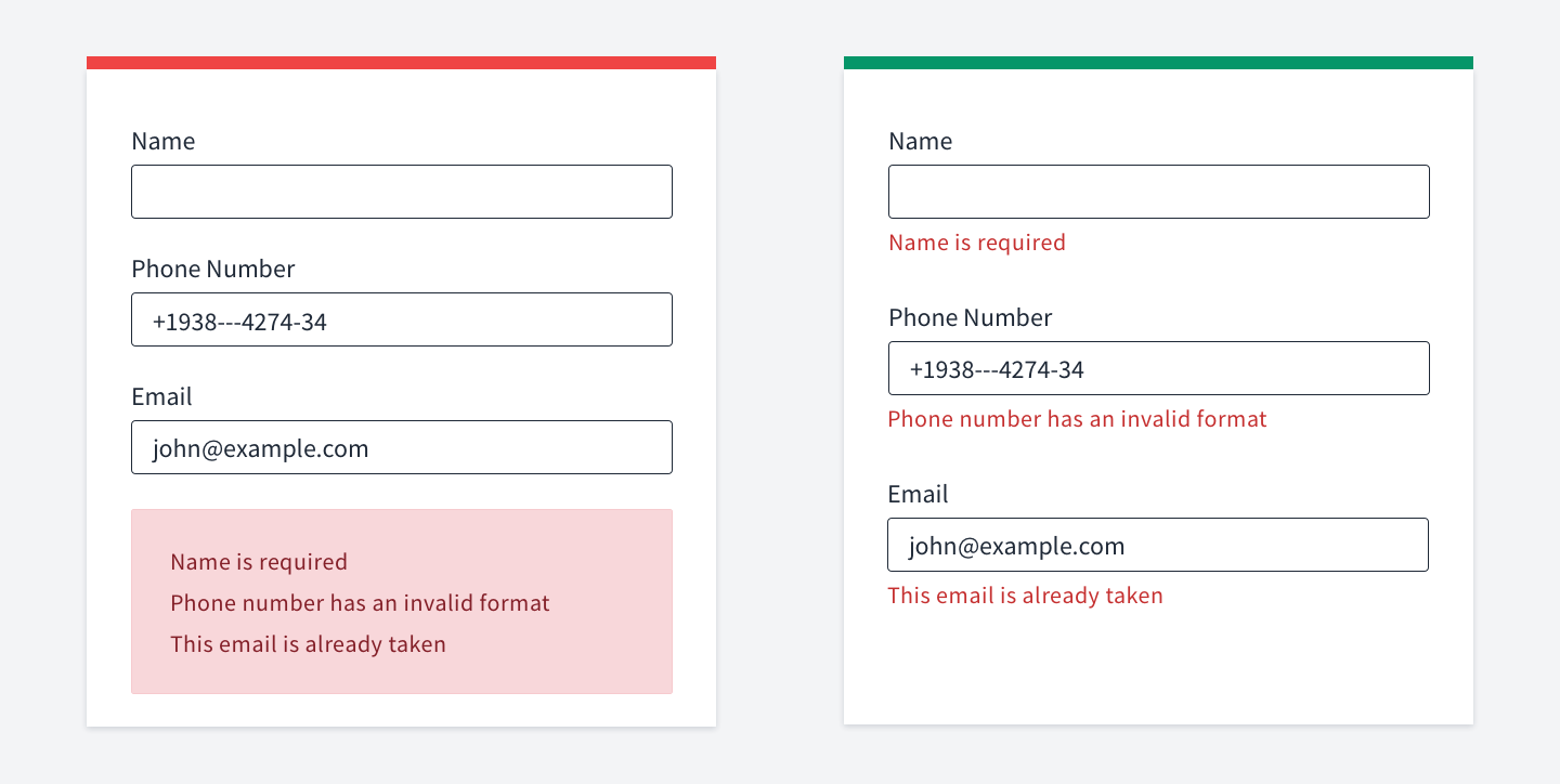

Put error messages in the right place
Many articles on the Internet claim the same thing: stick to inline validation. It means that you should place validation errors close to inputs they belong to.
If you show an error that way, the user will be in the context of what he's filling in.
While if you show it somewhere else, the user will have to match the text and the input.
Plus, if you group errors in one place (e.g., at the bottom), it might end up with many lines that's hard to read.

Landing pages
Require fewer fields
The more fields you require, the more significant becomes the barrier for users to fill the form. Thus, the conversion rate decreases. There is also a good question on UX
stackexchange related to conversion rates.
You don't need the user name to let them use your app.
You don't need the password confirmation since they can restore it via the reset password form.
You probably don't even need to verify users' emails to let them try your app out.
You can allow them to use the features that don't require email verification. And only ask it when they want to do something crucial that requires verified email.


Watch your text contrast on hero images
It often happens that you have a background image in the hero section. The image might be a photo of a person or something else. There are two common mistakes.
Placing text on an important part of the image. For example, right on a person's face. This is quite easy to fix. You should adjust the image so that the text doesn't cover any essential parts of the picture.
Having low contrast between the text and the image. You can fix this one in a few ways, but the basic idea is to add an overlay on the image to place the text on a dark background, which guarantees the proper contrast ratio.

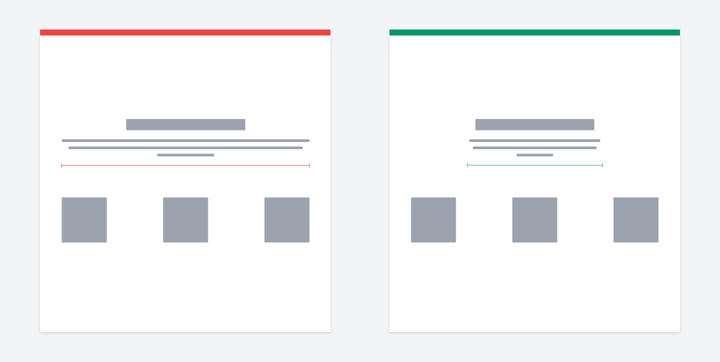
Don't have too much text
A typical mistake is when you describe features using the following pattern.
The problem is that it often happens that there is a lot of text for every block.
Especially if the text is centered, it's simply hard to scan.
The fix is simple enough. Just reduce the amount of text. Also, it's alright to center text it if you have 2-3 lines that don't occupy too much width.
Otherwise, be careful with centering text. Left aligning might be a safe choice.
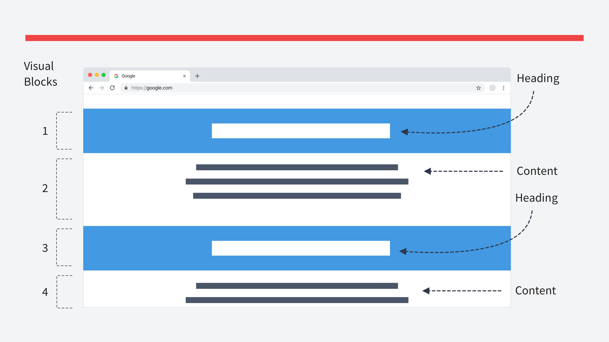
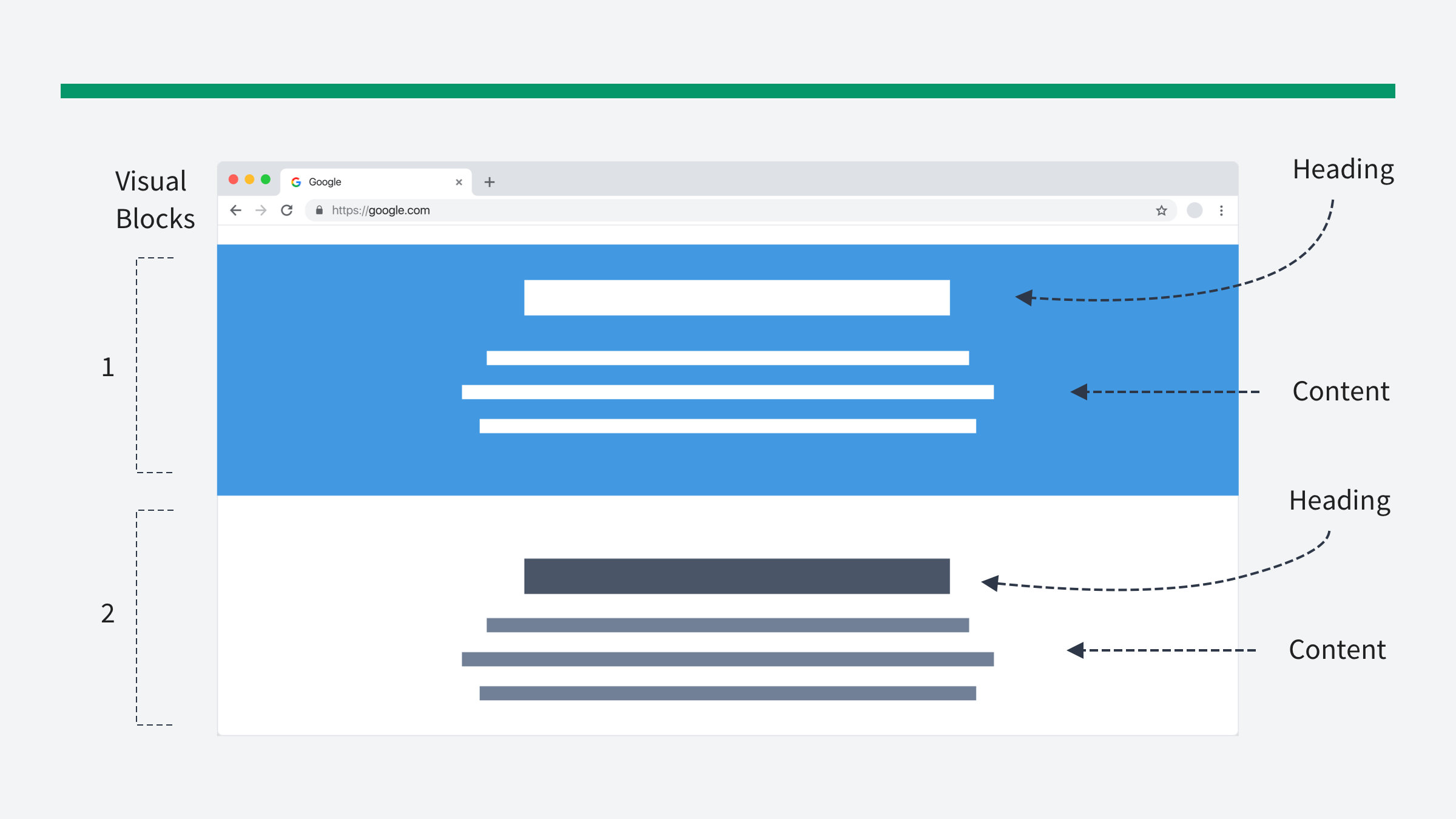

Wrong blocks separation
If you have blocks that contain ONLY headlines, they'll be perceived as separate blocks.
So instead of blocks that have "headline + content", you'll have TWO visually separated blocks: headline and content.
Instead, use different visual techniques.
You can highlight both headlines and content. Or don't highlight them at all.
Remember the UX rule of Common Region.
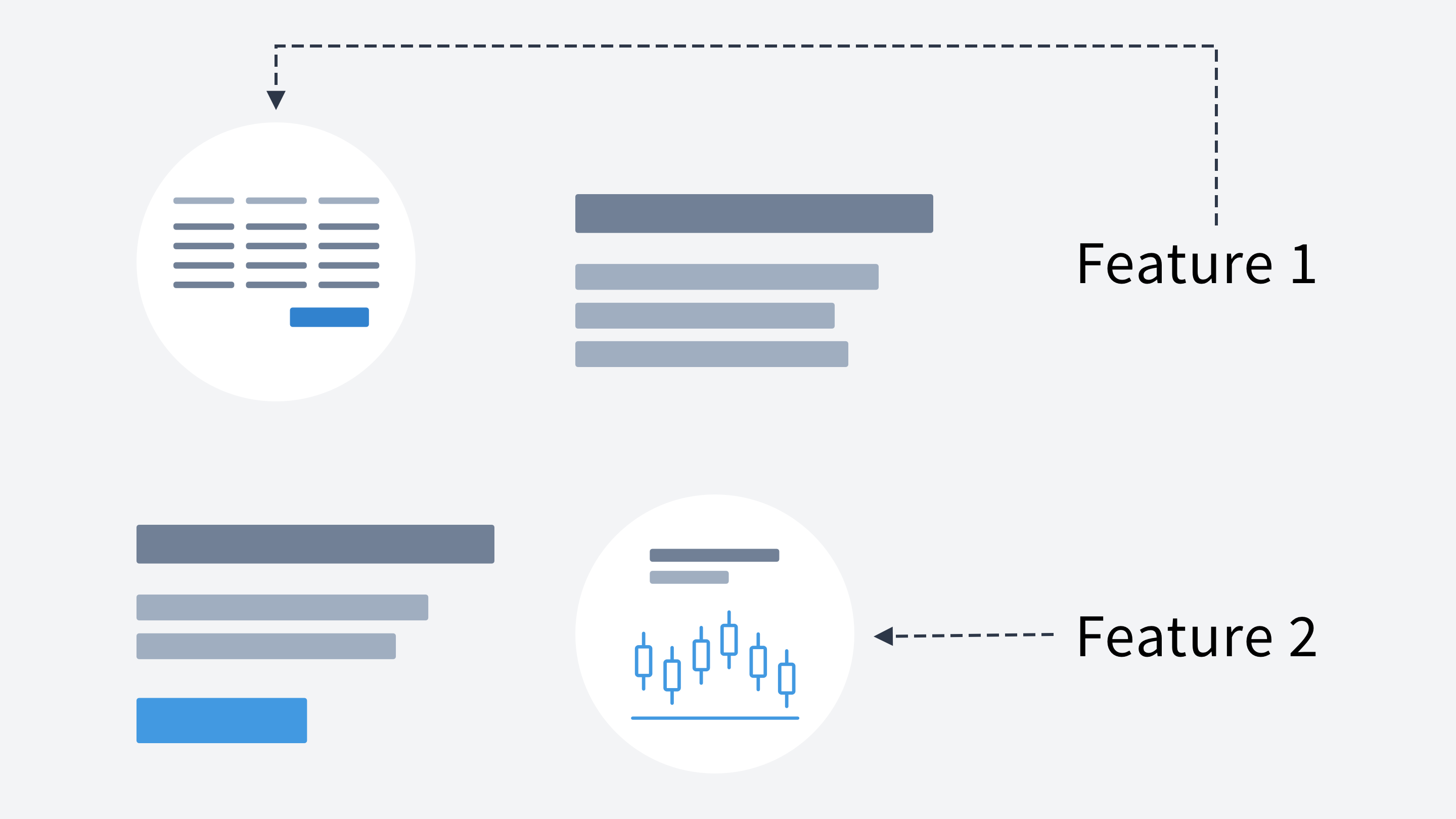

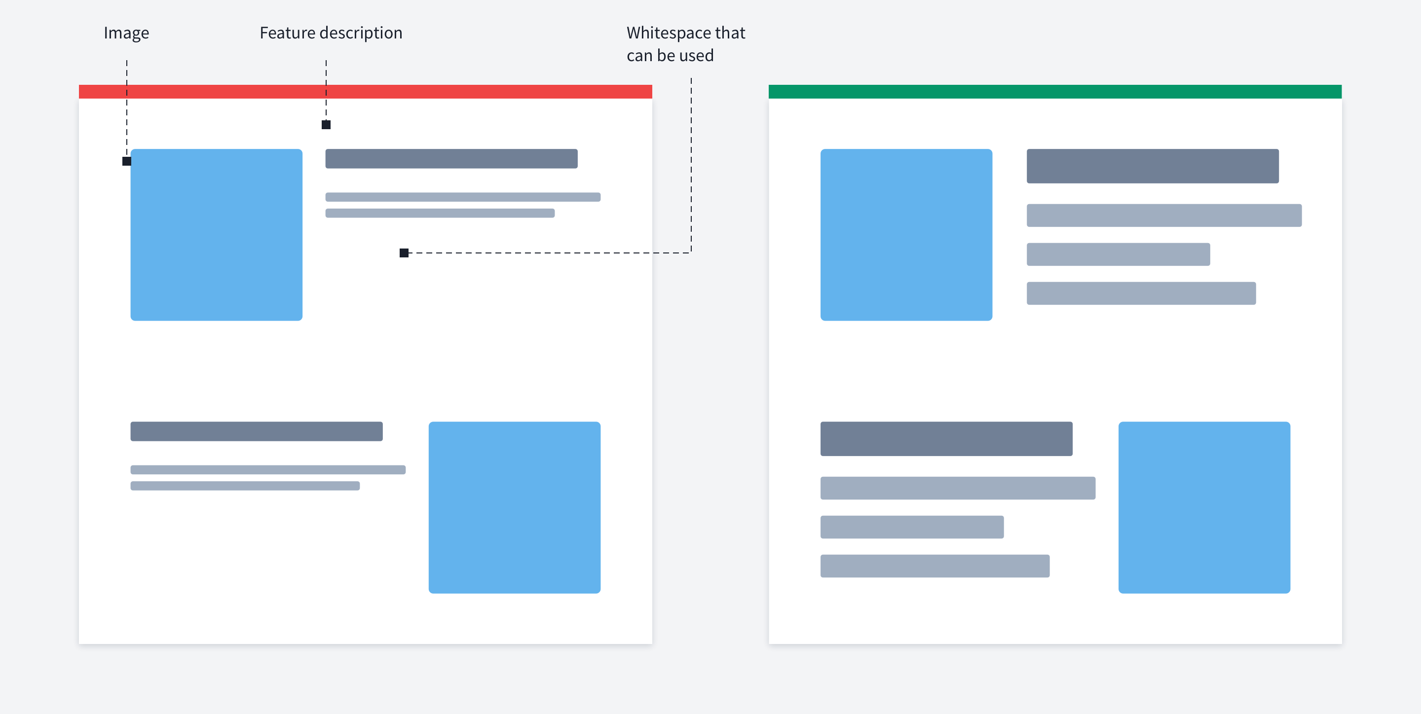
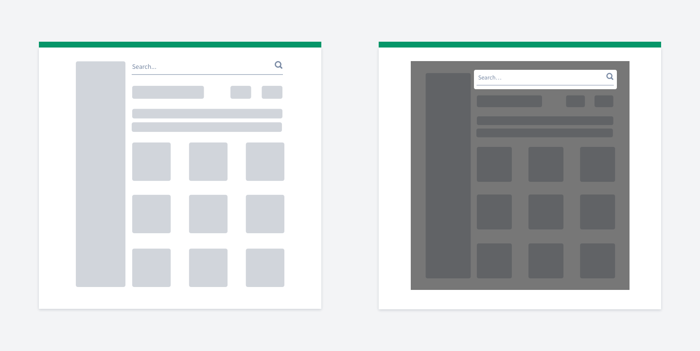
Illustrating your app
When designing your landing page, you don't have to put the whole screenshots of your app. You're describing FEATURES, so
take a part of your app
enlarge it
remove all the clutter
and make a clearly VISIBLE image of your awesome feature

Text container width
There is a pattern when you have a heading, subheading and a few blocks describing something. But remember: you don't have to fill the available width. Long lines are hard to read.
Nothing wrong with limiting the line length. So it'd look better if you neglect the full width, keep the three blocks as they are, but limit the heading/subheading text width.
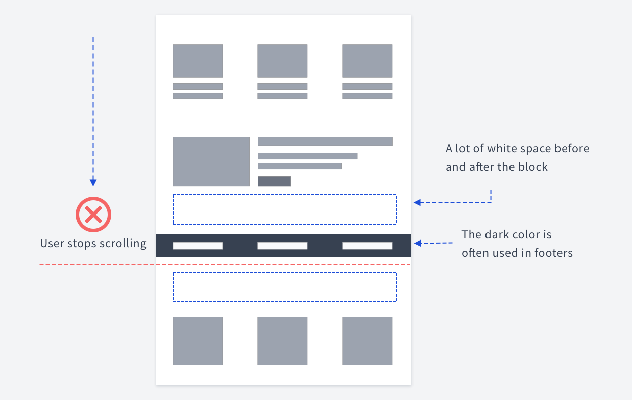

False bottom effect
When designing a landing page, you should be aware of the so-called "false bottom effect".
Basically, the false bottom is a place where users stop scrolling because they think that the page has ended, that there is no more content below.
There are many reasons why they might think that way. Some of the possible reasons are:
Huge Hero Shots
Too Much White Space
Ads, Calls to Action and Otherwise Familiar “Conclusions”
Horizontal Lines
Return to Top Arrow
Carousels
Pricing Pages
Personal Portfolios
Failure to Conduct QA
Here is a dedicated article related to this issue.
For example, if you have a block that resembles a footer and has a lot of whitespace before and after, chances are users will stop scrolling because they'll think it's a bottom.
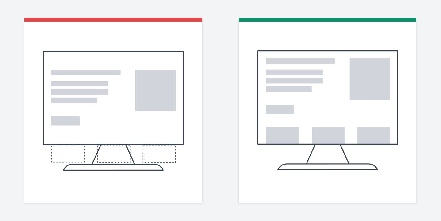

Visual hint for scrolling down below the fold
There is a trick to visually hint users that there is more content than they see at a particular moment.
Make it clear that you have something below the fold. There is no hint that there is content below in the first picture, while in the second picture, it's clear.
You don't even need arrows or pointers asking users to stroll down. You just need to show a part of the next section.

Small font size
I noticed that, for some reason, many people don't use large font sizes on landing pages. Eventually, their landing pages look like on the left image.
While you should have enough whitespace to separate landing page blocks, it doesn't mean that the text should be small. You still want users to scan your text.
So don't be afraid of using a big large font size.

Usability
Place inputs where users expect them
There is a UX law called Jakob's Law. Users spend most of their time on other sites.
This means that users prefer your site to work the same way as all the other sites they already know.
Say you need to put a search bar somewhere on your site. The idea is that you should choose a place that is commonly used, thus, familiar to most users.
For example, for a search bar, it'd be best to place it somewhere at the top of the page.

Delaying the welcome email on mobile
An opinionated trick to improve mobile UX.
If the user signed up via the mobile app, delay the "welcome email" delivery.
If it doesn't contain any important info, you don't need to bother users with yet another notification that they will swipe.
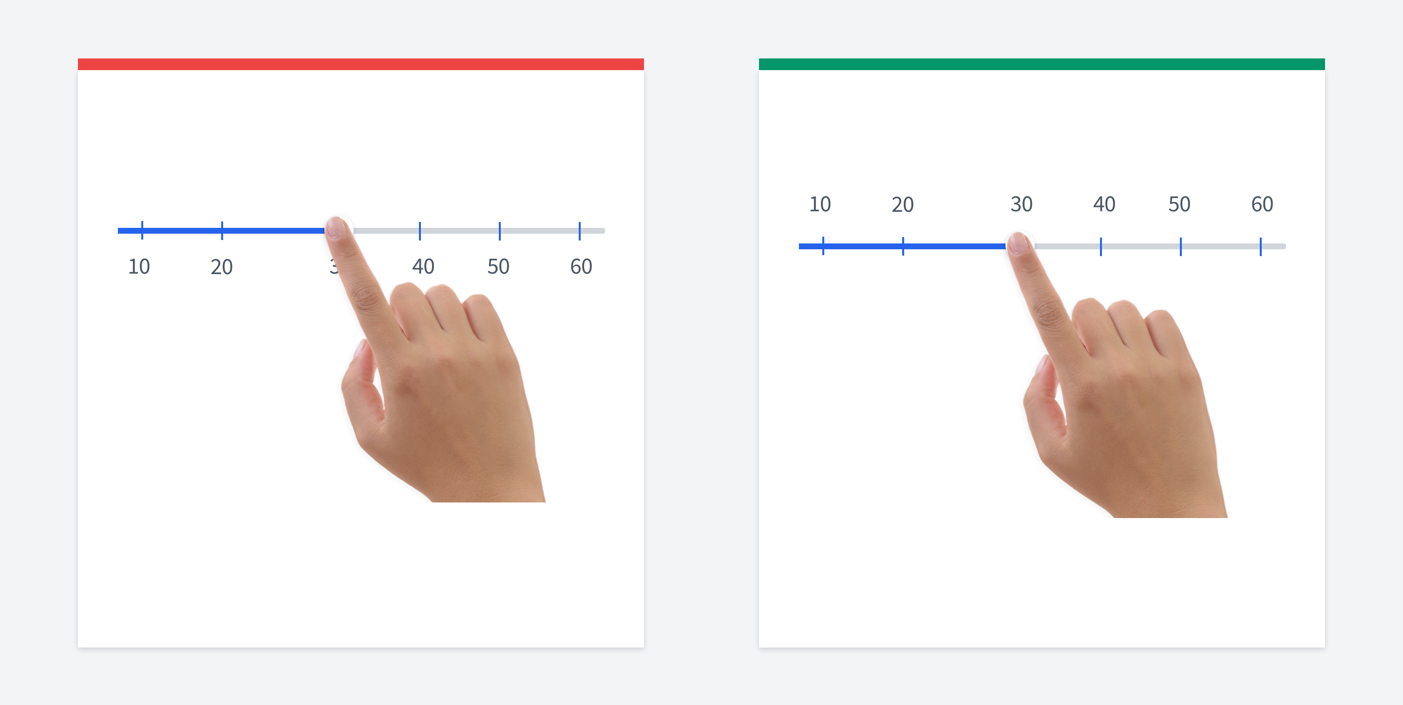

Place labels above sliders
In mobile UI, put the slider values above the slider, not below.
When users touch it, their index finger covers part of the values, so they won't be sure which value is currently selected.
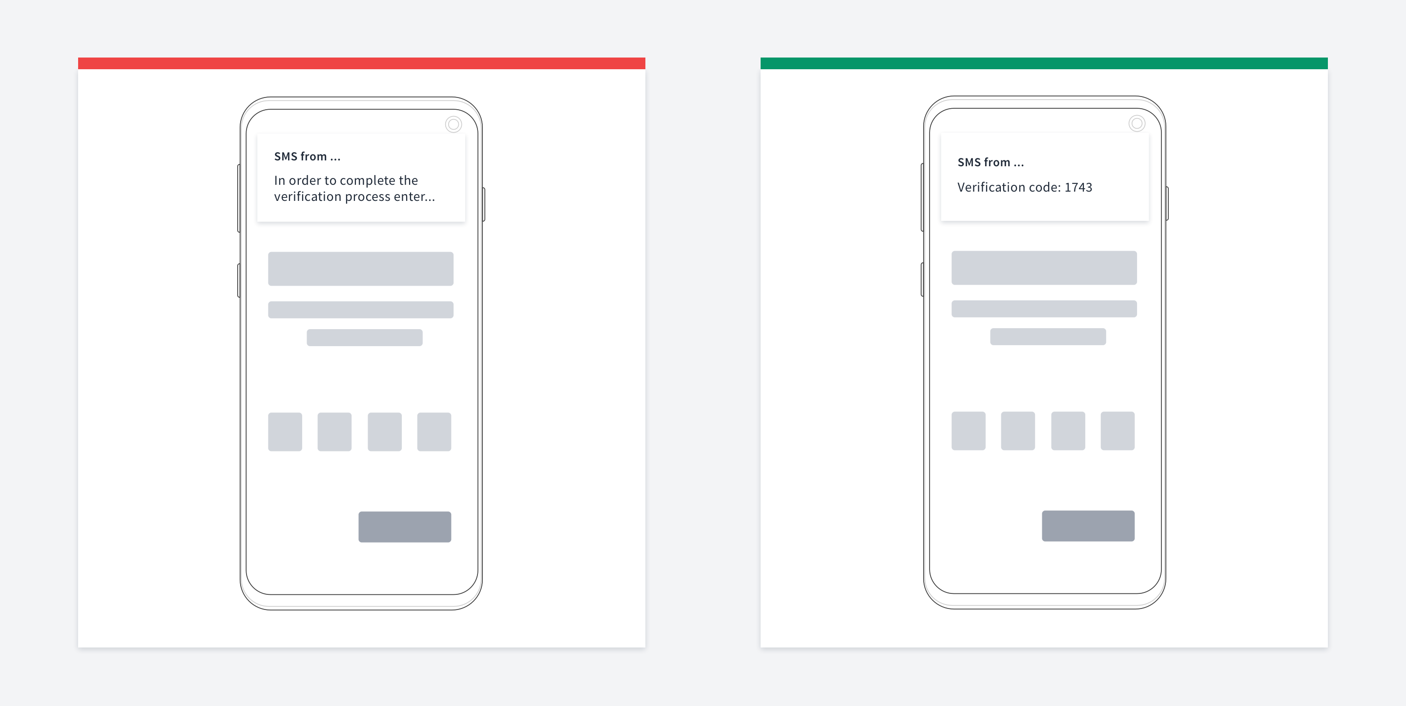

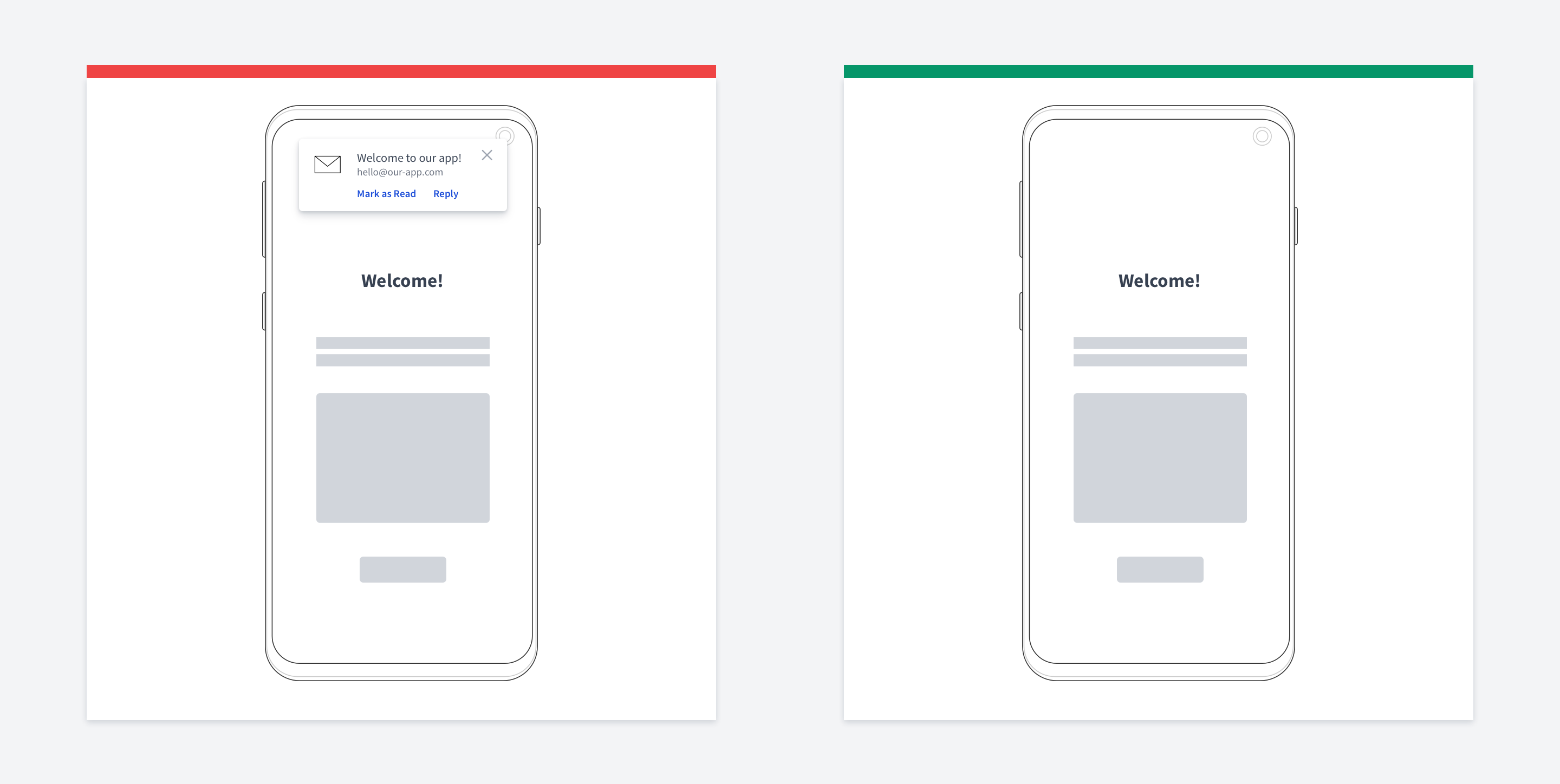
Verification code push notification/SMS
When you show an SMS/Push notification with a verification code, make sure it's visible without opening the SMS.
Actually, it's a golden rule: the fewer actions users have to make, the better.
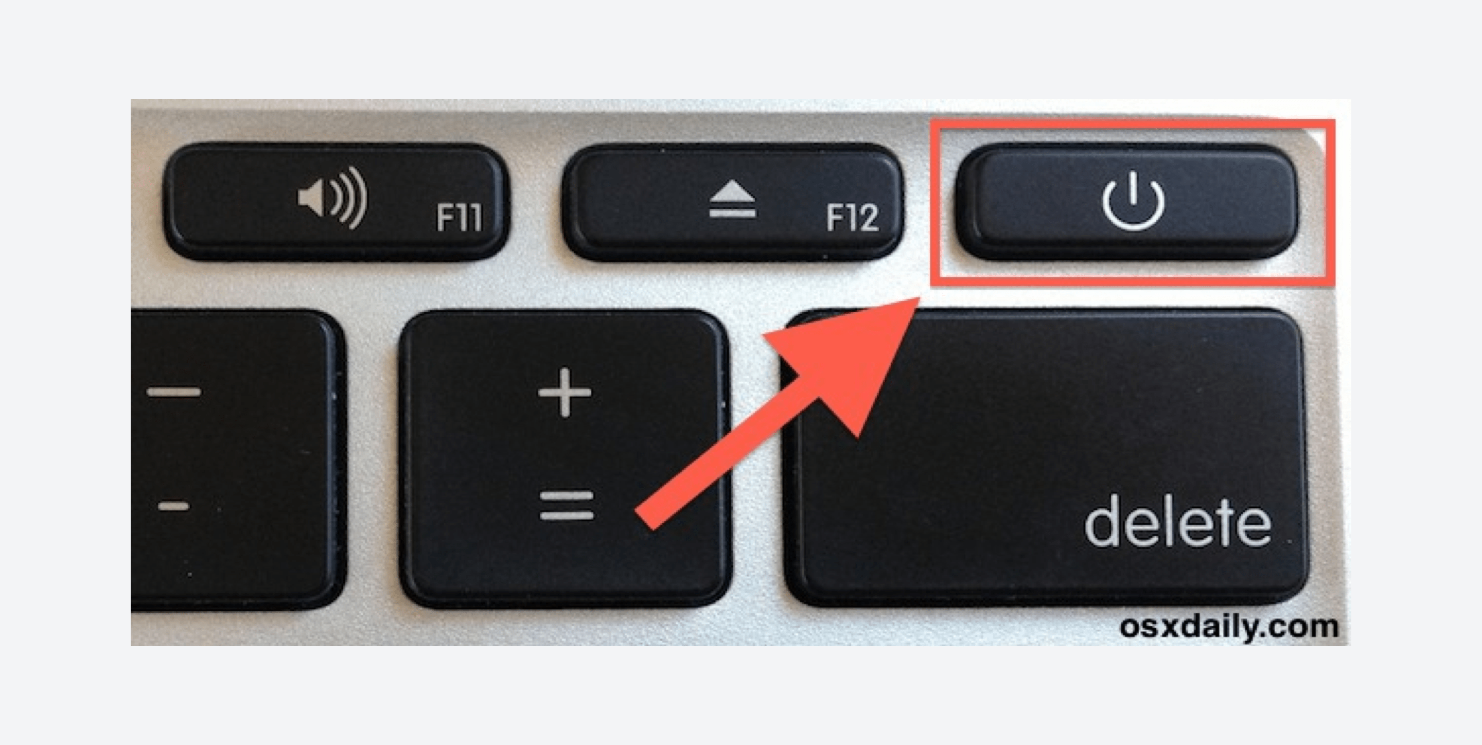

Don't put dangerous actions near frequent onces
Actions that can lead to irreversible effects should be kept apart from frequently used ones.
Don’t put such things as delete buttons, logout links, send message buttons near other actions.
A notable example of such a mistake is this keyboard. The "delete" button and
"power off" buttons are too close to each other, so you will end up turning your laptop off frequently.
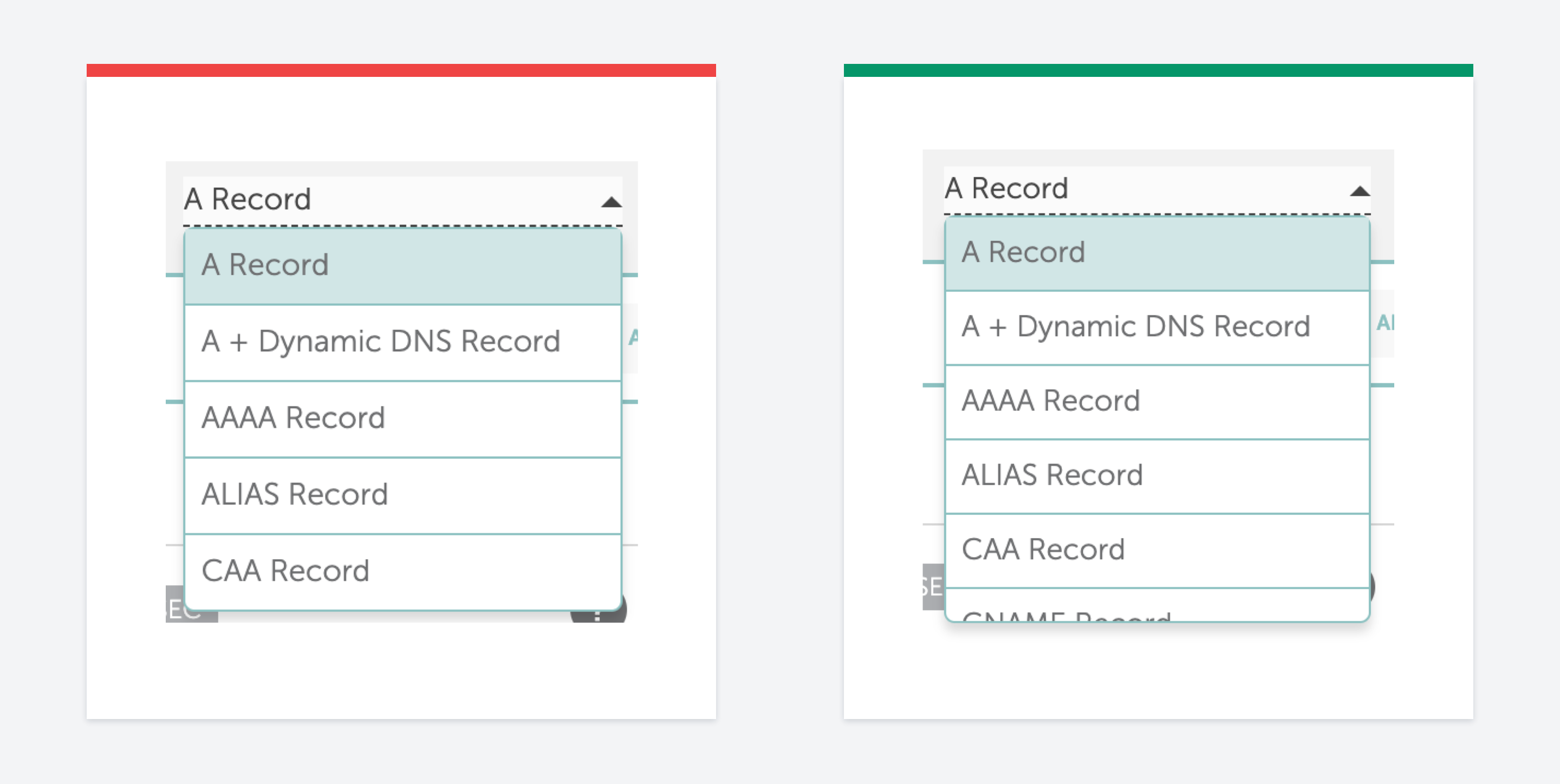

False bottom effect (another example)
This is very similar to the first example, but it's related to dropdowns this time.
It's easier to illustrate it than describe.
In the Namecheap DNS records editor, they have a dropdown for adding a new record. Due to the number of visible options, it looks like it doesn't have any more of them, especially on macOS, where the scrollbars are hidden.
In this case, all you need to do is increase the dropdown height to give users a clue that more options exist.
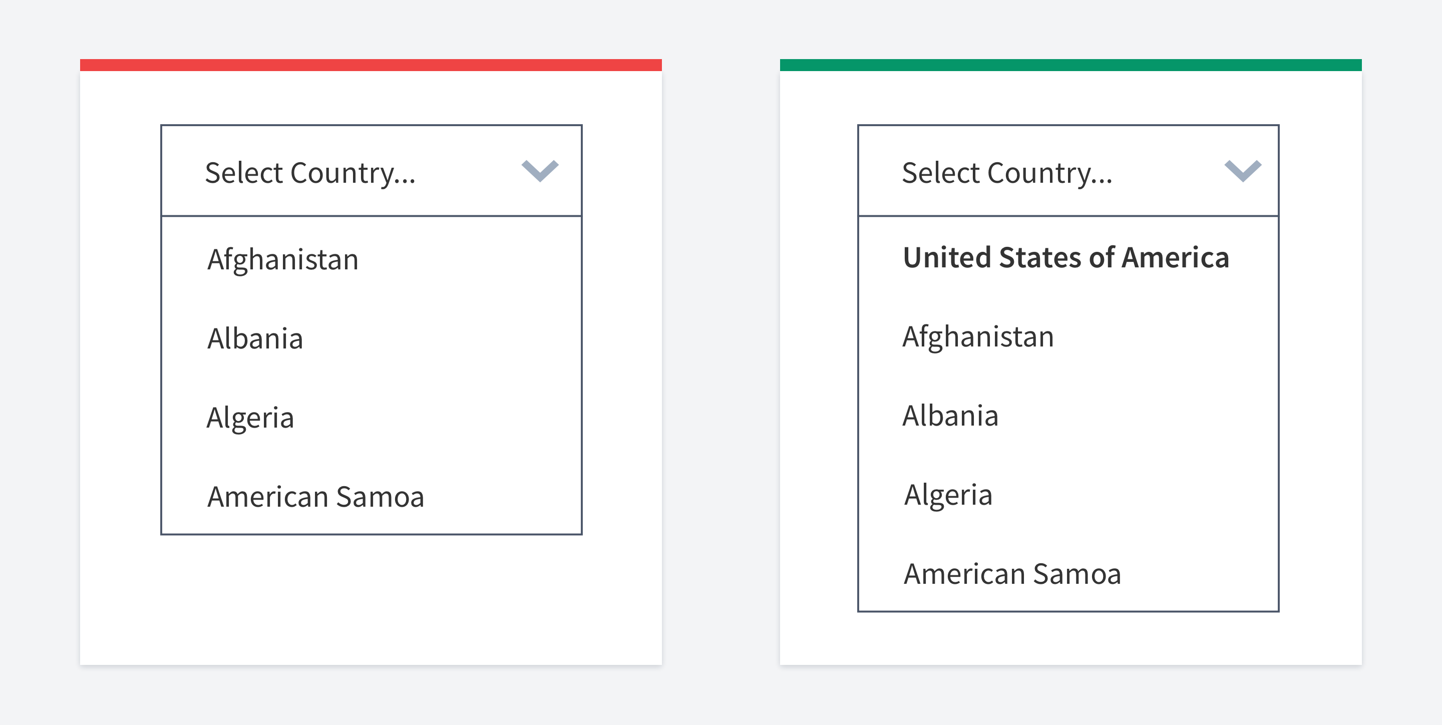

Put frequent options first
The fewer actions the user should take to achieve his goal - the better.
One of the tricks is to provide frequently used options right away. If somebody needs another option, they will have to do more work.
But by providing frequently used options, we can reduce the amount of effort for others. You can also remember what users often select and then show it on the top.

Avoid using carousels
Well, think twice before adding a carousel on your webiste.
There are so many articles on the Internet that there is no point in copy-pasting all of them here.
In a nutshell, carousels have poor usability. Most of the time, it's a bad idea to use a carousel.
There is even a dedicated site for this: shouldiuseacarousel
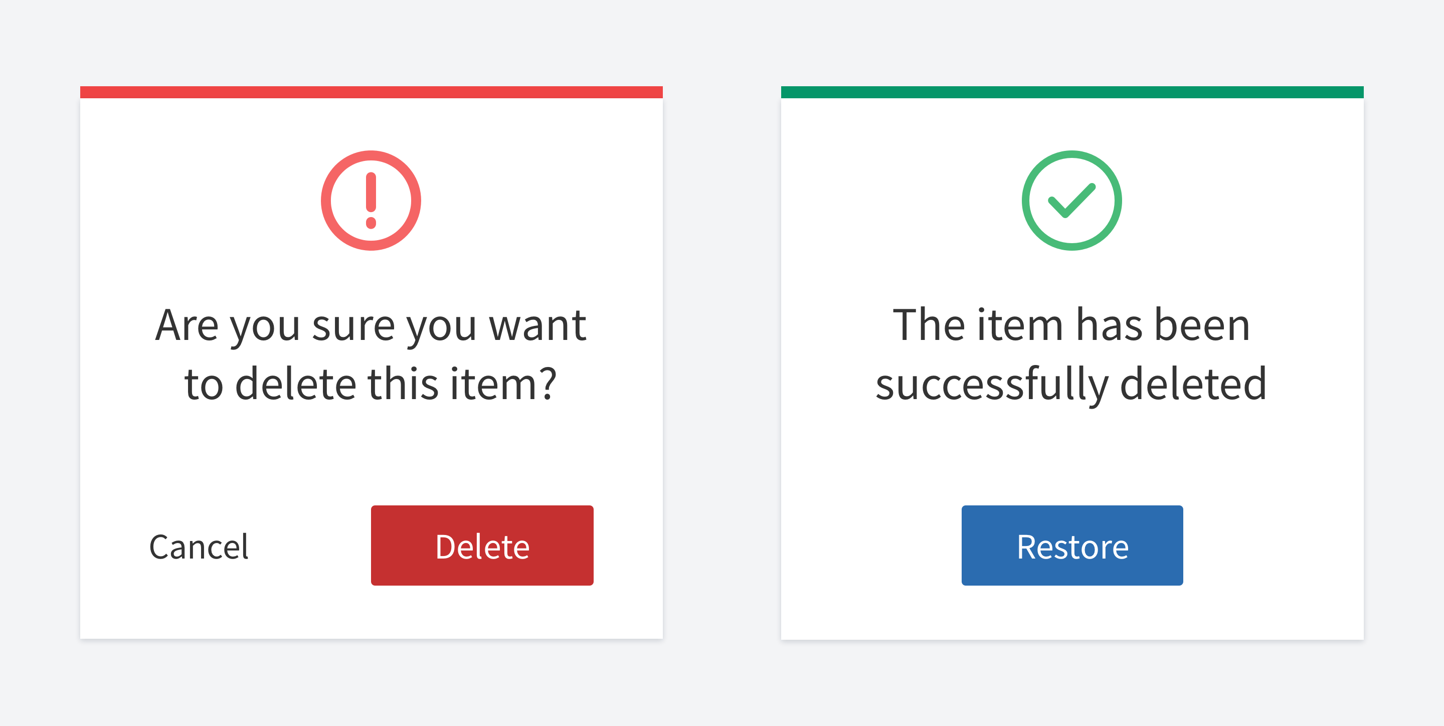

Consider allowing undo instead of confirmation
Confirmation modals don't work. We almost automatically click yes, because it became our habit.
The problem appears when users cannot restore what they have just deleted, especially if it's important..
It would be much better to allow the user to restore deleted information. When you delete a file, it goes to the trash bin at first in most operating systems. The same can be done on the web: you can store deleted items in some kind of trash, allowing users to restore them.
Sometimes you cannot do this tough. For example, if the user asked for account deletion. In this case, you should enhance your confirmation. You can ask your users to do some manual work. For instance, ask them to type something manually.
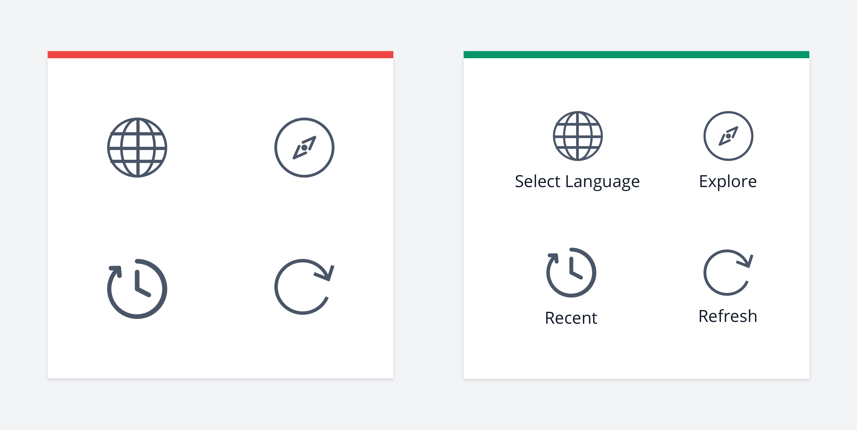

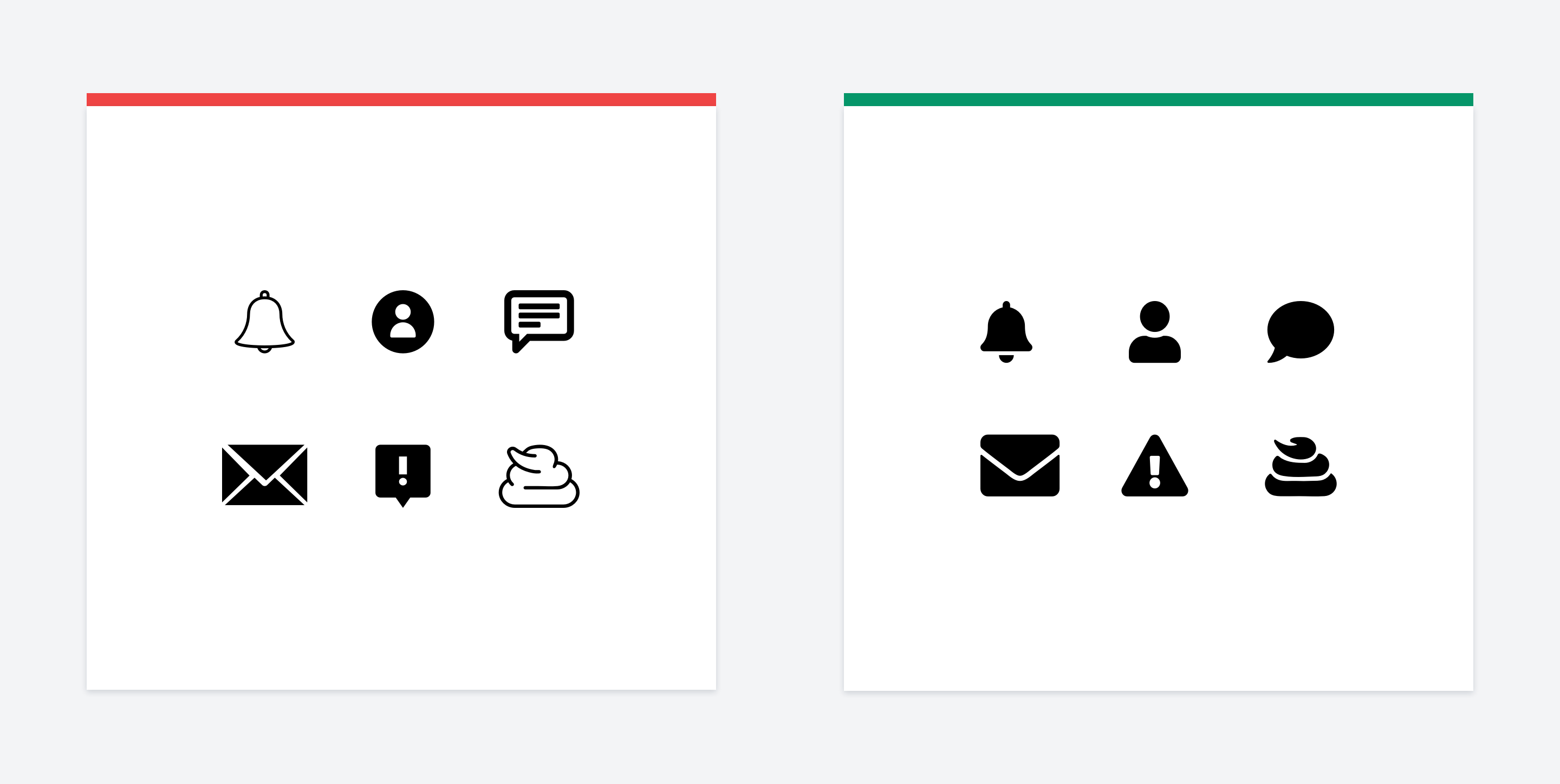
Label your icons
Since there is no standard of what each icon means, you should label your icons.
The same icon can mean different things. Every developer and designer has their own opinion of what it should represent.
If you cannot explicitly label them, you may want to add a tooltip shown on the mouse hover.
I found an excellent article explaining in detail why you should label your icons, so I'd better leave it here for further reading.
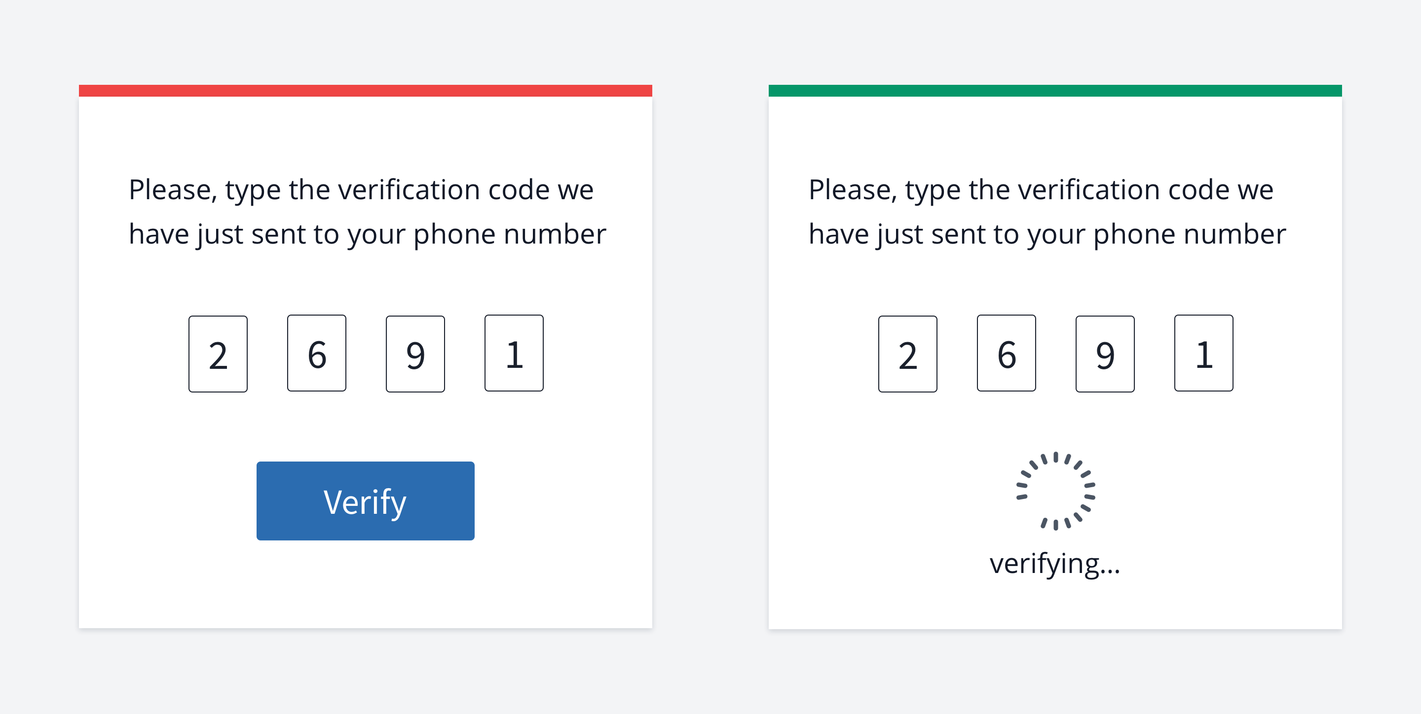

Instantly check the verification code
If your code is simple (e.g., has four digits), you might omit to ask the user to click the submit button.
The probability that the user will enter it incorrectly is small (especially if he copy-paste it from an email message), especially if it's easy to remember.
This way, you can reduce the number of required actions. If the user made a mistake, you could re-validate on change.

Provide further instructions
You shouldn't leave users without any clues of what they should do next.
Some examples of doing it wrong:
An error occurs, and you show users what happened, but you don't tell them what to do next.
The user googled your site and clicked on the link, but instead, they got a 404
error (page is not found). But you didn't give them instructions on what to do next.
User logged in to your complex app. And there is no onboarding or any hints of what they should do first.
So the general rule is that users shouldn't be stuck without any clues of what to do next.
There is a related heuristic called user control and freedom.
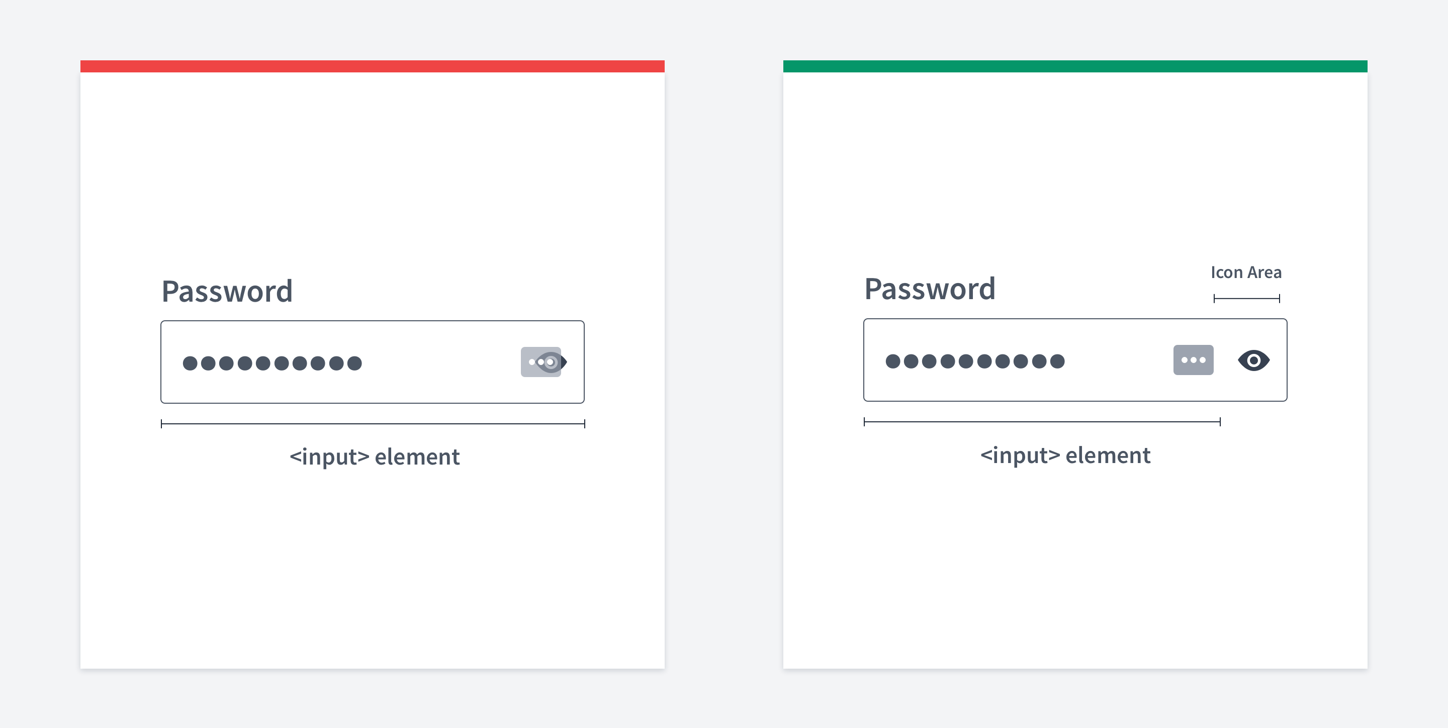

Use a separate area for toggle password icon
If you have a toggle password icon, don’t just put it above the input using position absolute. It might interfere with password managers.
Instead, you should make a separate area for the icon. This area doesn’t belong to the input but it should visually look like a part of the input.

Visuals
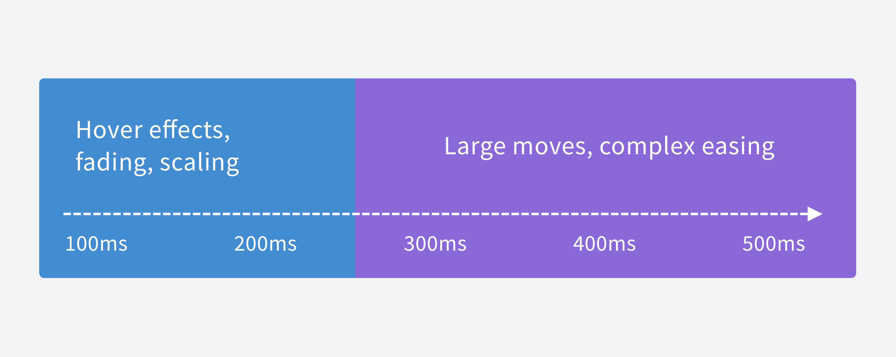
Animation speed
Animation speed matters.
less than 100ms - won't be perceived at all
100ms - 200ms - should be used for micro animations (e.g. hover effects ) 200ms - 300ms - an intermediate step, might be used for micro animations too more than 300ms - complex animations
Here is a detailed guide for animation speed.
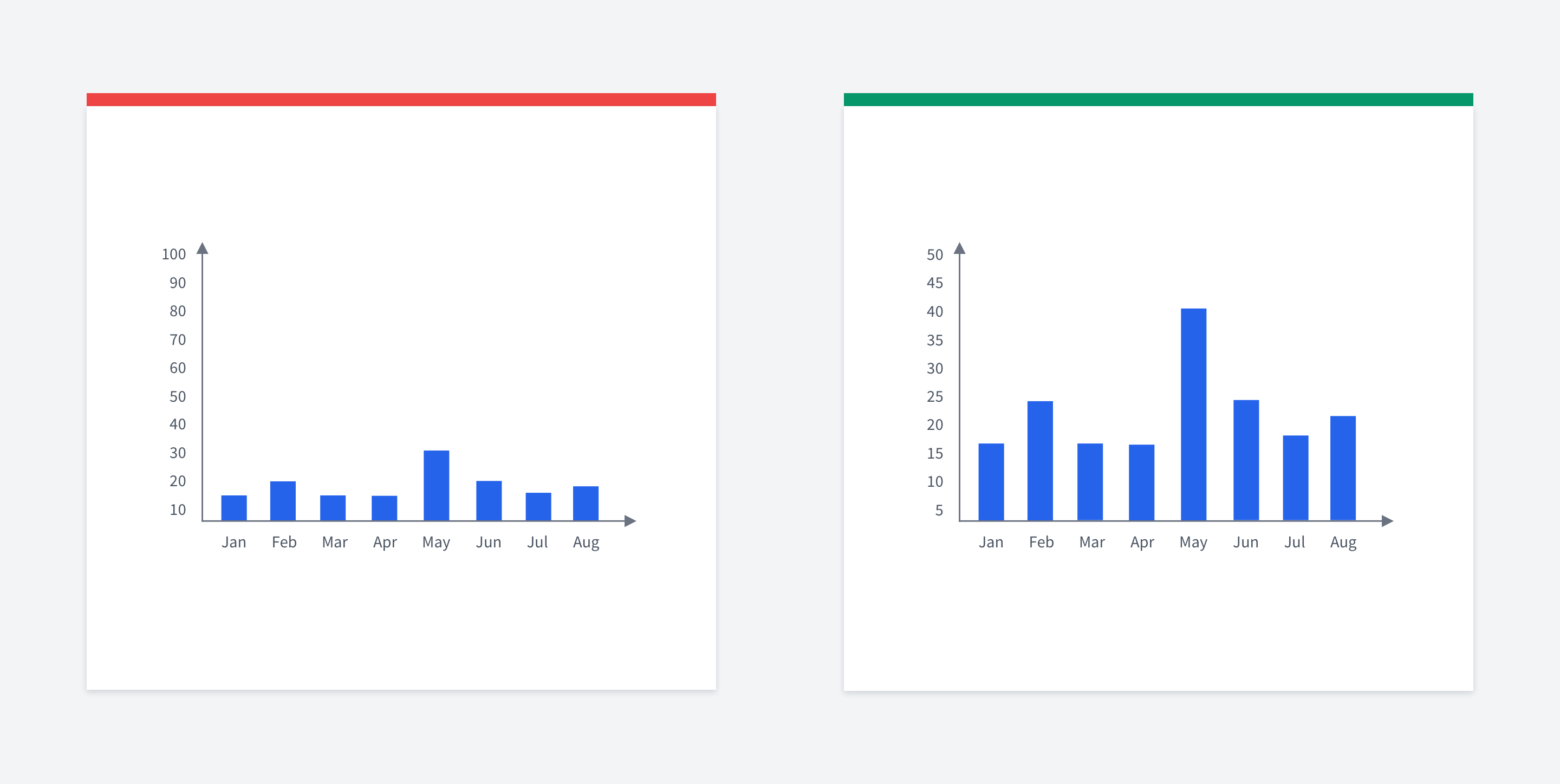

Normalize charts
Make the Y-axis maximum value slightly higher than the peak bar value.
If your maximum Y-axis value is 3-4 times higher than the peak bar value, you'll have a lot of free space. Plus, the bars will look zoomed-out.
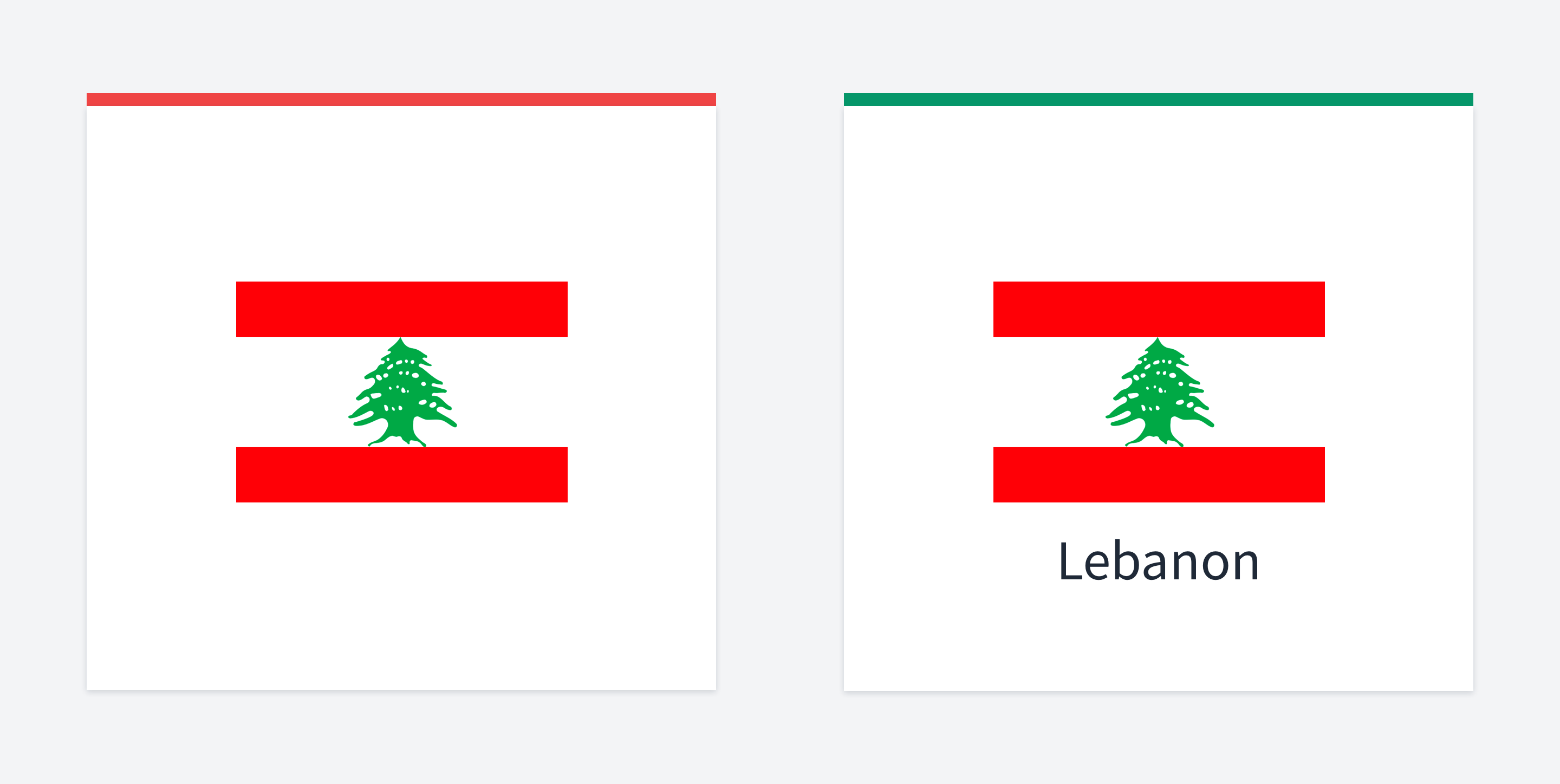

Label country flags
Not everyone knows geography perfectly.
If you have an app that uses country flags, don't forget to provide country names.
For example, there should be a way to see what the flag is in such apps as language exchange or similar.
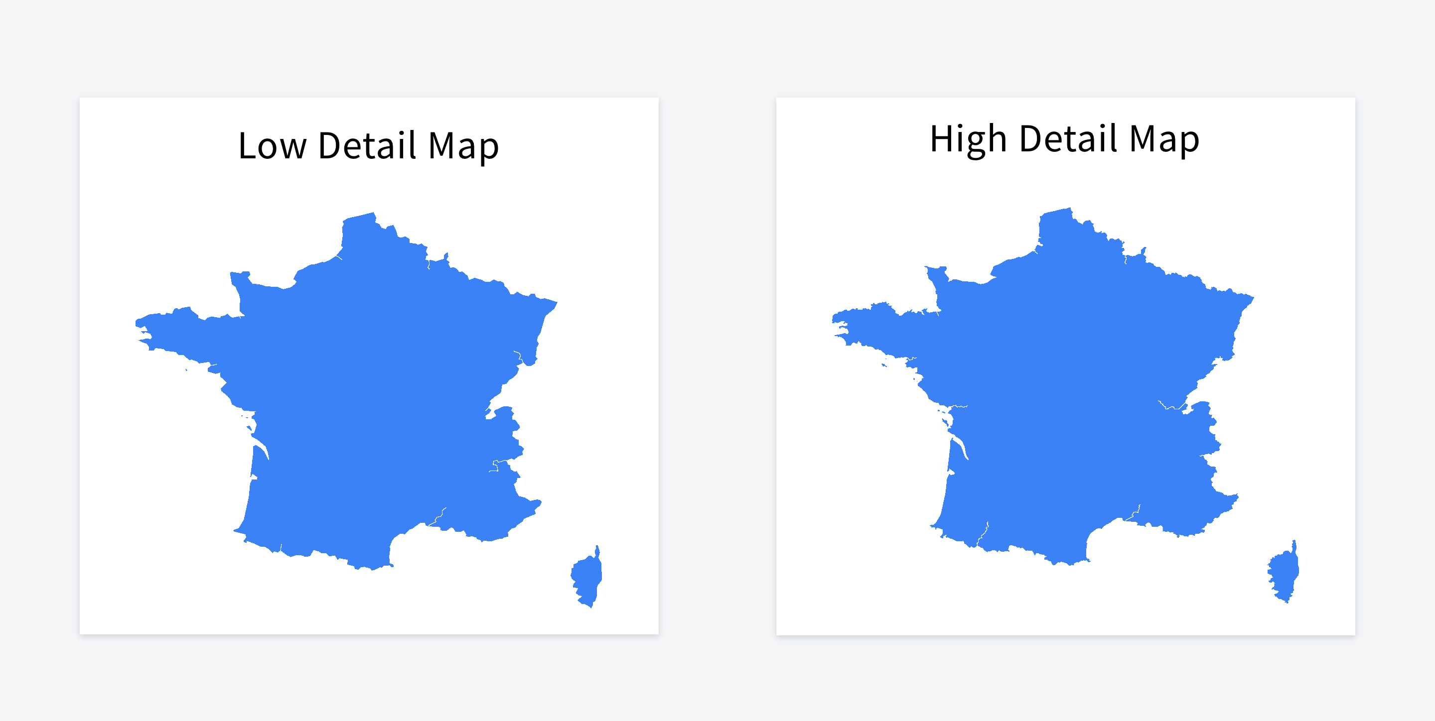

Low detail vs high detail map
Could you tell the difference between these two maps?
In most cases, your app doesn't need a high detailed map. You can decrease your map size drastically by reducing its quality without affecting the user experience.
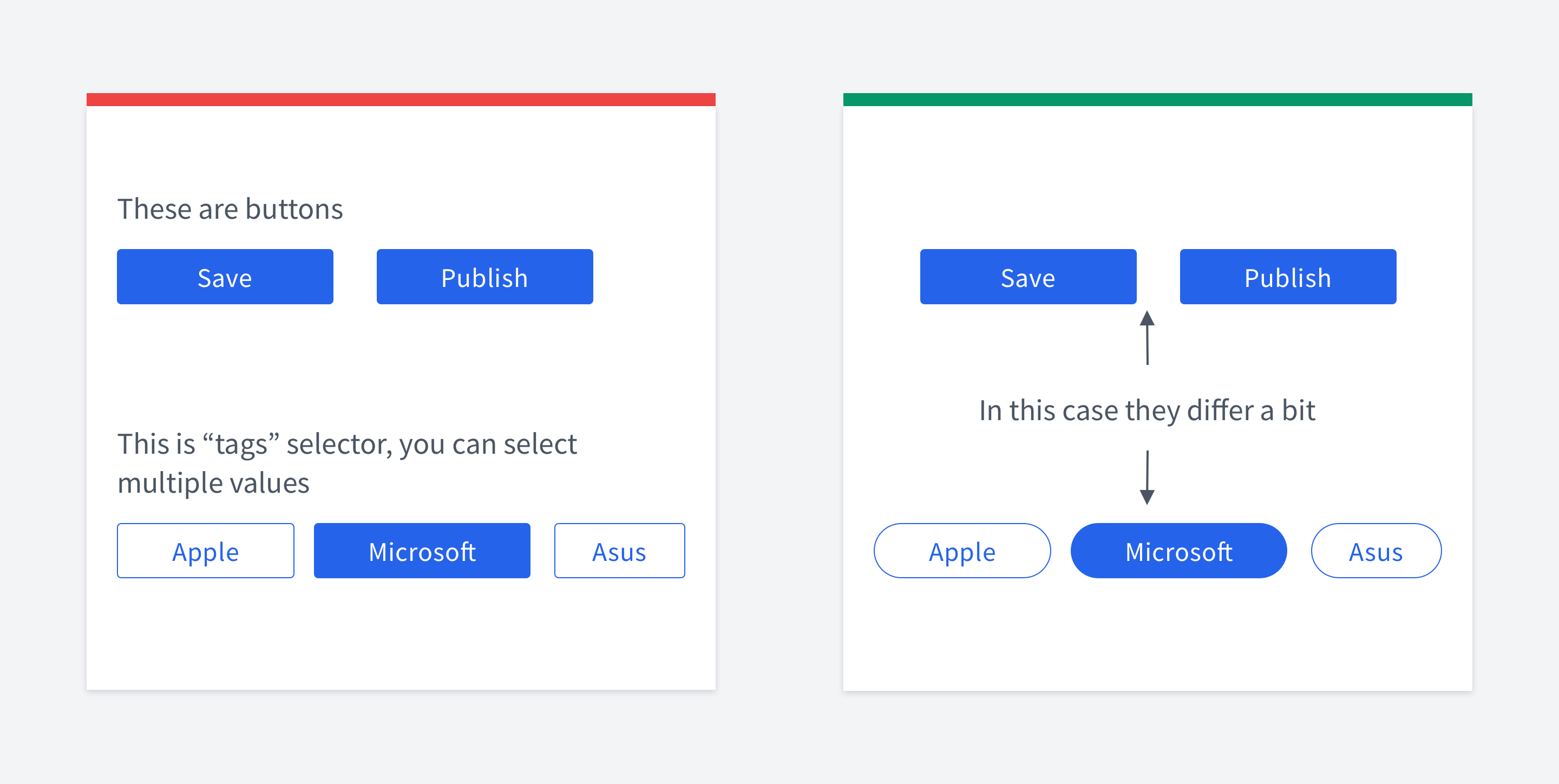

Buttons / tags confusion
Make sure your UI controls look different so that users can distinguish them.
For example, if you have buttons and tags that look almost the same, it's not that good.
You can play with border-radius, colors, sizes etc.
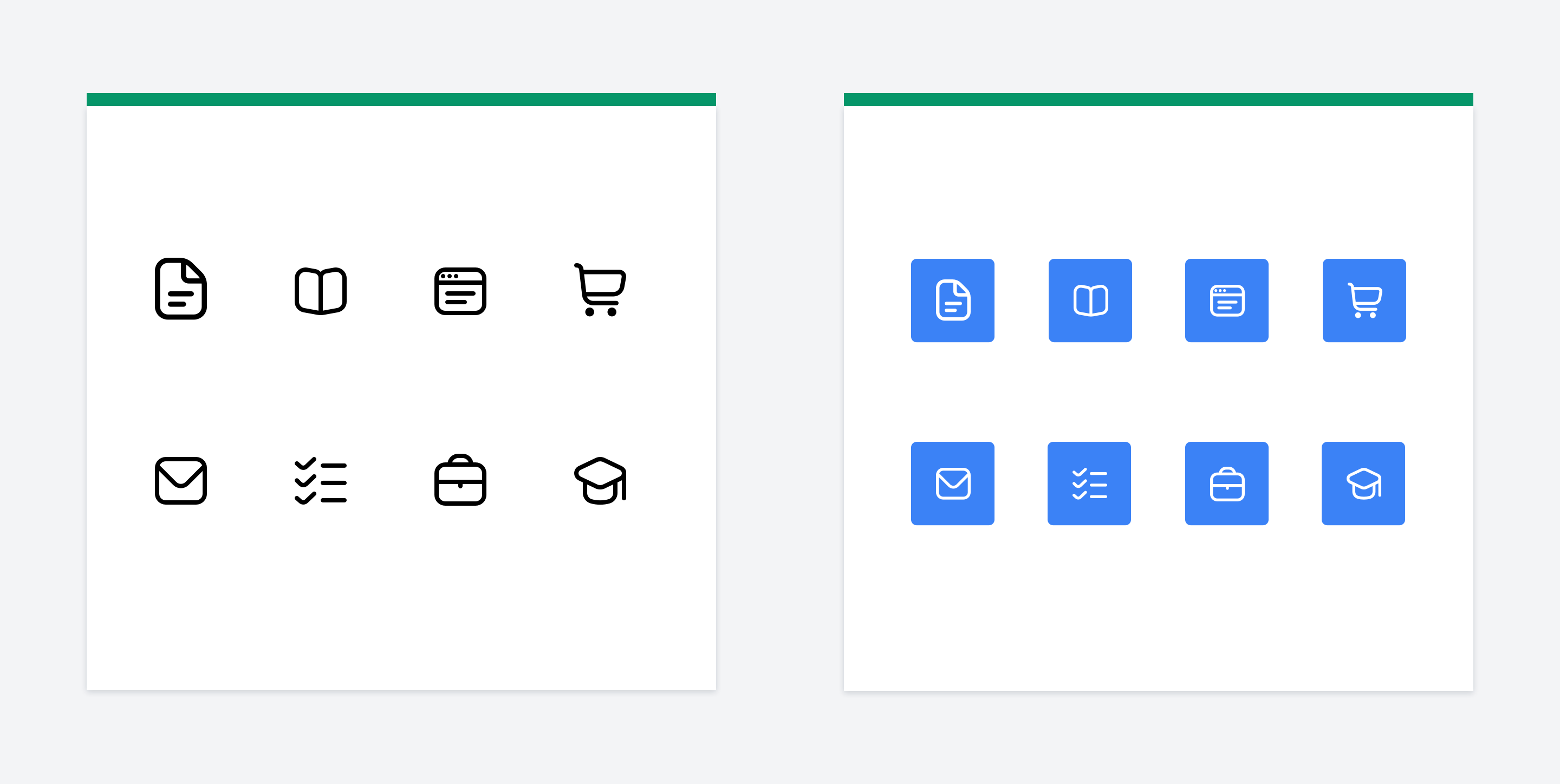

Styling icons that have different size
If you want your icons to be bigger & stand out, a nice trick is to put them into squares or circles.
It also helps if icons have different sizes, but you need them to fill the same amount of space.
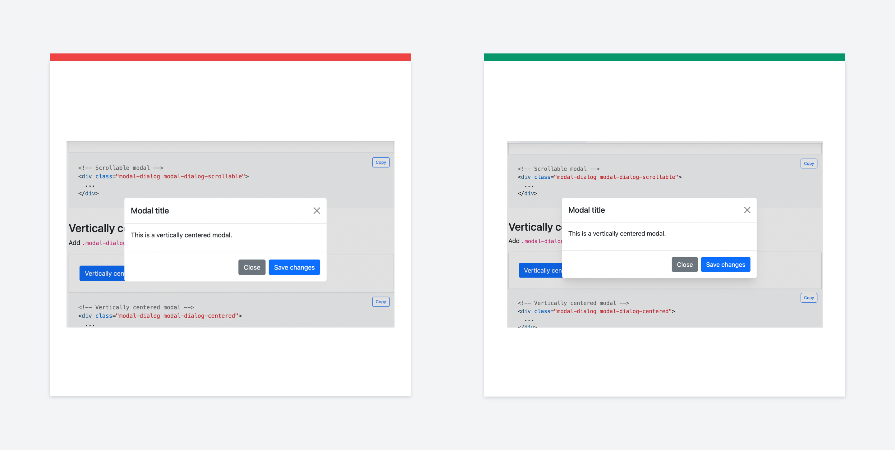

Modal depth
If you want your UI to look more natural, use shadows for conveying elevation.
A modal is placed on top of the interface, so the dimmed-out background is not enough.
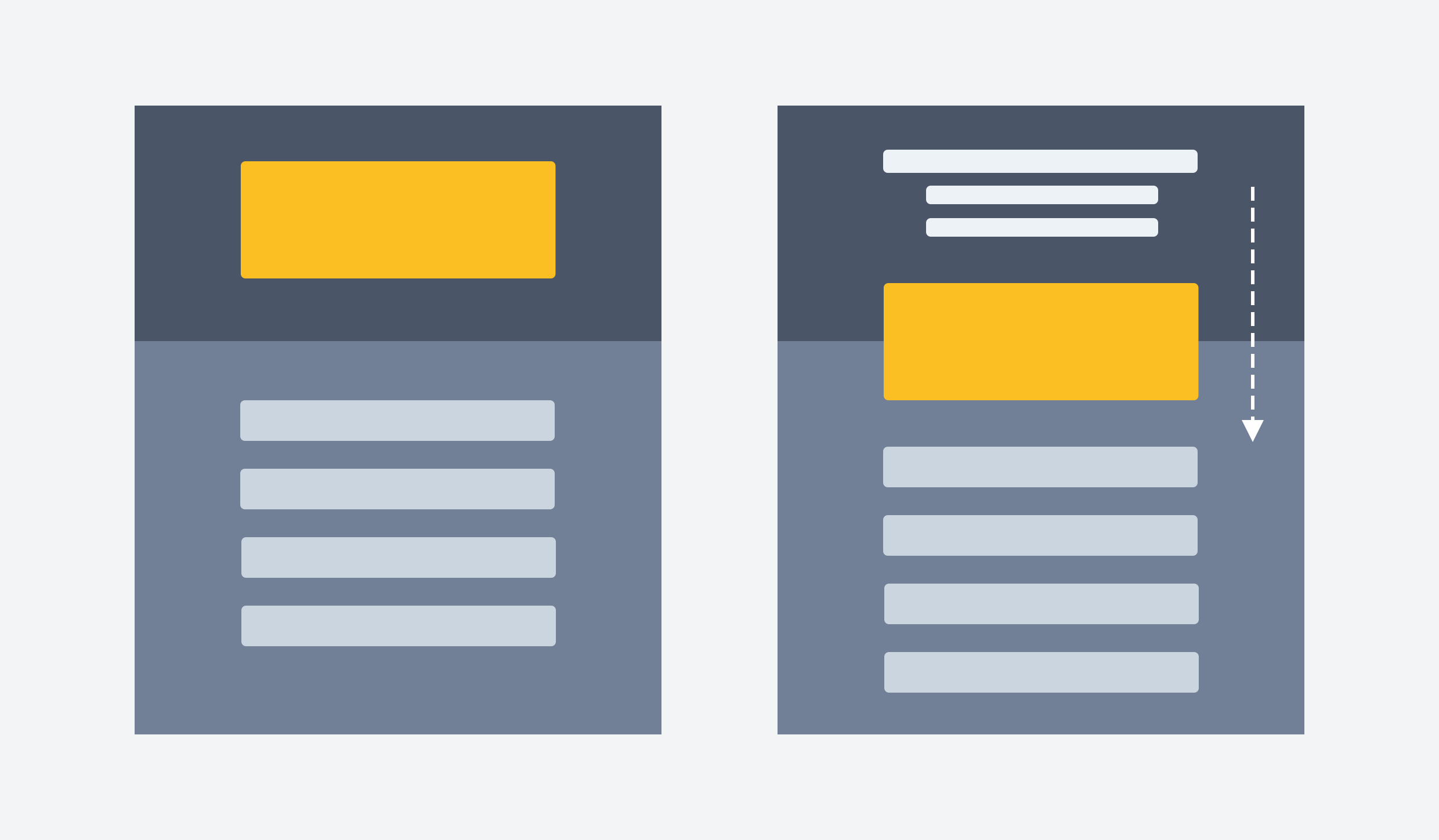

Overlapping trick
You can move the orange block so that it overlaps two sections.
This way it might bring a little bit more flow to your design. This trick is widely used, e.g. in Twitter profiles (avatar overlaps two sections)

Similarity law
The Law of Similarity states that elements that have similar visual appearances seem to be more related.
It’s possible to create similarities using size, color, and shape. Visually similar elements will be perceived as related.
In this case, the avatars should have the same shape, not a random one. In other words, similarity helps consistency.
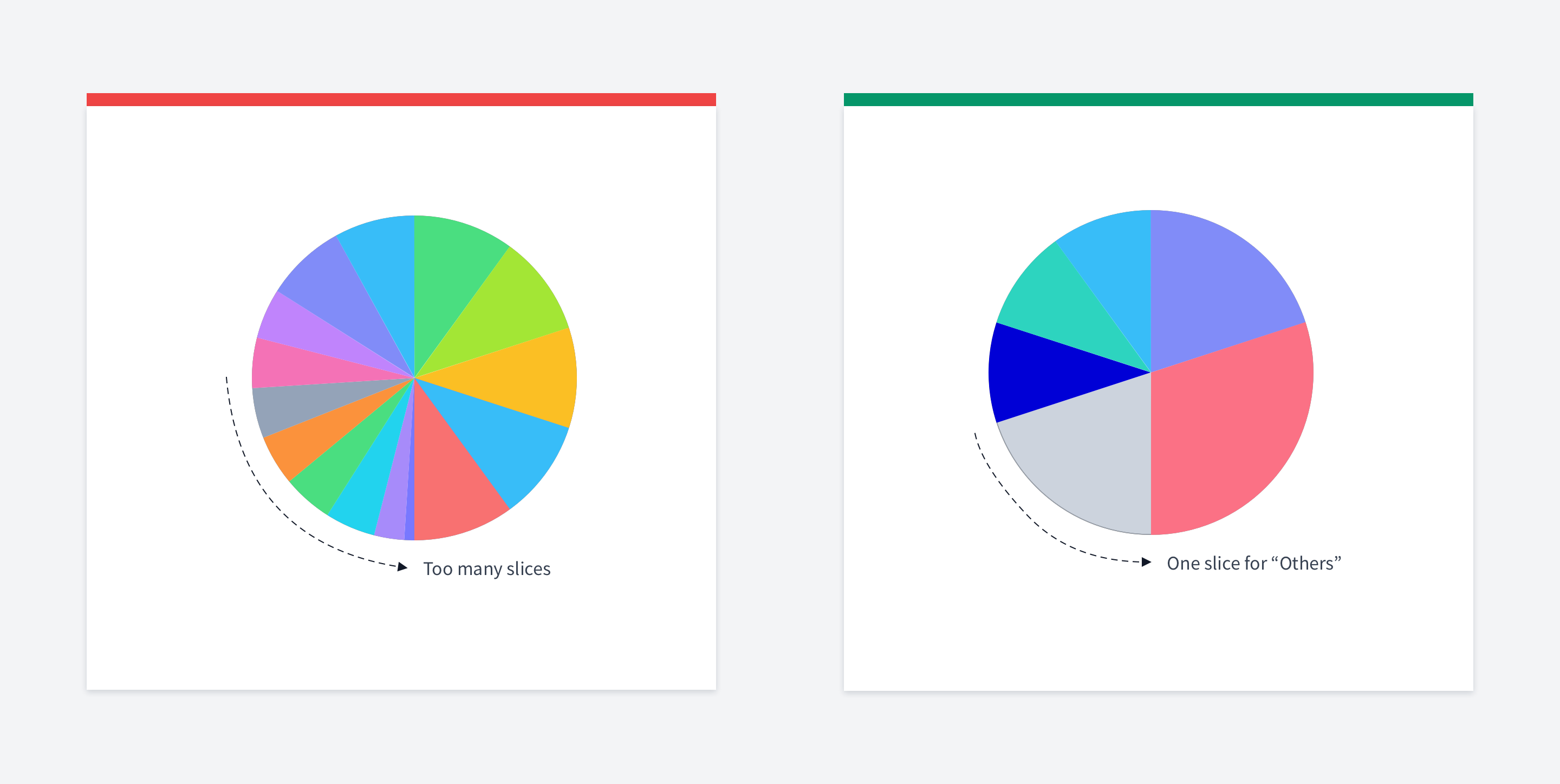

Groupping piecharts sections
Don't put too many slices in a pie chart.
The purpose of using charts is to simplify data perception. Having 20 slices will make it more complicated instead.
Usually, up to 5-6 slices are okay. The rest should be grouped in a single "others"
slice.

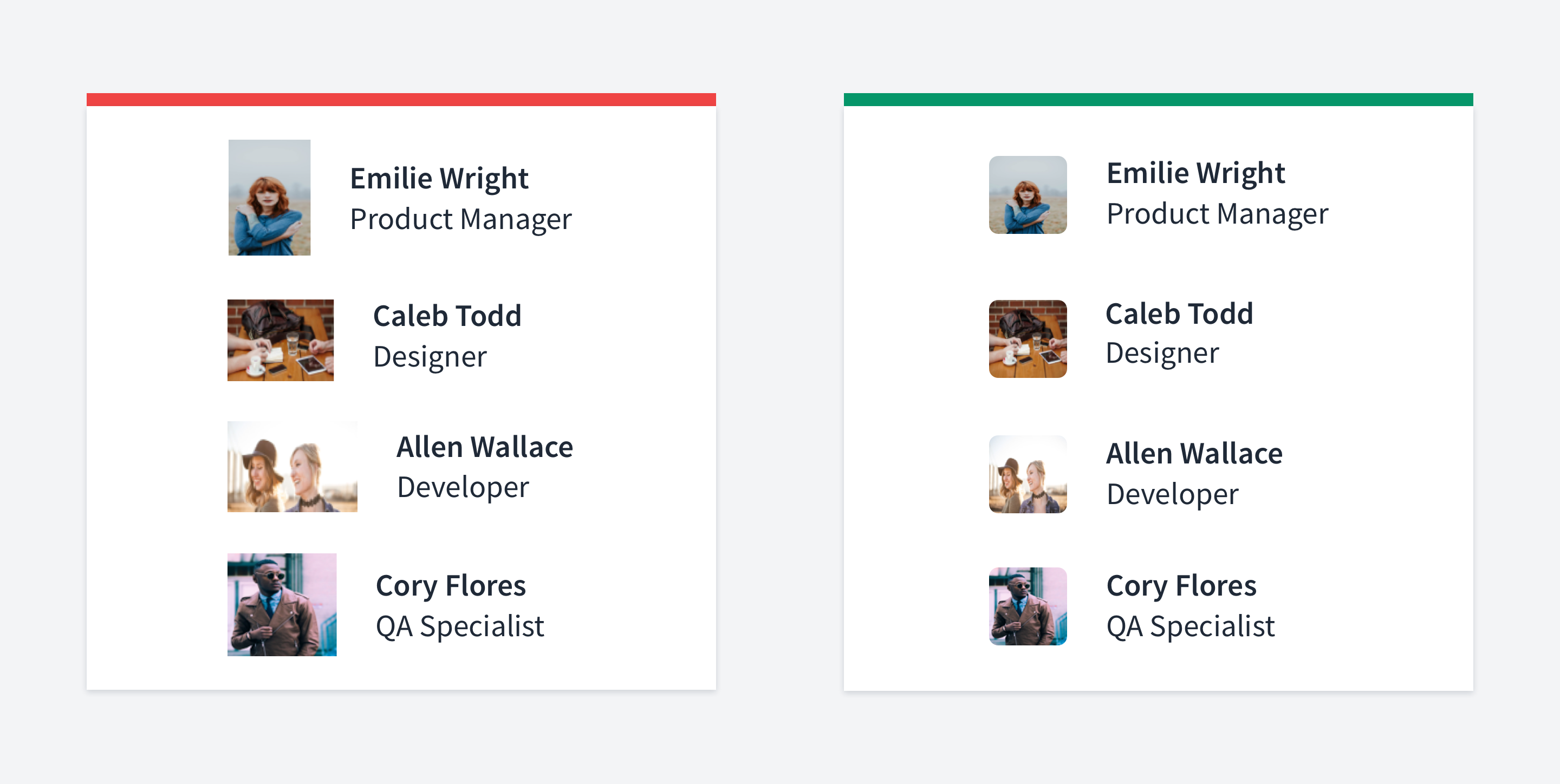
Styling images
If you can't control images uploaded by users and sometimes they can look really bad.
One of the reasons is that they can have bad contrast with your background. One of the possible solutions is adding a transparent inset border to the images.
Pay attention that it's transparent, that is important for those pictures that already have good contrast (see example below).

Overusing primary color
Do not overuse primary buttons.
Sometimes you may miss that you have them everywhere. If so, they're not primary buttons. There is no focus.
There are many techniques to make the UI less busy: use secondary, tertiary buttons, text/links etc.

Color saturation in dark mode
Avoid using saturated colors on dark themes as they can visually vibrate against dark surfaces.
Lighter tones (colors in the 20050 range) have better readability on dark theme surfaces (at all elevations).
This tip is taken from material design guidlines.

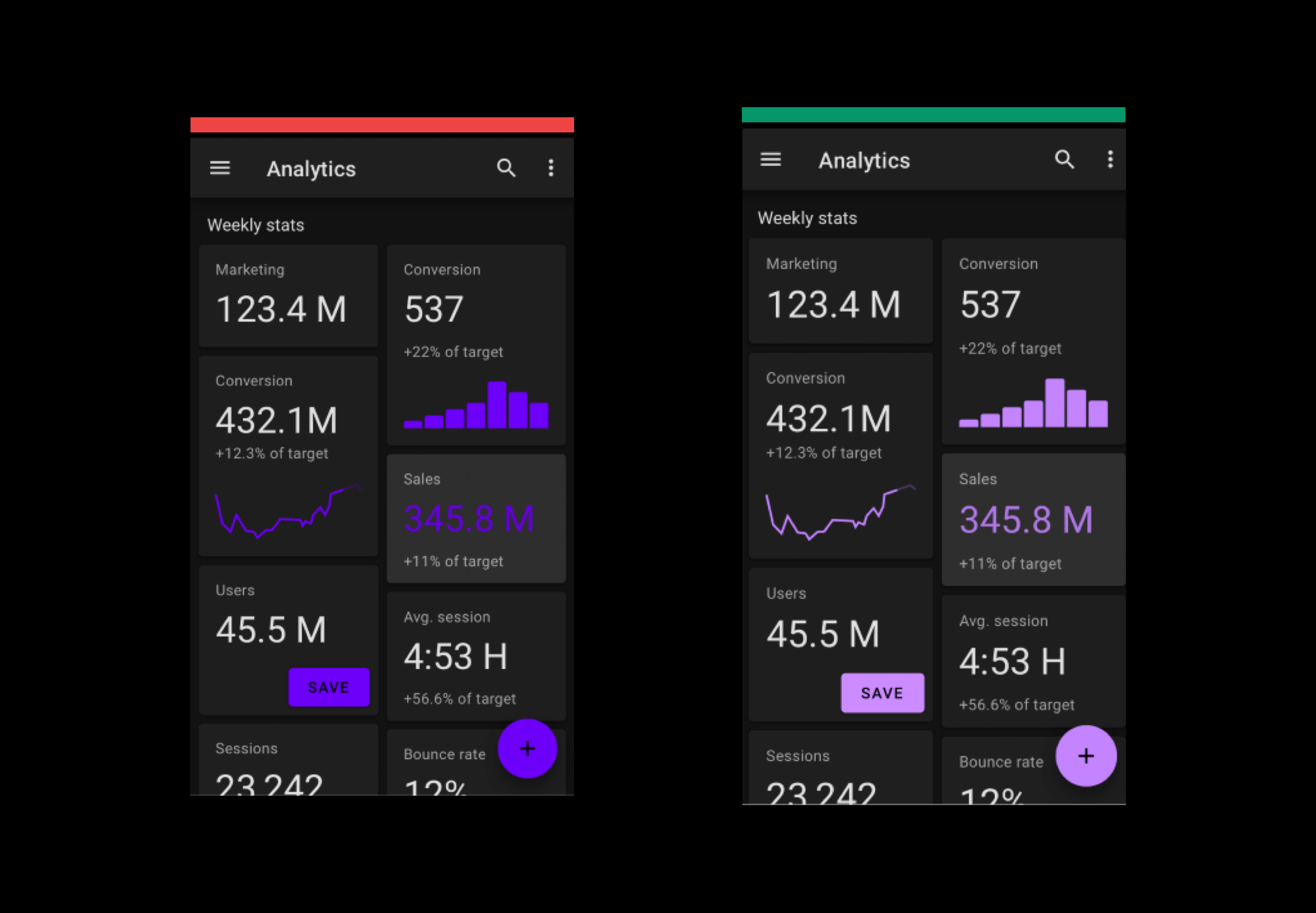
Harsh colored table borders
Two rules can help you make your table look better.
If you don't have many rows - omit bordering or striping them. Instead, enlarge the whitespace between rows.
If you have a massive table with many rows and columns, it will be hard to navigate through it. In this case, you can stripe your stripe or border it.
But pay special attention to the colors. They should be subtle and barely noticeable.
Otherwise, the table will look overloaded.

Watch your shadows
Your shadows should be soft and have a slight presence.
Also, it would be better to avoid using borders simultaneously since it might be hard to make them look good together.
What I would advice is to find a system of shadows that is already looks good and use it. For example, Tailwind is a good example of such system

Icon consistency
When you find some free icons on the web that belongs to different packs, it might turn out that they have different styling.
Different stroke width
Filled / Outlined
Coloured / Non-coloured
Minimalistic / Complex
It'd be better, of course, to use a pack that has some consistent styling.
But if you download a single icon that doesn't exist in the pack, make sure it conforms to the styling you already have.
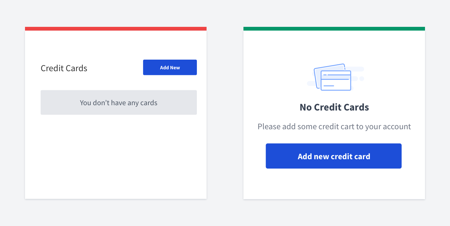

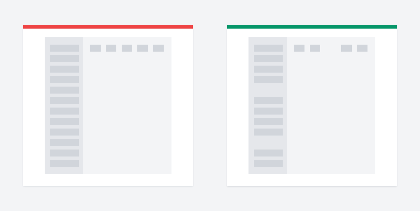
Empty/loading states
Leverage empty states
When you need to display a list of records, a typical pattern looks like on the left image.
But if there are no records, you can use available space for a more informative and engaging message.
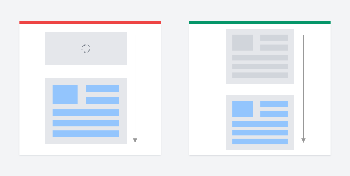

Avoid vertical layout shifts
If you use loaders when loading big content, you’ll have a layout shift after the content is loaded.
While if you use skeletons, the height will stay the same.
It’s best to use loaders in such things as buttons. At the same time, skeletons work well for layout/articles/large content.
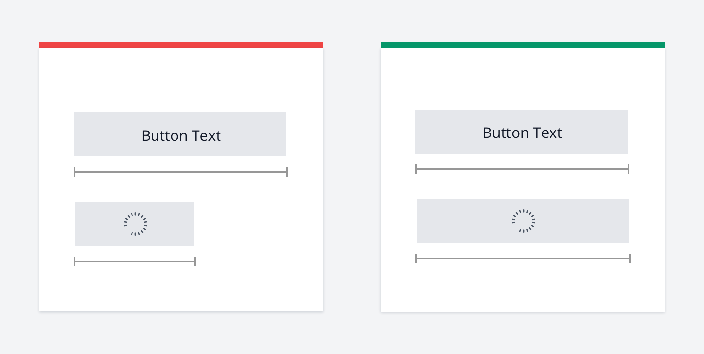

Avoid width changing when buttons are loading state
Buttons should keep the same width when they turn into the loading state.
The layout shift happens when you hide button content and show the loader instead.
One of the solutions is to make the text transparent. It will ensure that the button will have the same width because the content has not changed. It became transparent instead.
It will work even if you have localization and the user has changed the language.
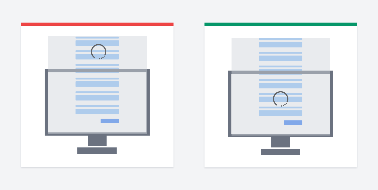

Wrong loader placement
I often see a pattern when developers put an overlay on the whole web page.
But it happens that the page height is bigger than one screen.
Thus, the loader icon stays beyond the visible part of the screen. So make sure the loader is centered properly.

Don't show loader right away
Developers usually display the loader as soon as the content starts loading.
But in reality, the content may be loaded in traction of seconds, e.g., in ~0.2
seconds.
In this case, showing loaders would look like a flashing piece of content. Things will look even worse if you have a large piece of content, e.g., an article.
It would be better to wait some time (e.g., 0.5 before showing loaders to avoid the flashing effect.

Use smart/progressive loaders
Sometimes it happens that the content is loading for a long time.
It might be because of a slow connection or if you have heavy calculations on the backend side.
In this case, when the loader is animated and nothing happens for 5-10 seconds, the user might not be sure if it's working or not.
Instead of showing the same loading animation, you can provide additional engaging content.
For example, by saying, "Hmm, it takes more than usual time...", "We're almost here..." etc. It will give users some assurance that the app is working and not broken.

Focus and user attention
De-emphasize other elements
If you need to emphasize an element, for example, a link, you can do it in two ways.
One way is to simply make it bolder.
But it can make the layout shift because bold links take more place. But on top of that, it just doesn't look good.
Consider the second way. De-emphasize other elements instead. It looks much cleaner.

Highlighting input search trick
A very simple yet a nice trick: when the user focuses on the search input, put a dark overlay on the rest part of the site.
It'll probably make the user more concentrated on the search task. At least I saw quite a few sites doing this.
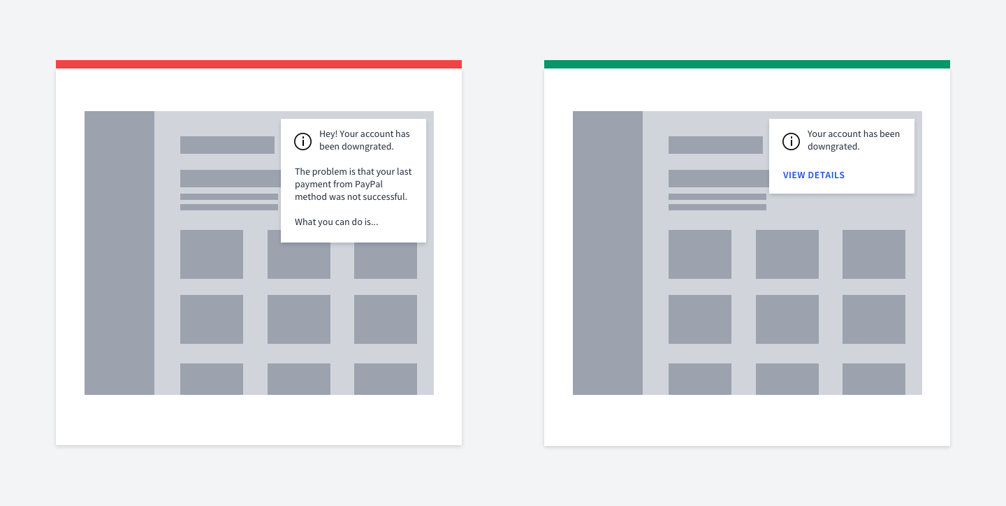

Don't put too much text in notifications
Don't put long messages in notifications.
The user might miss the content after it disappears. Also, you won't be able to put a detailed & long explanation there.
Use a button for redirecting to a page with further instructions instead.
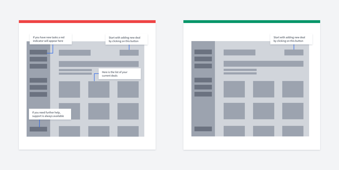

Don't show multiple hints at once
Show one hint/notification at a time.
Do not overload users with information. Showing multiple pieces of information at once increases cognitive load.

Use one primary button in dialogs
You should show users one logically completed piece of information at a time.
If you have a form, it should be related to one function and has one primary button.
One of the common mistakes is having too many primary buttons. It can also be a combination of buttons with different colors, e.g. primary + danger + success.
Instead, you should have one primary button, while other buttons/links should be secondary.

Use face and fingers to control attention
One of the coolest tricks to direct user attention is to use a face or a finger that points to something.
We naturally follow the glance of a person. Take a look at these examples.

Navigation
Don't hide navigation links
Don't hide your navigation under the hamburger menu. It's considered to be a really
bad practice on desktop devices.
The reason is that it's hard for users to find it. Instead, just show the navigation right away.
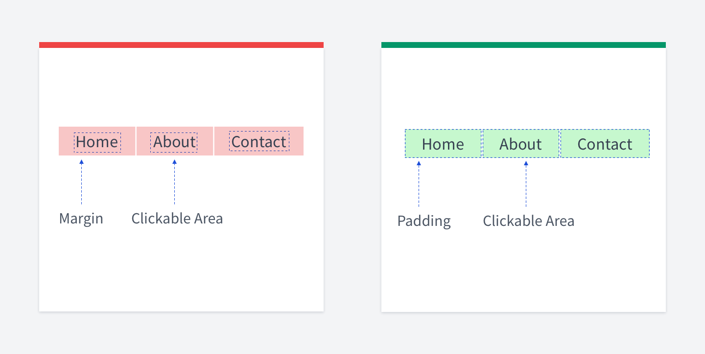

Increase clickable area
Fitt's law reads: The time to acquire a target is a function of the distance to and size of the target.
In other words, the bigger the object is, the easier it is to hit it.
For small controls, you can add an invisible clickable area that will help users hitting them. It is crucial on mobile devices. The invisible area is easy to achieve by simply using paddings for HTML elements.
Use paddings for making space between links. This way you'll have the same result as if you used margins, but the clickable area will be bigger. Thus, it'll be easier to hit the links.
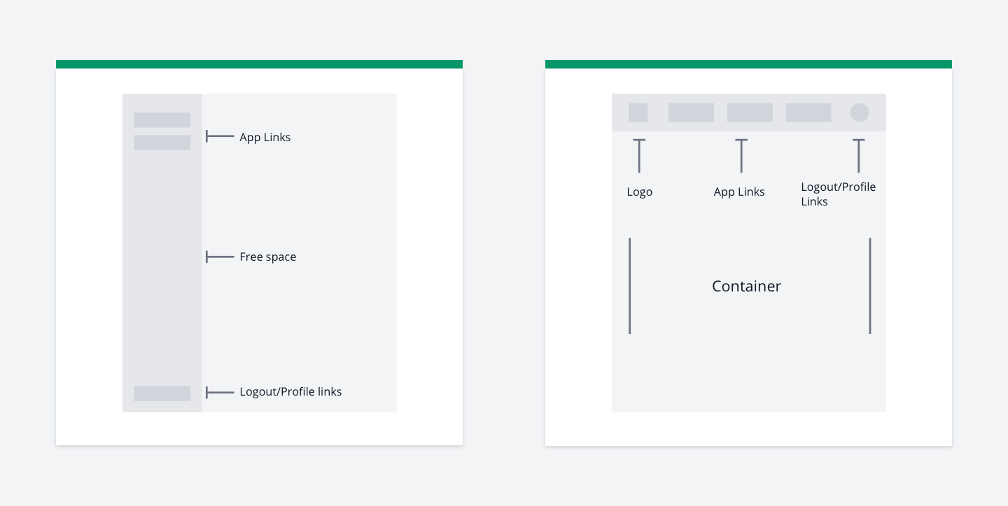

Vertical vs Horizontal navigation
If your app is simple or doesn't yet have many pages, it might be a good idea to use horizontal navigation instead of vertical.
The reason is that the vertical navigation takes all viewport height while the horizontal one can be centered. Also, horizontal navigation quite often has additional elements as logo and user menu.
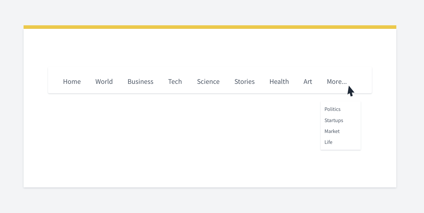

How to place more links in horizontal navigation
If you have many links in horizontal navigation, you may instinctively try to reduce the font size to fit more.
It's not the best solution. It's rather a temporary fix.
Instead, use "More..." with a separate dropdown. Or rethink your whole site navigation.
But. Remember that hiding navigation links is not a good practice. If you cannot restructure your whole site, the "More..." trick might help but keep in mind that it might be better to reconsider the whole site navigation.
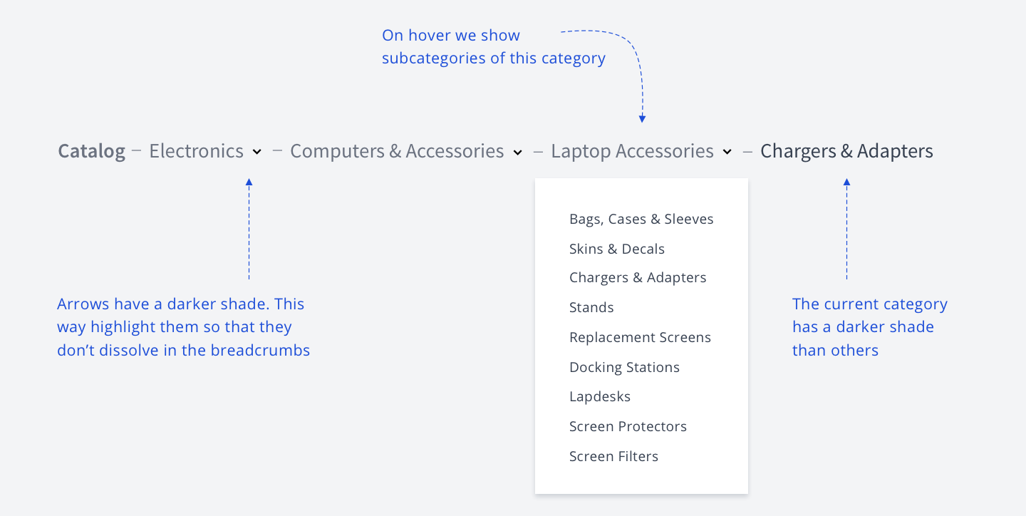

Breadcrumbs pattern
I've found an excellent example of combining breadcrumbs and navigation.
You not only show the category path, but you also show a dropdown of categories on hover.
In the example below, I took some categories from Amazo to illustrate this idea.
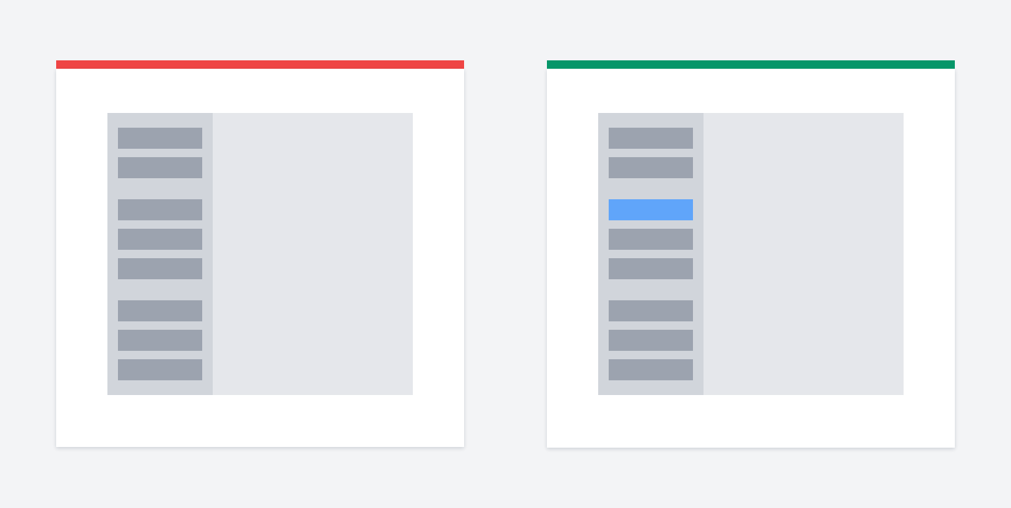

Show active link
Users should always know where they are at every moment they use your app.
Highlight navigation links. Add breadcrumbs if your information architecture is complex.
There is a related usability heuristic called “Visibility of System Status”
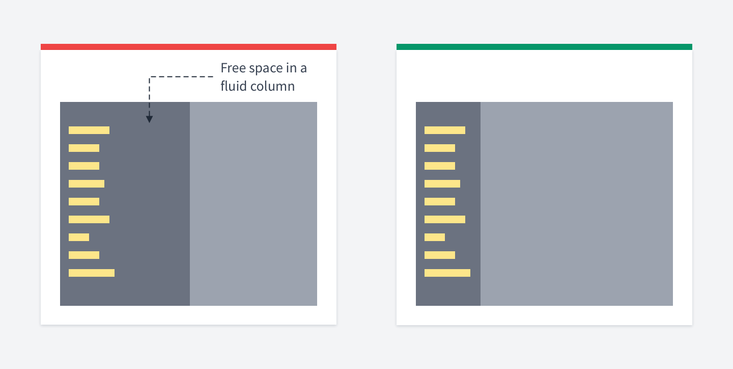

Fluid vs fixed sidebar
Don't put your sidebar navigation inside a fluid column.
It will stretch on bigger screens, while your links will stay the same. Using a column system is okay, but it's not a strict rule.
In the case of navigation, just let the menu occupy enough space.

Misc
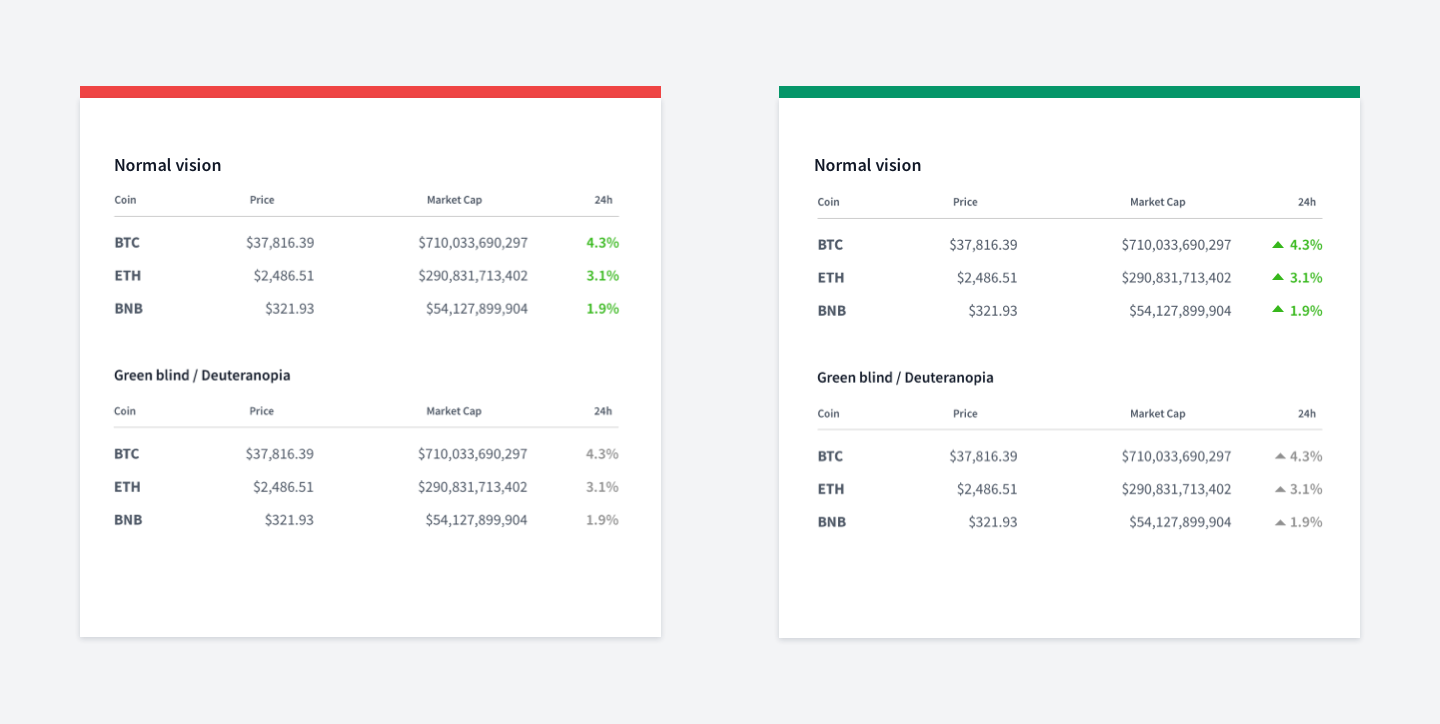
Color blindness & icons
Do not rely only on colors when building UI.
1 in 12 men has some degree of color blindness. Use text messages and icons along with colors.
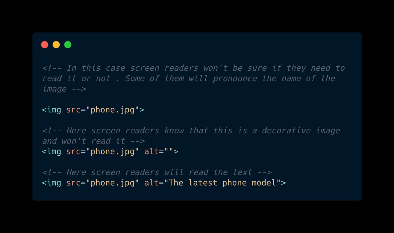

Use empty alt tag for decorative images
Did you know that having an empty alt attribute in the tag is not the same as not having it at all?
If your image serves decorative purposes, an empty alt tag tells screen readers to
If you don't have any alt attribute at all, the screen reader won't be sure if it's decorative or not.
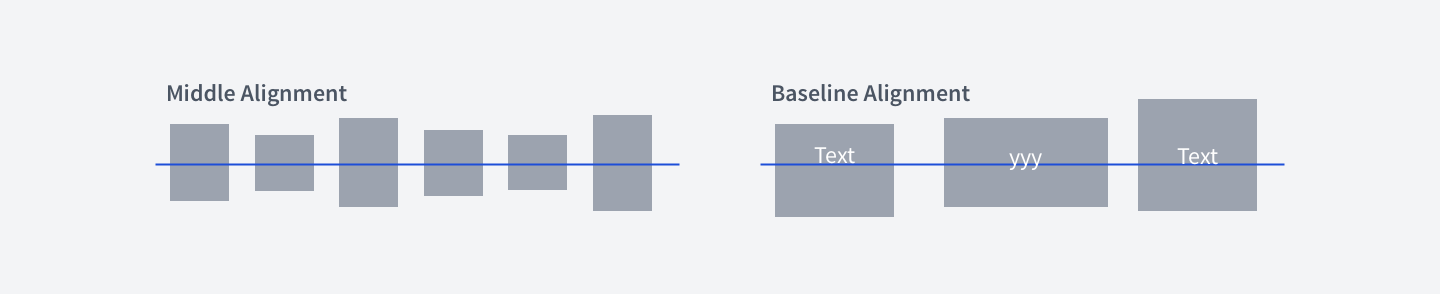
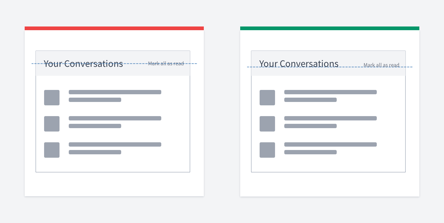

Aligning items using baseline
When you align items vertically, you have two options:
Middle
Baseline
For text items, consider using baseline. It looks smoother since your eyes move along the baseline.
Look at the "Mark all as read" label below.
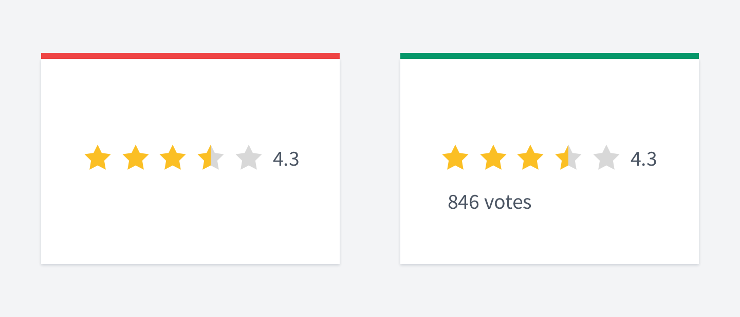

Show the number of votes along with rating
Show the number of users who voted. Otherwise, the score might be misleading.
One user gave one start, another gave five and we'll have 2.5 as an average. But this might not be relevant at all. Because two users don't give us idea if the product is good or not.
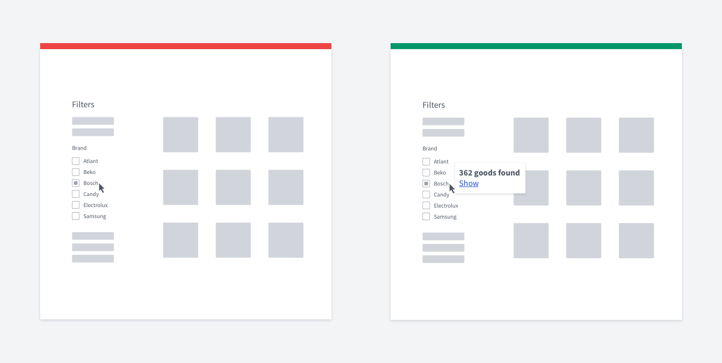

Instantly show how many goods were found
Before users apply filters they have selected - show the number of items found.
This will make it easier to decide for users whether they should keep on narrowing possible results or not.
Maybe the user will get zero results? By showing the number of found items you help them to change filters without the need of clicking the submit button. It simply speeds up user experience.
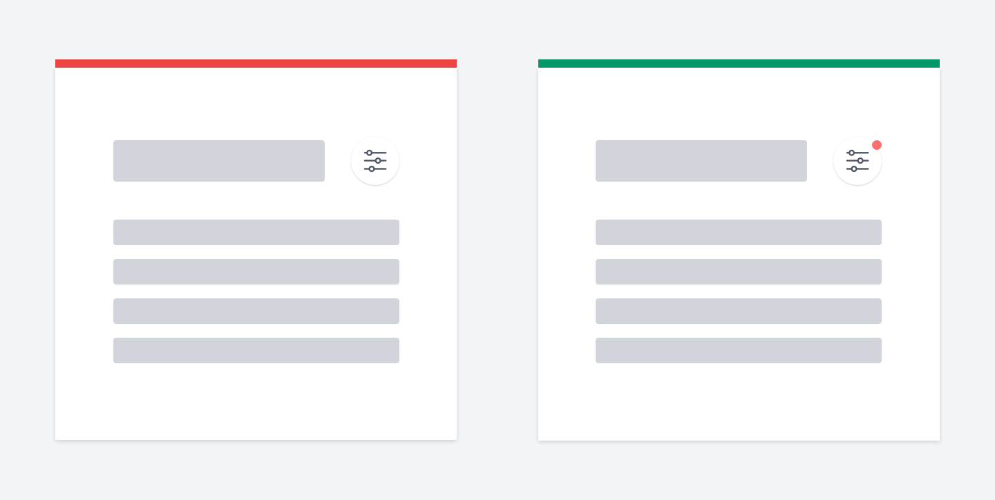

Filters indicator trick
If you have hidden filters, it'd be a good idea to put a red circle as an indicator if any of the filters are applied.
You can even put the number of filters applied.
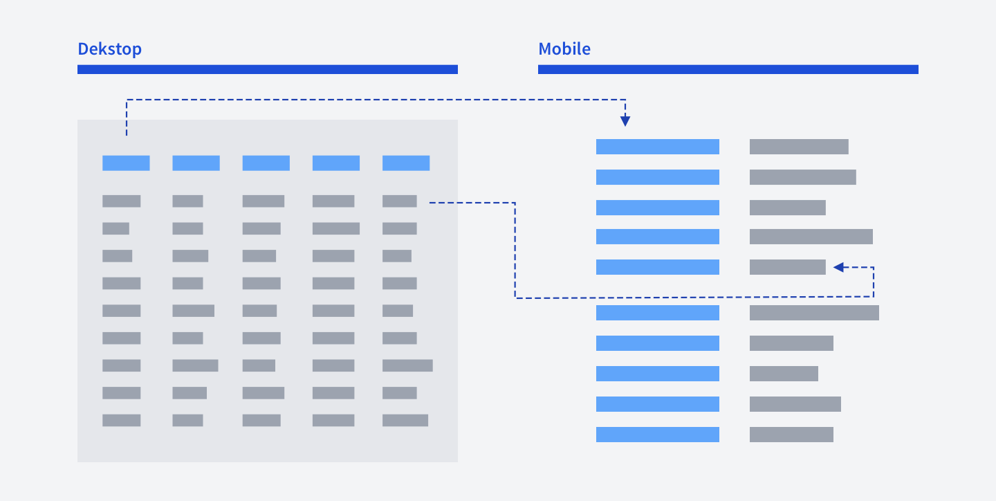

How to make tables responsive
There are quite a few ways to make a table responsive. The most common are: Remove unnecessary colums, thus shorting the table
Make it horizontally scrollable
Display each row as a custom card
Or, you can simply put head and value rows horizontally, next to each other, like in the picture below.

Group elements logically
Miller's law states that the number of objects an average person can hold in working memory is about seven plus or minus two.
You shouldn't take this literally, trying to fit elements in the magic number.
But you should place logically related elements into groups and provide enough whitespace between them.
If your navigation has 10-15 links that are not divided into any groups, it'll be more challenging for users to navigate through them.

Don't forget to put the post date
Our knowledge constantly evolves. The content written today might be irrelevant tomorrow.
When I google something related to programming and find an article without a date, there is no point in reading it because you cannot be sure that it is not outdated.
The article might've been written five years ago. It's a huge time range for programming.
The same applies to many areas of our life. So, don't forget to put the post date.
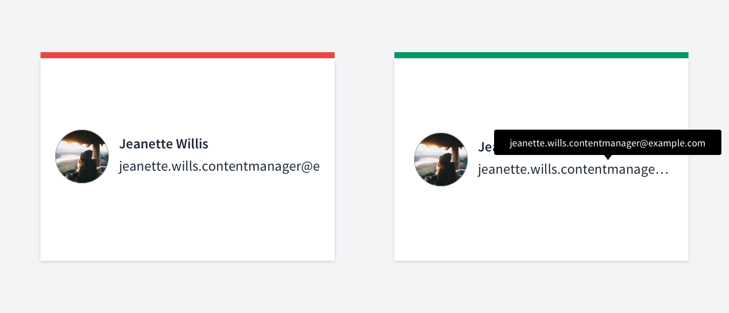
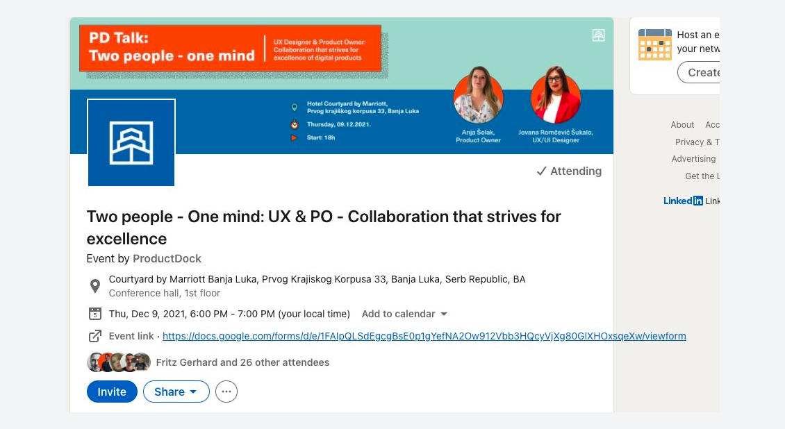

Remember that data can be large
A common case is when a UI is made assuming that the content won't be lengthy: emails, user names, article titles - all that are considered to be small.
But in reality, it often happens that the content is large. The user name suddenly consists of a few words, article's title has few sentences.
This case should be handled appropriately.
How can we deal with that? Well, there are many ways, such as: Truncating overflowing content with an ellipsis at the end Forbidding users to enter lengthy content by limiting the number of characters they can input
Hiding part of the content and showing users the option to see more The main thing is not to forget that the data can be lengthy.
And yes, it really happens, check out the LinkedIn screenshot below Afterward

Afterward
There is one secret tip that I haven't told you about yet.
Every rule has an exception. In every situation, there are many conditions.
Sometimes the business doesn't care about accessibility, sometimes your boss
"knows" how to do things better, sometimes, your research was wrong.
It's alright to make mistakes.
The golden rule here is to iterate. Research, iterate, try and then try again.
What's Your Reaction?
 Like
0
Like
0
 Dislike
0
Dislike
0
 Love
0
Love
0
 Funny
0
Funny
0
 Angry
0
Angry
0
 Sad
0
Sad
0
 Wow
0
Wow
0


