
![[VIP] Unlimited Pass 2026.03.27](https://i.pinimg.com/1200x/d2/f8/2e/d2f82e903b9ca33b0f13704cc85a3d8a.jpg)


![[LS] ls.graphics Pass 2026.02.16](https://i.pinimg.com/1200x/8d/ca/7f/8dca7ff72d8b698f955649340d0ff398.jpg)

![[PRO] Craftwork Pass 2025.06.11](https://i.pinimg.com/1200x/98/d2/f0/98d2f0169226b431f4727441ecc6aa06.jpg)


![[VIP] Creovo: Creative Portfolio](https://i.pinimg.com/1200x/92/5d/39/925d39b614ae4e39adda25b73837f82b.jpg)


![[VIP] Voltz: Electric Car Website Template](https://i.pinimg.com/1200x/03/ba/41/03ba41513483727fcd26b95349750783.jpg)
![[VIP] Zyra: Coded Chat AI Dashboard](https://i.pinimg.com/1200x/ce/7b/92/ce7b926f22423fc046659dfe1dd7a604.jpg)
![[$] AlignUI: Code Library](https://i.pinimg.com/1200x/8d/91/1c/8d911c0a22483842cff69c130e80c37b.jpg)
![[VIP] The Grid Deck Template](https://i.pinimg.com/1200x/f2/df/6d/f2df6d865d31ed4400ddd74137a5a79e.jpg)

![[VIP] Solaris: Sales Forecast & Pipeline Review Deck](https://i.pinimg.com/1200x/ba/7c/48/ba7c485ac40a51054cf9074aead204e2.jpg)
![[VIP] Brand Guideline Presentation](https://i.pinimg.com/1200x/64/87/a7/6487a7c4da21072150a1664f83a6a234.jpg)


![[VIP] 44 Device Mockups: Metal Scene Pack](https://i.pinimg.com/1200x/96/0c/c4/960cc4d39f6f9f08c4ba4a40ae740a65.jpg)
![[LS] iPhone 17 Mockup](https://i.pinimg.com/1200x/18/42/c1/1842c11e3da971765bdcfbc5315f3df8.jpg)
![[LS] iPhone 17 Pro Max Mockups](https://i.pinimg.com/1200x/f0/2a/72/f02a724ed9f52ac4a1c66b5614809111.jpg)
![[LS] AE-Mockups, Apple Devices](https://i.pinimg.com/1200x/03/04/9b/03049ba79acaa546ae6389639f89bcc1.jpg)


![[VIP] Volnitsa: BLNDR MINI (2025)](https://i.pinimg.com/1200x/c3/f7/0a/c3f70ae1126be5c0af1977e58b56ba7a.jpg)

![[VIP] React Three Fiber: The Ultimate Guide to 3D Web Development](https://i.pinimg.com/1200x/78/02/1f/78021ffdfc8113cc8caba5b2c563ead4.jpg)
![[VIP] Ryan Hayward: Ultimate Framer Masterclass 3.0](https://i.pinimg.com/1200x/48/d6/3f/48d63f9723d7c49e6c34c182557c7431.jpg)


![[VIP] Whoooa! 156 vector Lottie animations](https://design.rip/uploads/cover/blog/whoooa-156-vector-animations.webp)


![[VIP] Staff Product Designer (ENG, RUS)](https://i.pinimg.com/1200x/0c/52/a0/0c52a08d8b0a25329806437933cf538f.jpg)


40 Web Design Tips & Tricks
Creating a great website blends design, mindset, and tech skills. These 40 tips will help you build sites people love—let’s dive in!

-
Mindset Tips: Design Starts in Your Mind
No tool, no trendy framework, and no design system will save you if your mindset isn't wired for creative growth.
So before diving into gradients, grids, or even CSS, you've got to upgrade your mental operating system.
Here's how you become dangerous with design — starting from the inside out.
1. Learn by Doing
Forget tutorials on auto play. The real magic happens when you get your hands dirty.
Design that one-page layout.
Break it.
Rebuild it.
No progress ever came from passive scrolling.
Stop waiting to feel ready…
2. Study Great Websites
Reverse-engineer the internet.
Open your favorite site — now ask why it feels so good.
Is it the font combination?
The breathing space?
Steal like a curious detective, not a lazy thief.
3. Save Inspiration
Build a collection of buttons, layouts, color palettes, and micro-interactions that feels crazy.
One day, when you're out of ideas, that collection will save you.
4. Build a Font Library
Fonts are like voices.
Some whisper, others scream.
I organize mine in Google Docs, sorted by style — serif, sans serif, script, display, and so on.
I even make notes about which fonts are free and which require a purchase.
Build your library so you're never stuck shouting in Comic Sans.
5. Collect Daily, Not Occasionally
Great designers don't wait for inspiration — they hunt it.
Screenshots, Dribbble saves, tiny UI details — make it a habit.
Your design eye sharpens every time you notice something new.
6. Copy, Then Create
Before you become original, you've got to be deliberately unoriginal.
Recreate a design pixel-for-pixel.
You'll learn spacing, alignment, and hierarchy in a way that theory never teaches.
7. Design Daily
No, not when you feel inspired.
Every single day.
Treat design like the gym. You won't see gains instantly, but months from now?
You'll make complex UIs like they're nothing.
You already have what it takes. What you need is consistency and a mindset that leans into discomfort, curiosity, and craft.
Because design isn't just something you do.
-
Design Tips
Alright, now that your mindset is in beast mode, it's time to move from thought to form — from I could design that to I just did.
Design isn't just about how it looks — it's how it works, feels, guides, and earns trust.
And here's the secret sauce: you don't need to be a creative genius. You just need a compass and a few damn good habits.
So let's explore 24 design principles that instantly make your work sharper, cleaner, and more professional.
1. Master the Building Blocks
Start with the Lego blocks of web design — Layout, spacing, alignment, typography, color, and viewing patterns
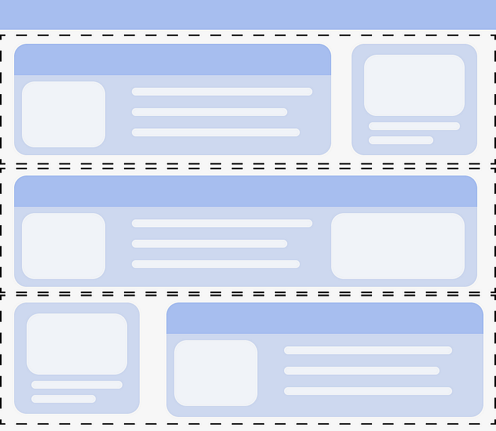
Image by Author
Think of every website like a house: no matter how pretty the wallpaper is, if the foundation is off, it collapses.
Look at Apple.com. See how every element sits in harmony?
That's not luck. It's mastery of basics like consistent padding, font weights, and alignment. Study those basics obsessively.
2. Use 1–3 Column Layouts
Don't overthink layout. One-column for focus (landing pages), two-column for comparison (pricing pages), three-column for content-rich pages (dashboards). That's it.
Example: A blog article? One column.
A product + description? Two columns.
A features grid? Three columns. You don't need 5 columns and chaos — just clarity.
3. Refresh Common Patterns
Users expect navigation at the top, the logo on the left, and the call-to-action near the hero.
Example: Take a common navbar pattern and refresh it with subtle animations, soft shadows, or a sticky scroll.
You're not reinventing the wheel — you're just polishing it until it shines.
4. Add More White Space
When in doubt, breathe out. Your UI is suffocating without white space.
Give every section room to breathe like a good conversation — with pauses, rhythm, and space to think.
Example: Compare Craigslist vs Stripe.
One is cluttered chaos, the other is systematic balance.
That's the power of whitespace.
Use it like you're designing for billionaires with expensive taste.
5. Vary Section Styles
A uniform layout makes users scroll on autopilot.
Mix things up.
Create contrast between sections — use different background colors, switch up the layout flow, and adjust container widths.
Example:
Hero section? Full width.
Next section? White background, centered text.
Then? Grid layout with soft grey backdrop.
This rhythm keeps the scroll engaging.
6. Use Visual Hierarchy
Everything can't be loud. Decide what screams, what whispers, and what stays silent.
That's visual hierarchy — the art of directing attention without saying a word.
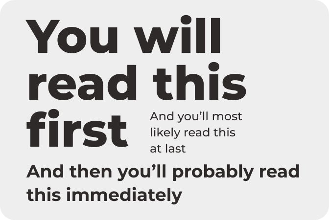
Visual Hierarchy
Example:
Big bold heading (H1).
Medium subheading (H2).
Body text with generous line-height.
Use font size, weight, color, and spacing to guide the eye like a spotlight.
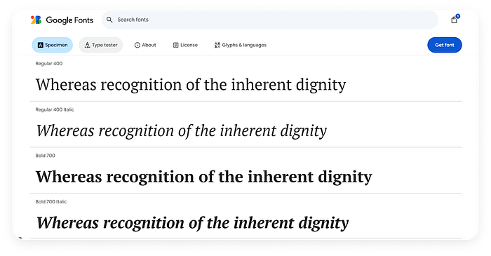
7. Learn Font Families
Fonts are more than style — they're personality.
Sans-serif for modern clean vibes.
Serif for elegance and tradition.
Monospace for code-like feel.
Know when to use what.
Example:
SaaS landing page? Use Inter or Poppins.
A portfolio for a classical artist? Try Playfair Display or Lora.
Choose fonts like you're casting actors in a movie.
8. Match Font to Context
Imagine using Comic Sans in a legal contract ?
Instant distrust, right?
Fonts set tone.
They should speak the same language as your message.
Example:
Designing a mindfulness app? Go with something soft and round like Quicksand.
Building a finance dashboard? Use strong, neutral fonts like Roboto or IBM Plex Sans.
9. Pair Fonts Intentionally
You don't need 4 fonts.
Pick one for headings, one for body text.
Make sure they contrast but don't clash. Think of it like a duet — complementary tones, not a shouting match.
Example:
Montserrat + Open Sans = Modern + Readable
Playfair Display + Roboto = Elegant + Professional
Try Google Fonts pairings for safe design.
10. Trust Your Visual Instinct
Sometimes, Figma won't give you the answer — your gut will.
If something feels off, it probably is.
Zoom out, squint your eyes, and see where your eyes land.
That's your instinct at work.
Example: That button you're unsure about? If your eyes keep drifting to it before anything else, maybe it's too loud.
Tone it down.
Design is half science, half vibe.
11. Test Fonts in Figma
Fonts behave differently in mockups vs live. Some break, some compress oddly, some lose readability.
Always test your fonts at different screen sizes.
Example: Create a mobile frame in Figma and check:
- Is the body text too small?
- Does the heading wrap awkwardly?
- Is there enough line-height?
Don't wait till dev phase to find out.
12. Learn Color Theory Basics
Color sets the emotion of your site.
Learn about complementary, analogous, triadic color schemes.
Understand hue, saturation, contrast, and accessibility.
Example: Blue evokes trust (finance, SaaS).
Green = growth or health (fintech, wellness).
Orange = action and energy (e-commerce, CTA-heavy pages).
Use tools like Coolors.co or Adobe Color to experiment.
13. Use One CTA Color
Pick a color — any color — but use it only for your call-to-actions.
That's your money-maker.
Don't dilute it by using it for other elements like borders or icons.
Example: If your CTA is bright orange, every Buy Now, Start Free Trial, or Sign Up button should match.
When everything is loud, nothing is loud.
14. Match Images to Your Palette & Message
Do you often pick Random stock photos? They instantly kill your credibility.
Every image you use should feel like it belongs.
That means matching your color palette and your design tone.
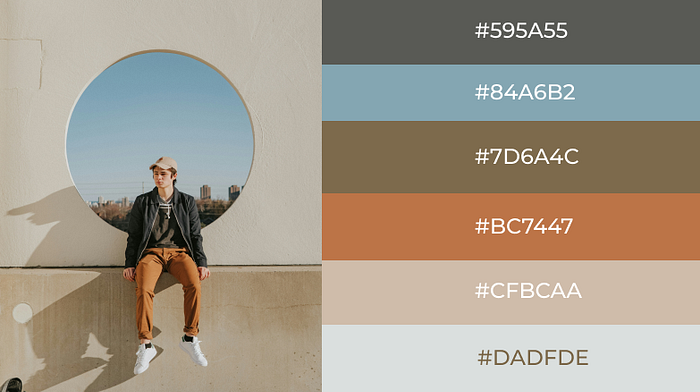
Image Created by Author
Example: A soft blue landing page with a photo full of harsh red tones? Visually jarring.
A modern SaaS app using cartoonish clipart? Confusing.
Use image editing tools to tweak image tones or add overlays that align them with your brand vibe.
15. Use Realistic, Intentional Photos
Stock is okay. Staged stock is not.
Use client-supplied photos whenever possible. When using stock, go for natural lighting, real people, and genuine emotion.
Example: Avoid those stiff office people high-fiving images.
Instead, pick candid, human moments that feel relatable.
Also: crop tightly to focus on the emotion or action.
Less background noise = more clarity.
16. Use compressed WebP images
Images are the silent killers of web performance.
You need them, but you also need them light.
Tips:
- Save images as WebP. Smaller size, same quality.
- Compress images under 300KB whenever possible. Use tools like TinyPNG or Squoosh.
17. Crop to Focus and Export Right
Cropping isn't just about trimming — it's about storytelling.

Rule of Thirds
Remove distractions, zoom into what matters, and always export at the right dimensions for web.
Use the rule of thirds to focus on the most important part of the image. Don't just rely on browser to do the cropping, export the cropped image and use inside your site.
Example: If your hero image will be displayed at 1200x600, don't upload a 4000x3000 pixel image.
It's wasted bandwidth.
Crop with intent. Export with purpose.
18. Reinforce Your Message with Imagery
Let images say what your words are saying — or better, what your words can't.
If your landing page is about speed and simplicity, show a clean, uncluttered UI screenshot — not a crowded dashboard.
Use imagery to amplify your message, not distract from it.
19. Balance Quality and Speed
This is the golden rule.
Don't chase pixel-perfect design if it makes your site painfully slow.
And don't sacrifice clarity in the name of speed. The trick? Balance.
Use Figma exports at 2x for retina screens, but compress them after.
Test your pages on a slow connection to feel what your users might experience.
And there you have it — design tips that go beyond aesthetics. These are the silent tricks of good designers — the parts no one sees but everyone feels.
-
UX Tips: Designing for the Human, Not Just the User
UX isn't just a layer on top of design — it's the engine underneath it.
Great UX isn't loud. It's invisible. It feels natural.
You don't notice it, because it never makes you stop and think.
And that's the point.
1. Design for Users, Not Stakeholders
It's tempting to design for your client. Or your boss. Or your portfolio.
But the only person that matters? The user.
That means simplifying flows, removing ego-driven features, and constantly asking:
What would make this easier for them?
You might love that new animated onboarding, but if users are skipping it just to get to the dashboard, scrap it.
Make onboarding optional and accessible anytime instead.
Designing for users is humility in action.
2. Expect Skimming, Not Reading
People don't read websites like books.
They scan. They hunt. They scroll like they're in a rush — because they usually are.
What to do:
- Break long paragraphs into bullets or bite-sized lines.
- Use headings as anchors.
- Highlight key takeaways in bold or color.
Example: Imagine a pricing page with three dense paragraphs.
Now imagine the same page with:
- Features → one-liners
- Plan names → bold
- Checkmarks for what's included
That second version wins every time.
3. Optimize Above the Fold
The initial screen view serves as your elevator pitch. It's the hook, the why, and the CTA — all in one.
Don't waste it on vague taglines like We change the way people connect.
Example:
Instead, go for: ? Automate your workflow in minutes. No code needed. ? Get Started Free
Include:
- A clear headline
- A sub-headline with benefits
- One focused CTA button
- Optional trust signals (logos, ratings, etc.)
Make the user want to scroll, not wonder what they're looking at.
4. Review Bottom to Top
Once your page is done, scroll from the bottom back up.
Why?
Because that's what users sometimes do — especially if they scroll quickly and then go back to decide where to act.
What to check for:
- Does every section have context when viewed alone?
- Are CTAs visible again near the bottom?
- Do the last impressions feel just as strong as the first?
If your footer CTA is a tiny Contact Us link while your header had a bold Start Free Trial, you're missing a chance to convert one more time.
5. Test on Real Devices (Not Just Your Monitor)
Your site might look stunning on your 27-inch 4K screen. But 70% of users might be viewing it on a low-end Android in harsh sunlight.
- Test on mobile, tablet, and small laptops
- Rotate screens to landscape
- Open your site on a slow connection
- Check tap areas with your thumb
Example: Is your hamburger menu tappable without zooming in?
Is the padding around buttons enough for fat fingers?
You can't claim responsive until you've felt the friction with your own hands.
6. Stick to One Builder
Pick your design system or builder — and stick to it.
Switching between numerous frameworks or design libraries results in a disjointed product lacking clarity.
Example:
Mixing Tailwind, Bootstrap, and MUI? You'll end up with three types of buttons, different spacing logic, and an inconsistent brand experience.
Stick to one. Build components intentionally. Consistency is a form of respect for the user.
7. Prioritize One Goal per Page
Every page should have one job.
Trying to get users to read your blog, sign up for the newsletter, schedule a demo, and download your eBook — all on one page?
That's how you get zero conversions.
How to fix it:
- Set one primary CTA per page
- Remove distractions
- Add support content only if it pushes users toward that main goal
Example: On a pricing page, the goal is sign-up. Not Follow us on Twitter. Not Read our blog. Focus sharpens experience.
8. Write Clear CTAs
Avoid vague buttons like Submit or Click Here.
That's lazy UX.
Instead, tell the user what happens next.
Clarity builds confidence.
Better CTA examples:
- ✅ Start Free Trial
- ✅ Download Resume Template
- ✅ Book a 15-Minute Call
Each CTA should answer the user's unspoken question:
What happens when I click this?
-
Technical Tips
This is where your site earns trust before anyone even reads a word.
Why? Because users judge how fast it loads, how smooth it feels, and whether it works on their device.
Your goa l should be to make a web design that feels like magic — even on a $150 Android phone with 2 bars of signal.
1. Remove Any Unused CSS or JavaScript Files
Every extra file you load — every animation library you might use but don't — adds invisible weight.
In your project you may add GSAP for one animation but later removed it. The script tag stayed. That's now 300KB of dead weight on every page load.
- Audit your CSS and JS.
- Use tools like PurgeCSS (for Tailwind).
- Tree-shake unused code in your JS bundler.
- Remove third-party plugins unless absolutely needed.
If it's not used, lose it.
2. Avoid Installing Unnecessary NPM Packages
You should not use an entire animation library for a single fade-in?
Grabbing a 2MB charting library when a 10KB SVG does the same job? Its Wasteful.
Ask yourself:
- Can I do this with native CSS or JS?
- Is there a lighter alternative?
- Will this add long-term maintenance or bloat?
Be a minimalist — your users don't care how fancy your dependencies are. They care how fast the site loads.
3. Use Only the Fonts That You Really Need
If you load too much, it slows everything down — even before the first pixel shows up.
You imported 4 Google Fonts, each with 4 weights. That's 16 font files.
Fix:
- Use 1–2 fonts max
- Load only the weights you need (e.g., 400, 700)
- Use
font-display: swapfor better perceived speed - Self-host fonts if needed for control
If you're only using Inter for both headings and body, do you really need to load Lato and Roboto too?
Stick to what you use. Users don't care if your subheading is just slightly more playful.
4. Compress and Optimize Images Before Uploading
This is a big one. Images are usually the #1 cause of slow pages.
You uploaded a full-res 5MB image from Unsplash. The user never even saw the full version — it was displayed as a 300px thumbnail.
- Resize to exact display dimensions (or 2x for retina)
- Use tools like TinyPNG, Squoosh, or ImageOptim
- Export to WebP or AVIF
- Set proper
widthandheightattributes to avoid layout shifts
Instead of
banner.pngat 3000x2000 pixels, export it at 1200x800 and compress it under 200KB.Same visual result. 90% faster.
5. Always Check Performance With Real Tools
Don't guess. Test.
- Lighthouse (built into Chrome DevTools)
- WebPageTest
- PageSpeed Insights
These tools tell you:
- How fast your page loads
- What scripts are blocking rendering
- What images are too large
- If your fonts are causing layout shift
A hero section that appears impressive on desktop might be hurting your mobile score because of large background videos or CSS that blocks rendering. You won't find out until you run a test.
6. Don't Skip Accessibility
Accessibility is not a nice-to-have.
It's the difference between usable and broken for many users.
Let's say You build a beautiful form. But there are no
aria-labels, and tab navigation skips key inputs.That's a barrier for screen reader users — or even just keyboard-only users.
- Use semantic HTML (
button,nav,section, etc.) - Ensure text contrast meets WCAG standards
- All interactive elements must be keyboard-navigable
- Add
alttext to images - Use focus states for all controls
Someone with a motor disability tries to tab through your UI. If they can't reach the CTA or don't see a focus outline, the site becomes unusable.
Accessibility = respect. Build for all.
7. Use Lazy Loading for Non-Essential Images and Content Below the Fold
Why load everything up front when users haven't scrolled yet?
- Use
loading="lazy"on images - Lazy load hero image, long blog post content, comment sections, or embedded videos
- Load JS features (like charts or maps) only when they enter the viewport
Instead of loading all 12 product thumbnails at once, load the first 4 and fade in the rest as the user scrolls.
8. Don't Use Heavy Background Videos
Background videos can feel slick — but they come at a high performance cost.
You may have got a 15MB video autoplaying on your hero section. Looks great on your machine.
Meanwhile, someone on a 3G connection is watching your page crawl into existence.
- Use lightweight MP4s optimized for web
- Mute + loop videos (or browsers will block autoplay)
- Set fallback images for mobile
- Use animation or Lottie instead of full video if motion is all you need
Ask yourself: Is this video adding value, or just vanity?
9. Test in Private Mode With Caches Disabled
You've built the site. You've tested it a dozen times.
But your browser is lying to you.
It's cached everything — images, fonts, scripts — making it look faster than it is for new users.
- Open your site in Incognito or Private Mode
- Use DevTools → Disable cache
- Test first-load speed like a user visiting for the first time
You think your homepage loads in 2s.
In reality, for a new user, it takes 6s — because fonts and third-party scripts are unoptimized.
That's a lot to take in — but don't worry, you're not expected to memorize it all.
The right tip will come to you when you need it.
Focus on making users feel something.
Use these ideas, remix them, break the rules if it makes sense — just always design with intention.
What's Your Reaction?
 Like
3
Like
3
 Dislike
0
Dislike
0
 Love
0
Love
0
 Funny
0
Funny
0
 Angry
0
Angry
0
 Sad
0
Sad
0
 Wow
3
Wow
3


