
![[VIP] Unlimited Pass 2026.03.27](https://i.pinimg.com/1200x/d2/f8/2e/d2f82e903b9ca33b0f13704cc85a3d8a.jpg)


![[LS] ls.graphics Pass 2026.02.16](https://i.pinimg.com/1200x/8d/ca/7f/8dca7ff72d8b698f955649340d0ff398.jpg)

![[PRO] Craftwork Pass 2025.06.11](https://i.pinimg.com/1200x/98/d2/f0/98d2f0169226b431f4727441ecc6aa06.jpg)


![[VIP] Creovo: Creative Portfolio](https://i.pinimg.com/1200x/92/5d/39/925d39b614ae4e39adda25b73837f82b.jpg)


![[VIP] Voltz: Electric Car Website Template](https://i.pinimg.com/1200x/03/ba/41/03ba41513483727fcd26b95349750783.jpg)
![[VIP] Zyra: Coded Chat AI Dashboard](https://i.pinimg.com/1200x/ce/7b/92/ce7b926f22423fc046659dfe1dd7a604.jpg)
![[$] AlignUI: Code Library](https://i.pinimg.com/1200x/8d/91/1c/8d911c0a22483842cff69c130e80c37b.jpg)
![[VIP] The Grid Deck Template](https://i.pinimg.com/1200x/f2/df/6d/f2df6d865d31ed4400ddd74137a5a79e.jpg)

![[VIP] Solaris: Sales Forecast & Pipeline Review Deck](https://i.pinimg.com/1200x/ba/7c/48/ba7c485ac40a51054cf9074aead204e2.jpg)
![[VIP] Brand Guideline Presentation](https://i.pinimg.com/1200x/64/87/a7/6487a7c4da21072150a1664f83a6a234.jpg)


![[VIP] 44 Device Mockups: Metal Scene Pack](https://i.pinimg.com/1200x/96/0c/c4/960cc4d39f6f9f08c4ba4a40ae740a65.jpg)
![[LS] iPhone 17 Mockup](https://i.pinimg.com/1200x/18/42/c1/1842c11e3da971765bdcfbc5315f3df8.jpg)
![[LS] iPhone 17 Pro Max Mockups](https://i.pinimg.com/1200x/f0/2a/72/f02a724ed9f52ac4a1c66b5614809111.jpg)
![[LS] AE-Mockups, Apple Devices](https://i.pinimg.com/1200x/03/04/9b/03049ba79acaa546ae6389639f89bcc1.jpg)


![[VIP] Volnitsa: BLNDR MINI (2025)](https://i.pinimg.com/1200x/c3/f7/0a/c3f70ae1126be5c0af1977e58b56ba7a.jpg)

![[VIP] React Three Fiber: The Ultimate Guide to 3D Web Development](https://i.pinimg.com/1200x/78/02/1f/78021ffdfc8113cc8caba5b2c563ead4.jpg)
![[VIP] Ryan Hayward: Ultimate Framer Masterclass 3.0](https://i.pinimg.com/1200x/48/d6/3f/48d63f9723d7c49e6c34c182557c7431.jpg)


![[VIP] Whoooa! 156 vector Lottie animations](https://design.rip/uploads/cover/blog/whoooa-156-vector-animations.webp)


![[VIP] Staff Product Designer (ENG, RUS)](https://i.pinimg.com/1200x/0c/52/a0/0c52a08d8b0a25329806437933cf538f.jpg)


UI Design will never be the same.
This is entering a new era — no more stacking boxes or lifeless templates. Design and code are merging again, bringing back creativity, emotion, and craftsmanship to digital products.
Future of design
When you say you do "product design", what do you mean exactly? Everyone has a definition, but for the last decade it used to be fairly similar.
Sure, everyone adds some unique buzzwords here and there (like senior AI-design-system-specialist) but in essence UI design has been the same thing.
Stacking boxes.
This is going to rapidly change now. I'm talking a full on revolution.

A box in a box with a box on top. Design work.
I'm already a part of this new path myself. The boxes can now just go … stack themselves.
We're built for better things! I'll also show you a couple direct examples and how design is merging with art again.
But you know what?
AI is not going to replace designers after all. In a way, this was the last thing needed for them to break free of the confines of the past. This is extremely exciting!
To understand that exciting new future we need to understand how we got here.
Stacking boxes…
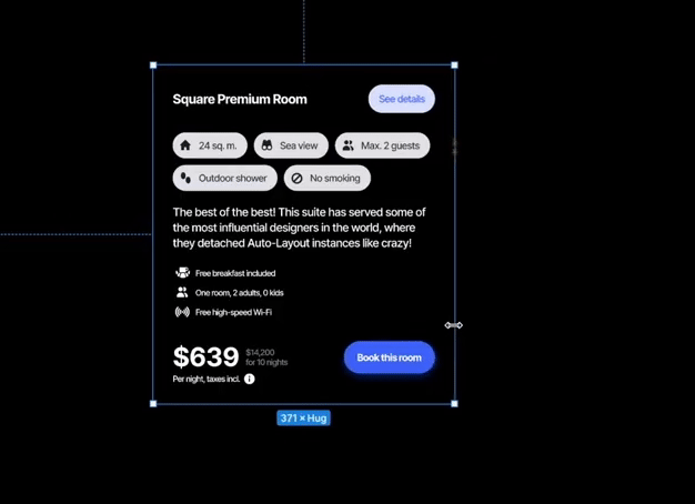
At first it was raster boxes in Photoshop. Then Sketch came along and made the boxes vector. Then Figma came and added automatic stacking (auto-layout).

Recognize this? Design is literally setting those widths and hugs and stack directions now…
It was all to save us time. To make things easier to develop. To build faster and to build more.
And somewhere along the line, it has lost all craftsmanship and soul. It's mindless now.
Pick component. Drag. Drop. Shift + A. Select flow direction. Select two stacks. Shift + A. Select flow direction.
Yay! You've made yet another login screen. Yet another dashboard. Like we don't have enough dashboards already.

This skit is called "Sad life of a designer". It's a joke, but the repetitiveness is real.
I've made a joke skit about a typical "sad life of a designer" where all they do all day is shift + A some components. It's as relevant as ever.
Designers became assemblers of templates. Yes, templates. All those complex interfaces, when you break them down are the same patterns over and over again.
Design is…
How can you define design? It's a broad field, but when we talk about the digital products the classic quote comes to mind:
"Design is not just what it looks like and feels like. Design is how it works" Steve Jobs
This led to most people obsessively focusing on functionality. After all, Steve said it. It's about how it works.
The problem is, they all deliberately ignored one word in his quote.
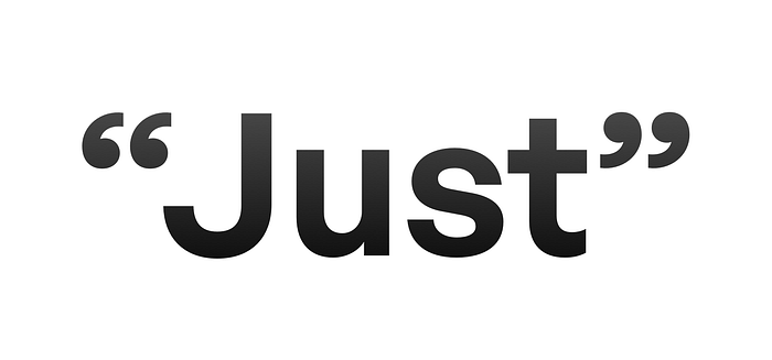
They missed the word "Just"
Because design obviously also is what it looks and feels like. It's a combination of the three. It has to work, obviously, but the way it looks and feels also works on our emotional levels.
It can bring joy, or just get the job done.

Everything becomes a tool. Functional and nothing else.
False premise of getting a job done
Many senior designers keep saying your app is supposed to "get a job done" and get out of the way. Only add the necessary. Make it faster. Easier. More streamlined. Everyone needs to have the task they wanted completed ASAP.
Let me ask you a question then:
If we're so obsessed with getting those "tasks done", we should have a lot of free time now, right? Yet we still spend on average 5 hours on our devices each day. Extreme users spend up to 9.
So which is it?
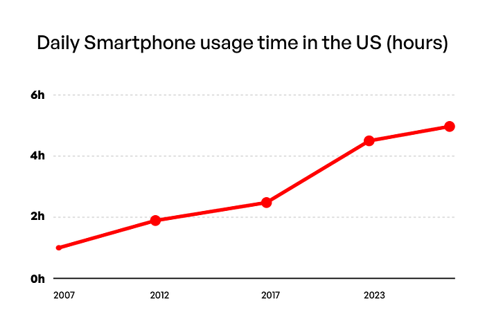
And if we're spending so much time looking at something, then the way it looks and feels becomes increasingly important.
Especially when you compare it to all those "just gets task done" kind of products. They were surely auto-layouted and drag and dropped and design-systemized. Under fluorescent lighting multi-person teams debated design tokens and variants and documentation.
It took weeks to deliver a simple form. With a badly aligned button to boot!
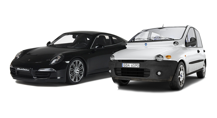
Both products deliver you from A to B. Yet most people choose the Porsche if they can afford it.
This is the last example, I promise!
Why do people buy a Porsche instead of a Fiat Multipla? Both are cars. Both get you from A to B. Both get "a task done". Multipla is also likely more fuel-efficient so it will get you to point B cheaper.
This is where the hypocrisy of "task doners" unfolds. Manyh of those design system obsessed people have designer glasses, a MacBook, stylish clothes.
Yet they keep their design a sterile set of stacked boxes.
Sterile. Auto-Layouted. The same.
This ends now!
There was a huge fear that eventually we'll all be replaced by AI. There's very little innovation in design right now.
If you think about it, we're still using the same login, onboarding, registration patterns we used a decade ago. Our tools got faster and smarter, but the output remained the same.
Having all those heuristics is the perfect scenario for AI to take over. We KNOW how to design most apps. They're the same thing, with minimal changes. Slightly modified logic. Different category. Different font, corner radius, colors.
It says "hug", but it's emotionless…

It's all stacked boxes. That's where AI is heading. From definition to boxes that are actually stacked in code already. Skipping steps. Making that boring work even more efficient.
This is what those systems enthusiasts all wanted.
This path will need a lot less humans to operate. AI is coming for your auto-layouts, variants, boxes. It will auto-document the system. Keep it in check.
Your design system team can shrink from 12 people to just one and be just as innefficient as before.
Good riddance!
The path of delight
But AI also opened a second path. It's not an easy one and I can attest the first month of going down the rabbit hole my health suffered. My HRV, normally around 100, dropped to a mere 80 at night. My resting heart rate went from the 40–41 range all the way to 46.
It may be part obsession and part excitement. Excitement I haven't felt in design since at least 2006.
The path of delight is designers being able to build entire experiences without developers. Sure, they're still limited somewhat and can have severe security issues.
But when done right, it's a superpower we've been asking for forever.
And it completely revolutionized my design process.
Getting from those paper sketches to the coded design required no steps in between.
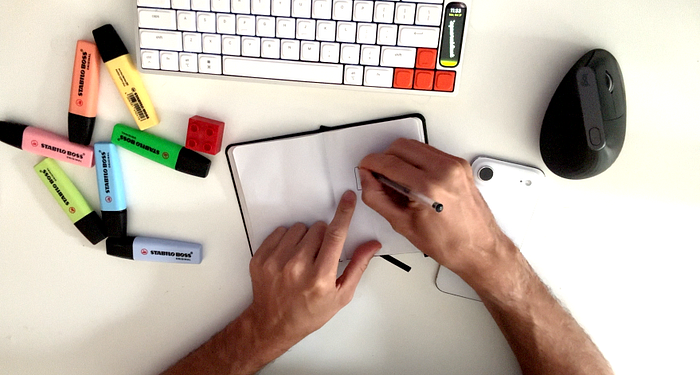
I used to spend a lot of time in high-fidelity design tools. Now I design on paper. Use colors. Enjoy myself. Then my imagination is trained enough already to make that high-fidelity, final UI already in code.
And while building it, I can tweak every little aspect to be perfect. No intermediate approximations.
Exactly. As. I. Wanted.
This approach also makes it more stimulating for my brain. I don't sit all day staring at screens anymore. I design everywhere. Then bring it home to code.
You can just make stuff
Designers are (or at least should be) curious people. Seeing a problem and coming up with a solution. But not just any solution. The first one is usually a simple path from A (problem) to B (no problem).
But then, you can stop and think, what could make this path fun. Some clever idea of showing the app do its thing? Some micro-interaction? UI pattern that's new yet familiar? All of the above?
I started design in 1998. My first real job was in 2001. As a designer I was also responsible for coding the frontend. That was normal back then.
Now it's becoming normal again, because you can augment your skills with technology. Still, to make full use of it you need to learn to code.
But you don't need to be amazing at it anymore. Just good enough is fine.
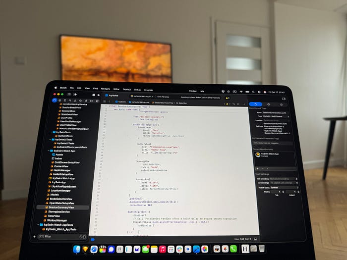
I learned enough SwiftUI to manually code the UI
Yes. I believe designers of the future should code. The split between designers and frontend developers was purely artificial. It led to misunderstandings and to people who don't love design building that design.
Of course it was rarely delightful!
The new process
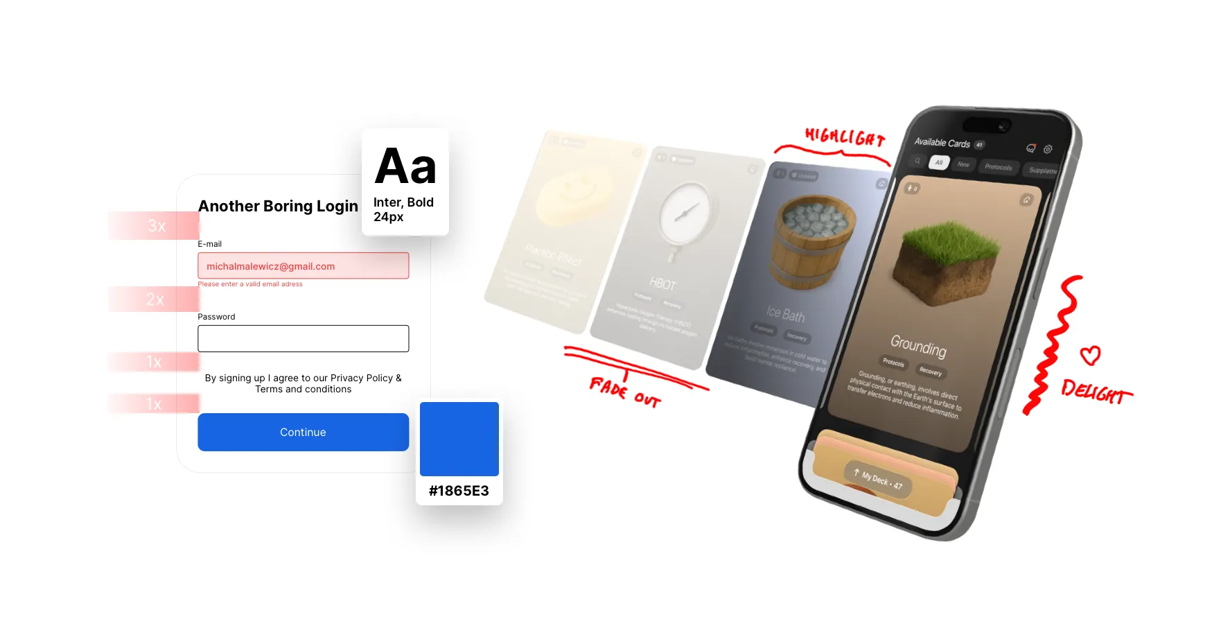
I have built a mobile app for the iPhone. It has over 3000 users and so far people love it. But what's interesting about it, they also feel that it was made with love.
It's not an app anymore, it feels like a product made with true passion. Often with purpose beyond the typical.
Non typical UI with cataloging content in a bottom stack.
What's the typical app purpose?
Ok, let's take a little break here because this is important! People use apps, we all know that. They use them because they need them. But there is a very high awareness nowadays from the users.
They know what the purpose of those apps is.
They know they data-mine them. They know they hack their attention and dopamine levels. They know some apps use dark patterns to trick them into purchases they don't need.
And it makes some sense, right? Making an app consumes time, money and energy. It has to make a lot of money back, otherwise it wouldn't exist.
Being able to now build an app alone, without a budget can obliterate that barrier. You don't HAVE TO be sneaky and abuse your users anymore!
Not always. Of course solo founders still need to make money. But over the top monetization may not have to be the priority for all products anymore.
I built this primarily for myself. Then for others.
You're not the user?
I will publish a full case study on how Longevity Deck came to be. There's an old UX fallacy, that you shouldn't design "for yourself" because you're not the user.
While the idea has good intentions, it's now becoming increasingly obsolete. Do instagram designers not have instagram accounts? Do Apple designers not use iPhones and the built in apps?
Of course you're the user. You're ALSO the user.
Just not the only one.
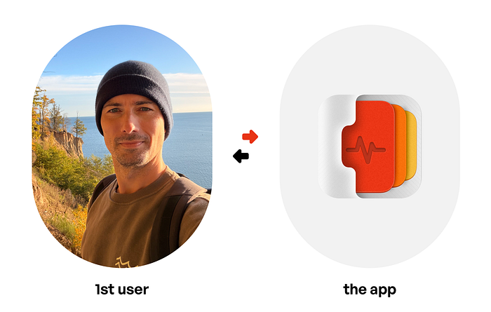
This app is my personal experience. And I share it with others, but it's primarily built for me.
Deeply personal experiences
But what if you could be the only user at first. With the time and money problems solved, you don't have to be as cautious.
You can just build stuff for yourself.
Things you genuinely need. Of course, if you're a designer, you'll still keep general usability in mind anyway. But imagine for a second you're the ONLY user.
How would you design your app then? How would you make it so that using it makes you smile? Think outside of the box. We don't need to stack them anymore.
Exactly!

Design and code, together.
I had a problem
I'm really deep into longevity and wellness. I watch all the Hubermans, Attia's, Patrick's and more. I listen to podcasts during my runs or bike rides.
My current protocol is 52 different things. I don't do all of them daily, of course, but I generally do fifty two wellness oriented things.
How can I keep track? What if something changes?
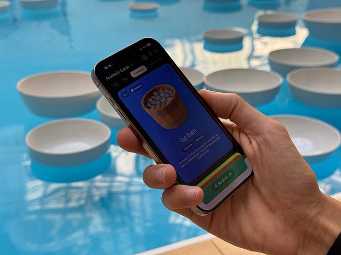
I love using a Sauna, and recent Tim Ferriss podcast revealed a new study that caps the beneficial Sauna temperature at 98°C. I've often been in Saunas of 105–110°C thinking it's just more beneficial. Turns out not necessarily.
How could I ensure that when studies like this get discussed, I'll get notified?
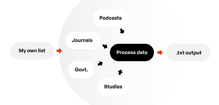
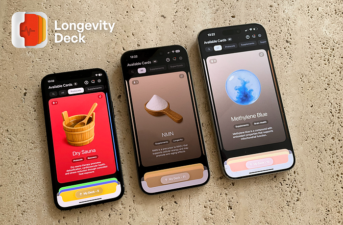
So I built a tool.
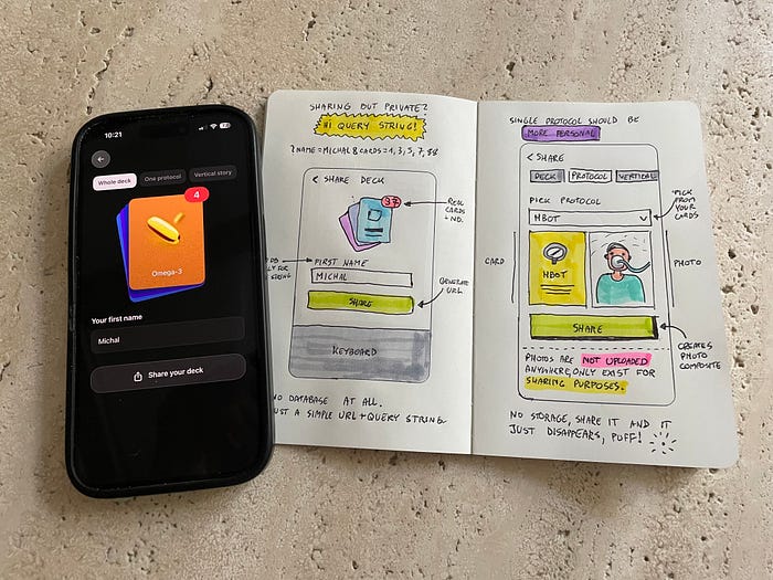
At first it was a bot that scanned pubmed and a couple other places + a handful of podcasts for a short list of my most used protocols.
It spits out a .txt file with recommendations, benefits, risks and a special field for what new thing was discovered recently.
Once I got the data back I instantly thought I need to organize it.
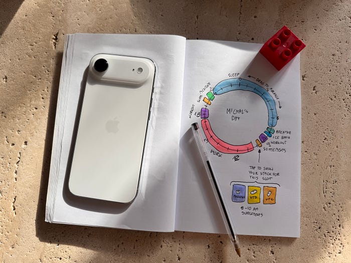
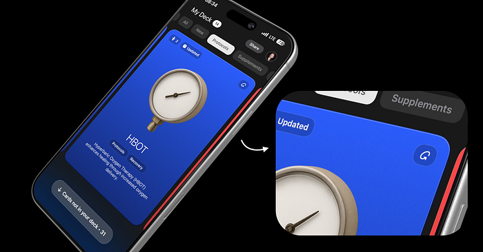
I thought of collecting my protocols like I used to collect Magic: The Gathering cards as a teenager. Building a personal deck. But this time, when a card gets an upgrade, you don't need to re-buy it.
It auto-updates in your deck.
That led to quick prototyping on paper, and then right in code. The tilting and swiping interaction was only natural. You slide a card into your deck.
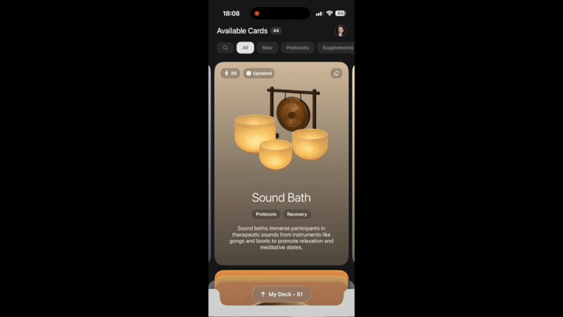
Every part of this was perfectly timed. The haptic buzz when the bottom deck reshuffles happens at the exact, expected time when you hold it in your hand.
Delightful
This app is full of stuff like that. Little reshuffle of the deck once you add a new card. A haptic buzz followed by a pleasant ding when you add a new protocol. The way the inner-highlight of the card is 1px off on the Y-axis but only on the Y-axis. Making a beautiful, realistic edge of the card.
The noise texture, the subpixel shifting of elements. It all adds up.
And there was no developer anywhere in sight to tell me it can't be done. Or that it's a waste of time.
Notice the 1px off highlight line on top of the card that fades out and closer to the edge when it moves along the right side of the element. This is the kind of details I meant.
I literally did 59 screen recording videos to precisely track how going back to the deck slides the card up into a carousel. Turned out the movement had to be capped at exactly 31 pixels. Not 30. Not 32.
It just looked unnatural otherwise. And almost nobody (but me) would notice that. I spent a whole day to arrive at 31 pixels.
The future?
The future of design is going to be both boring and exciting. Some will still be stacking boxes. They'll do it way faster and most of their friends will not be helping.
AI will be doing most of that.
But on the other hand, solo people with a vision will be making that vision a reality. Unique, weird, fun, playful. Delightful experiences are coming back big time!
We're in for a treat!
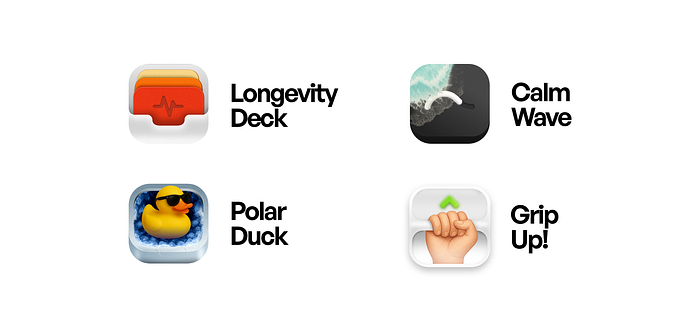
I'm making 4 wellness oriented mini apps right now. And even the icons are unique, going back to skeuomorphism and skipping what everyone expects.
And yes, having more people able to deploy apps will also increase the amount of bad ones. But that's a price I'm willing to pay to get access to true gems.
Because passion transcends design. And design without time and money constraints gets much closer to art again. And you know what?
I think it's where it should've been.
We have devices powerful enough to run Liquid Glass without hiccups. We can merge that with countless other UI ideas. The world is our playground.
We don't have to be component assemblers. Let's be builders instead!
No limits!
What's Your Reaction?
 Like
0
Like
0
 Dislike
0
Dislike
0
 Love
0
Love
0
 Funny
0
Funny
0
 Angry
0
Angry
0
 Sad
0
Sad
0
 Wow
0
Wow
0


