![[VIP] Unlimited Pass 2026.02.26](https://i.pinimg.com/1200x/d2/f8/2e/d2f82e903b9ca33b0f13704cc85a3d8a.jpg)


![[LS] ls.graphics Pass 2026.02.16](https://i.pinimg.com/1200x/8d/ca/7f/8dca7ff72d8b698f955649340d0ff398.jpg)

![[PRO] Craftwork Pass 2025.06.11](https://i.pinimg.com/1200x/98/d2/f0/98d2f0169226b431f4727441ecc6aa06.jpg)


![[VIP] Ayaka: Framer Resume Template](https://i.pinimg.com/1200x/e3/4b/e5/e34be51c350167296d4418093442ec56.jpg)
![[VIP] Starvy: Technology Website Template](https://i.pinimg.com/1200x/ee/3e/84/ee3e84e02bb1553898bfb05a4ed14b9f.jpg)
![[VIP] Atoks: Mobile App Landing Page](https://i.pinimg.com/1200x/70/c0/4c/70c04cad791f8c08410bb911b0e7f8bb.jpg)


![[VIP] Zyra: Coded Chat AI Dashboard](https://i.pinimg.com/1200x/ce/7b/92/ce7b926f22423fc046659dfe1dd7a604.jpg)
![[$] AlignUI: Code Library](https://i.pinimg.com/1200x/8d/91/1c/8d911c0a22483842cff69c130e80c37b.jpg)
![[VIP] Briefberry: AI Brief Generator Tailwind Kit](https://i.pinimg.com/1200x/71/9a/ff/719affec4372e4a8b1cda6e8702e7510.jpg)

![[VIP] Solaris: Sales Forecast & Pipeline Review Deck](https://i.pinimg.com/1200x/ba/7c/48/ba7c485ac40a51054cf9074aead204e2.jpg)
![[VIP] Brand Guideline Presentation](https://i.pinimg.com/1200x/64/87/a7/6487a7c4da21072150a1664f83a6a234.jpg)
![[VIP] SaaS Pro: Presentation](https://i.pinimg.com/1200x/d5/75/dc/d575dc20daed5af02a08ed54d53ce7f5.jpg)


![[LS] iPhone 17 Mockup](https://i.pinimg.com/1200x/18/42/c1/1842c11e3da971765bdcfbc5315f3df8.jpg)
![[LS] iPhone 17 Pro Max Mockups](https://i.pinimg.com/1200x/f0/2a/72/f02a724ed9f52ac4a1c66b5614809111.jpg)
![[LS] AE-Mockups, Apple Devices](https://i.pinimg.com/1200x/03/04/9b/03049ba79acaa546ae6389639f89bcc1.jpg)
![[LS] MacBook Air M2 Looped, Animated Mockups](https://i.pinimg.com/1200x/76/d9/0a/76d90af27052b69cb561a098cd1907a6.jpg)


![[VIP] Volnitsa: BLNDR MINI (2025)](https://i.pinimg.com/1200x/c3/f7/0a/c3f70ae1126be5c0af1977e58b56ba7a.jpg)


![[VIP] Unreal Engine Motion](https://i.pinimg.com/1200x/0e/be/6d/0ebe6d869b80651630b75fa8cdc09684.jpg)
![[VIP] Rive: Interactive Motion](https://i.pinimg.com/1200x/47/48/01/4748017b137668d1de75c2eac05b2577.jpg)

![[VIP] Memorisely: AI Prototyping in Figma Make](https://i.pinimg.com/1200x/4d/f1/eb/4df1ebfd0ebaeeb2e48ac24950a74b92.jpg)
![[VIP] Animations on the web](https://i.pinimg.com/1200x/8b/f1/e4/8bf1e43af3c14a8c28cde0210b6b3075.jpg)
![[VIP] Motion Master School: Rig Master](https://i.pinimg.com/1200x/45/7b/a3/457ba3d64d972c056b42136c58376271.jpg)
![[VIP] React Three Fiber: The Ultimate Guide to 3D Web Development](https://i.pinimg.com/1200x/78/02/1f/78021ffdfc8113cc8caba5b2c563ead4.jpg)
![[VIP] Ryan Hayward: Ultimate Framer Masterclass 3.0](https://i.pinimg.com/1200x/48/d6/3f/48d63f9723d7c49e6c34c182557c7431.jpg)


![[VIP] Whoooa! 156 vector Lottie animations](https://design.rip/uploads/cover/blog/whoooa-156-vector-animations.webp)


![[VIP] Staff Product Designer (ENG, RUS)](https://i.pinimg.com/1200x/0c/52/a0/0c52a08d8b0a25329806437933cf538f.jpg)


![[VIP] Products People Actually Want](https://i.pinimg.com/1200x/4e/aa/f9/4eaaf9c3961559a9bba223a33c5e6d19.jpg)
![[VIP] Imperavi: Web Interface Handbook [Dec 2025]](https://i.pinimg.com/1200x/5b/78/97/5b789780cffe796d3e8b4c7b98367391.jpg)


How Apple fooled users with fake infinite scroll
Why your iPhone's date picker was never infinite.

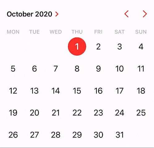
You've probably scrolled through Apple's date picker thousands of times and spun the satisfying wheel with your finger, selected years that stretch endlessly into the past and future. It was infinite.
For over a decade, Apple's most iconic interface elements operated under technical constraints disguised as limitless experiences. The data and time pickers that defined mobile interaction weren't infinite at all. They were engineered illusions that transformed hardware limitations into psychological breakthroughs.
Recently, I came across a social media post on how the alarm clock app is actually a long list of numbers rather than an infinite scroll.
It still amazes me to this day that all these years, I thought the time picker was infinite.
How did Apple achieve this illusion?
As designers, we study these interfaces for more than their visual elegance but to understand the mechanism behind their success. Apple took the iPhone's most restrictive technical constraints and made them feel like features.
Constrained innovation
Apple's wheel pickers emerge from desperation, not inspiration. The original iPhone launched in 2007 with 128MB of Ram. To put this into perspective, modern iPhones have 128 times more memory. Every UI element had to justify its memory footprint or risk crashing the device.

Traditional desktop date pickers used dropdown menus with hundreds of options. This approach would consume precious memory loading year lists, month arrays, and day calculations. Apple needed something that felt rich and interactive while operating within severe technical boundaries.

The solution at the time seemed simple:
Wheel interfaces that simulated infinite scrolling within finite memory constraints.
Users could spin through dates and times with satisfying momentum, but Apple controlled what data existed in memory at any moment.
- It really happened! Someone made it to the end of the iPhone alarm time picker
- Turns out the picker is just a super-long list and not a circular digital dial.
Art of deception
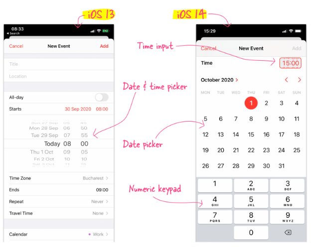
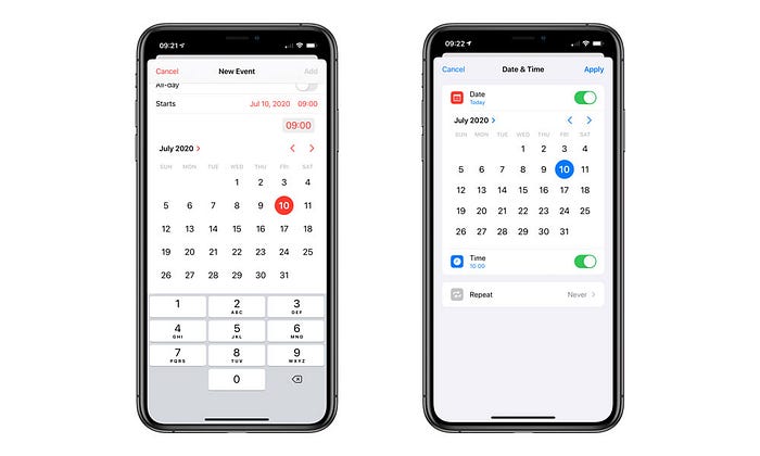
With the release of iOS 14, Apple has changed its iconic date & time picker. For thirteen years, these wheel interfaces defined mobile interaction patterns across the industry. The original wheel pickers felt boundless but actually operated within strict memory and performance constraints.

Apple's engineering team created what appeared to be infinite scrolling:
- Dynamic range generation: Only dates within a practical range (typically 50 years past and future) existed in memory
- Lazy loading boundaries: Additional date ranges loaded seamlessly as users approached limits
- Momentum simulation: Physics calculations that made wheel interactions feel realistic while consuming minimal processing power
- Boundary masking: Subtle resistance and visual cues that made technical limits feel like natural stopping points
The psychology of perceived infinity
Human perception operates through a phenomenon called boundary perception, where our brains naturally segment continuous experiences into discrete chunks. Research in cognitive psychology shows that boundaries shape how we understand and remember both spatial navigation and temporal events. Our minds naturally excel at detecting when one thing ends and another begins, but they also fill in gaps when boundaries aren't clearly defined.
Source: mobiscroll
Perceptual boundary masking exploits this cognitive phenomenon by deliberately obscuring interface boundaries. When designers create smooth transitions between constrained sections, users' brains interpret the experience as continuous rather than segmented. This technique works because overly complex and cluttered interfaces can overwhelm users, which leads to confusion and frustration, so subtle boundary treatment improves usability.
Apple became masters of this psychological sleight of hand. Their date pickers contained hard technical boundaries disguised as natural stopping points. Users never question why the calendar seems to resist scrolling beyond certain historical dates because these constraints feel logical rather than artificial.
"Efficient navigation from one place to another is facilitated by the ability to use spatial boundaries to segment routes into their component parts." - Cognitive Psychology Research, University of Iowa
The psychological principle underlying this deception is cognitive closure, where interfaces provide consistent interaction patterns, and users extrapolate those patterns infinitely.
If you can scroll smoothly through months and years with realistic momentum, your brain assumes this capability extends indefinitely. Apple essentially exploited several cognitive biases to strengthen this illusion.
- Availability heuristic: Users primarily select dates within a few years of the present. Apple optimized the picker for this common usage, making the most frequent interactions feel most natural while hiding constraints at the edges.
- Boundary rationalization: When users encountered resistance at extreme dates like scrolling centuries into the future, they attributed this to logical constraints rather than technical limitations. The year 1850 feels like a reasonable lower bound for most tasks.
- Temporal anchoring: People naturally anchor date selection around the current time. Apple leveraged this by making dates near the present feel most responsive, while gradually introducing subtle friction at chronologically distant dates.
The Time Picker's visual constraints
Apple's time picker demonstrated sophisticated constraint masking. Kinesthetic feedback loops made digital time selection feel like manipulating physical clock mechanisms. When you flicked the time wheel, momentum carried your selection with realistic deceleration that consumed significant processing power.
Source: github
Minute increment boundaries: the picker defaulted to 5-minute increments to reduce data points while allowing precise selection when needed.
Rather than storing every possible minute (00, 01, 02, 03… 59), Apple defaulted to 5-minute chunks (00, 05, 10, 15… 55). This reduced the data points by 80% while still feeling precise to most users. If you needed exact minute precision, you could tap and get 1-minute increments, but most people never did.
AM/PM transition smoothing: When the time wheel crossed from 11:59 PM to 12:00 AM, the system had to:
- Switch the date forward by one day
- Update any calendar-related displays
- Recalculate memory allocations for the new date
- Handle timezone considerations
This was computationally expensive, so Apple added special smooth animations and extra tactile feedback at midnight boundaries. Users interpreted this as natural resistance when crossing day boundaries, not recognizing the technical complexity happening underneath.
But then a new problem arises.
How might we handle the transition from 11:59 PM to 12:00 AM without breaking the illusion of continuous time?
This transition required recalculating date values, updating day displays, and managing memory for two different calendar days simultaneously.
Apple's solution used temporal transition masking. The interface provided extra tactile feedback and slightly slower scrolling around midnight boundaries. Users interpreted this as natural resistance when crossing day boundaries rather than recognizing the computational complexity underneath.
Memory management as design philosophy
Cognitive load theory explains why Apple's constrained pickers felt more natural than unlimited alternatives. Unlimited choice creates decision paralysis and cognitive overhead. By constraining options to practice ranges, Apple reduced mental effort while maintaining the perception of limitless choice.

Source: yourmarketingrules
Barry Schwartz's research revealed something counterintuitive:
Giving people more choices often makes them less happy with whatever they choose.
Here's how it works:
- When you have 3 date options, you quickly pick one and feel satisfied
- When you have 300 date options, you spend more time deciding, worry you're missing something better, and feel less confident about your final choice
- Even if you pick the objectively "best" option from 300 choices, you feel worse than someone who picked a "good enough" option from 3 choices
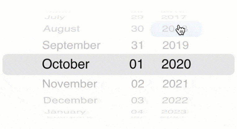
Apple's Application: Instead of showing you every possible date from 1 AD to 3000 AD, Apple's date picker only showed practical ranges, maybe 1900 to 2050.
You never felt constrained because:
- You didn't need to pick your birthday in the year 847 AD anyway
- The range felt complete for real-world tasks
- You spent less mental energy on the decision
- You felt more confident in your selection
Apple eliminated choices you didn't want anyway, but you experienced this as having "all the options you need" rather than being limited.
Don't show people everything at once; reveal options as they demonstrate they need them.
How it worked in Apple's picker:
- Level 1: You see the current year and a few years before/after
- Level 2: If you scroll toward the edges, more years gradually appear
- Level 3: Only if you keep scrolling do you reach the actual boundaries
- Hidden Level: You never see the technical constraint message "Sorry, this picker only goes back to 1901."

Source: stackoverflow
Why this felt natural:
- Most people pick dates close to today (birthdays, appointments, recent events)
- By the time you reached unusual dates (like 1850), you were already deep in exploration mode
- The gradual resistance felt like natural stopping points, not artificial limits
Think of it this way, it's like a helpful librarian who brings you the books you're likely to need, then fetches more specialized books only if you ask, rather than dumping the entire library on your desk.
These principles work together to create what psychologists call "choice architecture," which is designing how choices are presented to guide people toward better decisions with less effort.
Final thoughts
Apple's constrained date and time pickers reveal a fundamental design philosophy that is to navigate constraints and transform limitations into features. What began as desperate workarounds for severe memory constraints became defining patterns that shaped mobile interaction for over a decade.
The wheel interfaces that felt infinite were actually finite. The smooth scrolling that seemed effortless required careful engineering. The natural interactions that felt obvious were highly designed. This represents the highest achievement in interface design, where technology that works exactly how your brain expects it to work, even when your expectations exceed what the technology can actually deliver.
For designers, Apple's approach offers insightful lessons about the relationship between constraints and creativity. Technical limitations don't have to feel limiting when you understand human psychology.
Transform technical constraints into psychological features. Make limitations feel intentional rather than restrictive. Create the perception of boundless capability within bounded systems.
Users don't want unlimited options. They want the feeling of unlimited possibility within manageable boundaries.
What's Your Reaction?
 Like
4
Like
4
 Dislike
0
Dislike
0
 Love
0
Love
0
 Funny
0
Funny
0
 Angry
0
Angry
0
 Sad
0
Sad
0
 Wow
4
Wow
4