
![[VIP] Unlimited Pass 2026.03.27](https://i.pinimg.com/1200x/d2/f8/2e/d2f82e903b9ca33b0f13704cc85a3d8a.jpg)


![[LS] ls.graphics Pass 2026.02.16](https://i.pinimg.com/1200x/8d/ca/7f/8dca7ff72d8b698f955649340d0ff398.jpg)

![[PRO] Craftwork Pass 2025.06.11](https://i.pinimg.com/1200x/98/d2/f0/98d2f0169226b431f4727441ecc6aa06.jpg)


![[VIP] Creovo: Creative Portfolio](https://i.pinimg.com/1200x/92/5d/39/925d39b614ae4e39adda25b73837f82b.jpg)


![[VIP] Voltz: Electric Car Website Template](https://i.pinimg.com/1200x/03/ba/41/03ba41513483727fcd26b95349750783.jpg)
![[VIP] Zyra: Coded Chat AI Dashboard](https://i.pinimg.com/1200x/ce/7b/92/ce7b926f22423fc046659dfe1dd7a604.jpg)
![[$] AlignUI: Code Library](https://i.pinimg.com/1200x/8d/91/1c/8d911c0a22483842cff69c130e80c37b.jpg)
![[VIP] The Grid Deck Template](https://i.pinimg.com/1200x/f2/df/6d/f2df6d865d31ed4400ddd74137a5a79e.jpg)

![[VIP] Solaris: Sales Forecast & Pipeline Review Deck](https://i.pinimg.com/1200x/ba/7c/48/ba7c485ac40a51054cf9074aead204e2.jpg)
![[VIP] Brand Guideline Presentation](https://i.pinimg.com/1200x/64/87/a7/6487a7c4da21072150a1664f83a6a234.jpg)


![[VIP] 44 Device Mockups: Metal Scene Pack](https://i.pinimg.com/1200x/96/0c/c4/960cc4d39f6f9f08c4ba4a40ae740a65.jpg)
![[LS] iPhone 17 Mockup](https://i.pinimg.com/1200x/18/42/c1/1842c11e3da971765bdcfbc5315f3df8.jpg)
![[LS] iPhone 17 Pro Max Mockups](https://i.pinimg.com/1200x/f0/2a/72/f02a724ed9f52ac4a1c66b5614809111.jpg)
![[LS] AE-Mockups, Apple Devices](https://i.pinimg.com/1200x/03/04/9b/03049ba79acaa546ae6389639f89bcc1.jpg)


![[VIP] Volnitsa: BLNDR MINI (2025)](https://i.pinimg.com/1200x/c3/f7/0a/c3f70ae1126be5c0af1977e58b56ba7a.jpg)

![[VIP] React Three Fiber: The Ultimate Guide to 3D Web Development](https://i.pinimg.com/1200x/78/02/1f/78021ffdfc8113cc8caba5b2c563ead4.jpg)
![[VIP] Ryan Hayward: Ultimate Framer Masterclass 3.0](https://i.pinimg.com/1200x/48/d6/3f/48d63f9723d7c49e6c34c182557c7431.jpg)


![[VIP] Whoooa! 156 vector Lottie animations](https://design.rip/uploads/cover/blog/whoooa-156-vector-animations.webp)


![[VIP] Staff Product Designer (ENG, RUS)](https://i.pinimg.com/1200x/0c/52/a0/0c52a08d8b0a25329806437933cf538f.jpg)


Breaking design rules for higher conversion
Breaking design rules can sometimes lead to higher conversion rates by creating more engaging and memorable user experiences. This can involve unconventional layouts, bold color choices, or unexpected interactions that capture attention and encourage users to explore further.

Times change. While a lot of design stays universal, new challenges may require unusual approaches. Our recent Squareblack redesign is an example of this.
There are a few cases, where I broke my own design rules. Ones that I’ve been teaching for the last 5 years. Does it mean those rules don’t apply anymore?
No.
It means, that for this specific scenario going outside the comfort zone ends up being an improvement. I’ll walk you through our header redesign, annotated and explained.
We’ll also briefly look at the pricing section that has an important disclaimer.
You can also go watch it in video form to see the other website sections annotated.
The result was a 3x increase in client calls booked through the website and 1.5x increase in closed deals. How did this happen?
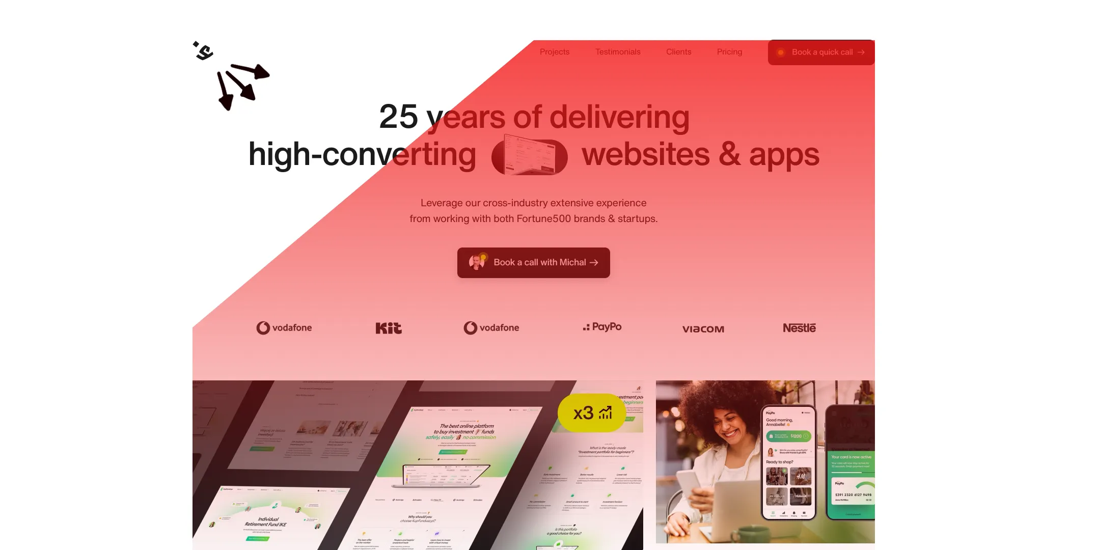
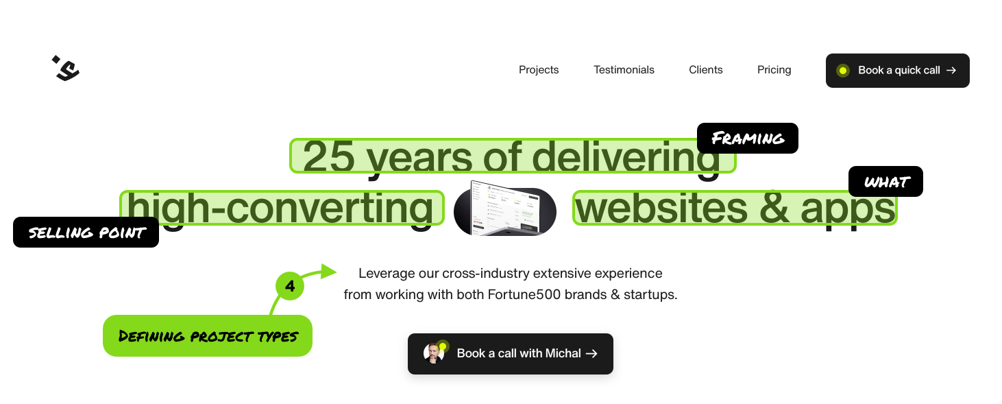
The header
First unusual thing is a much simplified logo with a right-aligned menu. That shifts the entire weight of the website to the right. If you follow an F pattern your eye has nothing to go back to on the left side.
Resulting in a modern, sloping F, but also less time to process the center information. Think of it this way:
The core of the content at first is in the center, but you’re being “pushed” to that center a little harder because our brain naturally skips over the empty space on the left. It’s subtle, but I love how it works.
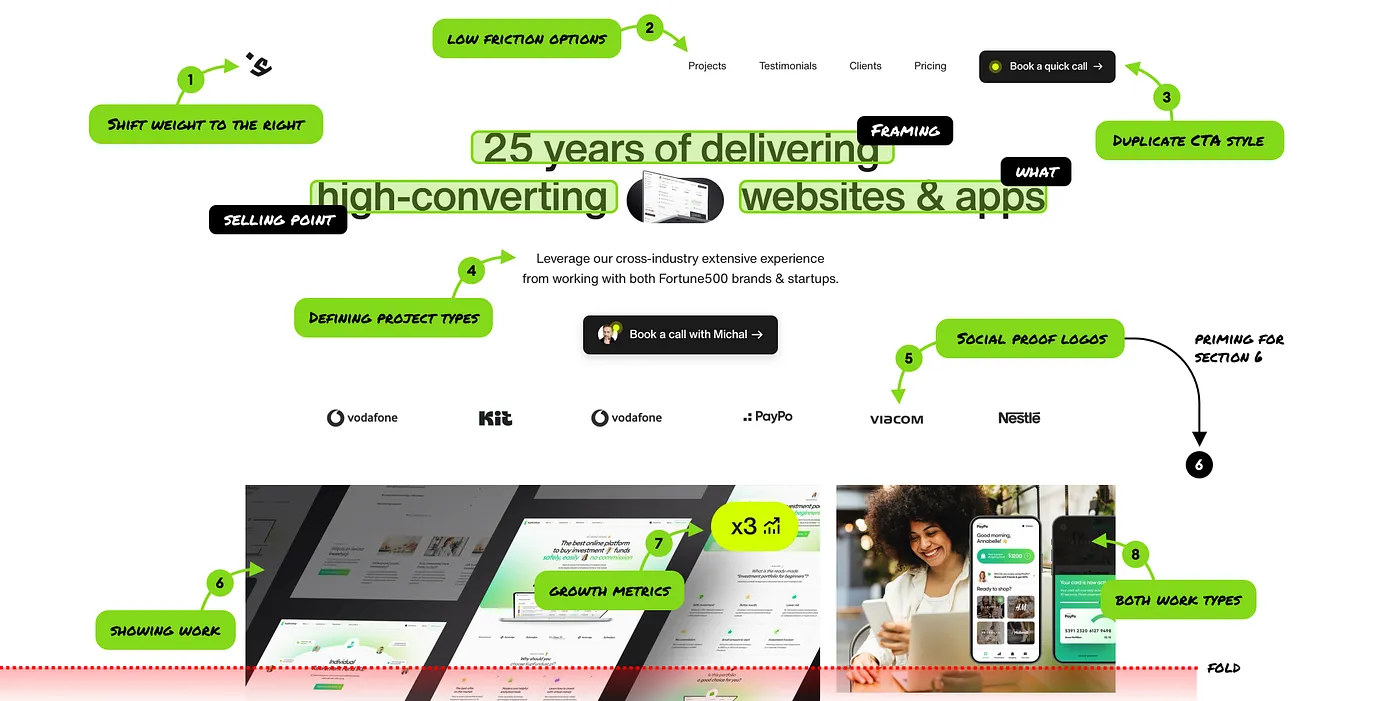
We already covered shifting the weight to the right (1), so let’s talk about friction. Many agencies focus on huge, complex menus. I’ve seen ones that had ALL their used UX methodologies outlined in the main menu.
Sure, it’s for SEO, but to clients it’s confusing. And Google bot is not your client. We skipped some sections (like FAQ) on purpose from the main menu. It’s there, on the page, but it’s not the main focus. If you’re interested and have questions, you’ll get to that section anyway.
Instead we focused heavily on the exact part that clients are looking for. What the agency did. Who did they work for (testimonials). What projects they did (clients) and how much does it cost (pricing).
I’ve been talking A LOT about not duplicating the CTA buttons in the header. Or at least, not duplicating them visually. If you have one, strong CTA in the center of the page, keep the top-right one less visible. It can then make itself more prominent as you scroll.
Here we broke that rule on purpose and initial tests confirmed that it works.
In our case the action is rather low friction. You don’t “pay” for anything just yet, just schedule a call. It does redirect you to information that the minimum project budget is $10K, and then you confirm.
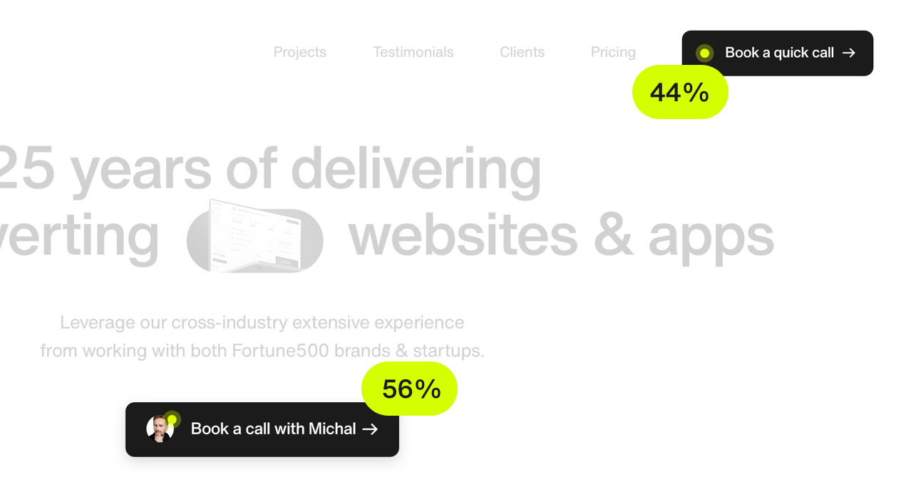
It also may have something to do with the overall shift of the header layout to the right. Those two buttons get roughly a similar number header of clicks (44% and 56% respectively).
The copy
We have the unique advantage of being in the industry since 1998. This is used as framing (priming) the client. This comes from a lot of client conversations and believe it or not, but the main reason why this works is not as obvious.
I was always thinking that it’s about doing stuff for a long time. But most of our clients either directly or indirectly said, that if we “exist” in the industry so long, that means we know what we’re doing.

Many companies achieve stellar growth for a few years and then go bankrupt. This shows perseverance. Fighting the odds. And of course the experience itself also doesn’t hurt.
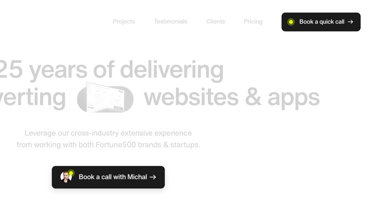
Then we focus on our selling point. Our work is a blend of beautiful and high converting. But to the client, beautiful is a secondary (and highly subjective) metric.
What they want is conversion. They want more sales, more views, more customers.
More money.
We could’ve gone with “seamless digital experiences” or other pseudointellectual bs jargon. The thing is, those only sound impressive to the AI-era designers. Clients want clarity.
“I want a high converting website, will your agency do the trick?”
If you start with their potential question it becomes a lot more obvious. But I had to dig deeper. I make a lot of videos about website conversion. Our clients naturally assume, that we only do websites.
That isn’t true. We actually did way more mobile apps (100+ designs) than landing pages. So we added &apps to make it clearer.

The first line is something we’re currently tweaking and simplifying. It will change. But the second line here is important.
We show a lot of logos of brands like Samsung, FX Pro or Viacom. To many startups it can send a message we’re out of reach.
To clarify that we added that we work for both big brands (sometimes) and startups (most often).

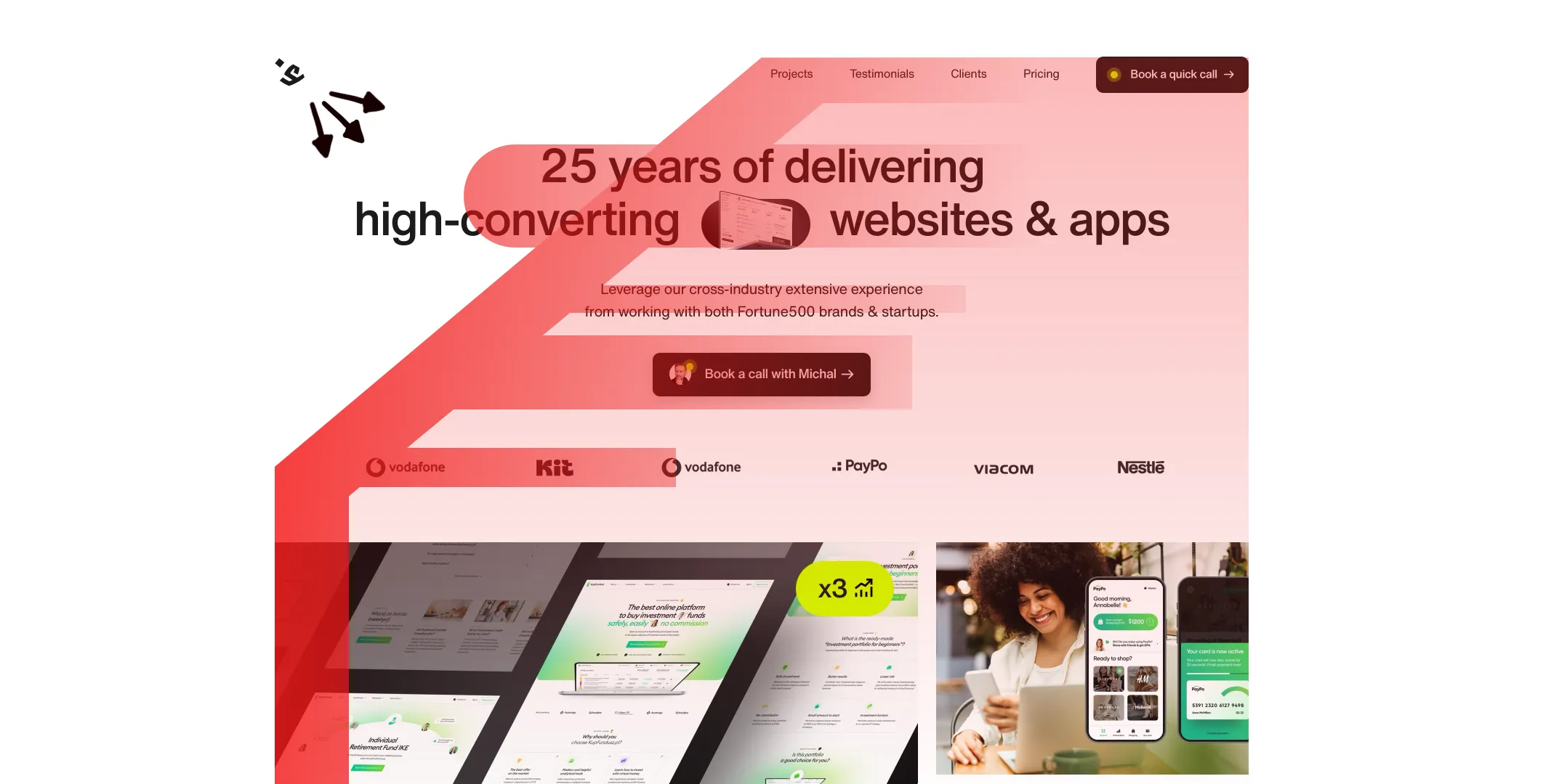
Social proof
Everyone puts logos of brands in the header. If you’re just starting, then of course they’ll likely be startups or even your own sub-brands.
But after a while you may get some known clients in and this causes a new problem.
Some of the work is old (our contract with Viacom happened in 2008–2013) and you don’t really showcase it in the portfolio anymore. Which makes a lot of those logos hard to believe.
And we solved this.
The main carousel has the most known logos going from right to left. But this isn’t the whole story. This is just priming the client for what’s to come.
At this point they may think:
Ok, nice. But is that even true?
Let’s scroll down the page a little to section 6. A section in which we cover what we did for our 50 most important clients.

The clients
Every logo has a story. We wrote down a single sentence talking about what exactly we did for each client. And the list expands into a huge overview of all 50.
We were also completely honest here. For some brands we did a single, small project as a contractor and that was it. But this gives the logo carousel at the top a whole new level of credibility.

The projects
I marked a typical fold on the design in red. There are a couple of interesting things here.
First off, we want the designs to be visible right away, before people start scrolling on desktop (6). We also show growth metrics when available (7).
This year we reached out to all of our clients to get the stats on how they’re doing.
We got enough data back to start compliling full case studies that show these metrics and what we believe contributed to them.
In case of the web platform on the left (kupfundusz), their signups have nearly tripled (2.87x increase) which was in part due to a redesigned and greatly simplified onboarding for beginner investors.
To amplify that we do both apps AND websites, we show one of each above the fold (8).
But there’s one other thing.
Squareblack’s color are green, black and white. To keep the header consistent with our brand, we moved all other colored projects below. If there’s red, orange or blue, it would be too cognitively loaded for the header.

We were lucky to have worked on both a green website and a mobile app (for different clients) and we chose to color-match the header on purpose.
You don’t design for yourself
Every decision in the header and the rest of the website was informed by talking to clients. You don’t even need a complex survey for this. Just talk on a call. Human to human.
I asked what convinced them the most and which parts they found confusing. That last part is supported by the questions they ask me. I compile all those questions together and see where we’re unclear and how to fix that.
The goal is for the client to only have one question: when do we start?
Bonus: clearing doubts
Some clients think I’m some famous YouTuber. Which means I’m just the face of the company, and we outsource the work to some junior designers abroad.
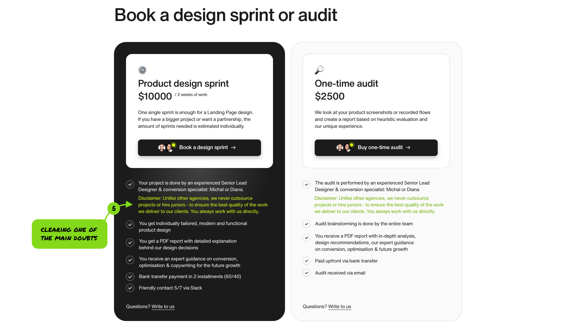
This is a valid concern. On practically every call I get the question: “Will I be working with you?” and the answer to that is always: there’s a 50/50 chance you will.
Because there are two main designers at the company. Me and Diana.
To make it completely clear, we added that, in green to our pricing section. The questions stopped and the number of calls increased. We’re also likely raising our prices soon to keep up with the demand.
As you can see, it’s all about looking at your site from your clients perspective. And for that you need to know who they are and what they’re looking for.
Then redesign your agency website exactly around their needs. That may require breaking some design rules, or letting go of some design trends. Bye bye glassmorphism, you won’t be needed here.
What's Your Reaction?
 Like
1
Like
1
 Dislike
0
Dislike
0
 Love
0
Love
0
 Funny
0
Funny
0
 Angry
0
Angry
0
 Sad
0
Sad
0
 Wow
0
Wow
0


