
![[VIP] Unlimited Pass 2026.03.27](https://i.pinimg.com/1200x/d2/f8/2e/d2f82e903b9ca33b0f13704cc85a3d8a.jpg)


![[LS] ls.graphics Pass 2026.02.16](https://i.pinimg.com/1200x/8d/ca/7f/8dca7ff72d8b698f955649340d0ff398.jpg)

![[PRO] Craftwork Pass 2025.06.11](https://i.pinimg.com/1200x/98/d2/f0/98d2f0169226b431f4727441ecc6aa06.jpg)


![[VIP] Creovo: Creative Portfolio](https://i.pinimg.com/1200x/92/5d/39/925d39b614ae4e39adda25b73837f82b.jpg)


![[VIP] Voltz: Electric Car Website Template](https://i.pinimg.com/1200x/03/ba/41/03ba41513483727fcd26b95349750783.jpg)
![[VIP] Zyra: Coded Chat AI Dashboard](https://i.pinimg.com/1200x/ce/7b/92/ce7b926f22423fc046659dfe1dd7a604.jpg)
![[$] AlignUI: Code Library](https://i.pinimg.com/1200x/8d/91/1c/8d911c0a22483842cff69c130e80c37b.jpg)
![[VIP] The Grid Deck Template](https://i.pinimg.com/1200x/f2/df/6d/f2df6d865d31ed4400ddd74137a5a79e.jpg)

![[VIP] Solaris: Sales Forecast & Pipeline Review Deck](https://i.pinimg.com/1200x/ba/7c/48/ba7c485ac40a51054cf9074aead204e2.jpg)
![[VIP] Brand Guideline Presentation](https://i.pinimg.com/1200x/64/87/a7/6487a7c4da21072150a1664f83a6a234.jpg)


![[VIP] 44 Device Mockups: Metal Scene Pack](https://i.pinimg.com/1200x/96/0c/c4/960cc4d39f6f9f08c4ba4a40ae740a65.jpg)
![[LS] iPhone 17 Mockup](https://i.pinimg.com/1200x/18/42/c1/1842c11e3da971765bdcfbc5315f3df8.jpg)
![[LS] iPhone 17 Pro Max Mockups](https://i.pinimg.com/1200x/f0/2a/72/f02a724ed9f52ac4a1c66b5614809111.jpg)
![[LS] AE-Mockups, Apple Devices](https://i.pinimg.com/1200x/03/04/9b/03049ba79acaa546ae6389639f89bcc1.jpg)


![[VIP] Volnitsa: BLNDR MINI (2025)](https://i.pinimg.com/1200x/c3/f7/0a/c3f70ae1126be5c0af1977e58b56ba7a.jpg)

![[VIP] React Three Fiber: The Ultimate Guide to 3D Web Development](https://i.pinimg.com/1200x/78/02/1f/78021ffdfc8113cc8caba5b2c563ead4.jpg)
![[VIP] Ryan Hayward: Ultimate Framer Masterclass 3.0](https://i.pinimg.com/1200x/48/d6/3f/48d63f9723d7c49e6c34c182557c7431.jpg)


![[VIP] Whoooa! 156 vector Lottie animations](https://design.rip/uploads/cover/blog/whoooa-156-vector-animations.webp)


![[VIP] Staff Product Designer (ENG, RUS)](https://i.pinimg.com/1200x/0c/52/a0/0c52a08d8b0a25329806437933cf538f.jpg)


Is Web Design over?
AI still can’t design. We lost anyway.

Design is over. We lost the battle with AI.
But not in the way you think.
I know this kind of title, this kind of article, will get many people riled up. They'll accuse me of negativity baiting, like they've done many time in the past when I was highlighting some of the bad Figma stuff.
Today none of my Figma criticisms seem controversial anymore, and people are switching to other tools at a rate we haven't seen in years.
Hear me out. I didn't want to write this article. The only reason I did, is that I noticed something bad going on. If we don't stop it, it will soon be too late.
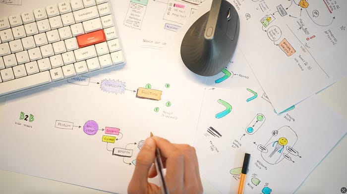
A lot of good design still starts on paper. Even in 2025.
What kind of AI design?
I'm talking primarily about web design here. There are tools out there — mostly for mobile apps — that can use an existing design system to sort-of put together some screens into a flow.
They've been around for a while, and they haven't replaced designers. It's the same with developers using AI tools to do some things faster, but we are nowhere close to them being actually replaced.
Can AI make good design? No. When AI tries to "make" a design it's really bad.
So what happened?
People lowered their expectations of what design is. First designers themselves, then many clients.
It's painful to watch.
Is it over, over? Or just in a bad spot?
There is a tiny path of hope, but only for the very few. I'll tell you what it is at the end. First we need to get through the problem itself.
Once I show you what it is you should be able to start seeing it everywhere. Great! Point it out! Talk about it! Let people know this approach is not what we want.
That may be the only way to reverse it.
Alternatively, you can just do the opposite and become better than 99% of designers pretty easily. Just let them follow that bad path.
Up to you. I chose my side.

301 designs. Only 9 were good.
I recently tweeted two posts asking people to show me their landing page hero sections. Got a combined 301 submissions and went through them all.
First did a manual dive, then used webreview to see if I haven't missed anything. It only confirmed my fears.
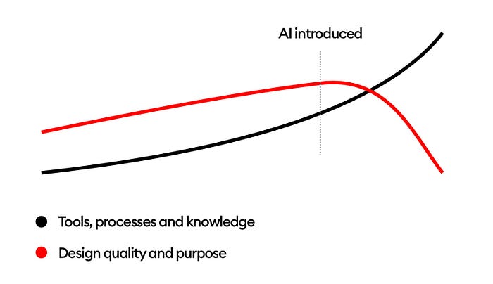
The results were scary.

I really wish for the red part of the graph to be next to 0. But it wasn't.
The Lazy Epidemic
I asked for a single image submission.
5% of people uploaded more than one image. Or a video. Or a figma link.
I know, nobody reads now… but this made me sad. Obviously I skipped all those who didn't read the instructions.

See how the words ONE and WEB are capitalized? Yeah.
Why?
We're losing to AI because it made us lazy. People are unable to read a short, single-paragraph prompt. The word "ONE" image was even capitalized so it's harder to miss.
Yet, many managed to fail even before I had a chance to see their work. In an on-demand, super-fast economy everyone just wants to maximize their chances. Send whatever. Just to be seen.
Maybe that's the personal brand thing everyone keeps talking about. Too bad a lot of that personal brand is AI generated.
Going through the data
Let's divide the analysis into segments. I'll show you red-flag words in the copy that make the design instantly useless. Then we'll go through hero image AI overuse. Then what people think design is — and why they're wrong.
And then we'll talk what is the solution, how to be better than 99% of the industry and avoid falling into the AI-slop trap.

These words combined with completely random, AI images are now commonplace.
Words? I was just doing design.
The main problem is that most design doesn't start with the copy.
Using nonsense words like streamline, empower or seamlessly makes it sound smart but it's the opposite.
Note: I am not trying to shame the people whose work I'm reviewing here. That's why I'm not including their personal information. This is for learning purposes only and I left them the comments under their posts too.
Let's begin.

The top menu in this image can make sense. There likely should be a pricing tab as well but so far so good.
But then it goes right into empowering your business with scalable solutions. There is absolutely no context about how it's empowering the business and with what kind of solutions. Only that they're scalable.
The description doesn't make it any clearer. Boosting productivity, streamlining operations, driving growth. This seems a bit like an "office jargon handbook" page 1.
Then it says it's some kind of innovative software tailored to your business needs. But what kind of needs? It doesn't say. And the app below is a complex system of some kind.
There is no problem and solution here. It just won't work as a website that is supposed to drive sales.
Now as a business, I would have no idea what this app does and why I should care.

Another example also starts with a menu that makes a little sense. Not sure why there are different font sizes for login / contact us and the rest of the menu, but it's not essential.
Once again I was looking to quickly grasp what the business is.
And I got hit with Effortless APIs built to scale seamlessly (again) to millions.
It doesn't say how the APIs are effortless (or what they are). It doesn't specify the millions either. Is it millions of users? Millions of dollars? Millions of watermelons?
The rest of the copy instead of explaining what it does only makes it more complex.
As a user I have no idea what this platform is.
The main CTA is all about entering a wallet address. If you're in any way connected to crypto, you probably know there is no single wallet address. Every blockchain has its own, compatible wallet addresses.
This doesn't say what to enter in the box so likely nobody will enter anything.

You should start your designs with just the copy. No visuals. Then tweak and polish that part until it's great. Only then add the visuals and they have to emphasize the text. Not be random.
Hero image that's a villain
Next to that there are hero images that don't match or complement the copy. So let me repeat.
You write the text FIRST. On a white background. It has to make sense. Clearly talk about what the website does.
Then add visuals.
In some of these examples it's clear it started with an AI image. Then went for AI text. Seamlessly empowering more nonsense.

This example at first glance looks very nice visually. There is structure, rhythm and even a fancy text-behind-image effect.
But when you try to understand it, the whole thing falls apart. You have a register button but no explanation what you're registering to.
There is the brand name in fancy text in the background, but the clients don't care how the company is called. They care how it'll solve their problem.
Then we have a windmill with a missing blade. That won't inspire confidence. AI is usually missing pieces like that. Try generating solar panels and you'll see what I mean.
On top of that, this is not an energy generating kind of windmill. This is a traditional mill, often used to make flour for bread.
How does that fit the theme?
The copy follows the patterns from the other examples. No idea what the product is, what it does and why I should care.
And these were some of the best looking examples.
Is this even design?
When I criticize the copy, many say they didn't do the copy because they wanted to just do the "design".
That shows a lack of understanding of what design is.
Design is NOT the blurry gradient in the background. Design is NOT an AI generated hand, face or light beam.
Design is how you get a user (client) from their problem, to a solution you (or your client) provide.
If your customer comes to your website and has no idea what the product or service is — you lost. You lost both as a designer and as a business owner. The whole reason for most websites to exist is to convince people to buy something.
If they have no idea what that thing is, they're 3 seconds away from closing the tab forever.

How did AI win?
AI didn't really beat us. It made generating seamlessly effortless slop easier. And that made designers lazy, complacent and less innovative.
The solution is easy. Avoid shortcuts and learn actual design. The principles and techniques. The layout. The colors. Typography.
But most of all learn logic. Learn WHY a design exists. Why are we designing this website? What is it for?
Then use AI as a helper, not as a brain replacement.
Don't make it write copy for you, but you can ask it to propose variations of the copy you've written. Or ask it to make it shorter.
And most of all, to know when AI does something badly — and that's most of the time — you need to first know design. If you skip some of the steps you won't be able to spot AI mistakes and the quality of output will get even lower.

You won't hack your way out of this. The best way to learn design is through practice. Guided practice with experts and mentors is the best. Or you can try to do it on your own.
I don't blame beginners for making UI mistakes. They'll learn. But I do criticize the pretenders. Those doing 5 minute "hero sections" with the same seamless copy and AI slop images.
They make it feel like their work is good. Like it has value. That creates a false understanding of design among juniors. It spoils the entire industry. For what? For some clicks on social media?

Yes, pumping out 5 "designs" like this daily is super simple and will get you likes. You'll also completely obliterate reason and logic from the industry.
It will be even easier to stand out when 99% of designers are lazy and low effort. Just be all about actual quality, logic and making sense.
Things that we seem to have lost somewhere along the way.
Let's make it right.
What's Your Reaction?
 Like
0
Like
0
 Dislike
0
Dislike
0
 Love
0
Love
0
 Funny
0
Funny
0
 Angry
0
Angry
0
 Sad
0
Sad
0
 Wow
0
Wow
0


