
![[VIP] Unlimited Pass 2026.03.27](https://i.pinimg.com/1200x/d2/f8/2e/d2f82e903b9ca33b0f13704cc85a3d8a.jpg)


![[LS] ls.graphics Pass 2026.02.16](https://i.pinimg.com/1200x/8d/ca/7f/8dca7ff72d8b698f955649340d0ff398.jpg)

![[PRO] Craftwork Pass 2025.06.11](https://i.pinimg.com/1200x/98/d2/f0/98d2f0169226b431f4727441ecc6aa06.jpg)


![[VIP] Creovo: Creative Portfolio](https://i.pinimg.com/1200x/92/5d/39/925d39b614ae4e39adda25b73837f82b.jpg)


![[VIP] Voltz: Electric Car Website Template](https://i.pinimg.com/1200x/03/ba/41/03ba41513483727fcd26b95349750783.jpg)
![[VIP] Zyra: Coded Chat AI Dashboard](https://i.pinimg.com/1200x/ce/7b/92/ce7b926f22423fc046659dfe1dd7a604.jpg)
![[$] AlignUI: Code Library](https://i.pinimg.com/1200x/8d/91/1c/8d911c0a22483842cff69c130e80c37b.jpg)
![[VIP] The Grid Deck Template](https://i.pinimg.com/1200x/f2/df/6d/f2df6d865d31ed4400ddd74137a5a79e.jpg)

![[VIP] Solaris: Sales Forecast & Pipeline Review Deck](https://i.pinimg.com/1200x/ba/7c/48/ba7c485ac40a51054cf9074aead204e2.jpg)
![[VIP] Brand Guideline Presentation](https://i.pinimg.com/1200x/64/87/a7/6487a7c4da21072150a1664f83a6a234.jpg)


![[VIP] 44 Device Mockups: Metal Scene Pack](https://i.pinimg.com/1200x/96/0c/c4/960cc4d39f6f9f08c4ba4a40ae740a65.jpg)
![[LS] iPhone 17 Mockup](https://i.pinimg.com/1200x/18/42/c1/1842c11e3da971765bdcfbc5315f3df8.jpg)
![[LS] iPhone 17 Pro Max Mockups](https://i.pinimg.com/1200x/f0/2a/72/f02a724ed9f52ac4a1c66b5614809111.jpg)
![[LS] AE-Mockups, Apple Devices](https://i.pinimg.com/1200x/03/04/9b/03049ba79acaa546ae6389639f89bcc1.jpg)


![[VIP] Volnitsa: BLNDR MINI (2025)](https://i.pinimg.com/1200x/c3/f7/0a/c3f70ae1126be5c0af1977e58b56ba7a.jpg)

![[VIP] React Three Fiber: The Ultimate Guide to 3D Web Development](https://i.pinimg.com/1200x/78/02/1f/78021ffdfc8113cc8caba5b2c563ead4.jpg)
![[VIP] Ryan Hayward: Ultimate Framer Masterclass 3.0](https://i.pinimg.com/1200x/48/d6/3f/48d63f9723d7c49e6c34c182557c7431.jpg)


![[VIP] Whoooa! 156 vector Lottie animations](https://design.rip/uploads/cover/blog/whoooa-156-vector-animations.webp)


![[VIP] Staff Product Designer (ENG, RUS)](https://i.pinimg.com/1200x/0c/52/a0/0c52a08d8b0a25329806437933cf538f.jpg)


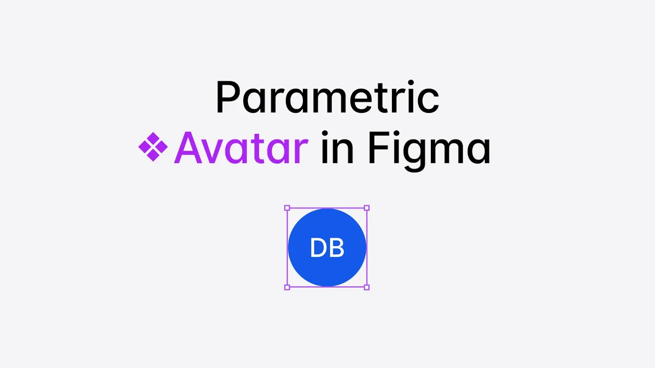
Parametric Tables in Figma
How to create flexible and responsive tables with Figma variables.

Table of Contents
- Setting up Variables for Figma Tables
- Base Variables for Tables in Figma
- Spacing Variables for Tables in Figma
- Column variables for Tables in Figma
- Why Columns Instead of Rows or Grids for Tables?
- Variable Scoping in Figma
- Setting up Table Components in Figma
- Creating a Responsive Table Layout in Figma
- Customizing Table Contents with Figma Components
- Apply Column Variables to the Table Contents
- What are Parametric Components?
- How to Create Parametric Components
- Why Does Parametric Design Matter?
- Conclusion
-
Setting up Variables for Figma Tables
For this approach, we'll use Parametric Variables to create a scale of universal variable parameters that will control how our Table resizes on the canvas.
We introduced the concept of parametric component design there: Parametric Components
But let's get back to our Tables and create a new collection and name it 'Table' (or anything else you prefer).
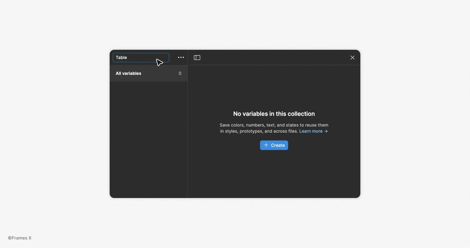
-
Base Variables for Tables in Figma
Now, let's add Base Variables. Base variables will serve as universal size parameters for our Table elements. These parametric variables will apply to the Width × Height of elements and the Font Size of the text.
For Base variables, we'll use a range from 1 to 6, with the addition of two Text Size variables specifically for controlling small and large text sizes of the table.
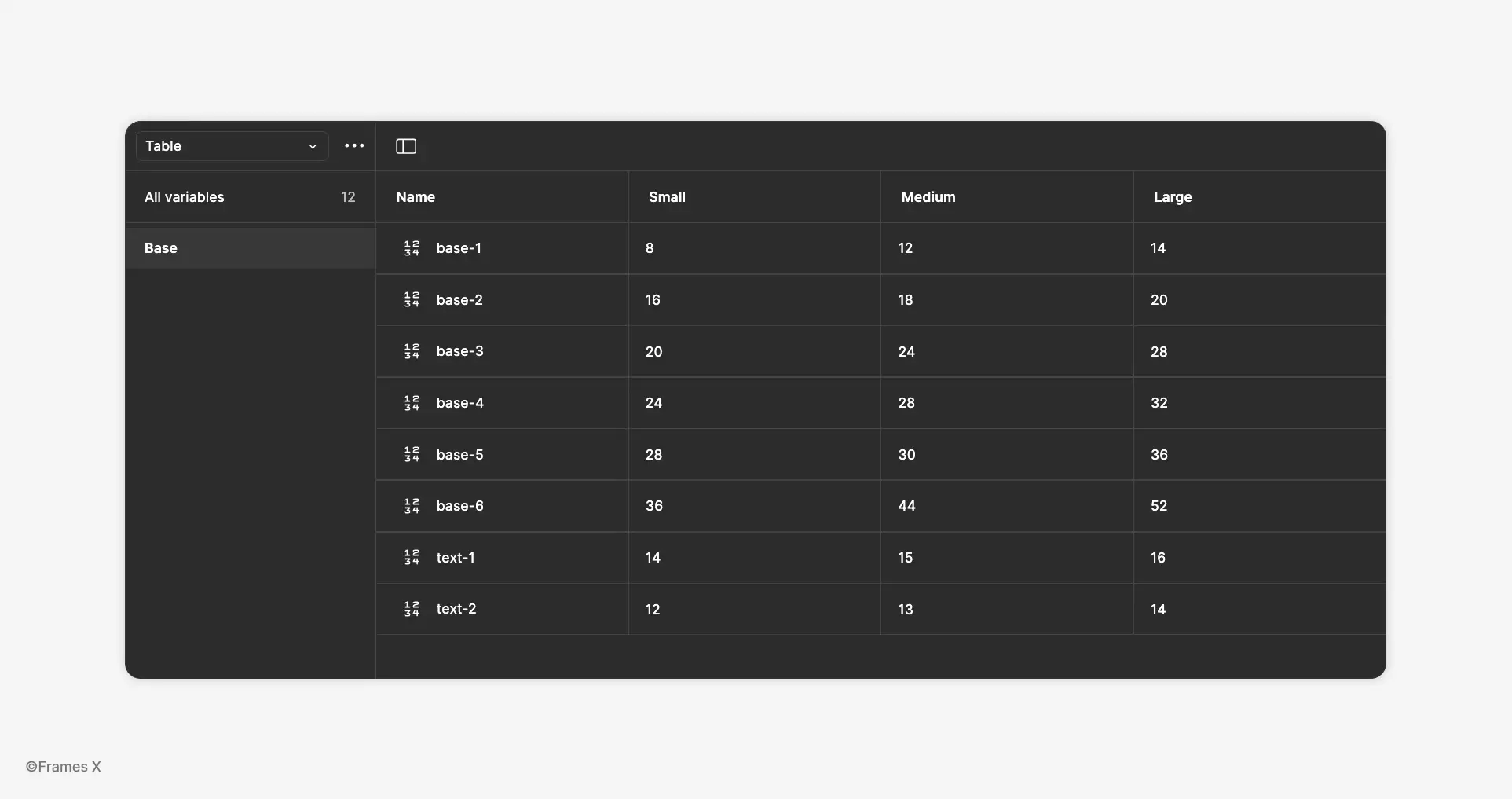
Why use the 1 to 6 range?
Because it's the minimum amount of parameters required to make our tables fully responsive across three main breakpoints: Desktop, Tablet, and Mobile.
For these breakpoints, we'll create three size modes: Large, Medium, and Small. Of course, you can expand this structure with additional variables and modes as your project requires.
-
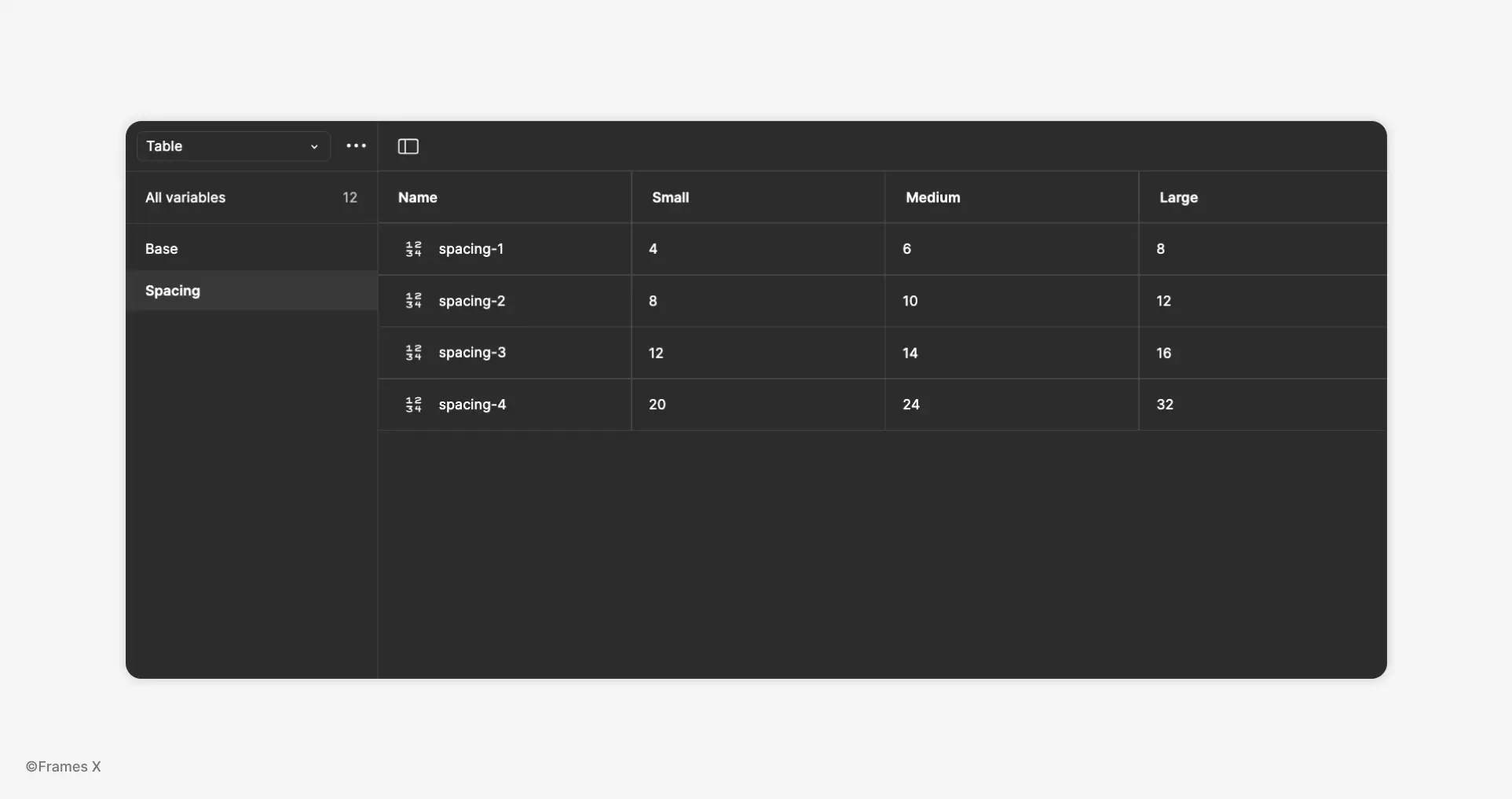
Spacing Variables for Tables in Figma
For our Table to be truly resizable, we will also require Spacing Variables.
Spacing variables are another important parameter that will help maintain consistent spacing when the table is resized.
We'll use a similar range with values from 1 to 5 to create it. These variables will define gaps and paddings for our table elements.
-
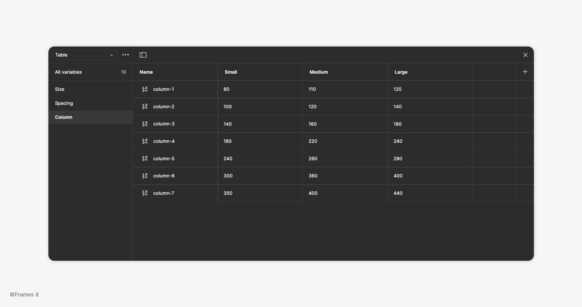
Column variables for Tables in Figma
When building tables in Figma, columns offer the most consistent and reliable structure for table layouts. Building tables with columns gives us precise control over both the content and the size of the table. For that purpose, we will require Column Variables.
For columns, we'll create a scale from 1 to 7. We'll be using these variables to manage column widths across the table.
Column variables will define the size of individual columns, helping us limit their resizing options to a controlled range, ensuring the Table content looks exactly as intended in every mode.
-
Why Columns Instead of Rows or Grids for Tables?
Columns make table design easier because they provide consistent width control and align better with how content is structured and resized across layouts. They also allow for more predictable behavior, especially when working with dynamic data.
Columns tend to use smaller numbers, e.g., column size =
150pxvs. row size =1000px.
-
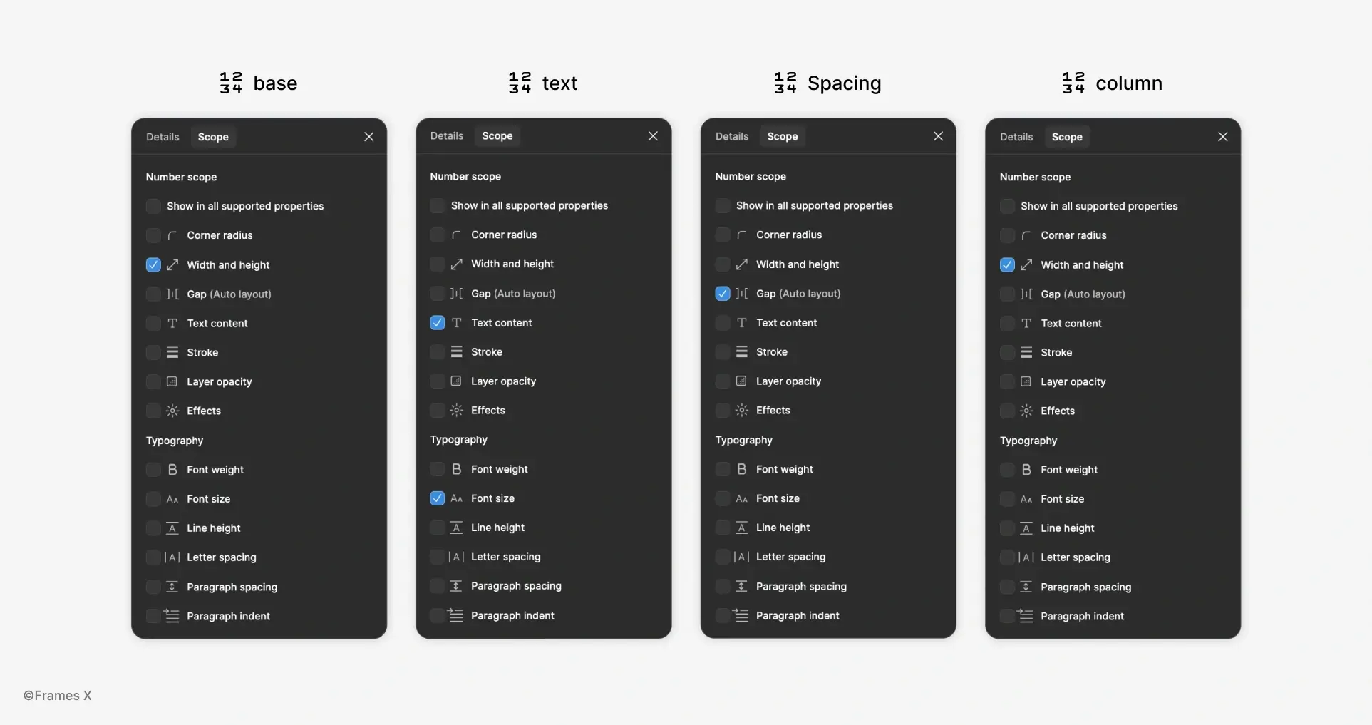
Variable Scoping in Figma
To help us assign and work with Table Variables, we can set the correct scoping for each variable we create in Figma. Scoping variables is a technique that will help us correctly assign variables and make our tables more user-friendly when operating.
-
For Size variables, use the Width and Height scope.
-
For Text Size variables, use the Text content and Font size.
-
For Spacing variables, use the Gap scope.
-
For Column variables, use the Width and Height scope.
-
-
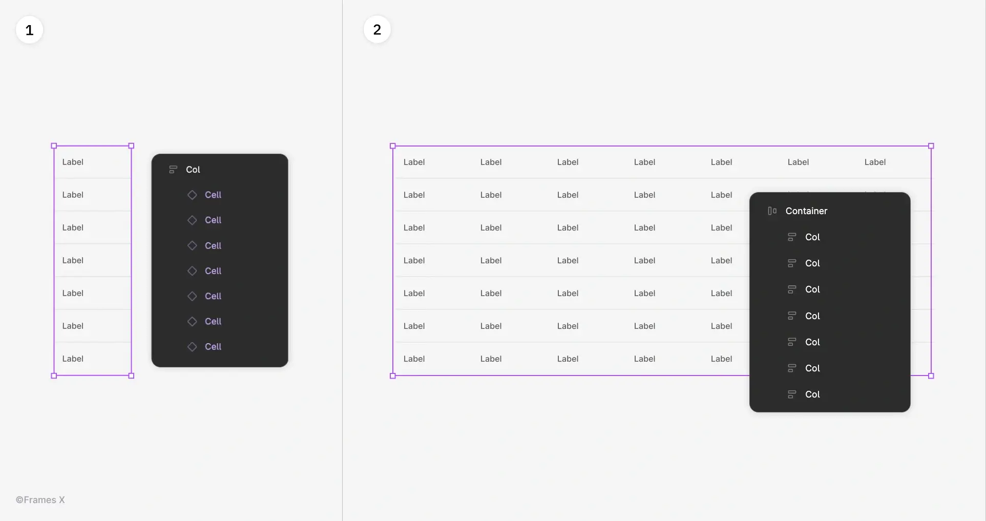
Setting up Table Components in Figma
Now that we have our variables ready, let's assign them to the table components.
We'll be using Components, as they already support the necessary Color Mode and Text properties. You can also access them from the Parametric Figma Tables File.
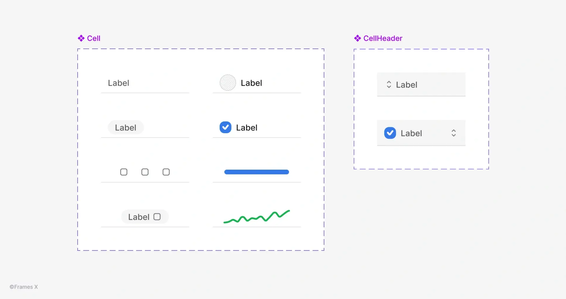
The core building blocks of our tables are Cell and Cell Header components. These components nest various table cell variants, making it easy to stack different types of content within the table.
However, in order for our components to react to variables, we first need to assign variables to them.
Start by assigning Size Variables (Width × Height) to the basic UI elements size, such as checkboxes, icons, badges, and the cell component itself. This will enable the components to adjust according to the Table modes we've created before (Desktop, Tablet, Mobile).
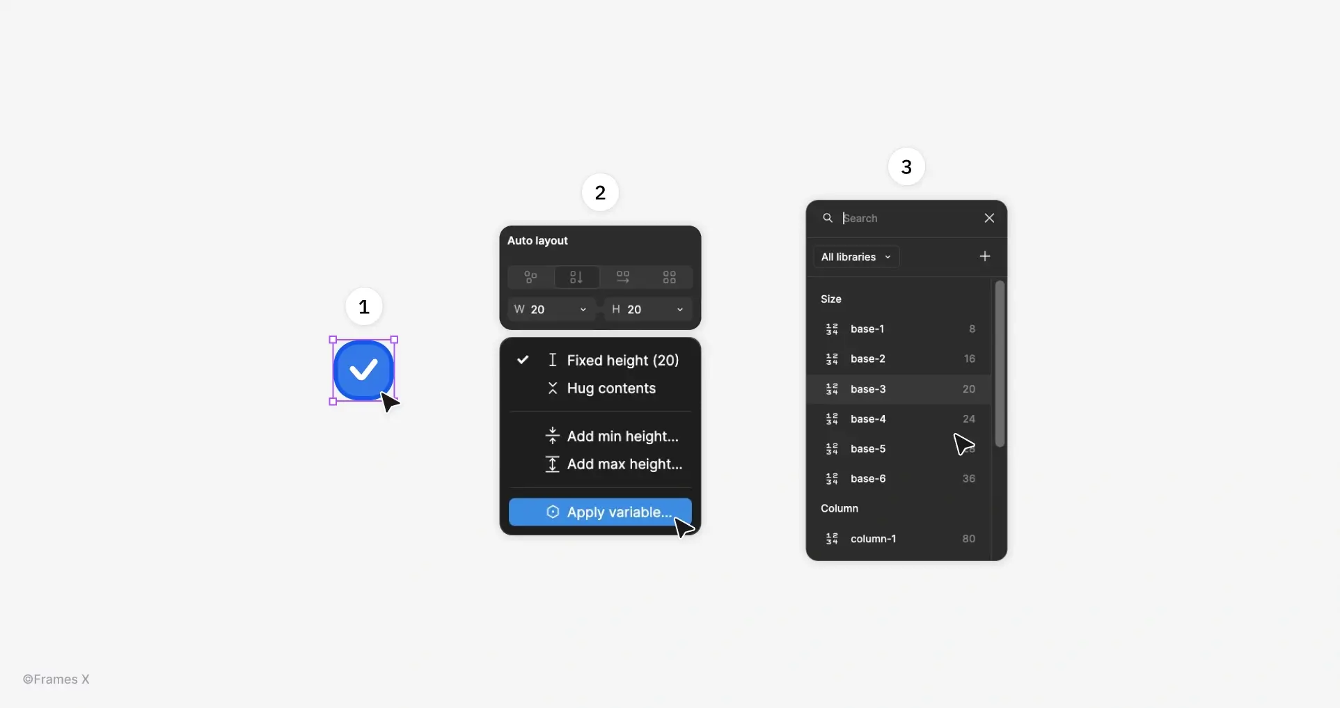
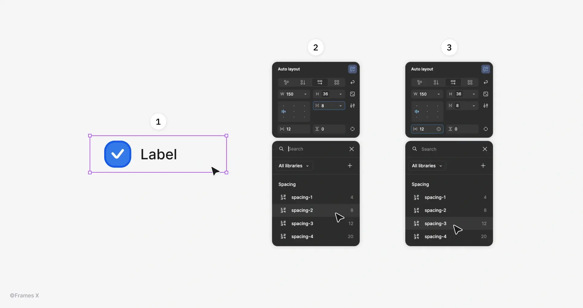
Do the same for gaps and paddings by assigning Spacing Variables to ensure elements are spaced correctly across different breakpoints.
See the Figma file components to better understand where you should apply variables and where you should not.
→ Download Figma Tables Template
-
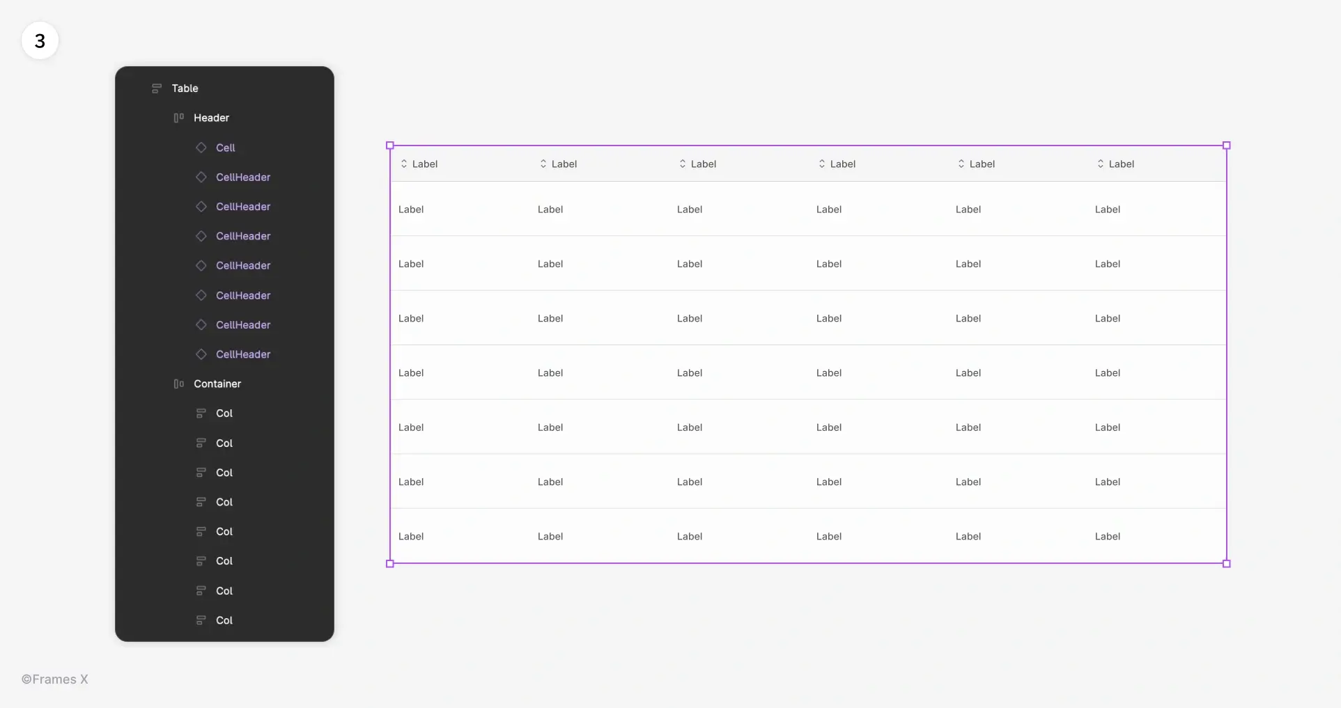
Creating a Responsive Table Layout in Figma
Once our components are fully charged with variables, we can assemble the layout for our Table.
Create a vertical Auto Layout stack with the cell components. And duplicate it to match the number of columns you need.
Add a Cell Header component as a separate top-pinned group and place it inside the Table container. Set the Width to 'Fill' and the Height to 'Fixed.'
Set all columns and cells to Fill × Fill for full flexibility.
-
Customizing Table Contents with Figma Components
Using Figma variants, we can now easily customize and change the content of individual columns. Use previously created Cell components to update content column by column.
Bonus Tip: You can use the Figma AI feature: "Rewrite this..." to quickly rewrite the table's text content by selecting multiple cells with the SHIFT key.
-
Apply Column Variables to the Table Contents
Now that we know our content, we can configure our table to behave like a real spreadsheet, ensuring that important content is not cut off at specific breakpoints.
We can make certain columns of our tables fixed by using previously created Column Variables.
To apply column variables, choose the header and the table column, and choose a property from the range of 6, matching the size of the content inside the column.
Apply column variable to the upstanding header to ensure the content always stays at the predefined size and position.
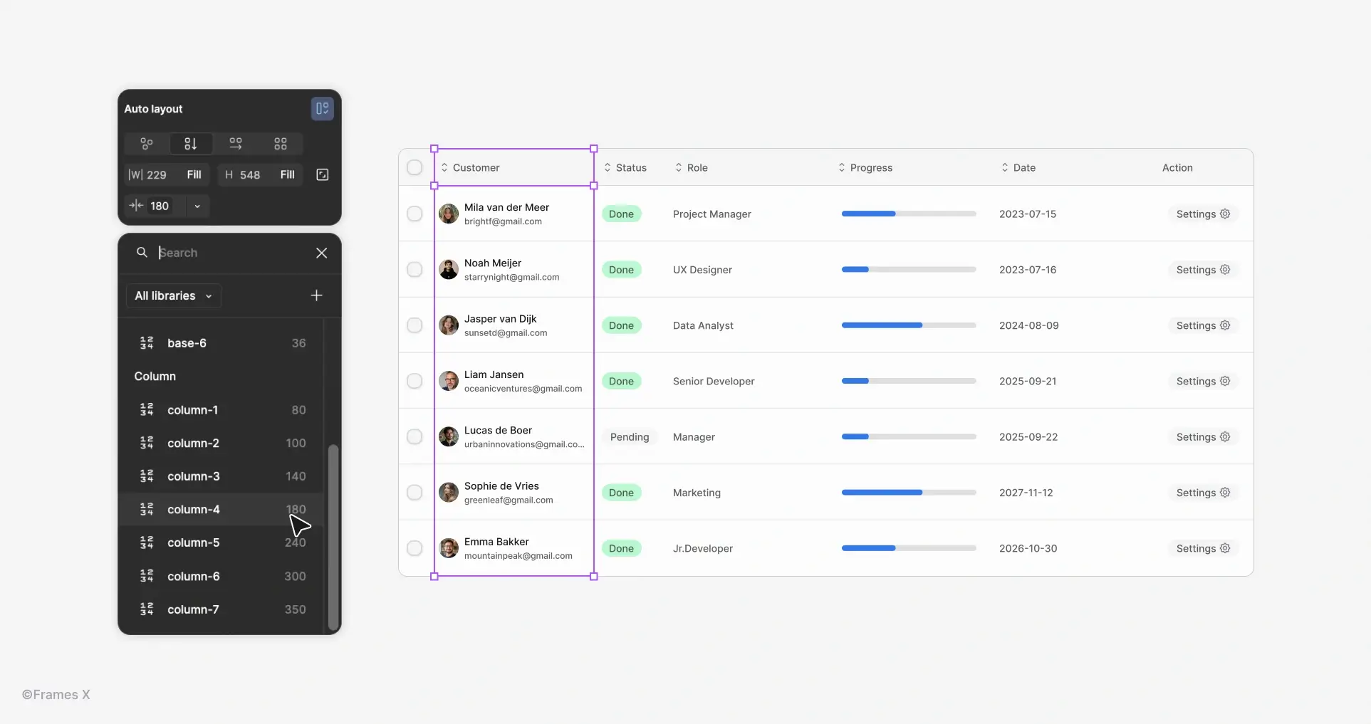
Which columns should use fixed-width Column variables?
Here's a simple rule: If a column contains important information that should always be visible, assign it a fixed size using a variable and define how it behaves across different breakpoints.
If the content is less critical and can be truncated, set that column to Fill.
-
What are Parametric Components?
Parametric design or parametric components is a technique for assembling Figma components that allows you to eliminate repetitive variants, such as Size, Color, or Text-specific variations.
Figma variants are typically used to reflect stylistic changes to a core component, such as altering the size, color, text, etc. Take a regular Badge, for example—it might have size and color variations baked in as separate variants, which usually results in a huge, unmanageable component set.
With parametric components, we can replace these repetitive variants with variables, allowing for a more optimized workflow and less memory usage in Figma. How does it work?
Let's take the Avatar component as a simple example:
Here's how the Avatar variants looked before and after using parametric components:
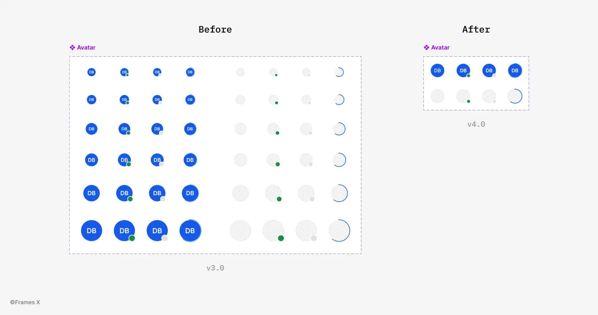
The Size-related variants for Avatar are gone, but the ability to change the size of the component is still available. So, how does this work?
-
How to Create Parametric Components
To create parametric components, start by identifying the properties that can be transformed into reusable Figma parameters. These can include colors, size, font-size, width x height, etc.
In our Avatar example, the following properties can be transformed into variables:
-
The size of the avatar;
-
Text font-size;
-
Online indicator (dot);
-
Loading progress indicator.
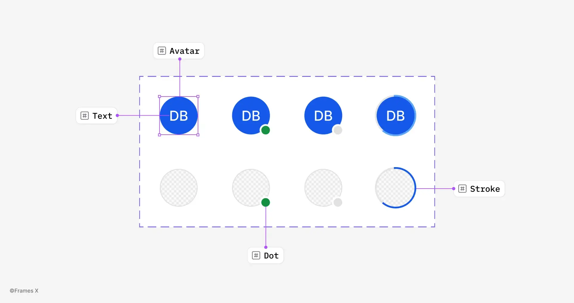
These properties will store Numeric values and use variable modes instead of variants to alter the component. So, once we know our properties, let’s turn them into variables.
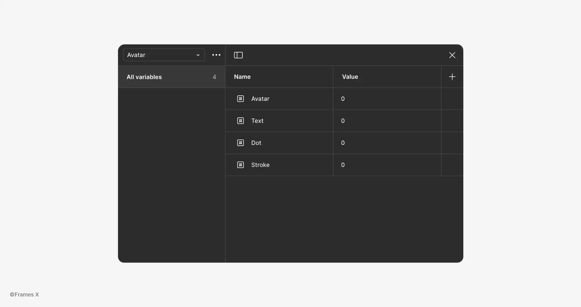
First, create a new variable collection named Avatar:
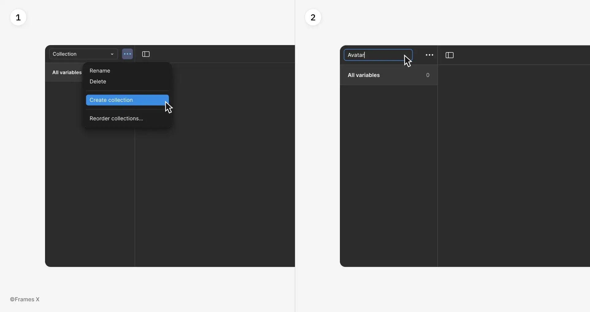
Next, create four Number variables to represent responsive width and height values for:
-
Avatar (size of the avatar);
-
Text (font-size of the label);
-
Dot (size of the online indicator);
-
Stroke (thickness of the loader stroke).
Then, we'll create Size modes for each variable, such as XS, Small, Medium, and Large, to match the options available in the previous component set.
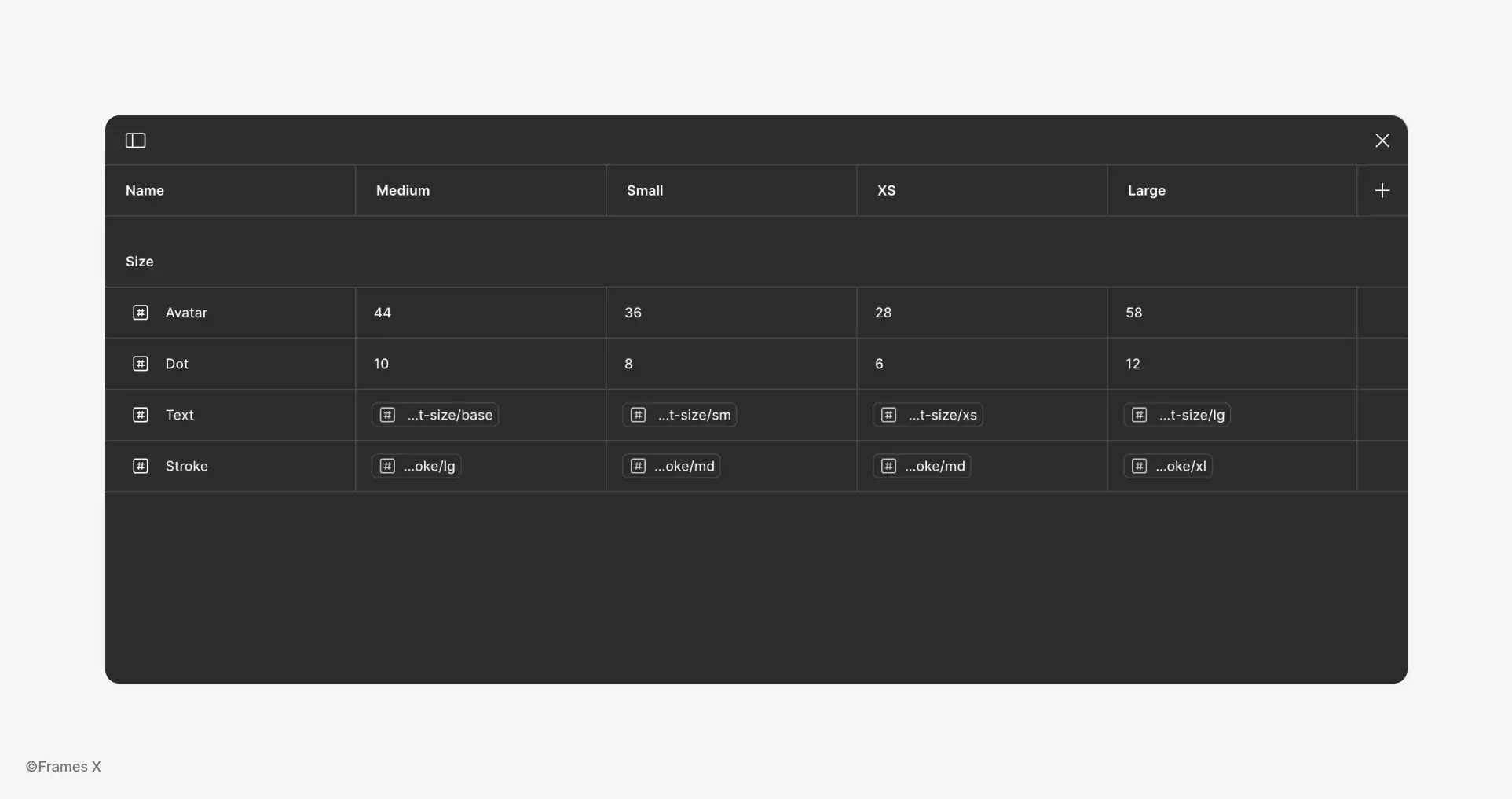
For Avatar size and Dot size, we will assign flat numeric values.
For Text, we'll reuse existing Text Variables from our Figma design system.
For the Stroke, we'll also reuse existing numerical Figma Variables. You can also reuse any numeric variables you previously had for that purpose, so it makes sense to have a single source of truth for all of your parametric components
!Important note: the standard Pro Figma plan allows for only 4 modes per variable, which is too low and needs to be revised. To have more than four modes, you'll need to upgrade to the Enterprise plan.
Now, we need to assign these variables to the actual component parameters: the Width and Height of the Avatar. We will also assign the font size of the text and the size of the dot indicator.
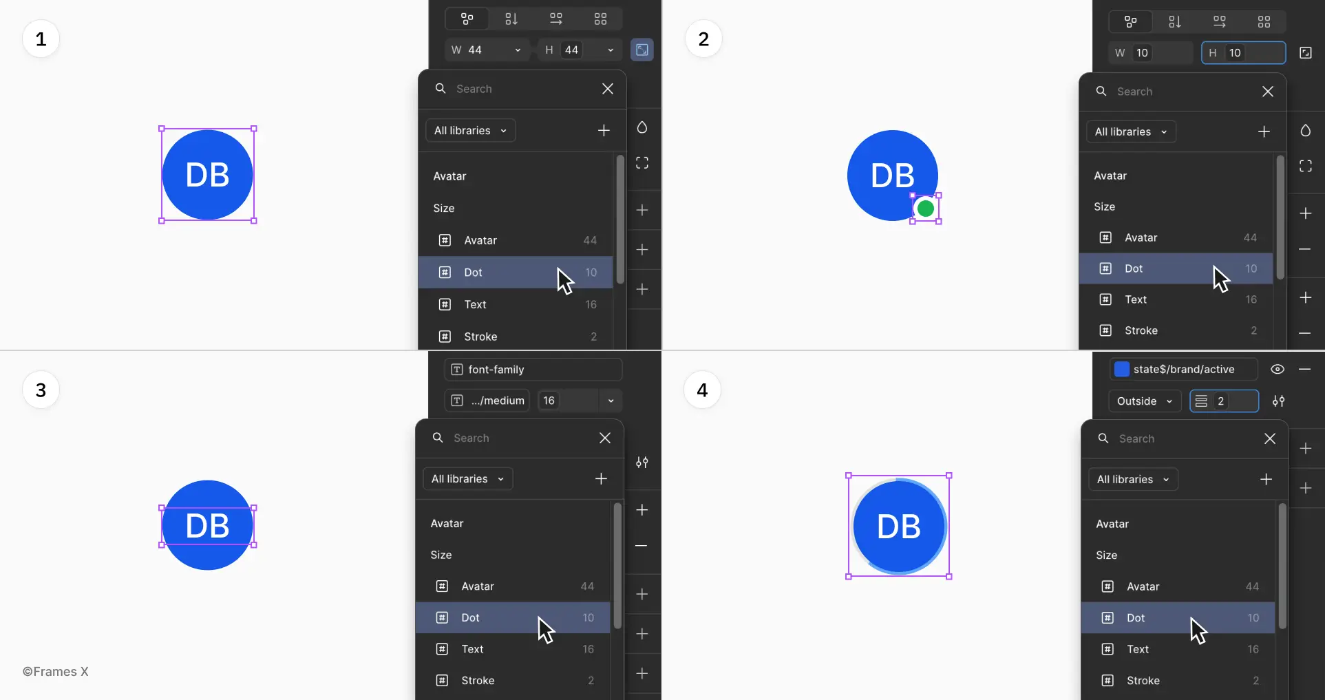
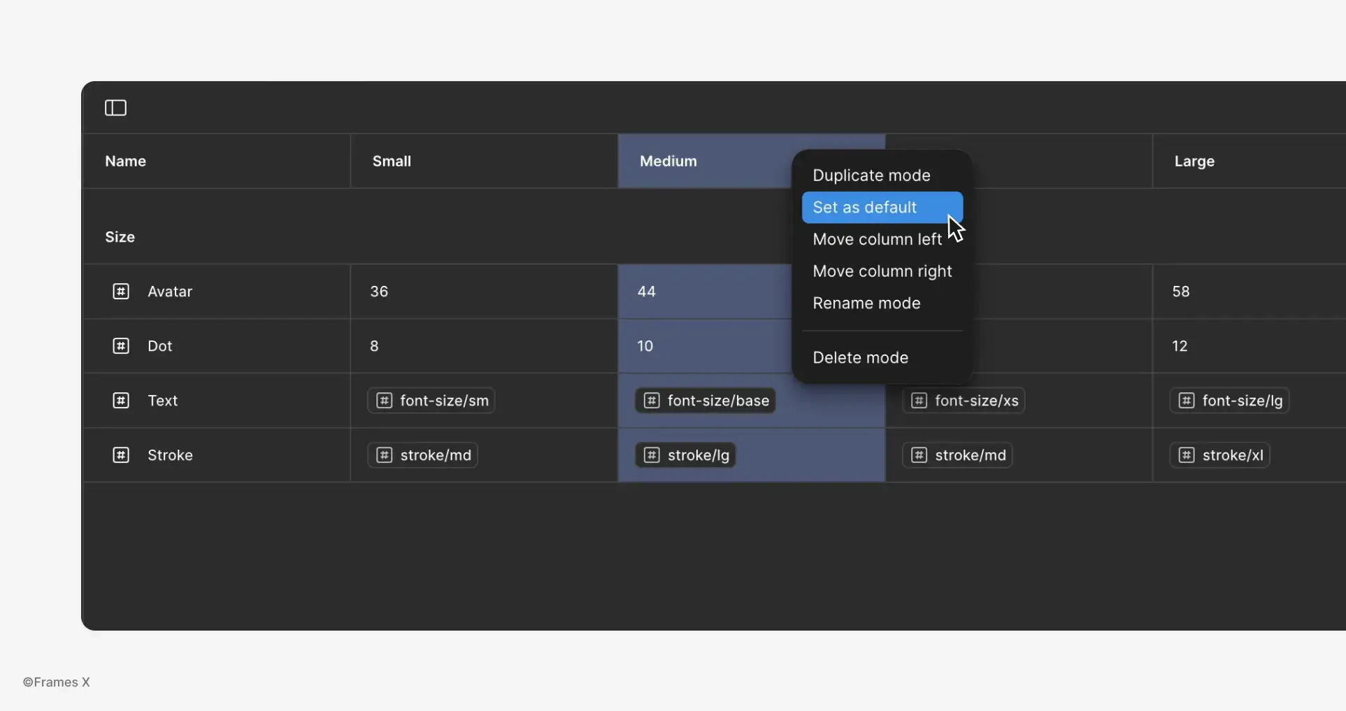
Bonus Tip: You can right-click the variable mode column and set it as the default Mode for a component. In our case, I’m making the default one the medium size.
Once everything is connected, let’s test Avatar setup and switch from one Size (Mode) to another.
Just like that, we've removed 80% of the original variants, making the entire Avatar set much easier to manage. The Figma Avatar component is also now lighter when imported than the original set. Here is a comparison of the two: when imported into the new empty with 197 layers vs 65.
-
-
Why Does Parametric Design Matter?
If you're building a design system, here's a key takeaway:
When someone imports a component from your UI kit/design library, all its variants get brought into their file, potentially bloating it and slowing things down with hundreds and maybe thousands of unused variants.
This isn't the case with variables. Variables only pass the necessary values into the file—they don't create variant duplicates or memory overhead.
What are the Downsides?
Parametric components have a learning curve. They require a blend of variants and variables, which might not be intuitive to most users.
Plus, the current execution in Figma aligns less with how things are represented on the code side. Variable modes feel closer to an attribute you'd have at a top level rather than on a component level.
-
Conclusion
By using parametric components and size mapping based on column content, we can design advanced and complex data tables in Figma while minimizing the need for redundancy in variants.
This method provides a solid foundation for creating more truly flexible Figma table layouts. Download the Figma Tables Template to help you get started with parametric design and serve as a trustworthy foundation.
To wrap everything up, I believe parametric design is the best way to build components in Figma. This method not only saves memory usage and removes extra work, but it also promotes the creation of better systems and products.
Hopefully, Figma will reconsider the number of variable modes available on the Pro plan.

What's Your Reaction?
 Like
0
Like
0
 Dislike
0
Dislike
0
 Love
0
Love
0
 Funny
0
Funny
0
 Angry
0
Angry
0
 Sad
0
Sad
0
 Wow
0
Wow
0


