
![[VIP] Unlimited Pass 2026.03.27](https://i.pinimg.com/1200x/d2/f8/2e/d2f82e903b9ca33b0f13704cc85a3d8a.jpg)


![[LS] ls.graphics Pass 2026.02.16](https://i.pinimg.com/1200x/8d/ca/7f/8dca7ff72d8b698f955649340d0ff398.jpg)

![[PRO] Craftwork Pass 2025.06.11](https://i.pinimg.com/1200x/98/d2/f0/98d2f0169226b431f4727441ecc6aa06.jpg)


![[VIP] Creovo: Creative Portfolio](https://i.pinimg.com/1200x/92/5d/39/925d39b614ae4e39adda25b73837f82b.jpg)


![[VIP] Voltz: Electric Car Website Template](https://i.pinimg.com/1200x/03/ba/41/03ba41513483727fcd26b95349750783.jpg)
![[VIP] Zyra: Coded Chat AI Dashboard](https://i.pinimg.com/1200x/ce/7b/92/ce7b926f22423fc046659dfe1dd7a604.jpg)
![[$] AlignUI: Code Library](https://i.pinimg.com/1200x/8d/91/1c/8d911c0a22483842cff69c130e80c37b.jpg)
![[VIP] The Grid Deck Template](https://i.pinimg.com/1200x/f2/df/6d/f2df6d865d31ed4400ddd74137a5a79e.jpg)

![[VIP] Solaris: Sales Forecast & Pipeline Review Deck](https://i.pinimg.com/1200x/ba/7c/48/ba7c485ac40a51054cf9074aead204e2.jpg)
![[VIP] Brand Guideline Presentation](https://i.pinimg.com/1200x/64/87/a7/6487a7c4da21072150a1664f83a6a234.jpg)


![[VIP] 44 Device Mockups: Metal Scene Pack](https://i.pinimg.com/1200x/96/0c/c4/960cc4d39f6f9f08c4ba4a40ae740a65.jpg)
![[LS] iPhone 17 Mockup](https://i.pinimg.com/1200x/18/42/c1/1842c11e3da971765bdcfbc5315f3df8.jpg)
![[LS] iPhone 17 Pro Max Mockups](https://i.pinimg.com/1200x/f0/2a/72/f02a724ed9f52ac4a1c66b5614809111.jpg)
![[LS] AE-Mockups, Apple Devices](https://i.pinimg.com/1200x/03/04/9b/03049ba79acaa546ae6389639f89bcc1.jpg)


![[VIP] Volnitsa: BLNDR MINI (2025)](https://i.pinimg.com/1200x/c3/f7/0a/c3f70ae1126be5c0af1977e58b56ba7a.jpg)

![[VIP] React Three Fiber: The Ultimate Guide to 3D Web Development](https://i.pinimg.com/1200x/78/02/1f/78021ffdfc8113cc8caba5b2c563ead4.jpg)
![[VIP] Ryan Hayward: Ultimate Framer Masterclass 3.0](https://i.pinimg.com/1200x/48/d6/3f/48d63f9723d7c49e6c34c182557c7431.jpg)


![[VIP] Whoooa! 156 vector Lottie animations](https://design.rip/uploads/cover/blog/whoooa-156-vector-animations.webp)


![[VIP] Staff Product Designer (ENG, RUS)](https://i.pinimg.com/1200x/0c/52/a0/0c52a08d8b0a25329806437933cf538f.jpg)


[$] Flowbite PRO: UI Kit v3.1
Figma design system built for integration with Tailwind CSS. Design UI interfaces and simplify the process of integrating into live websites with Tailwind CSS using this professional Figma design system featuring 1000+ component variants, responsive pages, dark mode, and auto-layout.
Design UI interfaces and simplify the process of integrating into live websites with Tailwind CSS using this professional Figma design system featuring 1000+ component variants, responsive pages, dark mode, and auto-layout
Integrate with Tailwind CSS
FlowBite is built around the utility classes available in the Tailwind CSS framework, which means that you can integrate a design built with this kit using Tailwind CSS without writing any extra HTML classes. Fun fact: this landing page was also designed in FlowBite and coded with Tailwind CSS.
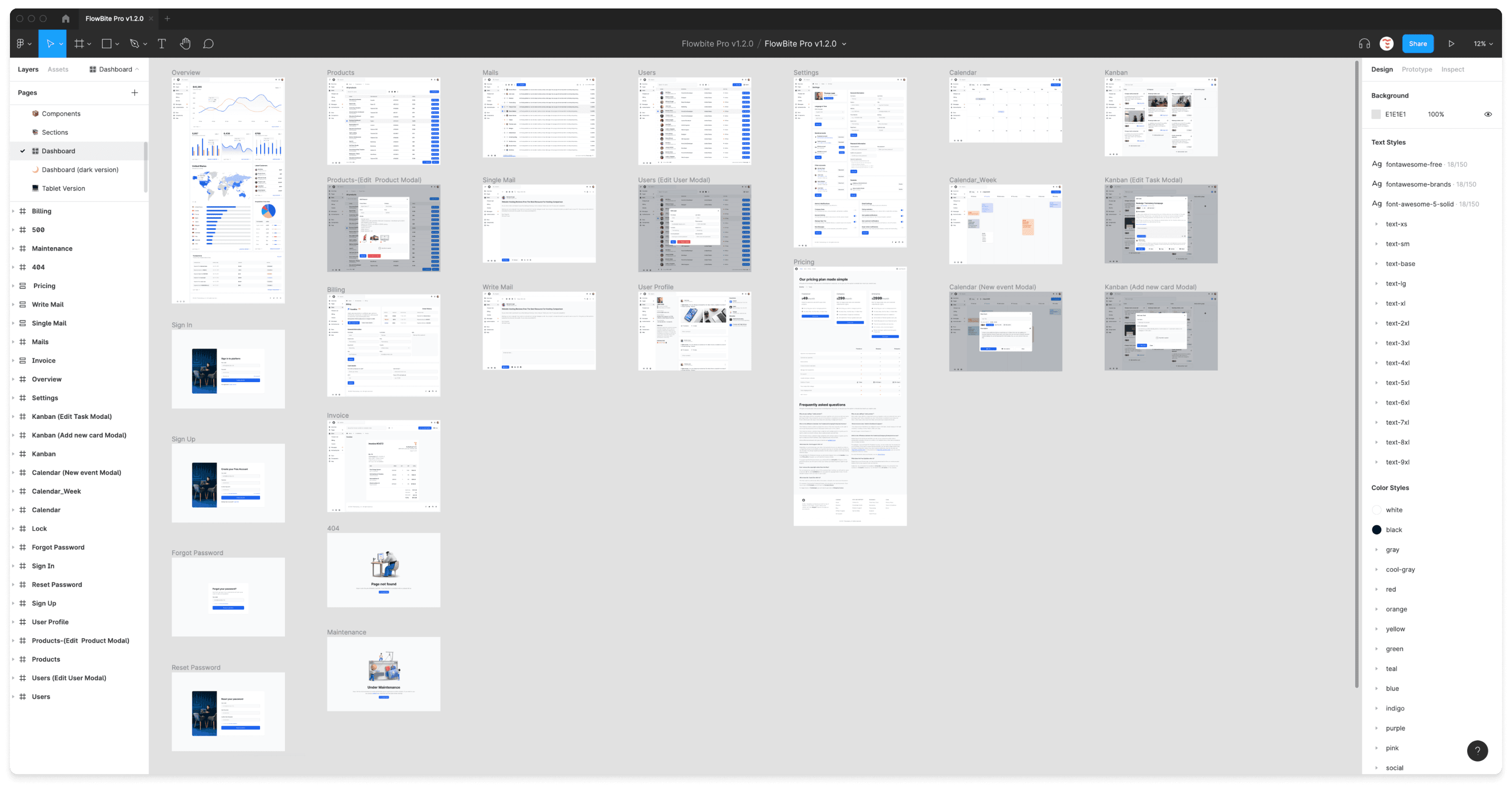
27 hand-crafted pages
The structure of the pages available in Flowbite are set up using the auto layout feature from Figma, so that changing the order and width of columns and rows will be easy to do so.
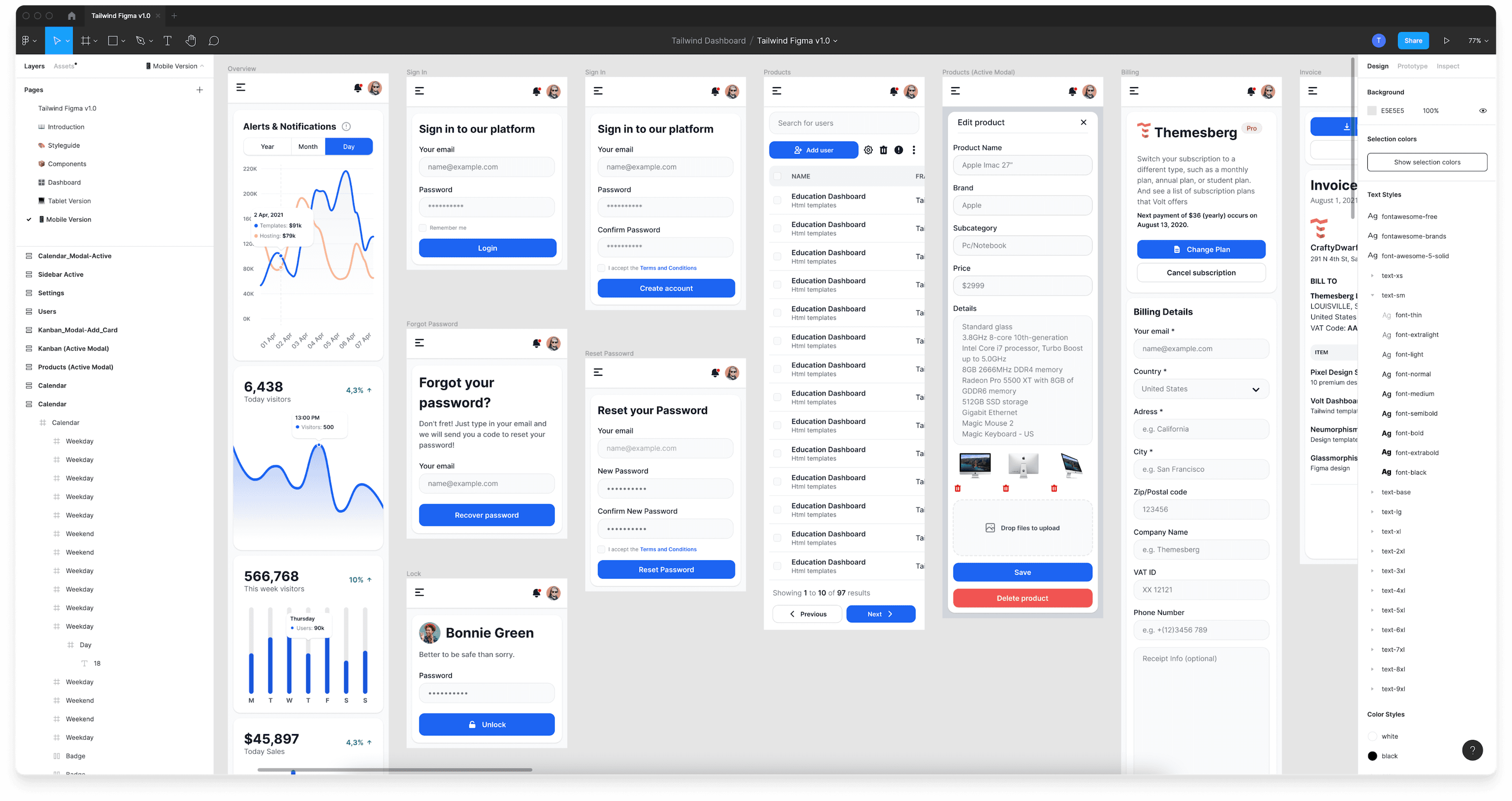
Built for all devices
Responsive design is an important requirement to build accessible user interfaces and provide a high quality experience for your users. That is why we built all of the desktop, tablet, and mobile screen examples for the devices from FlowBite.
Mobile vs Desktop vs Tablet Market Share:
- Mobile: 54.25%
- Desktop: 42.9%
- Tablet: 2.85%
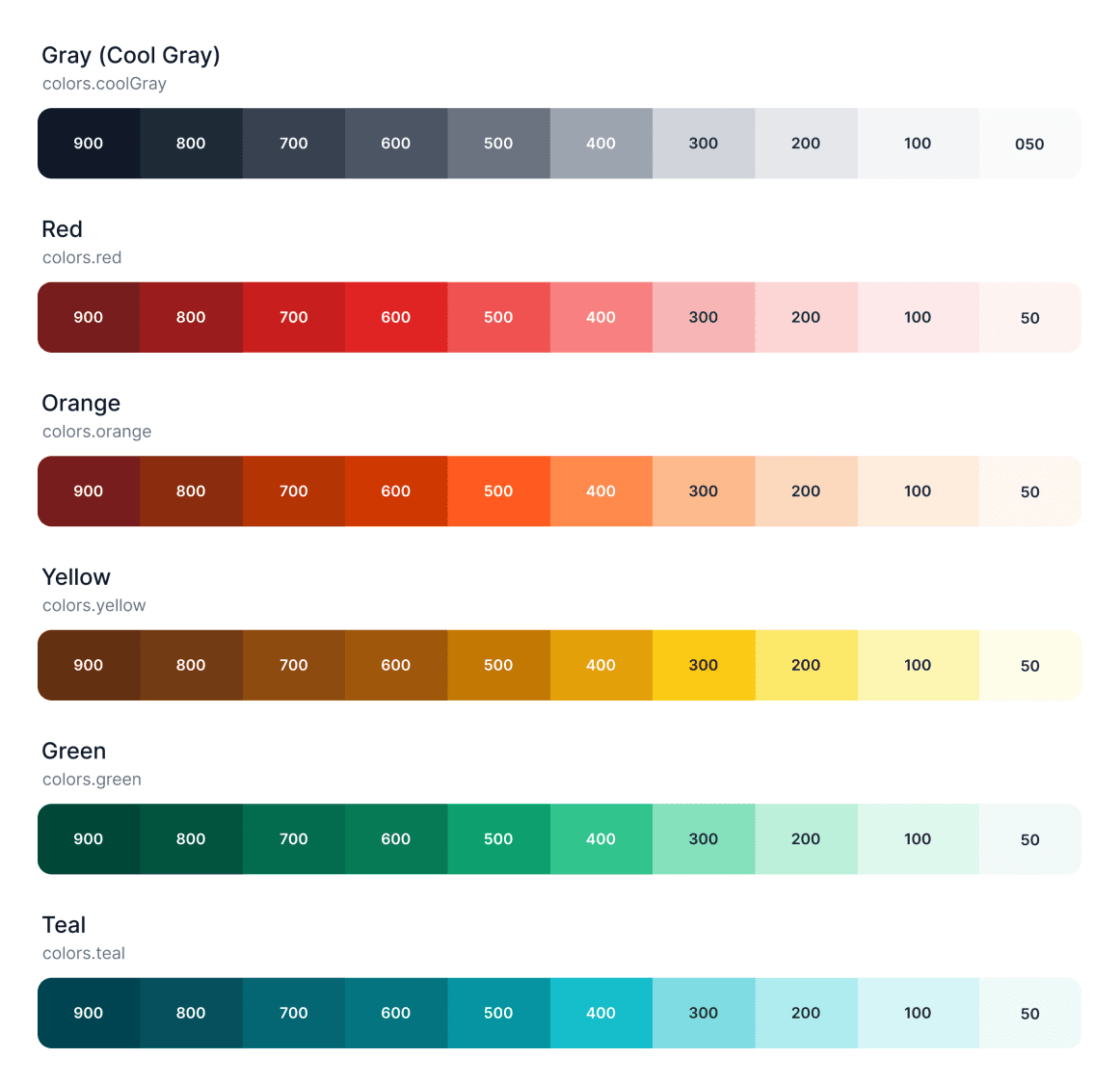
Style guideline
The style guideline is the backbone of the Flowbite project, completely identical with the structure of the utility classes from Tailwind CSS. We have covered color styles, typography, avatars, shadows, and many more.
- Avatars
- Typography
- Color styles
- Shadows

Figma variants
The variants feature from Figma is a great way to make development easier along the way by only having to select multiple style variants for a given component.
Most of the elements available in FlowBite have at least a couple of variants, such as for the buttons, forms, badges, tooltips, and many more.
- Buttons
- Forms
- Badges
- Progress bars
- Tooltips

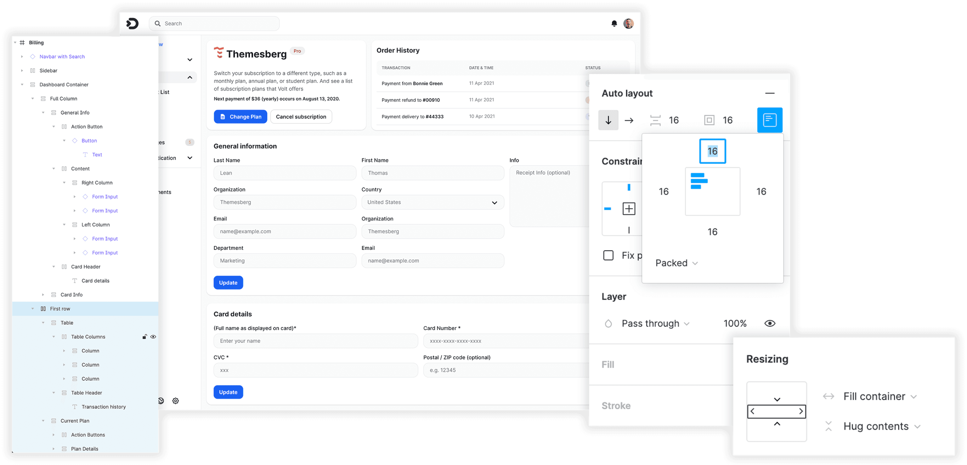
Auto Layout
The structure of the pages available in FlowBite are set up using the auto layout feature from Figma, so that changing the order and width of columns and rows will be easy to do so.
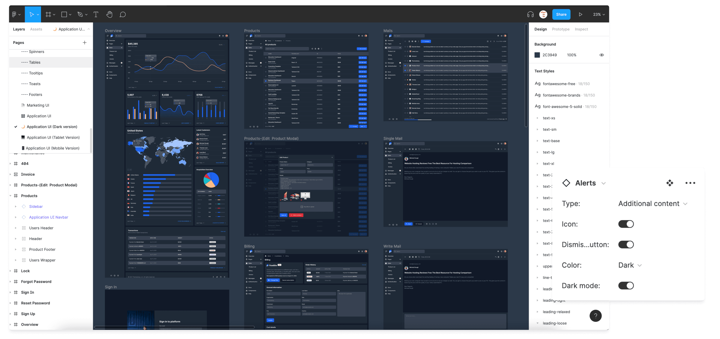
Dark mode
All of the components, sections, and pages from the Figma design system and code version also supports dark mode using Figma variants and the utility classes from Tailwind CSS.
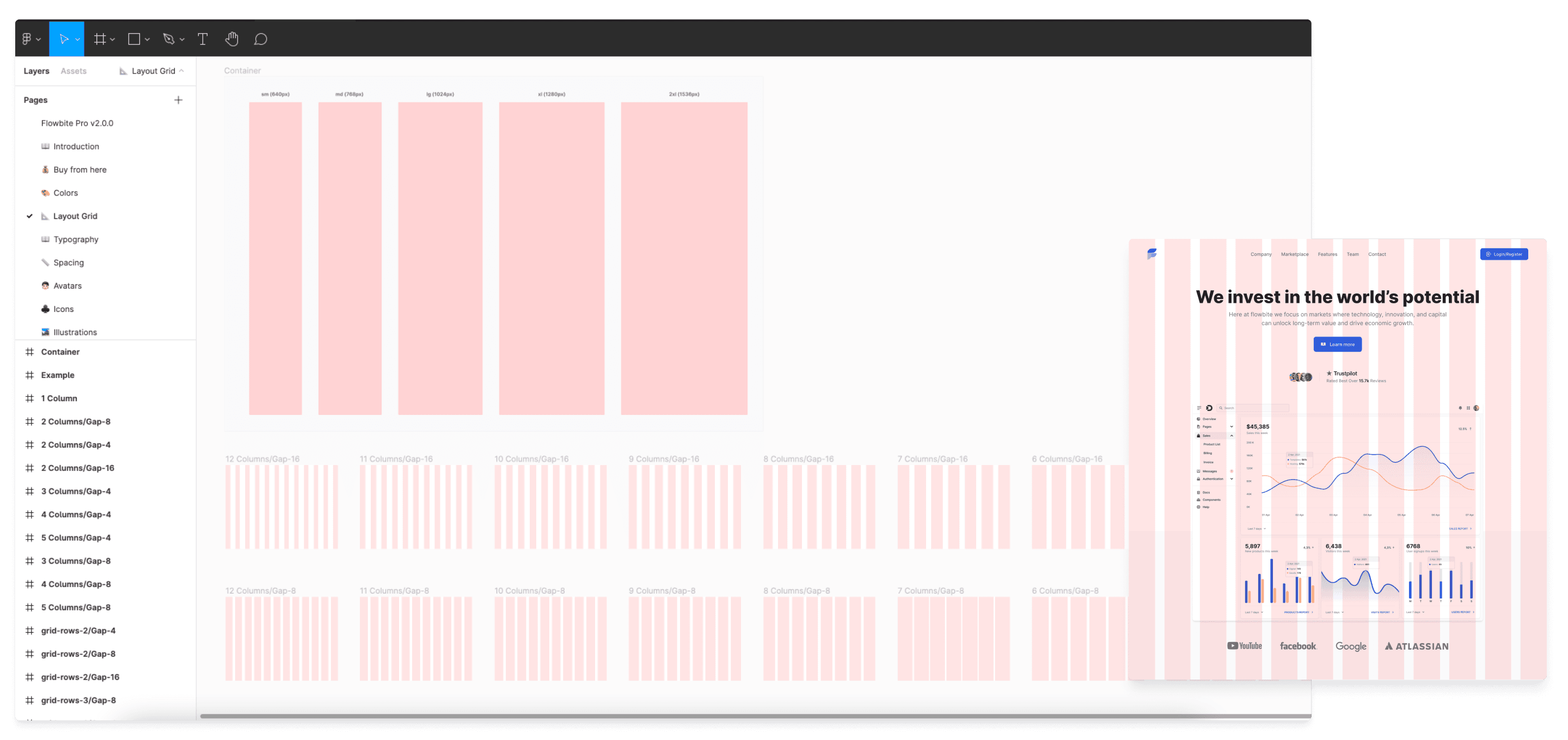
Grid layout
Use the grid feature in Figma to preview the container widths for responsive devices and the grid column and row layout when using CSS grid and flexbox with the utility classes from Tailwind CSS and Flowbite.
## Version 3.1 - Jul 10th, 2025

- Fixed missing primitives for border-radius, border-width, container  and typography.
- Fixed missing colors for tabs, cards, navbar.
- Fixed wrong border-radius for some buttons.
- Fixed missing autolayout for some pages.

## Version 3.0 - Jun 24th, 2025

- Revamped the design of all components, blocks, and pages to reflect a more modern, clean, and user-friendly aesthetic.
- Aded new advanced components and pages.

Standardized design properties through tokens for:

- Colors
- Spacing
- Font
- Sizes

Other updates:

- Rebuilt components following Atomic Design principles (Atoms, Molecules, Organisms) for better scalability, maintainability, and reuse.
- Removed all unused and redundant layers from design files to improve performance and organization.
- Fixed invalid components error when you try to publish Flowbite Design System as your main library.


## Version 2.9.0 - Jan 2th, 2024

Added 8 E-commerce UI pages:

- Homepage
- Product Showcase
- Cart
- Checkout
- Order Summary
- My Orders
- Payment
- Track Order

Added 40 E-commerce UI blocks:

- Homepage
- Shopping Cart
- Checkout
- Payment
- Track Order
- Product Showcase
- Product Review
- Product Testimonials
- Product Description
- Product Questions
- Orders List
- Order Summary
- My Orders
- Track Order
- Highlighted Products
- Footers

Added over 50 E-commerce UI components:

- Navbars
- Megamenus
- Dropdowns
- Product Cards
- Category Cards
- Filters
- Sidenavs
- Drawers


Other updates:

- Fixed invalid components error when you try to publish Flowbite Design System as your main library.
- Fixed some icons that had a red background behind instead of transparent.
- Fixed padding for some Marketing UI sections.
- Updated the components that did not use the latest version of autolayout.
- Removed unused frames from Application UI components to help files load faster and reduce memory usage.

## Version 2.8.0 - Oct 16th, 2023

Added over 40 new Application UI pages:

- Homepages
- Invoice
- Billing
- User settings
- Kanban
- Email
- Calendar
- Transactions
- Products
- Project management
- To-do
- Tickets
- Notifications page
- Users
- Events
- Integrations
- API
- Chat
- Chat GPT
- Two Factor
- Error 404, 500
- Forgot and reset password
- Sign in
- Sign up

Added new widgets:

- Input widgets
- Read (view user details) widgets


Other updates:

- Fixed padding for widgets cards.
- Fixed "missing icons" for Marketing UI sections.
- Removed unused frames from Application UI components to help files load faster and reduce memory usage.

## Version 2.7.0 - Jul 17th, 2023

Added local variables for:

- Spacing
- Colors
- Border radius
- Container size
- Width

Added over 480 Flowbite Icons

Added new widget components:

- File upload
- Lists
- Inputs

Other updates:

- Fixed padding for some components that did not have padding-top and padding bottom.
- Fixed "missing icons" for Marketing UI sections.
- Fixed "missing component" errors from some table components which took place due to the fact that some variants for badges, forms and buttons were changed.
- Resized all images and compress them to help files load faster and reduce memory usage.
- Removed unused frames from components and sections from tables

## Version 2.6.0 - May 2nd, 2023

Added new components:

- Jumbotron
- Banners
- Gallery (Masonry)
- Mockups

Other updates:

- Resized all images and compress them to help files load faster and reduce memory usage.
- Removed unused frames from components and sections

## Version 2.5.0 - February 27th, 2023

Added new pages:

- Landingpages
- About
- Login/register
- Services
- Contact
- Testimonials
- Terms and conditions
- Error
- Project showcase
- Pricing
- Team

Added new blocks:

- Hero (4 new examples)
- Customers (1 new examples)
- Content (2 new examples)
- Features (1 new examples)
- CTA (2 new examples)
- Team (3 new examples)

Added 2 new categories in blocks:

- Case study (6 new examples)
- Event schedule (4 new examples)

Added new widgets categories:

- Stats
- Chart
- Location

Other updates:

- Fixed navbars spacing inconsistencies
- Fixed double icon for some primary buttons
- Relinked several components that were delinked from the parent component
- Fixed typography issues for Marketing UI blocks
- Fixed mobile spacing for Marketing UI blocks
- Fixed "missing component" errors which took place due to the fact that some variants for badges, forms and buttons were changed
- Fixed "missing libraries" error when you try to publish Flowbite Figma as a library
- Flowbite Pro Figma v.2.5.0 no longer uses components from previous versions, we removed all the components from older versions that were used in the file.
- Reorganized the Figma file for blocks and pages - we have created separate pages for each category of blocks and pages, this helps the app to work better, avoiding those frustrating freezes of several tens of seconds.
- Refactored forms, nav tabs, advanced tables, CRUD layouts and charts
- Removed unused frames from components and sections
- Improved dark version for blocks and and some Application UI components

## Version 2.4.0 - December 16th, 2022

Added new Figma properties feature for:

- Buttons
- Forms
- Alerts

Other updates:

- Improved dark version for badges and alerts
- Refactored forms, buttons and all Application UI components
- Removed unused frames from components and sections
- Fixed button and form inconsistencies
- Relinked several components that were delinked from the parent component

## Version 2.3.0 - December 5th, 2022

Added new components:

- CRUD
- Faceted search
- Advanced Tables
- Table Headers and Footers
- Application UI Footers
- Timelines
- Toast
- Small inputs
- Small search
- Speed dial

Other updates:

- Refactor toggles, checkboxes and radio inputs, they are now created with autolayout
- Fix Accordion borders
- Fix buttons for Marketing UI (added base size instead of large)
- Refactor progress bars, they are now created with autolayout
- Fix typography issues for Marketing UI
- Fix “missing component” errors

## Version 2.2.0 - September 2th, 2022

Added new components:

- Drawer
- KBD
- Tables
- Popovers
- Skeleton
- Typography Format
- Navbars
- Badges
- Crypto Modal

Added new Marketing UI sections:

- Register
- Login
- Forgot password
- Reset password
- User Onboarding

Added new Marketing UI pages:

- Community Blog
- Comminity Single Article
- Simple with Sidebar
- Background Image
- Live Blogging
- Default
- Header Article

Added new App UI components:

- Vertical Bar Chart
- Horizontal Bar Chart
- Line Chart
- Area Chart
- Heatmap
- Treemap
- Candlestick
- World Map
- Donut Chart
- Radial Bar

- Adden Dashboard Layouts
- Fix some inconsistencies regarding spacing, padding and text size for Forms, and Buttons;


## Version 2.1.1 - Jul 6th, 2022

- Added new Floating Labels Forms
- Improve Figma mechanism behaviour for variants and Auto Layout v3.0
- Added large variants for Datepickes and Autocomplete Inputs
- Fix some inconsistencies regarding spacing, padding and text size for Forms, Datepickers and Buttons
- Add primary color as a main color for all components and blocks

## Version 2.1.0 - February 28th, 2022

- Added new Marketing UI sections and pages

## Version 2.0.0 - January 13th, 2022

Added new components:

- Badges with remove button
- Popovers
- Tables
- Toasts
- Social Icons
- Social Buttons
- Circular Buttons

Added new variants for:

- Typography
- Shadows
- Logo

Added dark version to all components and reorganized the Figma file.

## Version 1.3.0 - December 7th, 2021

Added the following new components:

- Breadcrumbs
- Accordions
- Group Buttons
- List Group
- Spinners
- Alerts
- Modals
- Nav Tabs
- Tables
- Autocomplete Inputs
- Range Sliders
- Pagination
- Carousel

Other changes:

- fixed font weight for buttons
- fixed autolayout for buttons
- added dark mode for all the next components

## Version 1.2.2 - December 2nd, 2021

- added variants for datepicker menus
- added dark mode for datepicker
- added variants for dropdown menu
- added dark mode for dropdown menu
- added variants for button group
- added dark mode for button group
- added dark mode for pricing and FAQ sections

## Version 1.2.1 -  November 11th, 2021

- Figma grid integration

## Version 1.2.0 - May 17th, 2021

Dark version changes:

- added dark version variant for components
- added dark version variant for all sections and pages
- added dark version for mobile and tablet pages

Other changes:

- updated widgets in dashboard to include a dropdown period picker and a CTA button
- add new Figma constraints feature
- improve Figma mechanism behaviour for variants and auto layout
- update the acquisition overview widget
- update the navigation bar with an extra applications action

## Version 1.1.0 - May 17th, 2021

Extra variants for the top bar component:

- colors: white, dark, blue, teal, purple, indigo, pink, red, green, gray
- dropdown: active/false
- search input: active/false
- breakpoints: mobile/tablet/desktop
- type: toggle button/default/centered + links/left + links/quick action button

Extra variants for the sidebar:

- colors: white, dark, blue, teal, purple, indigo, pink, red, green, gray
- type: default/contracted
- icons: true/false

New datepicker component and variants
Extra colors variants for the buttons
New sections, such as: pricing, pricing comparison table, FAQ, footers
Minor fixes

## Version 1.0.0 - May 10th, 2021

Initial release filesWhat's Your Reaction?
 Like
15
Like
15
 Dislike
3
Dislike
3
 Love
9
Love
9
 Funny
0
Funny
0
 Angry
0
Angry
0
 Sad
2
Sad
2
 Wow
6
Wow
6
![[VIP] NucaAI: Nutrition & Calories App](https://i.pinimg.com/1200x/98/b3/81/98b381fee4395f4c9585167210969368.jpg)
![[VIP] Notely: AI Note Taking & Productivity Mobile](https://i.pinimg.com/1200x/bb/84/be/bb84beffed5e7213e2557650ef7bdec9.jpg)
![[VIP] Debtrix: Personal Finance Dashboard](data:image/png;base64,iVBORw0KGgoAAAANSUhEUgAAAcIAAAEYAQMAAAD1c2RPAAAAA1BMVEUAAACnej3aAAAAAXRSTlMAQObYZgAAACVJREFUaN7twQEBAAAAgqD+r26IwAAAAAAAAAAAAAAAAAAAACDoP3AAASZRMyIAAAAASUVORK5CYII=)
-
 badermutebif i join the vip will i be able to download it ?


