

![[LS] ls.graphics Pass 2026.02.16](https://i.pinimg.com/1200x/8d/ca/7f/8dca7ff72d8b698f955649340d0ff398.jpg)

![[VIP] Unlimited Pass 2026.01.26](https://i.pinimg.com/1200x/d2/f8/2e/d2f82e903b9ca33b0f13704cc85a3d8a.jpg)

![[PRO] Craftwork Pass 2025.06.11](https://i.pinimg.com/1200x/98/d2/f0/98d2f0169226b431f4727441ecc6aa06.jpg)


![[VIP] Momentify: Social Media App](https://i.pinimg.com/1200x/82/43/57/824357f6e31dda353f8e459ed57e2b96.jpg)

![[VIP] Ayaka: Framer Resume Template](https://i.pinimg.com/1200x/e3/4b/e5/e34be51c350167296d4418093442ec56.jpg)
![[VIP] Starvy: Technology Website Template](https://i.pinimg.com/1200x/ee/3e/84/ee3e84e02bb1553898bfb05a4ed14b9f.jpg)
![[VIP] Atoks: Mobile App Landing Page](https://i.pinimg.com/1200x/70/c0/4c/70c04cad791f8c08410bb911b0e7f8bb.jpg)
![[VIP] Archar: Ultra Creative Portfolio Template](https://i.pinimg.com/1200x/dc/63/d8/dc63d8b40f3a756ddcf35b0fcee2231b.jpg)


![[VIP] Zyra: Coded Chat AI Dashboard](https://i.pinimg.com/1200x/ce/7b/92/ce7b926f22423fc046659dfe1dd7a604.jpg)
![[VIP] Briefberry: AI Brief Generator Tailwind Kit](https://i.pinimg.com/1200x/71/9a/ff/719affec4372e4a8b1cda6e8702e7510.jpg)
![[VIP] Solaris: Sales Forecast & Pipeline Review Deck](https://i.pinimg.com/1200x/ba/7c/48/ba7c485ac40a51054cf9074aead204e2.jpg)
![[VIP] Brand Guideline Presentation](https://i.pinimg.com/1200x/64/87/a7/6487a7c4da21072150a1664f83a6a234.jpg)
![[VIP] SaaS Pro: Presentation](https://i.pinimg.com/1200x/d5/75/dc/d575dc20daed5af02a08ed54d53ce7f5.jpg)
![[VIP] Pitch Deck: SWOT & Strategy Frameworks Business Planning](https://i.pinimg.com/1200x/6d/20/ca/6d20caae5d3b056335b1c4c3d457978e.jpg)


![[LS] iPhone 17 Mockup](https://i.pinimg.com/1200x/18/42/c1/1842c11e3da971765bdcfbc5315f3df8.jpg)
![[LS] iPhone 17 Pro Max Mockups](https://i.pinimg.com/1200x/f0/2a/72/f02a724ed9f52ac4a1c66b5614809111.jpg)
![[LS] AE-Mockups, Apple Devices](https://i.pinimg.com/1200x/03/04/9b/03049ba79acaa546ae6389639f89bcc1.jpg)
![[LS] MacBook Air M2 Looped, Animated Mockups](https://i.pinimg.com/1200x/76/d9/0a/76d90af27052b69cb561a098cd1907a6.jpg)


![[VIP] Unreal Engine Motion](https://i.pinimg.com/1200x/0e/be/6d/0ebe6d869b80651630b75fa8cdc09684.jpg)
![[VIP] Rive: Interactive Motion](https://i.pinimg.com/1200x/47/48/01/4748017b137668d1de75c2eac05b2577.jpg)


![[VIP] Memorisely: AI Prototyping in Figma Make](https://i.pinimg.com/1200x/4d/f1/eb/4df1ebfd0ebaeeb2e48ac24950a74b92.jpg)
![[VIP] Animations on the web](https://i.pinimg.com/1200x/8b/f1/e4/8bf1e43af3c14a8c28cde0210b6b3075.jpg)
![[VIP] Motion Master School: Rig Master](https://i.pinimg.com/1200x/45/7b/a3/457ba3d64d972c056b42136c58376271.jpg)
![[VIP] React Three Fiber: The Ultimate Guide to 3D Web Development](https://i.pinimg.com/1200x/78/02/1f/78021ffdfc8113cc8caba5b2c563ead4.jpg)
![[VIP] Ryan Hayward: Ultimate Framer Masterclass 3.0](https://i.pinimg.com/1200x/48/d6/3f/48d63f9723d7c49e6c34c182557c7431.jpg)


![[VIP] Whoooa! 156 vector Lottie animations](https://design.rip/uploads/cover/blog/whoooa-156-vector-animations.webp)


![[VIP] Staff Product Designer (ENG, RUS)](https://i.pinimg.com/1200x/0c/52/a0/0c52a08d8b0a25329806437933cf538f.jpg)


![[VIP] Products People Actually Want](https://i.pinimg.com/1200x/4e/aa/f9/4eaaf9c3961559a9bba223a33c5e6d19.jpg)
![[VIP] Imperavi: Web Interface Handbook [Dec 2025]](https://i.pinimg.com/1200x/5b/78/97/5b789780cffe796d3e8b4c7b98367391.jpg)


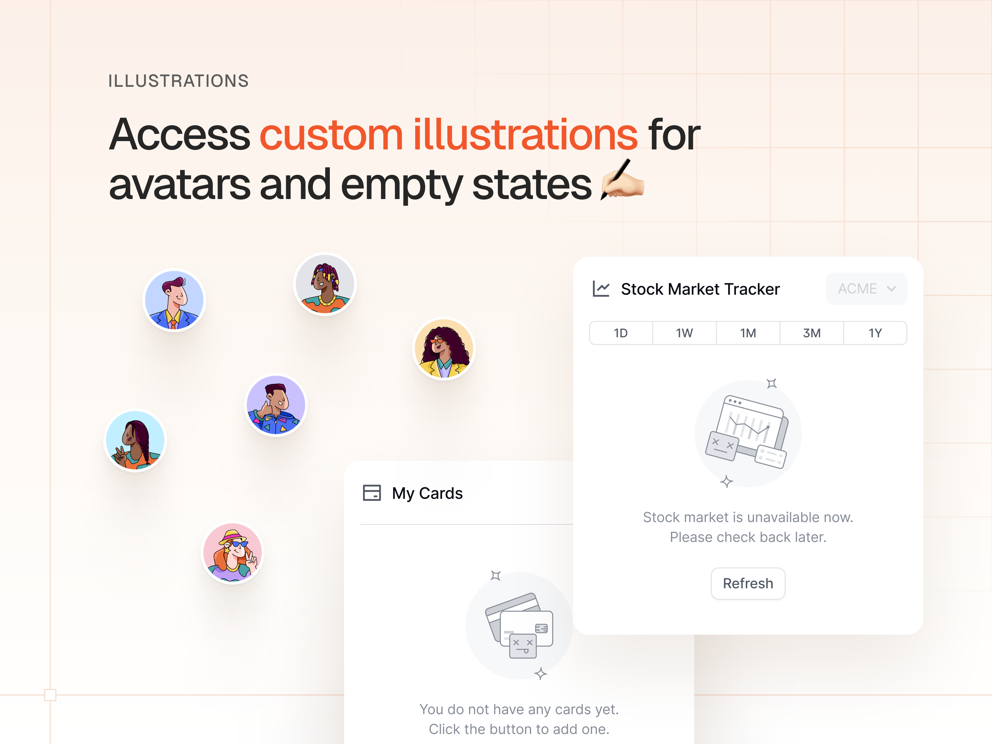
[$] AlignUI: Code Library
This is a complete component library built for React, styled with TailwindCSS. With our extensive code library, you'll build faster, maintain consistency, and have access to well-documented components.
![[$] AlignUI: Code Library](https://i.pinimg.com/1200x/8d/91/1c/8d911c0a22483842cff69c130e80c37b.jpg)
Changelog
This is a complete component library built for React, styled with TailwindCSS. With our extensive code library, you'll build faster, maintain consistency, and have access to well-documented components.
Landing Page Sections
We are releasing one of the largest expansions in AlignUI’s history.
It introduces a modular landing page system built from over 150 sections across 16 categories, each available for both desktop and mobile. This update helps you design high-performing, visually balanced pages faster and with greater confidence. Every layout follows AlignUI’s refined variable structure, spacing tokens, and typography hierarchy..
Section Library Overview
A concise overview of 16 landing page categories — each refined for flexibility, clarity, and consistency across all screen sizes.
-
Headers (20 variants)
-
Brand & Social Proof (18 variants)
-
Features (24 variants)
-
Stats & Metrics (20 variants)
-
How it Works (24 variants)
-
Testimonials (20 variants)
-
Pricing (20 variants)
-
Integrations (24 variants)
-
Careers (22 variants)
-
Teams (32 variants)
-
Contact (36 variants)
-
Newsletter (36 variants)
-
CTA (46 variants)
-
FAQ (20 variants)
-
Blog (24 variants)
-
Footer (24 variants)
Additional Components & Pages
Supporting elements that extend the landing page system — including navigations, announcements, and shared assets built for flexible use.
-
Navigations (80 variants)
-
Announcements (36 variants)
-
Assets (includes helper components for landing pages)
Landing Page Examples
10+ full landing pages demonstrate how AlignUI’s modular system scales across different layouts and industries — with more examples coming soon.
-
Examples & Templates (more than 10 examples)
AI Template
The AI Template is designed for chat-based platforms, AI assistants, and automation workflows. It provides a complete product foundation with an emphasis on clarity and scalability.
-
35 plus pages covering chat, projects, settings, and authentication
-
Dedicated layouts for Empty, Active Chat, and Collapsed states
-
Project-management and workspace pages for organizing content
-
Prompt-area variations supporting text, image, and contextual inputs (Added Image, Chat POV)
-
Complete authentication flow with Sign in, Sign up, and Reset Password
-
Settings pages for Workspace, Account, and Security
-
Light & Dark Mode optimization through the updated variable palette
-
Fully responsive structure ensuring consistency across devices
Crypto Template
The Crypto Template introduces a refined structure for dashboards, wallets, and analytics platforms. Its layouts emphasize precision, legibility, and balance in data-dense environments.
- 20 plus pages covering trading, analytics, and wallet management
- Dynamic overview tables with Compact and Detailed views for real-time information
- Token search modals with Default, Active, and Empty states
- Wallet and navigation dropdowns for Favorites, Notifications, and Menu
- Advanced table filters for Type, Date, and Token
- Complete authentication flow including Email Sign in, Email Verification, and Connect Wallet
- Clean empty states and modular cards for streamlined visualization
- Light and Dark Mode support aligned with updated alpha and color systems
Visual & Variable Improvements
Fine-tuned visuals and system variables for smoother, more consistent design performance.
- New shadow presets and alpha-color variants added to the variable system
- Primary palette refreshed with improved dark-mode contrast
- The fourth primary color updated to Sky / Green for a smoother tonal transition
- Mobile designs added for HR Management, Finance, and Marketing templates
Typography & Components
Refined type hierarchy and new interface elements that expand usability and creative range.
- Six new title-typography styles introduced for landing pages
-
New Checkbox (X-Small) size added
-
DM MONO font integrated for technical and data contexts
-
Added a Green Alpha variant expanding tonal depth
What's Your Reaction?
 Like
-65
Like
-65
 Dislike
0
Dislike
0
 Love
0
Love
0
 Funny
0
Funny
0
 Angry
0
Angry
0
 Sad
0
Sad
0
 Wow
2
Wow
2
![[VIP] FrontendMentor: Premium Challenges [Updated: 06.2025]](data:image/png;base64,iVBORw0KGgoAAAANSUhEUgAAAcIAAAEYAQMAAAD1c2RPAAAAA1BMVEUAAACnej3aAAAAAXRSTlMAQObYZgAAACVJREFUaN7twQEBAAAAgqD+r26IwAAAAAAAAAAAAAAAAAAAACDoP3AAASZRMyIAAAAASUVORK5CYII=)
![[VIP] ShadCnKit: UI Kit [Oct 2025]](https://i.pinimg.com/1200x/f6/1b/82/f61b82730374fcaf1f474d520af0153b.jpg)

