![[VIP] Unlimited Pass 2026.03.27](https://i.pinimg.com/1200x/d2/f8/2e/d2f82e903b9ca33b0f13704cc85a3d8a.jpg)


![[LS] ls.graphics Pass 2026.02.16](https://i.pinimg.com/1200x/8d/ca/7f/8dca7ff72d8b698f955649340d0ff398.jpg)

![[PRO] Craftwork Pass 2025.06.11](https://i.pinimg.com/1200x/98/d2/f0/98d2f0169226b431f4727441ecc6aa06.jpg)


![[VIP] Creovo: Creative Portfolio](https://i.pinimg.com/1200x/92/5d/39/925d39b614ae4e39adda25b73837f82b.jpg)


![[VIP] Voltz: Electric Car Website Template](https://i.pinimg.com/1200x/03/ba/41/03ba41513483727fcd26b95349750783.jpg)
![[VIP] Zyra: Coded Chat AI Dashboard](https://i.pinimg.com/1200x/ce/7b/92/ce7b926f22423fc046659dfe1dd7a604.jpg)
![[$] AlignUI: Code Library](https://i.pinimg.com/1200x/8d/91/1c/8d911c0a22483842cff69c130e80c37b.jpg)
![[VIP] The Grid Deck Template](https://i.pinimg.com/1200x/f2/df/6d/f2df6d865d31ed4400ddd74137a5a79e.jpg)

![[VIP] Solaris: Sales Forecast & Pipeline Review Deck](https://i.pinimg.com/1200x/ba/7c/48/ba7c485ac40a51054cf9074aead204e2.jpg)
![[VIP] Brand Guideline Presentation](https://i.pinimg.com/1200x/64/87/a7/6487a7c4da21072150a1664f83a6a234.jpg)


![[VIP] 44 Device Mockups: Metal Scene Pack](https://i.pinimg.com/1200x/96/0c/c4/960cc4d39f6f9f08c4ba4a40ae740a65.jpg)
![[LS] iPhone 17 Mockup](https://i.pinimg.com/1200x/18/42/c1/1842c11e3da971765bdcfbc5315f3df8.jpg)
![[LS] iPhone 17 Pro Max Mockups](https://i.pinimg.com/1200x/f0/2a/72/f02a724ed9f52ac4a1c66b5614809111.jpg)
![[LS] AE-Mockups, Apple Devices](https://i.pinimg.com/1200x/03/04/9b/03049ba79acaa546ae6389639f89bcc1.jpg)


![[VIP] Volnitsa: BLNDR MINI (2025)](https://i.pinimg.com/1200x/c3/f7/0a/c3f70ae1126be5c0af1977e58b56ba7a.jpg)

![[VIP] React Three Fiber: The Ultimate Guide to 3D Web Development](https://i.pinimg.com/1200x/78/02/1f/78021ffdfc8113cc8caba5b2c563ead4.jpg)
![[VIP] Ryan Hayward: Ultimate Framer Masterclass 3.0](https://i.pinimg.com/1200x/48/d6/3f/48d63f9723d7c49e6c34c182557c7431.jpg)


![[VIP] Whoooa! 156 vector Lottie animations](https://design.rip/uploads/cover/blog/whoooa-156-vector-animations.webp)


![[VIP] Staff Product Designer (ENG, RUS)](https://i.pinimg.com/1200x/0c/52/a0/0c52a08d8b0a25329806437933cf538f.jpg)


Apple Fired the iOS 26 Designer
Now he's going to Meta, Stephen Lemay is taking over, and Apple employees are publicly celebrating. Here's the full story.

Apple's head of interface design just got fired, and employees are celebrating. Do you know his face?
More importantly, do you know his work? His legacy is Liquid Glass, the controversial design language that's been causing problems since iOS 26 launched. And now he's leaving Apple for Meta.
There are two fascinating aspects to this story. First, Apple employees actually spoke up publicly, saying they were happy about this departure, explaining this person's background and why his design approach was flawed. Second, and this is the truly incredible twist, this lead designer from Apple is going to Meta, the company that recently showed off Meta Glasses interfaces that look suspiciously similar to Liquid Glass.
Let me explain why this matters, what went wrong with Liquid Glass, and what this personnel change means for the future of Apple's interfaces.
What Liquid Glass Actually Is and Why It Failed
If you've followed tech news this year, you know what Liquid Glass is.
It's the new design language introduced in iOS 26, appearing across iPhone, Mac, iPad, and the entire Apple ecosystem. It's essentially a transparent glass aesthetic that's even more transparent than its predecessor, Glass Morphism, and plays with light refractions on the edges.

On paper, that sounds beautiful.
It presents serious accessibility and contrast problems. The result is simple: text and icons frequently appear white on white backgrounds. For accessibility, the issues are broader. Text and interface elements aren't readable for everyone, especially those with permanent or temporary visual impairments or users in bright sunlight or low-light conditions.
- The irony is rich.
The lead designer of Liquid Glass once said, "Design is just what it looks like." And that quote perfectly encapsulates the problem. He prioritized appearance over functionality, aesthetics over usability.
Apple employees celebrated his departure.
Here's where it gets genuinely interesting. The departure of Alan Dye was reportedly perceived positively within Apple.
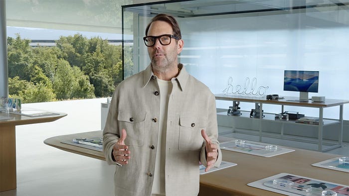
Alan Dye presents Liquid Glass at WWDC 2025.
- I found an article that summarizes what people were saying behind the scenes on the day of his departure, and it's revealing.
Apple announced a few weeks ago that designer Alan Dye, who had been the number two in design at Cupertino, responsible for software interfaces under Molly Anderson, is leaving to head design at Meta starting in late December. His team developed Liquid Glass, the controversial new interface based on glass transparency, which was launched this year across iOS 26, macOS 26, and all Apple systems.
- According to John Gruber, who is well-informed, the surprising departure and appointment of Stephen Lemay were received excellently at Cupertino.
- An Apple employee was quoted as saying, "Today's announcement is almost too good to be true. We had lost hope of seeing Dye leave."
Can you imagine?
Your design lead is so unpopular that employees publicly celebrate when he leaves. That's not just a personnel change; it's an indictment of leadership.
The quote continued:
- "When you're interested in design, leaving Apple means descending sharply. What we overlooked is the obvious fact: Alan doesn't really care about design."
That's brutal.
- John Gruber explained that Dye originally came from the world of advertising and marketing, not interface design. And apparently, this troubled quite a few people.
This explains the problems with Liquid Glass. It's a graphically impressive style, but it's not adapted to interfaces.
It was Johnny Ive who appointed him to head Apple's interface in 2015. This might have made sense at the launch of the Apple Watch, which was Apple's first real foray into the fashion world. Perhaps Dye was relevant at that moment. An idea that could have been judicious but led to difficulties later.
In contrast, Steve Lemmet has spent his entire career designing interfaces. He's the real deal, a proper interface designer returning to lead. People I spoke with who worked with him at Apple praise him warmly, particularly for his attention to detail and craftsmanship. These qualities were sorely lacking in Dye's era.
Stephen Lemay: The Interface Designer Apple Actually Needs
Not everyone appreciates all of Lemay's work, but nobody's perfect. Designers love criticizing each other's work. Lemay is highly appreciated, and his talent is recognized by everyone.
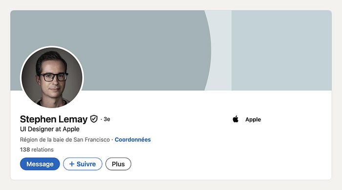
Stephen Lemay's LinkedIn profile
- A source well-positioned to know the options declared, "I don't think there was a better choice than Lemmet."
Will we see a shift in Apple's interfaces? It's entirely possible, estimates John Gruber, who, with considerable restraint, declared that this could be the best thing to happen to user interface design at Apple since Steve Jobs' death and Scott Forstall's departure.
Incredibly, the person who designed Apple's biggest interface pivot in 10 years is leaving after less than a year.
That's remarkable.
Why I Predicted This Would Fail
I had written 3 articles about Liquid Glass when it launched because, let's be honest, interface design is my specialty. I had to give all my takes and be solid in my positions, even if I came across as a hater. But I predicted these exact problems.
The argument some made was that white on white prepares us for spatial computing.
- My response then and now is this: just because it's spatial computing doesn't mean we shouldn't be able to see anything. You can create an evolution without making things illegible. You're not obligated to make people suffer for three years so they can eventually read white text on their white walls.
- Some, myself included, said, "Today it's still unreadable; we'll see in five years."
Well, in five years, they'll have increased the contrast, reduced the blur, and added a black background behind white text. They'll fix all the problems I identified at launch.
Alan Dye Goes to Meta and the Cycle Continues
So Dye is heading to Meta to be responsible for interfaces. What will Alan do at Meta? He'll likely work on interfaces for new products, whether the brand's connected glasses or AI integration into them, to maintain the brand's lead in the domain. His new boss is Andrew Bosworth, head of Reality Labs, which handles wearables, connected glasses, and VR headsets.
Here's where it gets interesting again. If you look at Meta's display interfaces for their smart glasses, what do you notice? The pop-ups are white with white text. Sound familiar? It's not exactly Liquid Glass because there's no distortion effect, but they have the absurd idea of securing white text with a white background.
I'm going to sound like a boomer here, but I'll repeat it:
- To secure white text, you use a transparent black background. To secure black text, you use a transparent white background. But if you put white on white, it will always be worse than if you had put nothing at all.
The Context Where Liquid Glass Might Actually Work
The difference between those enormous smart glasses and your smartphone screen is that with smart glasses, the fact of looking through lenses that are slightly tinted or slightly separated from reality might mean that white on white is sufficient. However, on an iPhone, please remove the white on white.
- I'll concede that perhaps in this wearable context, it functions. The text color might be dynamic based on what's behind it in the real world. In augmented reality interfaces overlaid on the physical world, the rules might genuinely be different.
However, on a flat smartphone screen? There's no excuse. The legibility problems are real, the accessibility issues are documented, and the user complaints were immediate and justified.
What This Means for Apple's Future
Steve Lemmet's appointment signals a potential return to interface design that prioritizes function alongside form. Someone who has spent their career actually designing interfaces, not marketing materials, is now in charge.
That matters.
Will we see Liquid Glass disappear? Probably not immediately. These design languages take time to develop, and Apple moves deliberately. However, I expect we'll see meaningful improvements: increased contrast, reduced blur, improved text legibility, and a recognition that not every interface element needs to be transparent glass.
The employee reactions tell you everything you need to know. When your own design team celebrates your departure, it means the problems were real, acknowledged internally, and frustrating to the people actually implementing these decisions.
My Honest Take After a Year of Liquid Glass
I've been criticized for being too harsh on Liquid Glass, for being a hater, and for not understanding Apple's vision. But here's the thing: good design serves users, not designers.
- A beautiful design that people can't read isn't beautiful; it's broken.
Alan Dye came from advertising and marketing, and it shows. Advertising prioritizes impact and aesthetics. Interface design prioritizes usability and accessibility. These are different disciplines with different success metrics.
I'm genuinely hopeful about Lemay's appointment. Someone who understands that interfaces exist to help people accomplish tasks, not to showcase aesthetic trends, is undoubtedly what Apple needs right now.
Will I stop complaining about Liquid Glass? Not until they fix it. But I'm optimistic that under new leadership, those fixes will actually happen. And when they do, I'll be the first to acknowledge the improvement.
Please share your thoughts in the comments and stay tuned; plenty more to come on iOS 26, Apple's ecosystem, and where the tech world is heading next.
What's Your Reaction?
 Like
2
Like
2
 Dislike
0
Dislike
0
 Love
1
Love
1
 Funny
0
Funny
0
 Angry
0
Angry
0
 Sad
0
Sad
0
 Wow
1
Wow
1