
![[VIP] Unlimited Pass 2026.03.27](https://i.pinimg.com/1200x/d2/f8/2e/d2f82e903b9ca33b0f13704cc85a3d8a.jpg)


![[LS] ls.graphics Pass 2026.02.16](https://i.pinimg.com/1200x/8d/ca/7f/8dca7ff72d8b698f955649340d0ff398.jpg)

![[PRO] Craftwork Pass 2025.06.11](https://i.pinimg.com/1200x/98/d2/f0/98d2f0169226b431f4727441ecc6aa06.jpg)


![[VIP] Creovo: Creative Portfolio](https://i.pinimg.com/1200x/92/5d/39/925d39b614ae4e39adda25b73837f82b.jpg)


![[VIP] Voltz: Electric Car Website Template](https://i.pinimg.com/1200x/03/ba/41/03ba41513483727fcd26b95349750783.jpg)
![[VIP] Zyra: Coded Chat AI Dashboard](https://i.pinimg.com/1200x/ce/7b/92/ce7b926f22423fc046659dfe1dd7a604.jpg)
![[$] AlignUI: Code Library](https://i.pinimg.com/1200x/8d/91/1c/8d911c0a22483842cff69c130e80c37b.jpg)
![[VIP] The Grid Deck Template](https://i.pinimg.com/1200x/f2/df/6d/f2df6d865d31ed4400ddd74137a5a79e.jpg)

![[VIP] Solaris: Sales Forecast & Pipeline Review Deck](https://i.pinimg.com/1200x/ba/7c/48/ba7c485ac40a51054cf9074aead204e2.jpg)
![[VIP] Brand Guideline Presentation](https://i.pinimg.com/1200x/64/87/a7/6487a7c4da21072150a1664f83a6a234.jpg)


![[VIP] 44 Device Mockups: Metal Scene Pack](https://i.pinimg.com/1200x/96/0c/c4/960cc4d39f6f9f08c4ba4a40ae740a65.jpg)
![[LS] iPhone 17 Mockup](https://i.pinimg.com/1200x/18/42/c1/1842c11e3da971765bdcfbc5315f3df8.jpg)
![[LS] iPhone 17 Pro Max Mockups](https://i.pinimg.com/1200x/f0/2a/72/f02a724ed9f52ac4a1c66b5614809111.jpg)
![[LS] AE-Mockups, Apple Devices](https://i.pinimg.com/1200x/03/04/9b/03049ba79acaa546ae6389639f89bcc1.jpg)


![[VIP] Volnitsa: BLNDR MINI (2025)](https://i.pinimg.com/1200x/c3/f7/0a/c3f70ae1126be5c0af1977e58b56ba7a.jpg)

![[VIP] React Three Fiber: The Ultimate Guide to 3D Web Development](https://i.pinimg.com/1200x/78/02/1f/78021ffdfc8113cc8caba5b2c563ead4.jpg)
![[VIP] Ryan Hayward: Ultimate Framer Masterclass 3.0](https://i.pinimg.com/1200x/48/d6/3f/48d63f9723d7c49e6c34c182557c7431.jpg)


![[VIP] Whoooa! 156 vector Lottie animations](https://design.rip/uploads/cover/blog/whoooa-156-vector-animations.webp)


![[VIP] Staff Product Designer (ENG, RUS)](https://i.pinimg.com/1200x/0c/52/a0/0c52a08d8b0a25329806437933cf538f.jpg)


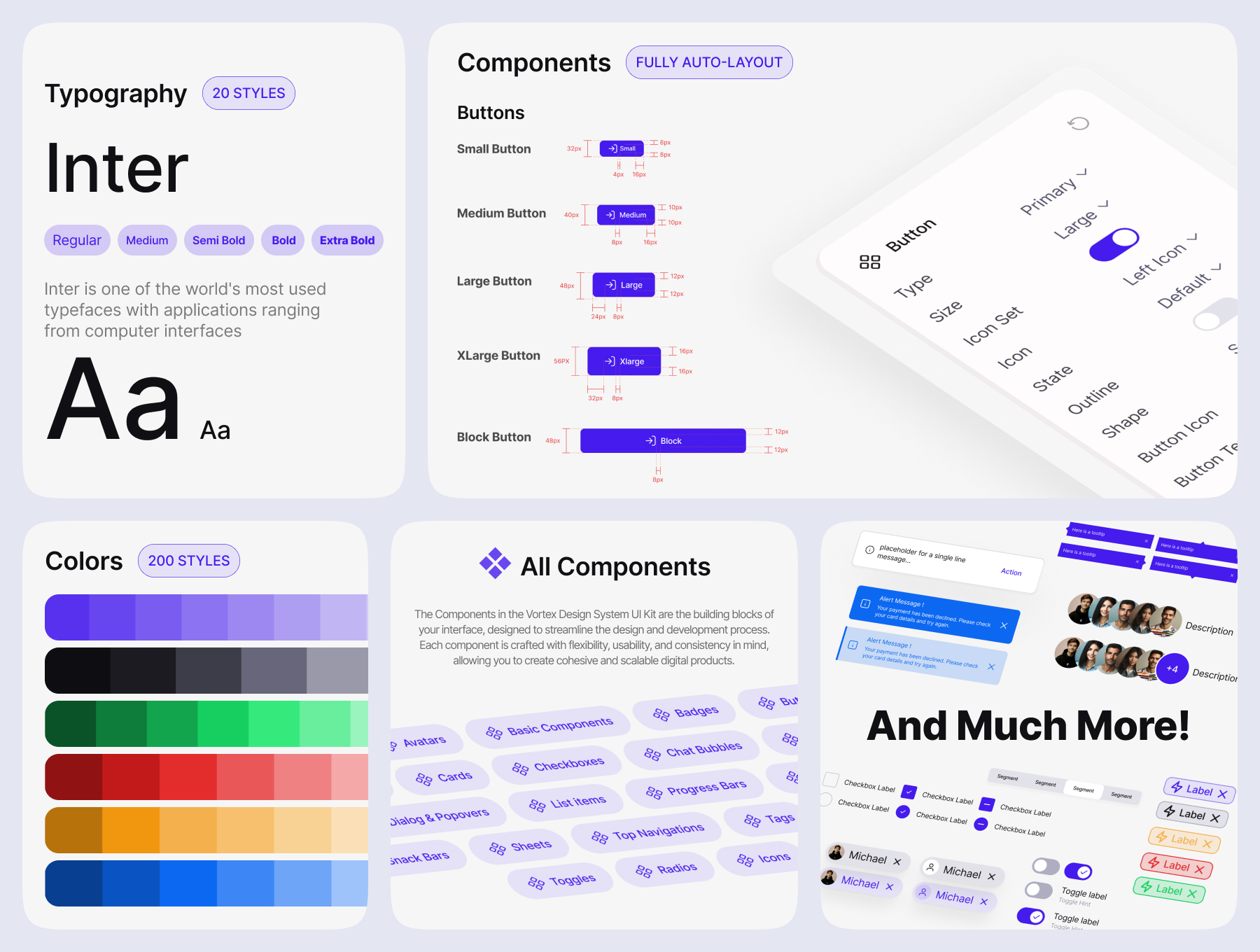
[VIP] Vortex Design System UI Kit
This is a meticulously crafted design system and UI Kit, built to empower designers and developers in creating high-quality, scalable, and efficient digital experiences. More than just a collection of components, Vortex is a fully-fledged framework designed for consistency, flexibility, and seamless collaboration across projects.
Overview
The Only Figma UI Kit You’ll Ever Need
Vortex is a meticulously crafted design system and UI Kit, built to empower designers and developers in creating high-quality, scalable, and efficient digital experiences. More than just a collection of components, Vortex is a fully-fledged framework designed for consistency, flexibility, and seamless collaboration across projects.
With 6,000+ components and variants, Vortex offers complete customization to match your brand and project needs.
Why Choose Vortex
- ✅ Unmatched Versatility – Features responsive typography, auto-layouts, and dynamic multi-shape components (square, pill, etc.).
- ✅ Enterprise-Grade Quality – Built for scalability and modularity, making it perfect for teams and large-scale projects.
- ✅ Figma Compatibility – Ensuring seamless collaboration across different workflows.
- ✅ Lifetime Updates & Support – Stay ahead with continuous improvements and enhancements.
- ✅ Auto Layout Support – Designed for faster workflows, precision, and efficiency.
What’s Inside?
Comprehensive Component Library (6000+ Variants)
- Core UI Elements – Buttons, icon buttons, toggles, checkboxes, radio buttons, inputs, list items, tags, segmented controls, and more.
- Navigation & Feedback – Progress indicators, top navigations, bottom navigations, tabs, alerts, snackbars, tooltips, and badges.
- Advanced Features – Sliders, modals, avatars, and fully optimized UI elements for mobile.
Style & Design System
- Typography – Scalable text styles for mobile, tablet, and desktop.
- Color Palette – A modern monochrome palette following accessibility standards.
- Shadows & States – Thoughtfully designed hover, pressed, and active states.
- Feather Library – Includes 2000+ high-quality icons for a polished UI.
- Avatar & Logos – Carefully crafted assets for a consistent and professional look.
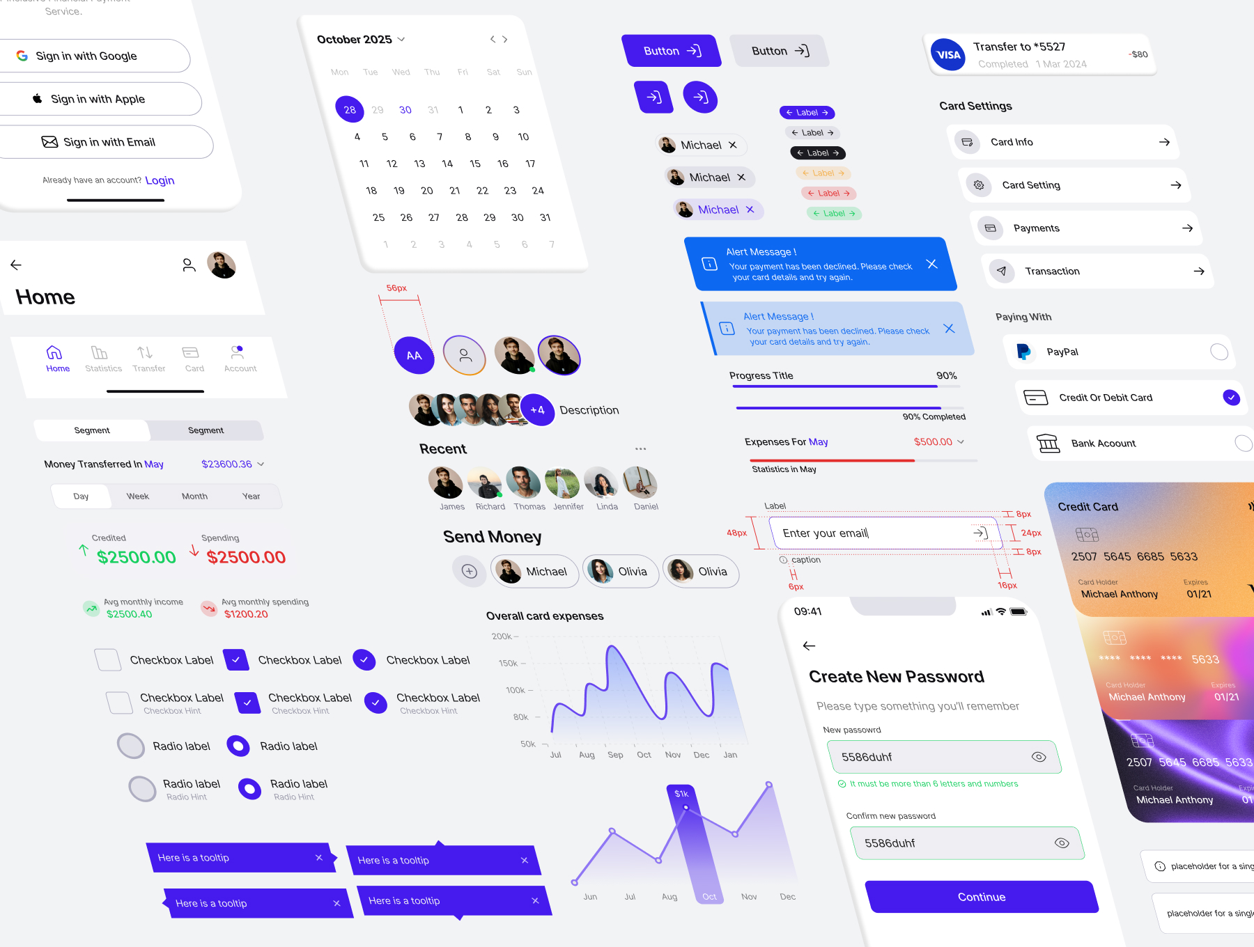
Build Faster. Design Smarter.
Whether you're designing mobile apps, enterprise dashboards, or complex web solutions, Vortex Design System UI Kit provides the ultimate toolkit to accelerate your design process and elevate your projects.
Highlights
- +6k Variants/Components + Lifetime Updates
- Light & Dark Theme
- Easily Drag & Drop Design
- Fully Customizable & Responsive
- Auto layout and constraints
- FinCore Banking App Example


What's Your Reaction?
 Like
0
Like
0
 Dislike
0
Dislike
0
 Love
1
Love
1
 Funny
0
Funny
0
 Angry
0
Angry
0
 Sad
0
Sad
0
 Wow
0
Wow
0
![[VIP] NucaAI: Nutrition & Calories App](https://i.pinimg.com/1200x/98/b3/81/98b381fee4395f4c9585167210969368.jpg)
![[$] Final UI: Design Systems](https://i.pinimg.com/1200x/d0/dc/25/d0dc25d35d2164bd318fb2afce0be8d8.jpg)
![[VIP] Mooney: Financial Planer Dashboard](https://i.pinimg.com/1200x/44/20/60/442060a0d9c380653e8eb3ac01f1cbdc.jpg)
![[VIP] Prismé Framer Template](data:image/png;base64,iVBORw0KGgoAAAANSUhEUgAAAcIAAAEYAQMAAAD1c2RPAAAAA1BMVEUAAACnej3aAAAAAXRSTlMAQObYZgAAACVJREFUaN7twQEBAAAAgqD+r26IwAAAAAAAAAAAAAAAAAAAACDoP3AAASZRMyIAAAAASUVORK5CYII=)
![[VIP] Spentra: Expense & Budget Tracker App](https://i.pinimg.com/1200x/8f/5a/79/8f5a7990421614a93e7fb21509f63c80.jpg)


