
![[VIP] Unlimited Pass 2026.03.27](https://i.pinimg.com/1200x/d2/f8/2e/d2f82e903b9ca33b0f13704cc85a3d8a.jpg)


![[LS] ls.graphics Pass 2026.02.16](https://i.pinimg.com/1200x/8d/ca/7f/8dca7ff72d8b698f955649340d0ff398.jpg)

![[PRO] Craftwork Pass 2025.06.11](https://i.pinimg.com/1200x/98/d2/f0/98d2f0169226b431f4727441ecc6aa06.jpg)


![[VIP] Prismé Framer Template](https://i.pinimg.com/1200x/31/cd/ed/31cdeda383c0f3d765425847c27021aa.jpg)


![[VIP] Creovo: Creative Portfolio](https://i.pinimg.com/1200x/92/5d/39/925d39b614ae4e39adda25b73837f82b.jpg)


![[VIP] Voltz: Electric Car Website Template](https://i.pinimg.com/1200x/03/ba/41/03ba41513483727fcd26b95349750783.jpg)
![[VIP] Zyra: Coded Chat AI Dashboard](https://i.pinimg.com/1200x/ce/7b/92/ce7b926f22423fc046659dfe1dd7a604.jpg)
![[$] AlignUI: Code Library](https://i.pinimg.com/1200x/8d/91/1c/8d911c0a22483842cff69c130e80c37b.jpg)
![[VIP] The Grid Deck Template](https://i.pinimg.com/1200x/f2/df/6d/f2df6d865d31ed4400ddd74137a5a79e.jpg)

![[VIP] Solaris: Sales Forecast & Pipeline Review Deck](https://i.pinimg.com/1200x/ba/7c/48/ba7c485ac40a51054cf9074aead204e2.jpg)
![[VIP] Brand Guideline Presentation](https://i.pinimg.com/1200x/64/87/a7/6487a7c4da21072150a1664f83a6a234.jpg)


![[VIP] 44 Device Mockups: Metal Scene Pack](https://i.pinimg.com/1200x/96/0c/c4/960cc4d39f6f9f08c4ba4a40ae740a65.jpg)
![[LS] iPhone 17 Mockup](https://i.pinimg.com/1200x/18/42/c1/1842c11e3da971765bdcfbc5315f3df8.jpg)
![[LS] iPhone 17 Pro Max Mockups](https://i.pinimg.com/1200x/f0/2a/72/f02a724ed9f52ac4a1c66b5614809111.jpg)
![[LS] AE-Mockups, Apple Devices](https://i.pinimg.com/1200x/03/04/9b/03049ba79acaa546ae6389639f89bcc1.jpg)


![[VIP] React Three Fiber: The Ultimate Guide to 3D Web Development](https://i.pinimg.com/1200x/78/02/1f/78021ffdfc8113cc8caba5b2c563ead4.jpg)
![[VIP] Ryan Hayward: Ultimate Framer Masterclass 3.0](https://i.pinimg.com/1200x/48/d6/3f/48d63f9723d7c49e6c34c182557c7431.jpg)


![[VIP] Whoooa! 156 vector Lottie animations](https://design.rip/uploads/cover/blog/whoooa-156-vector-animations.webp)


![[VIP] Staff Product Designer (ENG, RUS)](https://i.pinimg.com/1200x/0c/52/a0/0c52a08d8b0a25329806437933cf538f.jpg)


7 UI/UX Mistakes That Scream “Beginner”
Even great gradients can’t hide rookie UI/UX habits. Clients notice flow, spacing, and clarity before visuals. Fix these 7 silent mistakes to make your designs feel confident, professional, and client-ready.

Even with the most stunning gradients and shadows, you may still look inexperienced.
Because clients see more than just pixels. They feel clarity, flexibility, and trust.
Here's how to fix the seven silent signals that scream "junior designer" and replace them with habits that make your work feel professional, confident, and client-ready.
Why This Matters
Even talented designers accidentally send "I'm new at this" signals with messy interfaces, awkward spacing, and inconsistent flows.
Mid-senior designers, project managers, and founders immediately notice these details, which separate a portfolio work from a marketplace product.
These changes improve freelancers' overall worth, besides just improving their skill.
Your work now gets better pay, faster approvals, and longer client connections.
What You'll Learn
- The seven most typical mistakes in design that make UIs feel rough and crude.
- Quick techniques that boost clarity and trust overnight.
- A step-by-step mini audit that will improve any screen in 90 minutes.
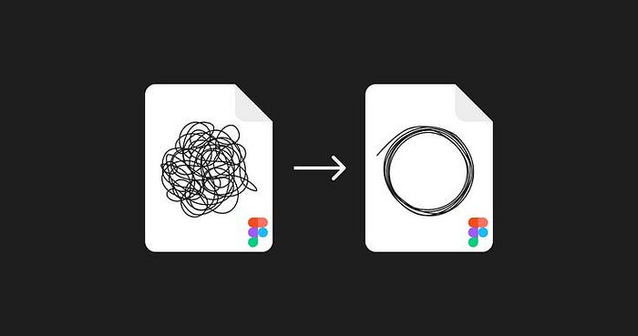
1. Fix the flow before touching the pixels.

A client previously told me to "make the app look modern."
What's the true problem?
Users were unable to complete the signup process without getting lost.
After addressing this issue, retention increased without needing any color changes.
- Key takeaway: Poor user flow is the hidden killer of great design.
Map out your key goal, test it with three real people, and remove unnecessary processes.
Add skip buttons, search bars, and progress indicators to maintain momentum.
- Find the shortest path from entry to main task to success. If it takes more than three steps, reduce them.
Think about adding a "Skip for now" button in your onboarding to reduce user friction, which clients like.
HubSpot found that reducing friction boosts conversion rates by up to 30%.
2. Tone down effects for clarity over looks.
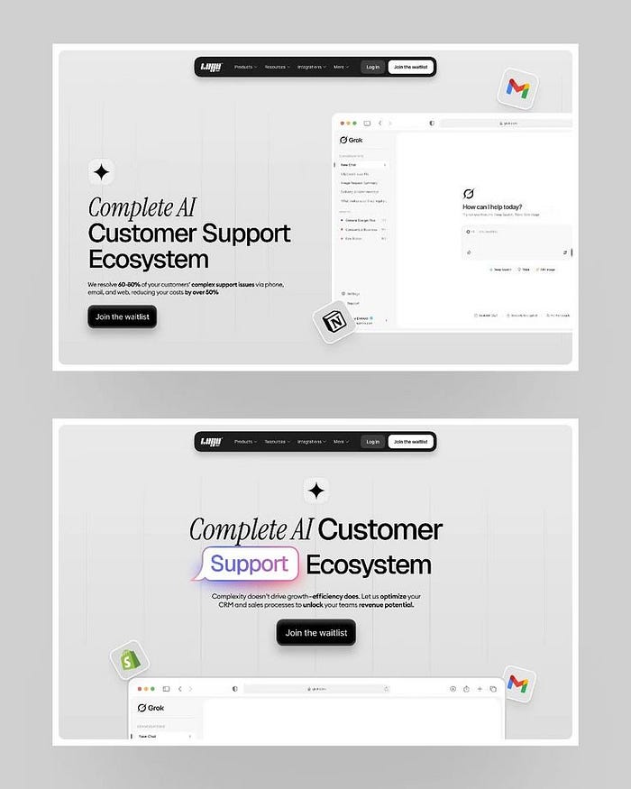
Hot take: using too many gradients and glows is the eye-catching version of shouting.
Effects should direct the eye rather than blind it.
Use the "Rule of 3": only one strong effect at a time.
Avoid using soft shadows, soft gradients, and clean surfaces.
Key insight: Visual depth should look hidden; it is effective when no one detects it.
DO THIS: Duplicate your design, remove all effects, and reapply just those that increase readability.
Share your "no-effects" version on social media for a calmer look and more thoughtful comments.
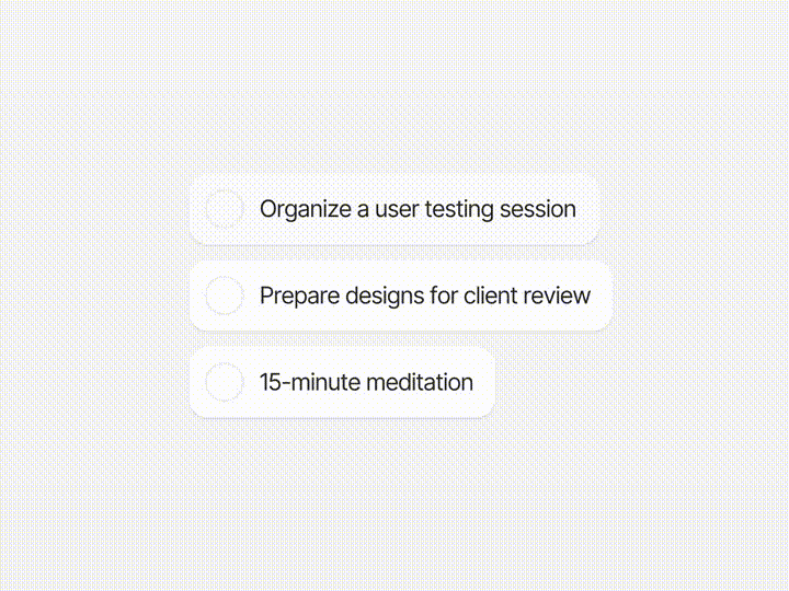
3. Spacing is the secret code of senior designers.
If you've ever wondered why some apps feel so premium, the answer is space.
Designers that use consistent grids and scales immediately show professionalism.
Start with an 8-pixel base system. Create a spacing scale (8, 16, 24, 32, 40…).
Audit your layouts and replace any odd numbers with a scale step.
The key to consistency is to focus on rhythm rather than perfection.
DO THIS: Conduct a 15-minute spacing audit on your latest project. Replace all 11px and 23px values with your base scale.
Provide clients with a "Visual Rhythm Review" as an add-on, which takes a little effort but provides great satisfaction.
4. Build small systems, not random screens.
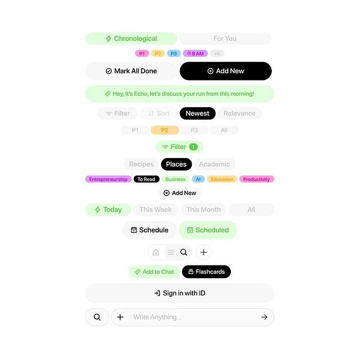
Inconsistent buttons, flat lines, and random icons scream "junior" louder.
I previously worked on a startup dashboard where buttons had four different corner radii.
By combining everything under a single 8px guideline, the product became clearer and felt to be created by just one idea.
Design systems increase trust, not create complexity.
DO THIS: Create a "Base Components" page in Figma containing buttons, inputs, and cards to reuse regularly.
Deliver your small system as a bonus delivery.
It immediately showcases you as a "design partner," not a pixel pusher.
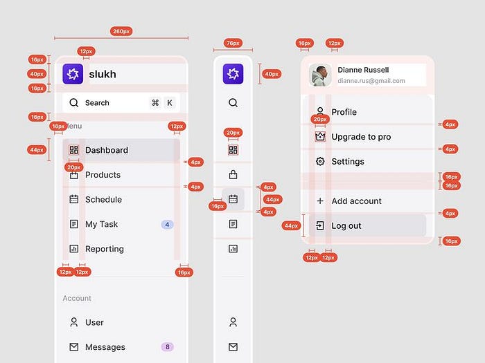
5. Manage Your Icons: Small Details, Big Signals.
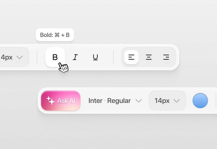
Icons show tone of voice.
If one sounds off, the message looks wrong.
Stick to one family (Feather, Phosphor, or Material), match stroke weights, and never use filled and outline icons in the same context.
The main takeaway: Icon consistency communicates unnoticed skill.
DO THIS: Create a "Icons" Figma page with consistent sizes and strokes.
Offer to "normalize icons" as part of visual QA for a high-value, low-effort upsell.
6. Organize like a Senior Designer.
If you can, delete it. If you are unable to delete it, mute it.
Overused arrows, unnecessary separators, and many CTAs ruin clarity.
Minimalism is to reduce confusion rather than reducing design elements.
DO THIS: Run the "Does it help?" test for each element. If it doesn't help the main task, remove or disable it.
Post a before and after of your "organized round." It's an easy way to show off design maturity in public.
7. Feedback Creates Interfaces. Feel alive.
Buttons that do not react.
Loaders that never appear.
Users ask, "Did it even work?" Micro-interactions are wordless storytellers that show, "Hey, I heard you."
Key takeaway: Feedback builds trust much faster than UI copy can.
DO THIS: Add hover, push, and loading states to all important components.
Bonus: Charts Should Clarify, Not Show Off
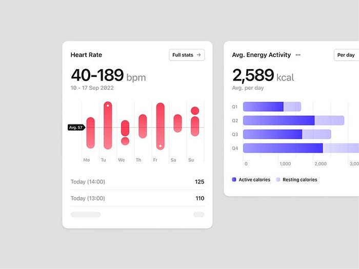
If your charts need explanation, they are overdesigned.
Start with understanding, not style.
Limit the number of colors, simplify the axes, and label all the necessary points.
Key takeaway: Clarity beats cleverness. Always.
DO THIS: Replace one beautiful chart with a plain bar graph and clear labels.
Your PM will love it.
Quick Audit: Fix Your App in One Shot
- User Flow → Make sure the core task runs smoothly from start to finish.
- Use a consistent scale when spacing.
- Components → Replace random components with system versions.
- Icons help normalize families and weights.
- Effects → remove noise.
- Feedback → Add loaders, states, and micro-interactions.
- Charts → Cut down for better readability.
After completing this process, your design will look more skilled, as if it were part of a paid-for product rather than a student portfolio.
Take the Mini 90-Minute Challenge today!
Choose one screen.
- 0–15 minutes: Set the user's goal.
- 15–35 minutes: Wireframe the simplest possible flow.
- 35–60 minutes: Apply the spacing and component system.
- 60–80 minutes: Add states and clear mess.
- 80–90 minutes: Test with someone else.
Then share your before and after pics.
Small, quick improvements build into expert designs.
Final Thought: From "Looks Good" to "Feels Right"
Beginners ask for attention. Pros go for momentum.
When your interface is simple, consistent, and responsive, people will stop thinking about design and start trusting it.
If you only do one thing, review your flow and spacing. Fix those, and your portfolio will immediately boost up.
What's Your Reaction?
 Like
3
Like
3
 Dislike
1
Dislike
1
 Love
1
Love
1
 Funny
1
Funny
1
 Angry
1
Angry
1
 Sad
1
Sad
1
 Wow
2
Wow
2


![[VIP] Memorisely: AI Design System](https://i.pinimg.com/1200x/00/31/78/00317811d7cda9792e12b379e96b6c88.jpg)
