


![[VIP] Unlimited Pass 2026.02.26](https://i.pinimg.com/1200x/d2/f8/2e/d2f82e903b9ca33b0f13704cc85a3d8a.jpg)
![[LS] ls.graphics Pass 2026.02.16](https://i.pinimg.com/1200x/8d/ca/7f/8dca7ff72d8b698f955649340d0ff398.jpg)

![[PRO] Craftwork Pass 2025.06.11](https://i.pinimg.com/1200x/98/d2/f0/98d2f0169226b431f4727441ecc6aa06.jpg)


![[VIP] NexoWallet Fintech App](https://i.pinimg.com/1200x/9d/ae/4b/9dae4bca1f323fb4d1d9bd5a5ff4116e.jpg)
![[VIP] Voltz: Electric Car Website Template](https://i.pinimg.com/1200x/03/ba/41/03ba41513483727fcd26b95349750783.jpg)

![[VIP] AI Workflow Automation SaaS](https://i.pinimg.com/1200x/9a/bd/42/9abd4201b34742e2696764ebe48297d5.jpg)
![[VIP] Fuchsia: Web3/SaaS Framer Website](https://i.pinimg.com/1200x/36/6c/37/366c371285f13531caf2077c599fa1cc.jpg)

![[VIP] NexLabs: Best Agency Template](https://i.pinimg.com/1200x/e6/18/86/e6188624641654e98927529f8c4adbc7.jpg)


![[VIP] Zyra: Coded Chat AI Dashboard](https://i.pinimg.com/1200x/ce/7b/92/ce7b926f22423fc046659dfe1dd7a604.jpg)
![[$] AlignUI: Code Library](https://i.pinimg.com/1200x/8d/91/1c/8d911c0a22483842cff69c130e80c37b.jpg)

![[VIP] Solaris: Sales Forecast & Pipeline Review Deck](https://i.pinimg.com/1200x/ba/7c/48/ba7c485ac40a51054cf9074aead204e2.jpg)
![[VIP] Brand Guideline Presentation](https://i.pinimg.com/1200x/64/87/a7/6487a7c4da21072150a1664f83a6a234.jpg)
![[VIP] SaaS Pro: Presentation](https://i.pinimg.com/1200x/d5/75/dc/d575dc20daed5af02a08ed54d53ce7f5.jpg)


![[LS] iPhone 17 Mockup](https://i.pinimg.com/1200x/18/42/c1/1842c11e3da971765bdcfbc5315f3df8.jpg)
![[LS] iPhone 17 Pro Max Mockups](https://i.pinimg.com/1200x/f0/2a/72/f02a724ed9f52ac4a1c66b5614809111.jpg)
![[LS] AE-Mockups, Apple Devices](https://i.pinimg.com/1200x/03/04/9b/03049ba79acaa546ae6389639f89bcc1.jpg)
![[LS] MacBook Air M2 Looped, Animated Mockups](https://i.pinimg.com/1200x/76/d9/0a/76d90af27052b69cb561a098cd1907a6.jpg)


![[VIP] Volnitsa: BLNDR MINI (2025)](https://i.pinimg.com/1200x/c3/f7/0a/c3f70ae1126be5c0af1977e58b56ba7a.jpg)


![[VIP] Memorisely: AI Design System](https://i.pinimg.com/1200x/00/31/78/00317811d7cda9792e12b379e96b6c88.jpg)
![[VIP] React Three Fiber: The Ultimate Guide to 3D Web Development](https://i.pinimg.com/1200x/78/02/1f/78021ffdfc8113cc8caba5b2c563ead4.jpg)
![[VIP] Ryan Hayward: Ultimate Framer Masterclass 3.0](https://i.pinimg.com/1200x/48/d6/3f/48d63f9723d7c49e6c34c182557c7431.jpg)


![[VIP] Whoooa! 156 vector Lottie animations](https://design.rip/uploads/cover/blog/whoooa-156-vector-animations.webp)


![[VIP] Staff Product Designer (ENG, RUS)](https://i.pinimg.com/1200x/0c/52/a0/0c52a08d8b0a25329806437933cf538f.jpg)


![[VIP] Products People Actually Want](https://i.pinimg.com/1200x/4e/aa/f9/4eaaf9c3961559a9bba223a33c5e6d19.jpg)


My Complete Web design & build workflow
Do better instead of more. 25 years of experience condensed into the best process there is.

We're entering the possibly best stage for modern web design. A spot where the right people will push boundaries again. I've set my processes up around it already and the results blew my mind.
It's next level!
I'll go through our entire workflow, hardware, apps, AI models, methods and patterns, including a full cost breakdown on how to set it all up and running yourself. Should you try it?
Yeah.
I believe you should.
The past shifts
I've been very fortunate to be a part of all the major web shifts. From the mid-90's I witnessed the emergence of gif's on the web, then basic CSS, Flash, VRML (most don't know what it stands for now), all the way to overhyped Web 2.0, Web 3.0, rise of social media, responsive web, HTML5 and more.

One of my first designs (and code) websites in 1998. Lots of raster editing and an animated electric bolt in a GIF. This back then was something completely new and unexplored.
But none of these shifts have made me as excited for the future of the web as I am right now. Our complete in-house process at the company became just that cool.
From self-reliance on multiple levels all the way to collaboration and awesome new design concepts.
But before I show you how I do it, we need to address all the small, micro-elephants in the room.

Design overlaps frontend even more strongly now than in the early 2000s.
Designers vs code
When I started my first "real" job in 2001, as a designer my responsibilities were also to code the frontend. Back then it was normal, because on the web frontend IS design.
Extreme overhiring and hype around the emerging "UX" introduced new people to the industry. They didn't want to code. Often they didn't even want to actually design, just talk.
That led to an extreme niching process, with lots of non-designers suddenly getting a designer badge by proxy.
It was a dark time.
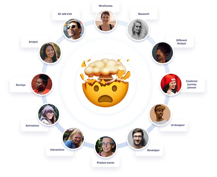
UX roles graph, showing many useless jobs
This was from my 2019 articles on UX having bad UX that went viral back then.
In 2019 I wrote my very first viral article called "UX has pretty bad ux" that addressed that. A lot of people felt personally attacked by this.
Where are they now?
Luckily the market readjusted. Most of the overhiring got reverted and only actually useful roles are staying. Some say it's because of AI, but I think AI is only used as a scapegoat. It's just easy to blame it all on "robot replacement".
Reality is that the split experiment didn't really work out.
Most of the super-niche roles just added overhead, complexity and lowered the output quality. Design IS frontend.
Right now, largely due to AI tools, designers are closer to frontend than they were in the last two decades.
And I love this!

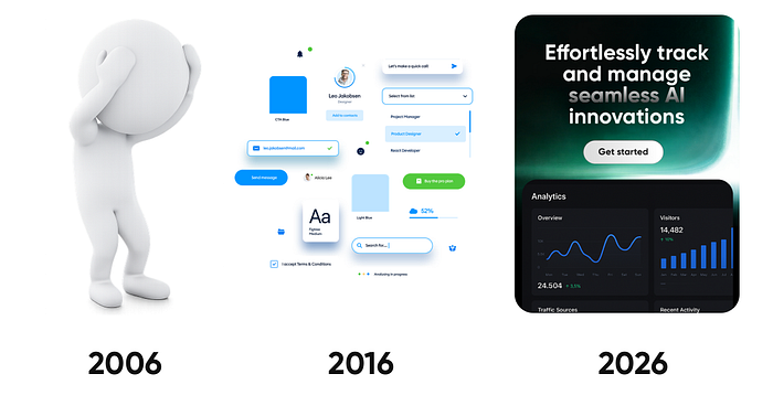
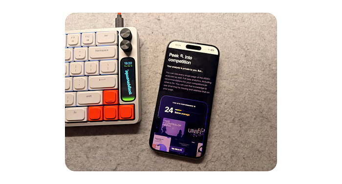
I'll show you our workflow based on our upcoming Pageformance project.
Web Design workflow for 2026
The workflow now is a lot different than even a year ago. It's way better quality outputs and more granular control on how things are being built.
I use Claude Code to put together my frontend builds. There are three main rules to always abide by:
- The output cannot be AI SLOP
- NEVER optimize for speed, only for quality
- Understanding most of the code written by AI
Slop across the times.
Let's talk slop
Slop is not a new concept. It existed way before AI. From ugly cliparts, all the way to $30 templates. If you wanted a website cheap and fast, it was just as possible before any AI existed.
Slop design is a lack of taste multiplied by a common denominator.
Let me explain. Most people aren't designers.
They don't live and breathe design. They don't surround themselves with finely crafted things. They don't have "the eye" to spot quality. They feel it sometimes, but subconsciously.
But sadly, most designers also aren't designers.
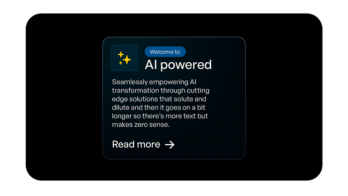
One of the most common AI slop UI examples is boxes with borders within borders. Often colorful, with a radial fill and overused iconography.
They're assemblers from past patterns. Be it design system components (drag & drop inputs all day), or templates. All those established patterns and popular solutions are the common denominator.
When they meet a lack of taste, we get the current wave of sloppy AI generated websites.
That is not the way. It's also why I founded the slopless movement and wrote a manifesto on how to fix this.
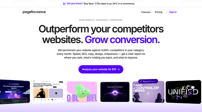
Below you can see how we used "ai colors" (purple) and colored borders but in a way where it's refined, makes sense and is reinforcing the copy, not just being there as some "generated visual".

When working on Pageformance we crafted even the in-section micro-interactions. Extreme detail and precision went into this.
Never optimize for speed
For years design industry led us to believe faster is better. Let's make a design system so we can work faster. Let's use a template, so things get built faster.
That leads to complacency and lack of innovation. Instead of finding new solutions to old problems, we use speed of "good enough" as the main metric. As long as it works and happens fast, we're good.
AI tools can speed up a workflow significantly, especially around code. What happens next is blindly following that exact speed addiction. You save 80% more time, so let's make 5 x more things.
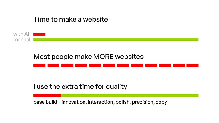
Most people just make MORE stuff with the time saved. We focus on using the time to do BETTER.
Instead, in my workflow we spend the exact same time as before on a project. All that "saved" time, now goes into upping the quality. More copy explorations. Awesome micro-interactions. Polish. Pixel perfection (optical, not grid based).
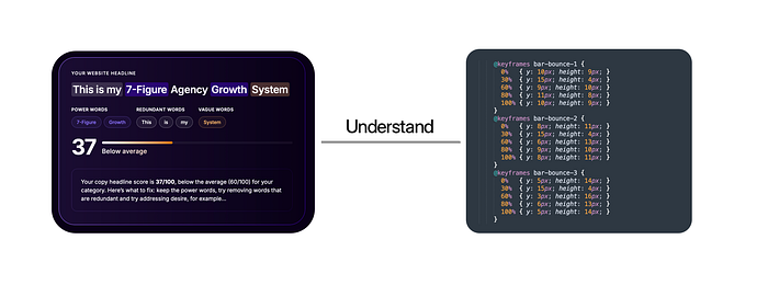
Understand how to change things by hand, as it's often faster to do granual tweaks to perfection WITHOUT ai.
Understand the code
Designers should understand CSS. I can give you a pass on most of JS, and HTML is something you should already understand. But building for the web needs you to know what that AI output means.
Modify it by hand. Don't ask an LLM to change a padding by 1 pixel. Go into the code and type that in. It's a waste of resources.
As a web designer, browser's inspect mode is now your best friend.
Since the designer/frontend paths are merging, this of course also means frontend devs should learn design.
This new hybrid role is necessary to be able to get the best possible results.
Not faster. Just a lot better.
Fast vs good
If you just want to generate the generic AI slop garbage everyone does I guess you can just type in prompts. But for anything of quality is just not enough.
Let's walk through how we do things at Squareblack. A boutique design (and now partially dev) agency that I run alongside Diana Malewicz.
We do all kinds of design, but for this workflow let's focus on landing page design specifically for our upcoming product called Pageformance.
Our office setup is four computers. Two work-machines and two servers.
The Setup
The hardware
We have four computers at the office. We each work on Macbook air m4's now because of their portability and speed. I'll get to the full specs in a minute.
Then we use an M1 Mac mini, 32GB ram as an Apache server, a git server, a 14B parameter local AI model and openclaw server for Brick.
It handles all that perfectly. I connected a portable USB-C, LG 15" flat display to it, a keyboard and mouse. It sits in a closed cabinet as we don't usualy need to even turn it on. We can locally SSH to it via terminall to run or change things.
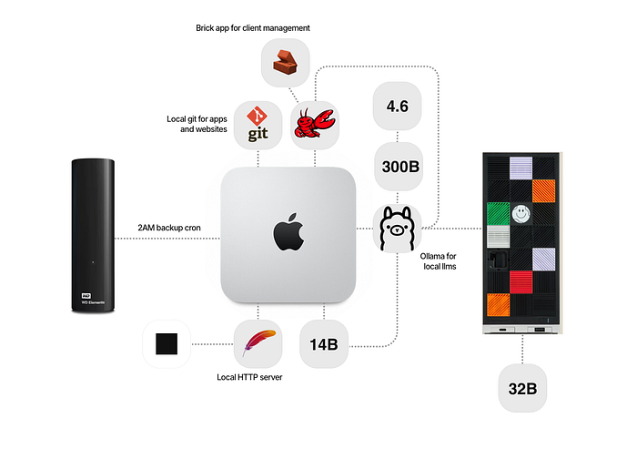
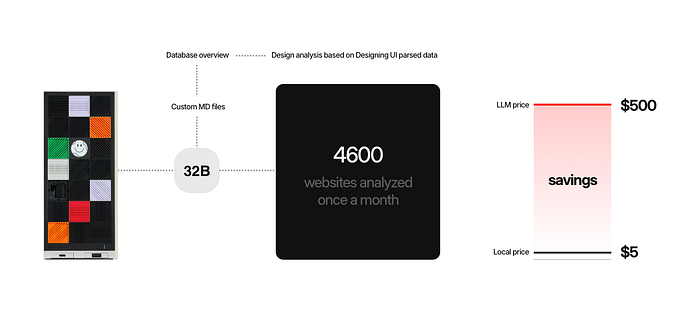
There's also a Framework Desktop computer running another, this time 32B parameter model for more complex tasks that serves that ollama model to the mini via ethernet.
I also use the Framework desktop once per month to parse a huge dataset from my startup, Pageformance. It runs for 18 hours straight, with around $5 extra electricity cost.
But what it replaces is around $500/mo in API costs for cloud LLMs so it's a huge time-saver. And in this particular use-case the quality of a 32B local model is completely enough for what is being analyzed and how.
The local AI
Combined, these two machines serve as our main organizational support. They run Ollama (in terminal), while the mini also serves as git and local web server.
Organizational support means onboarding clients, generating documents using Brick, keeping client profiling (how they respond to specific issues so we can address those better in the future) and a lot more. The Brick app is our internal app based on the .MD files and PDFs from my Squareblack Blueprint.
We use it as a business-source of truth, that also generates ongoing project updates for the clients in a pretty UI.
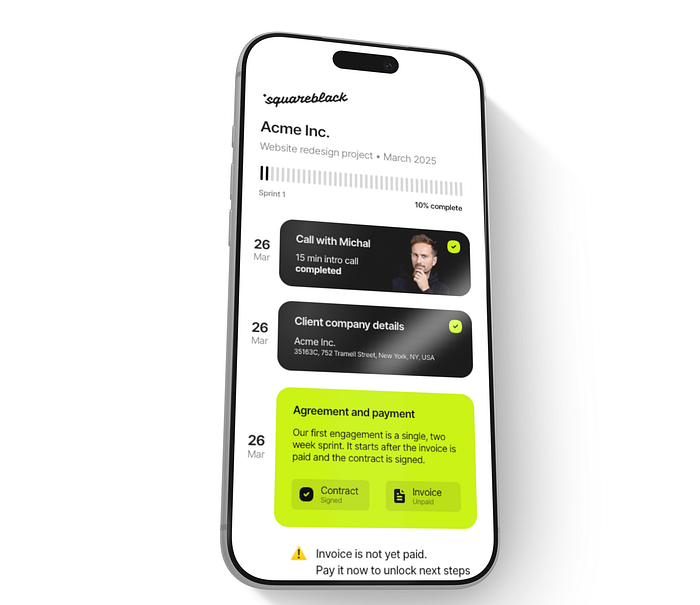
We answer simple questions to our bot, it auto-generates a client portal view with updated elements. Anything changes (like contract signed) it auto-updates for everyone.
We don't use those local models for general AI tasks (for now) as they're not powerful enough.
For those I use openclaw running a cloud version of the 297B parameter model of Qwen via Ollama. It's free up to 1M tokens and the cooldown resets are quite generous.
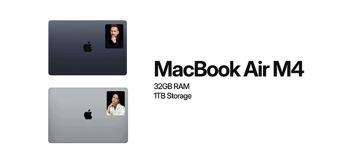
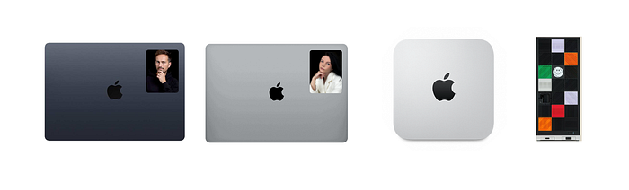
MacBook Air M4 at Squareblack
MacBooks
Both me and Diana run on Macbook Air M4. Maxed out ram at 32GB, 1 Terabyte of storage. We travel a lot and found out that the Air is completely capable enough for everything we do. From coding, design, writing all the way to editing my 4K YouTube videos.
I don't need a pro. Sold mine and never looked back. A Macbook Neo would probably be a bit too slow for what I do, but the Air is a perfect sweet spot. Especially paired with 32GB of RAM.
The macbooks use a shared repository from the mini to push and pull the sites we're working on locally. Then those git repositories auto sync to the Apache server on the mini.
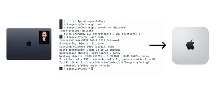
Source of truth lives on the Mac Mini
And every night at 2AM a cron job starts on the mini to backup all that we worked on to an external hard drive and a secure VPS.
The local apache server on the mini allows us to quickly preview what we're working on, on macbooks or on actual phones using wifi. No more simulators or responsive design modes.
It just works.
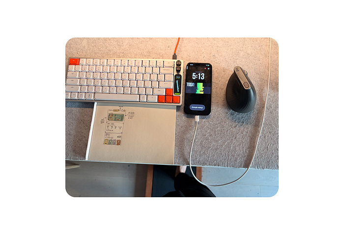
The walking pad under the standing desk is a great way to get the steps in while building products.
The workspace
I work at a standing desk. Sometimes standing, sometimes walking, sometimes sitting.
The Apple Studio display works great to stay at eye-level and have enough space for all the apps.
Diana prefers working on a laptop and has a small laptop table on wheels that's like a mini standing desk. She likes to move around when working, sometimes from one spot, sometimes from another, sometimes from a completely different room.
The web design workflow
The web design workflow is 5 step.
The first step is high level brainstorm on what the main goals of the product are. Then we try to think about the potential angles to mix the benefits together and how to best communicate them. It's like a conversation, pretending to be the perfect user.
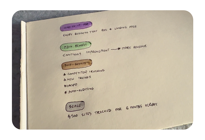
We start all the work on paper.
Paper
Then we sketch ideas on paper. That's the rough, super-low fidelity kind of approach. After that we write out all copy and brainstorm results in text. With the core structure ready we make another paper sketch, this time with colorful markers.
Coloring helps you relax a bit and often during that seemingly boring stage we get the most inspired with what to change or upgrade.
For this project we also explored a couple of options of the logo on paper.
MD file generation for code happens in Obsidian
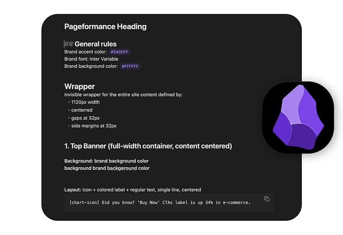
Obsidian
Then I use obsidian to write out the more refined copy structure. Defining the heading of the site, a kicker, H1, description, CTA and what else can be added as side notes. + the navigation and top bar.
This is full markdown file, that can be fed into AI tools to actually build the structure.
We have a couple of sizing values for best H1, description and CTA label combos. Depending on the amount of text we add one of them to the markdown as well.
The specifics can be tweaked later, but having proper proportion and hierarchy is really helpful.

Some elements need to be created on vectors, for which we use Sketch.
Sketch
For Pageformance we use Sketch to make the SVG of the logo, and later, down the page a couple more assets as fast wireframes.
The svg gets exported with a nice drag and drop directly from the app to the right folder.
Sometimes we do a typeframe or a final design in Sketch, but in many cases we jump from paper straight into code.
Coding
We both use a Claude Max plan for coding at the moment and Sublime Text for manual editing. Because this is manual work made of many small steps, we don't go for the CLI Claude Code version.
I do use it for another project though that I can't talk about yet. For landing pages the Claude app in the code tab is more than enough.
After the initial .MD file gets converted into a layout with proper hierarchy we start with the inspect mode in the browser. Manually move stuff around, change properties and then paste the specific CSS classes directly into Claude.
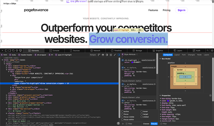
Using inspect to give AI precise layout instructions
It's not vibe-coding, because we talk to the AI in precise language.
Starting a project like that is about defining a grid, still the same based on the blueprint methods, 64 x 32 x 12 is the perfect grid for the web.
Using that we define the main wrapper. Then code in the navigation, the top bar, the H1, description and CTA all get prefilled from the base MD file.
We take parts of the code we like from our other websites too, like the effect on the CTA button from Squareblack Blueprint.
For things like the carousel, we search online ourselves to find the perfect open source solution. Yes, Claude can do the search for you, but in many cases the results are not exactly what you need.
We want the closest solution to what we want, then modify it. When asking AI to just find one, it will find the 5 or 6 most popular and your carousel (or any other custom object) will look like everyone else's.
Doing it yourself saves time.
The first takes on the mobile breakpoints happen in browser. Pro tip, do not EVER let AI define those itself. Everything from font sizes to even where the lines break has to be thought out.
You can make a BR tag be mobile or desktop only and define that perfect break yourself.
We test on three iPhone sizes, a Macbook and a Studio Display.]\
Because all changes are pushed locally to git and then to apache server, we can preview the site in seconds on all our local network devices including all smartphones at the office.
Cleanup
Manual tweaks in code happen in sublime, so at this messy build stage most styles are inline. It just makes it easier to tweak a specific part by hand without constantly asking an AI model to move something by a single pixel.
After the tweaks are done though, we ask the AI to split the JS and styles to separate files, define their structure and clean up the code.
We also ask it, when necessary to convert our different font sizes (very often odd numbers) into fractional rems, but that doesn't happen every single time.
Some websites need a more artistic, unique approach to them, and browser upscaling of regular px fonts works pretty well now too.
The cost
Our maxed out M4 Macbook Airs were around 2000 dollars each. The mini was close to 1500 back when it was new, now you can get a refurb for super cheap.
The framework desktop was around 2500, so after 5 months of running our pageformance data analysis it basically paid for itself.
We pay a $12/month for each Sketch license. One $20 license for photoshop, and on my computer I use Pixelmator Pro for a one time payment, no subscription.
We each run a $100 Claude Pro subscription for coding. Extra electricity costs for those two servers running constantly are $25/month.
AI API costs for more reasoning on OpenClaw are now down from $200 to around $20, as Opus is last on the list, after the two local models and the almost 300B param free tier for qwen on Ollama.
Overall, for an innovative, boutique agency our costs aren't that high.
We're also currently migrating from Slack to a custom, self-hosted (also on the mini) solution that we can access from anywhere in the world using Tailscale.
I believe everything you do should slowly transition to being local, with full control and as little SaaS as possible.
Making the website look EXACTLY how we wanted, down to a subpixel.
Why it matters?
Most people are getting it wrong. They think AI is useful for making things fast. Like write a prompt, get a website. But see, back in the 2000s, if you didn't want to make a custom website, you could've just bought a cheap $30 template and change the copy.
Just vibe-prompting without thinking is the same. You get slop, but fast. This is not what we're about, and the more slop gets pushed out by AI, the more important it will be to stand out and do quality things.
AI gets better at UI, but slowly, and as designers it's our job to always be a few steps ahead of the currently AI scraped trends.
If you use AI as a tool, not as a "designer/developer", you end up creating great things. That's our approach.
And this workflow helps us deliver the best possible work we can. Not faster, just better.
What's Your Reaction?
 Like
1
Like
1
 Dislike
0
Dislike
0
 Love
1
Love
1
 Funny
0
Funny
0
 Angry
0
Angry
0
 Sad
0
Sad
0
 Wow
1
Wow
1


![[VIP] Memorisely: AI Prototyping in Figma Make](https://i.pinimg.com/1200x/4d/f1/eb/4df1ebfd0ebaeeb2e48ac24950a74b92.jpg)