
![[VIP] Unlimited Pass 2026.03.27](https://i.pinimg.com/1200x/d2/f8/2e/d2f82e903b9ca33b0f13704cc85a3d8a.jpg)


![[LS] ls.graphics Pass 2026.02.16](https://i.pinimg.com/1200x/8d/ca/7f/8dca7ff72d8b698f955649340d0ff398.jpg)

![[PRO] Craftwork Pass 2025.06.11](https://i.pinimg.com/1200x/98/d2/f0/98d2f0169226b431f4727441ecc6aa06.jpg)


![[VIP] Prismé Framer Template](https://i.pinimg.com/1200x/31/cd/ed/31cdeda383c0f3d765425847c27021aa.jpg)


![[VIP] Creovo: Creative Portfolio](https://i.pinimg.com/1200x/92/5d/39/925d39b614ae4e39adda25b73837f82b.jpg)


![[VIP] Voltz: Electric Car Website Template](https://i.pinimg.com/1200x/03/ba/41/03ba41513483727fcd26b95349750783.jpg)
![[VIP] Zyra: Coded Chat AI Dashboard](https://i.pinimg.com/1200x/ce/7b/92/ce7b926f22423fc046659dfe1dd7a604.jpg)
![[$] AlignUI: Code Library](https://i.pinimg.com/1200x/8d/91/1c/8d911c0a22483842cff69c130e80c37b.jpg)
![[VIP] The Grid Deck Template](https://i.pinimg.com/1200x/f2/df/6d/f2df6d865d31ed4400ddd74137a5a79e.jpg)

![[VIP] Solaris: Sales Forecast & Pipeline Review Deck](https://i.pinimg.com/1200x/ba/7c/48/ba7c485ac40a51054cf9074aead204e2.jpg)
![[VIP] Brand Guideline Presentation](https://i.pinimg.com/1200x/64/87/a7/6487a7c4da21072150a1664f83a6a234.jpg)


![[VIP] 44 Device Mockups: Metal Scene Pack](https://i.pinimg.com/1200x/96/0c/c4/960cc4d39f6f9f08c4ba4a40ae740a65.jpg)
![[LS] iPhone 17 Mockup](https://i.pinimg.com/1200x/18/42/c1/1842c11e3da971765bdcfbc5315f3df8.jpg)
![[LS] iPhone 17 Pro Max Mockups](https://i.pinimg.com/1200x/f0/2a/72/f02a724ed9f52ac4a1c66b5614809111.jpg)
![[LS] AE-Mockups, Apple Devices](https://i.pinimg.com/1200x/03/04/9b/03049ba79acaa546ae6389639f89bcc1.jpg)


![[VIP] React Three Fiber: The Ultimate Guide to 3D Web Development](https://i.pinimg.com/1200x/78/02/1f/78021ffdfc8113cc8caba5b2c563ead4.jpg)
![[VIP] Ryan Hayward: Ultimate Framer Masterclass 3.0](https://i.pinimg.com/1200x/48/d6/3f/48d63f9723d7c49e6c34c182557c7431.jpg)


![[VIP] Whoooa! 156 vector Lottie animations](https://design.rip/uploads/cover/blog/whoooa-156-vector-animations.webp)


![[VIP] Staff Product Designer (ENG, RUS)](https://i.pinimg.com/1200x/0c/52/a0/0c52a08d8b0a25329806437933cf538f.jpg)


The End of Dashboards and Design Systems
Design systems were built to scale manual interface creation. They're now content fodder for AI. The perfect worker for parsing components, outlining specs, and shuffling identical boxes around. One that doesn't complain about the boring parts of it all.

Design systems were built to scale manual interface creation. They're now content fodder for AI. The perfect worker for parsing components, outlining specs, and shuffling identical boxes around. One that doesn't complain about the boring parts of it all.
Now it's starting to kill them off.
Imagine building yet another form that looks like all the other forms (Hi Jakob's law!). This is as refreshing as competitive clicking accept on cookie banners.
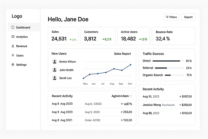
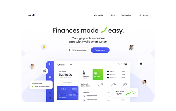
This dashboard was already generated in code, no design. Took 5 minutes for real data connection and fully working, responsive UI.
You can generate a design system using AI, build a complex dashboard and then realize nobody really needs it anymore. AI ate its own tail when it comes to generative user interfaces.
In short: it replaced itself.
We pretended everyone needed a system
Before we dive deeper, I have to warn you. This will be an extremely controversial take.
One that can turn your world upside down. Ask yourself this:
Who promotes using design systems the most?
Companies who make tools that build design systems. Or influencers they pay to do that.
It's simple: if you have something to maintain for long, they get money. And most systems require a lot of people.
When I said most designs need a hug that's not what I meant…
Big players like Figma promote systems as the ultimate productivity layer. The truth is, they mostly sell collaboration seats. The more the better.
This is why I believe the idea of "everyone needs a design system" was born. To keep pumping money into tools.
To keep a lot of people constantly reworking the same boring forms in a false hope of consistency and time savings.
Pretty clever.
Now, we designed a complex mobile app with just a simple styleguide.
But systems are…
Before you get your trusty pitchfork, I do acknowledge instances where design systems are necessary. They're a small fraction of design.
Most design will work just as well with a styleguide. A simple set of main rules. Even if everything else gets slightly inconsistent, it will all be held together by those main rules.
And judging by how bad most design nowadays looks, it seems like even those consistency efforts aren't working.
We got better, faster, smarter tools, yet it feels like EVERYTHING is breaking apart.
When I think of consistent, scalable systems and their output, I mostly think of this:

Assembly line of subpar experiences.
The altar of consistency
They used to sell design systems by a premise of time and cost savings. Anyone who tried implementing one (a proper one) quickly realizes it's often the exact opposite.
You pay MORE money and spend MORE time managing the system. It also often blocks you from innovating with extra constraints.
All in the name of consistency. When you're not saving money or time, you're at least getting a consistent interface, right?
Sure. But have you also noticed that everything looks pretty much the same now? I don't mean Jakob's law here.
I mean when you look at all complex systems, they're some form of shadcn/tailwind combo.
You maintain and manage a system that looks like the system of multiple other brands. But yes, it is consistent.
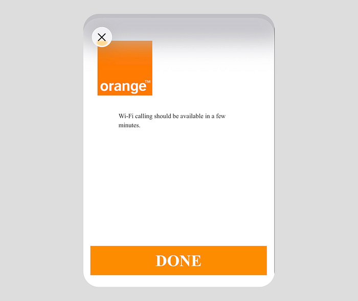
Consistently boring. And if only that. Many fail to even implement their own systems in rather important parts of the user experience. Take this Orange modal for enabling Wi-Fi calling on the iPhone.
This can be potentially seen by millions of new iPhone users. Orange has a pretty nice design system.
I know because I did some designs for them back in the day. But where is that design system here? Exactly.
Apps are tools to solve problems
Most popular counter argument is that apps should be boring. They should be functional and streamlined, so you accomplish your task quickly.
But have you looked at your screen time lately? Most people spend 5–9 hours every single day on their phones. If this were true, they must've been accomplishing an insane amount of tasks, right?
Apps are not tools anymore. They're experiences that are supposed to fill voids in our lives. We're bored so we doomscroll this feed. Then switch to that feed because it has vertical videos. Then this one because it has text outrage.
We don't use apps to get things done. We use them to get away from things.
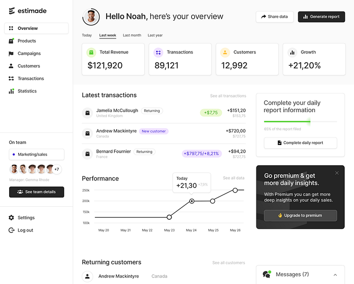
Another dashboard I designed years ago for a course on web design. This is now also an obsolete way to present data.
Dashboards were used to sell design systems
A dashboard is eyecandy to sell different types of boxes. Most of interfaces are forms of some kind.
That's boring!
A dashboard merges multiple different data types with often useless graphs and charts and looks great.
For a while designers were pushing hard to learn dashboard design. To use a design systems. To learn the variants, variables, components, tokens.
Not many ever ask the question if it's even valid. Does a dashboard make sense? Why does it exist?
Who cares? Let's just stack identical looking boxes all day. When I recorded this "Sad life of a designer" skit, I never thought about how prophetic it would be.

Adding identical components to frames all day and shift + a every 10 seconds
The humble beginnings of dashboards
It all started with data. Computers were really good at processing vast amounts of it. We, as humans however, weren't good at interpreting them.
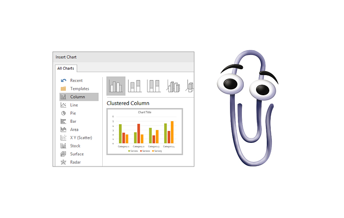
So design gods from Microsoft created Excel. From now on everyone can input data, then macro-code some formulas and that data gets visualized. It's like magic, but with Clippy jumping out of the hat.
Data visualization for the masses
You get a nice looking pie chart that can track your pie sales in your pie-shop for autumn. The pumpkin pie can be a nice matching orange on the graph.
Fast forward two decades later and all of design is either a chatbot interface or a dashboard. Or a chatbot interface that builds dashboards for you.
Cognitive load vs intent
Most dashboards are a prime example of a high cognitive load interface. Sure, there are some just having 2 big numbers in the middle that go easy on the brain.

A user-friendly dashboard needs nothing else.
Dashboards assume you already know what to look for. AI systems ask why you're looking, and answer that instead. Hitting people in the face with a wall of charts and tables won't solve the problem.
It's shifting the ux paradigm from exploration-driven to intent-driven.
We only get what we really need at any given time.
The shift is not about giving you a new, better dashboard. It's about getting you an answer or guidance faster.
This ends now
Some say the future is all chatbots. Some say it's voice. I'd lean more into contextual experiences.
If you think about it, a dashboard is a way to organize data. But do you really need all that data all at the same time?
When working on one of our startups, we side-coded a chatbot connected to our database. That chatbot can now query the data directly and present ALL possible correlations.
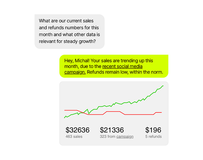
It even generates graphs and charts. Instead of a fixed dashboard with data tables, you simply get what you need at the moment. Without the clutter.
What's best is that you're never lost. You can even ask the bot what data from the last month is relevant to growth and get just what you need.
And it was made using the generic, AI design system.
Smart people were required to connect the dots the same as before, they only had a nicer data presentation layer to work with.
It requires no maintenance of the components. No design system teams. Nobody even knows or cares what variants and tokens are here. We get an output. The system is generic but 100% handled by AI.

Lower cost of insight
Dashboards were based on assumptions and law of averages. Smart people were required to connect the dots the same as before, they only had a nicer data presentation layer to work with.
Now that's becoming outsourced to LLMs. But is AI reasoning in connecting those dots trustworthy?
This would be a valid question in an ideal world. A world where huge consultancy firms don't use Chat GPT to write their entire reports they sell for millions.
In our world, the real world, we want machine to go smarrrrrt. To tell us what to do. Or better yet, to figure it out and automagically do it for us.
This shift that's happening is not really technological. It's psychological. Before we relied on people to parse the dashboard data for insights.
Now will we trust AI to do that for us? I'd say most likely because people have already gotten too comfortable to even consider the alternatives.
This isn't about AI replacing dashboards. It's about us outsourcing curiosity itself for metrics.
The truth is that we dont' really need them anymore.
Dashboards didn't die
They evolved into a conversation.
Design systems no longer have a visual selling point. With no dashboards, what's a shiny thing you'll show to sell the idea? A login form? Please…
Those who still have teams that manage their design systems are also eyeing a switch to a fully AI-based component library. One without human involvement.
The more companies lean into generative interfaces, the less need there will be for actual design system teams.
All that component, variant, token learning may have been for nothing after all.
AI-generated dashboards aren't dying because they're hard.
They're dying because they're too easy. When something becomes effortless to make, it also loses its value.
I talked about this before: UI Design will never be the same.
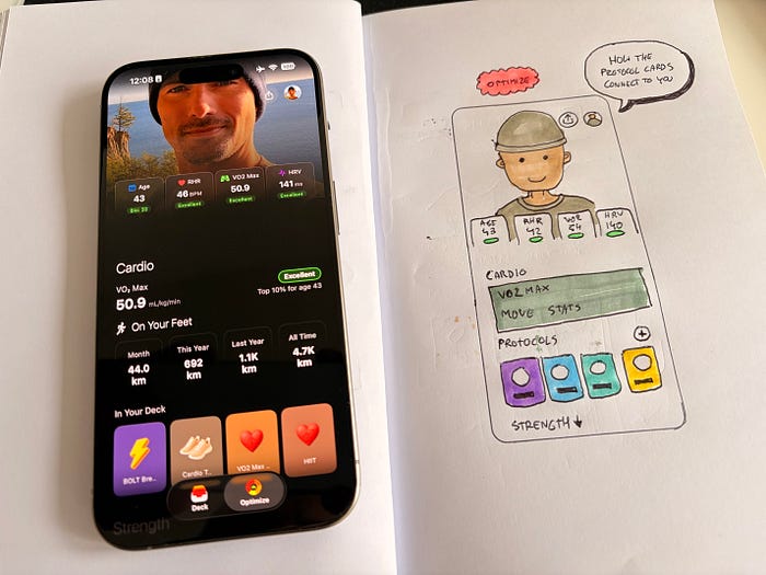
Why is your personal photo so big? You could show MORE DATA right away. No. Emotion first.
Future of interfaces
UI is going full circle with a huge need for emotional, passionate, small products with beautiful experiences baked in.
I say good riddance! Systemic work was the most soulless, boring thing you can imagine. It made most design look and feel exactly the same. Like cheap copies.
Designers should be shifting their sights towards expression in UI design. Towards beauty, originality and craft.
The next great interfaces won't be dashboards.
They'll be moments.
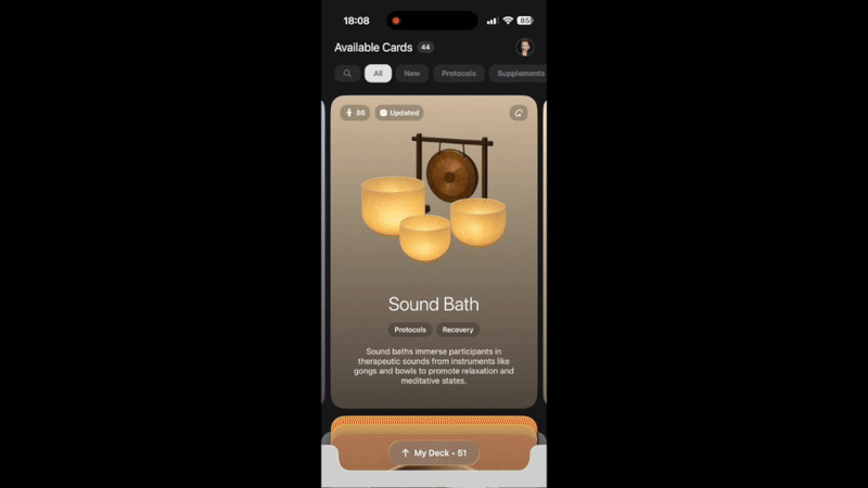
When I coded and designed this interaction, I focused on how it makes you feel to add a card to your stack
We spent all that time optimizing our work to match a system and feed the machine. Maaybe it's time to start designing for humans again?
Let the systems systemize themselves, and let humans design something that sparks emotion.
What's Your Reaction?
 Like
0
Like
0
 Dislike
0
Dislike
0
 Love
0
Love
0
 Funny
0
Funny
0
 Angry
0
Angry
0
 Sad
0
Sad
0
 Wow
0
Wow
0


![[VIP] Memorisely: AI Design System](https://i.pinimg.com/1200x/00/31/78/00317811d7cda9792e12b379e96b6c88.jpg)
