
![[VIP] Unlimited Pass 2026.03.27](https://i.pinimg.com/1200x/d2/f8/2e/d2f82e903b9ca33b0f13704cc85a3d8a.jpg)


![[LS] ls.graphics Pass 2026.02.16](https://i.pinimg.com/1200x/8d/ca/7f/8dca7ff72d8b698f955649340d0ff398.jpg)

![[PRO] Craftwork Pass 2025.06.11](https://i.pinimg.com/1200x/98/d2/f0/98d2f0169226b431f4727441ecc6aa06.jpg)


![[VIP] Creovo: Creative Portfolio](https://i.pinimg.com/1200x/92/5d/39/925d39b614ae4e39adda25b73837f82b.jpg)


![[VIP] Voltz: Electric Car Website Template](https://i.pinimg.com/1200x/03/ba/41/03ba41513483727fcd26b95349750783.jpg)
![[VIP] Zyra: Coded Chat AI Dashboard](https://i.pinimg.com/1200x/ce/7b/92/ce7b926f22423fc046659dfe1dd7a604.jpg)
![[$] AlignUI: Code Library](https://i.pinimg.com/1200x/8d/91/1c/8d911c0a22483842cff69c130e80c37b.jpg)
![[VIP] The Grid Deck Template](https://i.pinimg.com/1200x/f2/df/6d/f2df6d865d31ed4400ddd74137a5a79e.jpg)

![[VIP] Solaris: Sales Forecast & Pipeline Review Deck](https://i.pinimg.com/1200x/ba/7c/48/ba7c485ac40a51054cf9074aead204e2.jpg)
![[VIP] Brand Guideline Presentation](https://i.pinimg.com/1200x/64/87/a7/6487a7c4da21072150a1664f83a6a234.jpg)


![[VIP] 44 Device Mockups: Metal Scene Pack](https://i.pinimg.com/1200x/96/0c/c4/960cc4d39f6f9f08c4ba4a40ae740a65.jpg)
![[LS] iPhone 17 Mockup](https://i.pinimg.com/1200x/18/42/c1/1842c11e3da971765bdcfbc5315f3df8.jpg)
![[LS] iPhone 17 Pro Max Mockups](https://i.pinimg.com/1200x/f0/2a/72/f02a724ed9f52ac4a1c66b5614809111.jpg)
![[LS] AE-Mockups, Apple Devices](https://i.pinimg.com/1200x/03/04/9b/03049ba79acaa546ae6389639f89bcc1.jpg)


![[VIP] Volnitsa: BLNDR MINI (2025)](https://i.pinimg.com/1200x/c3/f7/0a/c3f70ae1126be5c0af1977e58b56ba7a.jpg)

![[VIP] React Three Fiber: The Ultimate Guide to 3D Web Development](https://i.pinimg.com/1200x/78/02/1f/78021ffdfc8113cc8caba5b2c563ead4.jpg)
![[VIP] Ryan Hayward: Ultimate Framer Masterclass 3.0](https://i.pinimg.com/1200x/48/d6/3f/48d63f9723d7c49e6c34c182557c7431.jpg)


![[VIP] Whoooa! 156 vector Lottie animations](https://design.rip/uploads/cover/blog/whoooa-156-vector-animations.webp)


![[VIP] Staff Product Designer (ENG, RUS)](https://i.pinimg.com/1200x/0c/52/a0/0c52a08d8b0a25329806437933cf538f.jpg)


I was wrong about Liquid Glass.
My Liquid Dillema. First I was hopefull. Then slightly disappointed. Now I'm excited for Liquid Glass again. And Liquid Ice.

Delightful UI
My Liquid Dillema
First I was hopefull. Then slightly disappointed. Now I'm excited for Liquid Glass again. And Liquid Ice. What's Liquid Ice?
Read on to find out.
But first let's go back to June 2025.
Shortly after Apple unveiled the Liquid Glass design aesthetic, I jumped onto the beta version of the software right away! The presentations looked extremely impressive and I was excited for new UI paradigms.
It also felt personally fun, as after coining the Glassmorphism name in 2021, I really liked exploring Glass based UI's. Two years later, when Vision Pro dropped, I came up with what I then called Deep Glass, that in many respects mimicked the Liquid Glass depth component.
Of course I didn't have the skill back then to do occlusion and distortion to make it as realistic as Apple did. But it did excite me to get the iOS developer beta as soon as it was available.
Please note, this article also covers how Apple's design shaped me as a designer and as a person. And why when I criticize, I do it out of love.
Liquid Glass… beta?
As soon as I got the new (beta) OS, it started my love-hate relationship with it. I've been a designer since 1998. I notice (probably) a little more than regular phone users.
I instantly notice delight though.
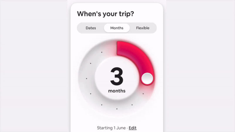
And at first I was delighted. Very delighted. Almost as delighted as I was with that airBnB skeuomorphic picker! Mmmm… delight!
First impression
And then I got hit with personalization and readability issues. I joined in on criticizing, because maybe I was a bit too invested in delightful UI's. I wanted a change desperately and almost got the exact thing I wanted. First try?
Seeing Apple make a jump towards delight clashed with those first beta issues. I wanted their design prowess to bring us to the future of UI and they (initially) only sort of did.
But as with most things Apple design, it got better. And it's constantly improving. Is it perfect? No. There are some small issues here and there, but it is the breath of fresh air that was needed in interfaces.
And quickly other companies started to copy.
Personal = ugly?
And what about people making ugly color combinations on their homescreens?
The personalization examples were blown out of the water, but what I actually noticed by looking over shoulders, is that most people use one of the three main settings: light, dark or clear.

I haven't seen any of the clashing tints "in the wild". Maybe I underestimated the users a little.
My point was, that with Apple's understanding of design, I'd prefer being led with strict rules. A professionally enforced aesthetic. Like Dieter Rams standing over my shoulder saying how things should look.
But I am beginning to realize, that those years of design aesthetics from design leaders led to the general public having a much clearer sense of good design. Apple taught people design, so it can trust them to (mostly) make good personalization choices.
And for some of those who won't? That's fine. They're not a majority. Let them enjoy their own, separate aesthetic.

The little design dictator in me quieted down. Eased up. Apple once again knew what they were doing. It is a rocky road, so it's not without bumps. But you either innovate and iterate, or you stagnate with just adjusting the dropshadow by 4px blur with next OS release.

Most companies don't go into the trouble of actually MAKING their UI elements in real life to be sure how they react. This is the love and attention to detail we desperately need in the land of "just functional" boxes.
But but but…
Every time I talk about app delight, people always come back with the same thing:
Apps are supposed to be functional. You do a thing (quickly) and you're on your way.
Yeah, sure. That's why people spend between 5 and 9 hours every day on their phones. To just "get a thing done quickly".
We're using our devices a lot. We're interacting with both content and interfaces around that content a lot. Adding a little bit of delight to that mix can create (at least for a while) that sense of wonder. That sense of "wow this is cool!".

A smile.
A warm feeling when a button reacts in a beautiful, fluid way.
Most interfaces are clunky. Generic. Boring. Predictable, yet overcomplicated. Filled with deceptions, dark patterns, optimized to extract money from us.
We learned to accept it to "get stuff done" but we're forced to use all that boring UI anyway.
This is why I complain about not enough delight. And Liquid Glass is one of the ways to add that delight.
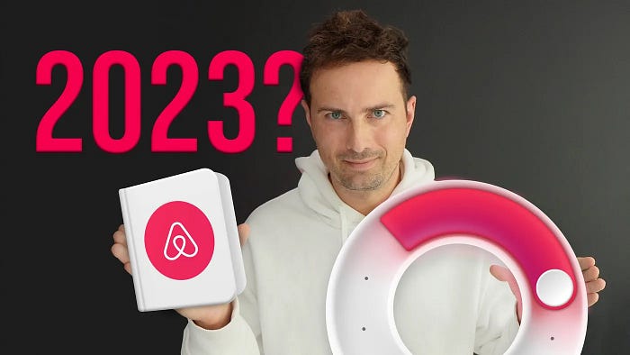
In 2023 airBnB delighted users by some pretty bold design choices. Back when flat design was king, they went against the grain and combined flat with the exact opposite.
Back then I heralded it the right direction for design to go. I loved it and I also loved that I was partially right. Even if they finally retracted some of those ideas, the general direction is not as flat anymore.
And it's definitely way more fun!
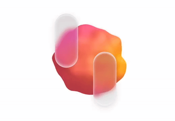
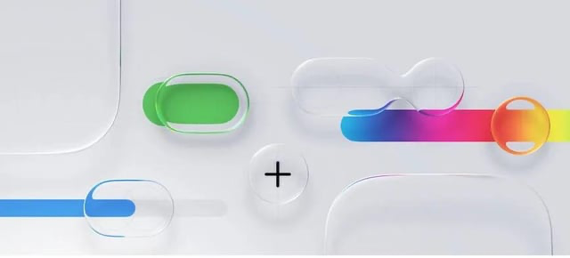
What is delight?
Delight is in the details. It's how a glass toggle reacts, but it's also a skeuomorphic, round range picker, the way you add a noise texture to a card. A subtle animation that just makes sense.
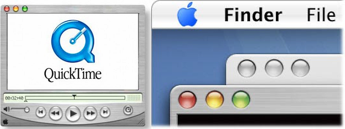
Remember when the Aqua design system came to Mac OS? Computers used to be ugly and boring. Most of what Windows did was light grey fill with a white border at the top and a black one at the bottom. That was "depth". And it had zero delight.
This is around the time when I got my first ever white plastic MacBook. After years on Windows I was suddenly… you guessed it. Delighted.
UI was friendly. Familiar. High fidelity. Windows transformed beautifully when minimized. And dropping widgets onto the desktop had a beautiful ripple effect.
This is when I got hooked on delight in design and it's all thanks to Apple.
How to do delight?
I don't mean going over the top. I mean obsessing about little details. And when I started seeing how Liquid Glass buttons beautifully light up and bounce on tap, I was hooked.
But once again, delight is NOT about just grabbing one style and running with it. True delight comes when you combine multiple elements into a whole that feels familiar yet completely new at the same time.
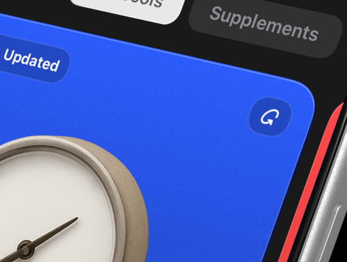
What happens when you combine a high-depth liquid glass button, with a textured card that has depth, and a little 1px (off) highlight at the top?
This is what I did in my app and it made me realize it's what I want to be doing. In a way Apple's liquid glass pushed me to learn SwiftUI basics and with the help of some of the technologies of the future code my very first solo iPhone app.
Liquid Glass and then what?
Design ideas are to be used. Of course. But they're also to be merged. And from merging ideas and exploring their intersections come new, delightful things.
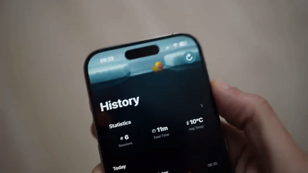
I'm building a new cold-swimming Apple Watch + iPhone app and I wanted to share two little examples with you to wrap this up. The first one is right above. The companion iPhone app that shows history, reacts to phone tilt. And the little duck up top swims in the direction of the tilt.
Is it necessary to read your stats? No. Is it delightful?
DUCK YEAH!
Since it's cold swimming, I obviously needed it to feel cold. So how about combining Liquid Glass with a procedurally positioned ice texture?
We get liquid ice. And to top it off, let's add a beautiful ripple effect that happens on tap.

And as with most of my design ideas, this was also planned on paper. I had a notebook with me at the beach and sketched out a quick, rough version. Then back home I recreated it with colors and extra annotations.
And then coded it on top of Liquid Glass.

Liquid Glass is a base
I believe Liquid Glass is a starting point to talk about UI depth from another angle. It shows that the processing power of our pocket computers is huge now.
And instead of the same old boring boxes every time, we can use that power to drive anything that we imagine. Be it Glass, Ice, shader based UI transformations, particle effects.
Whatever you feel that can make the interface delightful.
And I'm all here for it!
What's Your Reaction?
 Like
2
Like
2
 Dislike
0
Dislike
0
 Love
0
Love
0
 Funny
0
Funny
0
 Angry
1
Angry
1
 Sad
0
Sad
0
 Wow
2
Wow
2


