
![[VIP] Unlimited Pass 2026.03.27](https://i.pinimg.com/1200x/d2/f8/2e/d2f82e903b9ca33b0f13704cc85a3d8a.jpg)


![[LS] ls.graphics Pass 2026.02.16](https://i.pinimg.com/1200x/8d/ca/7f/8dca7ff72d8b698f955649340d0ff398.jpg)

![[PRO] Craftwork Pass 2025.06.11](https://i.pinimg.com/1200x/98/d2/f0/98d2f0169226b431f4727441ecc6aa06.jpg)


![[VIP] Creovo: Creative Portfolio](https://i.pinimg.com/1200x/92/5d/39/925d39b614ae4e39adda25b73837f82b.jpg)


![[VIP] Voltz: Electric Car Website Template](https://i.pinimg.com/1200x/03/ba/41/03ba41513483727fcd26b95349750783.jpg)
![[VIP] Zyra: Coded Chat AI Dashboard](https://i.pinimg.com/1200x/ce/7b/92/ce7b926f22423fc046659dfe1dd7a604.jpg)
![[$] AlignUI: Code Library](https://i.pinimg.com/1200x/8d/91/1c/8d911c0a22483842cff69c130e80c37b.jpg)
![[VIP] The Grid Deck Template](https://i.pinimg.com/1200x/f2/df/6d/f2df6d865d31ed4400ddd74137a5a79e.jpg)

![[VIP] Solaris: Sales Forecast & Pipeline Review Deck](https://i.pinimg.com/1200x/ba/7c/48/ba7c485ac40a51054cf9074aead204e2.jpg)
![[VIP] Brand Guideline Presentation](https://i.pinimg.com/1200x/64/87/a7/6487a7c4da21072150a1664f83a6a234.jpg)


![[VIP] 44 Device Mockups: Metal Scene Pack](https://i.pinimg.com/1200x/96/0c/c4/960cc4d39f6f9f08c4ba4a40ae740a65.jpg)
![[LS] iPhone 17 Mockup](https://i.pinimg.com/1200x/18/42/c1/1842c11e3da971765bdcfbc5315f3df8.jpg)
![[LS] iPhone 17 Pro Max Mockups](https://i.pinimg.com/1200x/f0/2a/72/f02a724ed9f52ac4a1c66b5614809111.jpg)
![[LS] AE-Mockups, Apple Devices](https://i.pinimg.com/1200x/03/04/9b/03049ba79acaa546ae6389639f89bcc1.jpg)


![[VIP] Volnitsa: BLNDR MINI (2025)](https://i.pinimg.com/1200x/c3/f7/0a/c3f70ae1126be5c0af1977e58b56ba7a.jpg)

![[VIP] React Three Fiber: The Ultimate Guide to 3D Web Development](https://i.pinimg.com/1200x/78/02/1f/78021ffdfc8113cc8caba5b2c563ead4.jpg)
![[VIP] Ryan Hayward: Ultimate Framer Masterclass 3.0](https://i.pinimg.com/1200x/48/d6/3f/48d63f9723d7c49e6c34c182557c7431.jpg)


![[VIP] Whoooa! 156 vector Lottie animations](https://design.rip/uploads/cover/blog/whoooa-156-vector-animations.webp)


![[VIP] Staff Product Designer (ENG, RUS)](https://i.pinimg.com/1200x/0c/52/a0/0c52a08d8b0a25329806437933cf538f.jpg)


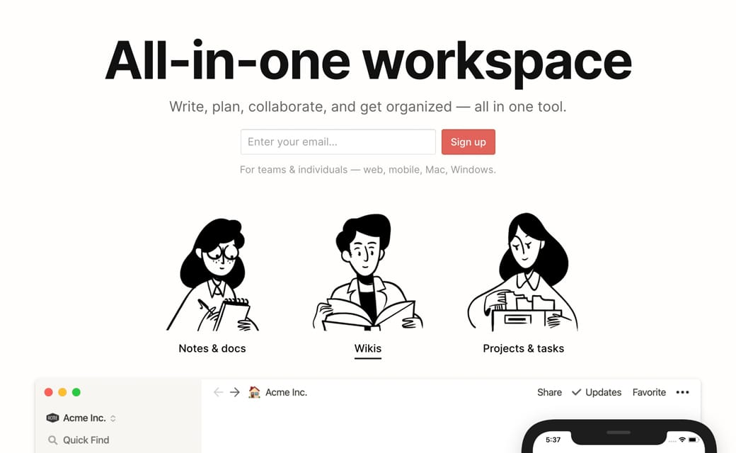
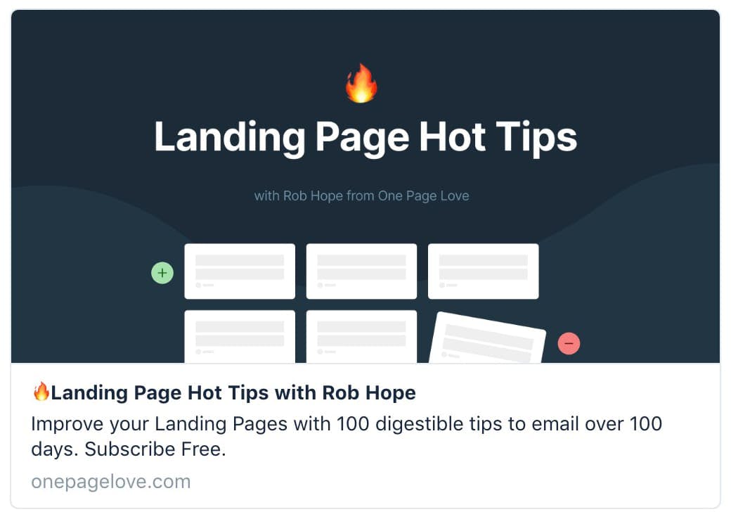
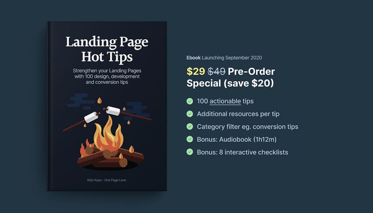
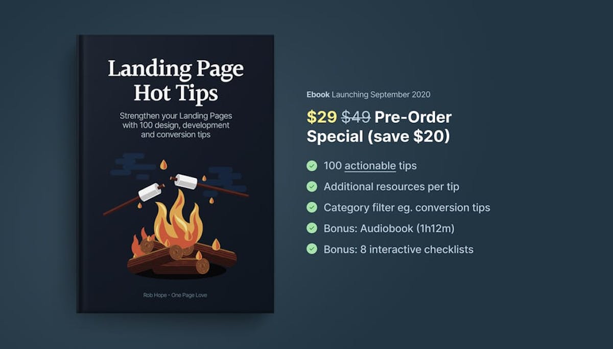
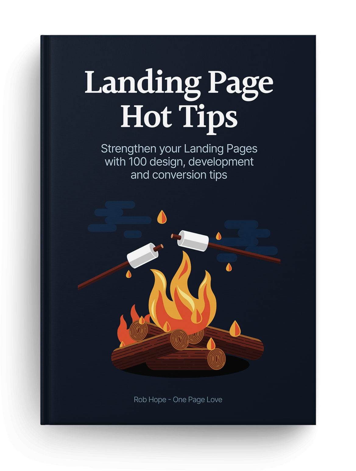
Landing Page Hot Tips: Landing Page Critique
Strengthen your Landing Pages with 100 design, development and conversion tips.

Audiobook
All 100 Hot Tips are available in a tidy, zero-fluff 55 minute audiobook. Simply right click on the link to save it locally:
- Flac (628mb)
- MP3 High - 320kbps (131mb)
- MP3 Medium -192kbps (79mb)
- MP3 Standard - 128kbps (53mb)
I'm so excited to share the Hot Tips are also available on all streaming platforms. This is a great way to shuffle the tip order or mix up the learning experience on the move.
Launch Checklists
- Design Checklist
- Development Checklist
- Testimonial Checklist
- Pricing Checklist
- Images Checklist
- Final Pre-Launch Checklist
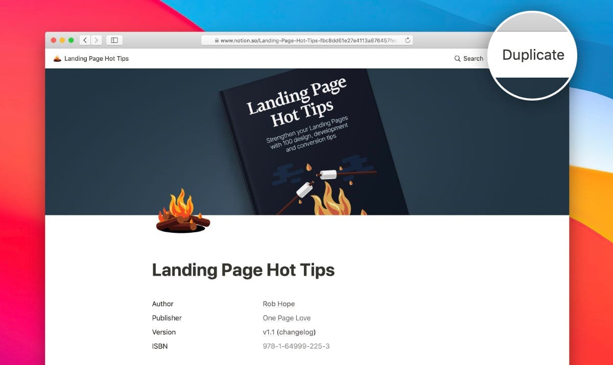
Simply kick off this private Notion link and hit the duplicate link top-right to add the Notion Book to your existing account:
Rich Media
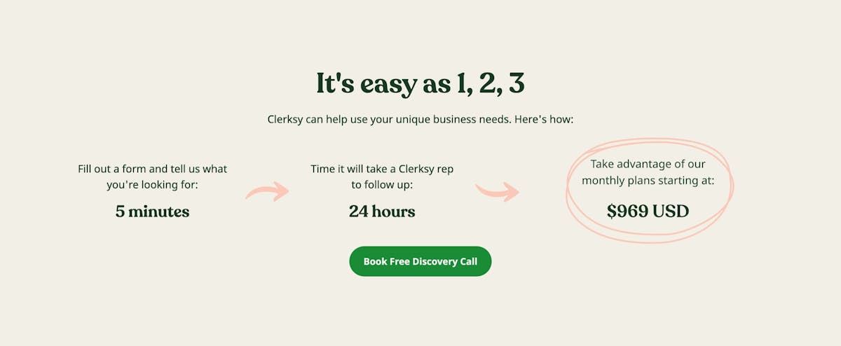
#01 - Conversion Tips, Decluttering Tips
Utilize customer testimonials
Hot Tip #01 is to utilize your customer testimonials by highlighting features and answering doubts.
So often I see Landing Pages packed with testimonials providing very little value to the visitor. Let’s compare two testimonials. The first is by a customer, Gavin Jenkins:
"I’m a huge fan of the brand, so I’m glad I could finally sample their product."
Note how Gavin’s testimonial is generic, offering superficial information to the potential customer reading it. This second testimonial is also by a customer, Kim Davis — but note the difference:
"So glad I could finally experience their superb quality myself and I was quite impressed by the thoughtful packaging of such a delicate item."
See how Kim’s testimonial highlighted a product feature while also answering a potential doubt? The feature being the build quality and the potential doubt being if postage would damage the item.
Round up all of your customer testimonials and select only the choice few adding value for your Landing Page visitor.
- How to request testimonials – A three-step method to help generate great Landing Page testimonials from your customers.
- Testimonial examples – A more specific collection I’ve put together of well-designed or interesting Testimonial examples in Landing Pages
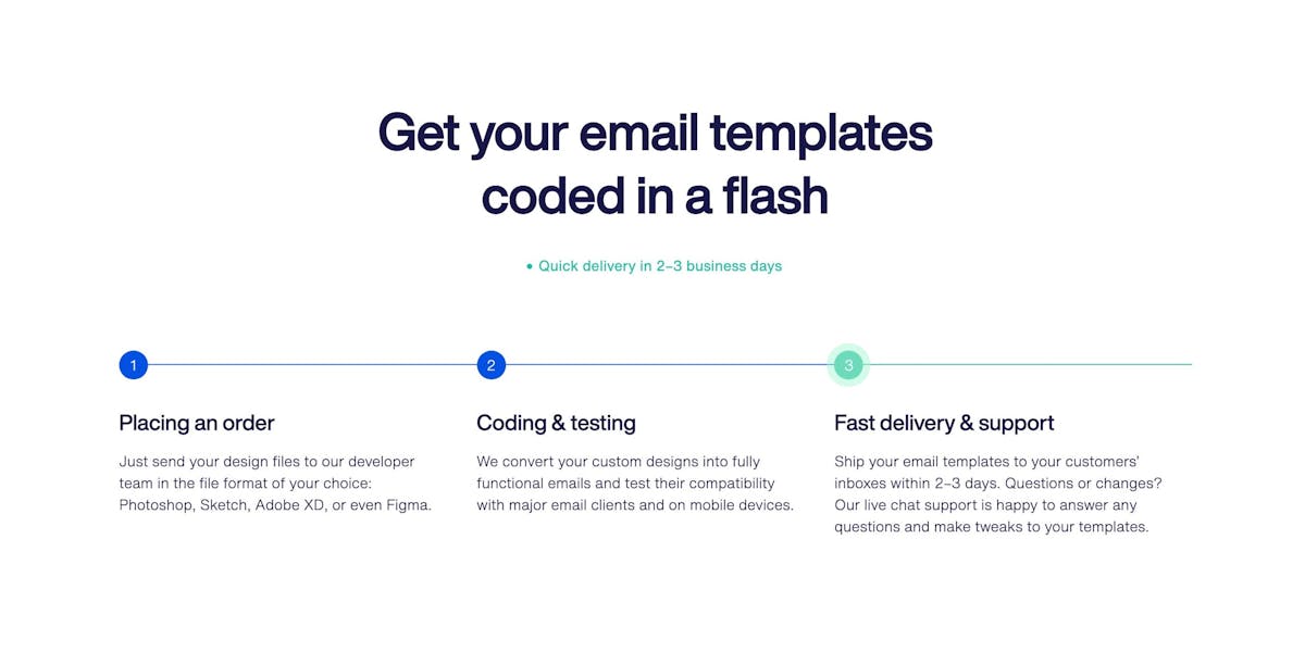
#02 - Conversion Tips, Decluttering Tips
Showcase testimonials from a similar demographic
Hot Tip #02 is to showcase testimonials from similar demographics to your potential customers.
If you are selling enterprise-level support software, it’s wise to curate testimonials from customers who work for enterprise-sized businesses.
Put yourself in your Landing Page visitor’s shoes and imagine the concerns of an enterprise customer. They’ll be wary of moving a huge amount of staff over to new support software due to the high stakes involved.
They’ll also want to know other enterprise businesses took this risk and made this transition successfully.
Using Hot Tip #01 as a guide, I’ve hand-picked this excellent testimonial by enterprise customer, Dave Lewis:
"Our team just loves how easy to use the software is and support response time improved by 22% in month one."
Glowing feedback, right? Now, let’s take it a step further by highlighting who he works for alongside his name. In this case, Dave is the VP of Customer Relations at Starbucks, which adds significant weight to the testimonial as its backed by an enterprise-sized business:
"Our team just loves how easy to use the software is and support response time improved by 22% in month one."
- Avataaars – Online avatar generator for when customer imagery isn’t available or poor quality. Try not mix animated with real customer images. So choose a style for consistency.
#03 - Design Tips
Fewer images, better images
Hot Tip #03 is to use fewer images but also better images.
Good imagery builds trust, and trust is the foundation for conversions. When it comes to your visuals — spend the money! 
Invest in a photoshoot of your team, your product, your food. The ROI on a professional photoshoot is pretty much guaranteed.
- ImageOptim – My go-to for image size optimization for JPG, GIF, PNG and SVG.
- Optimage – An alternative image size optimization tool by Vlad Danilov. Conveniently optimizes MP4 too.
- Stocksy – My favorite premium resource for stock images. If you only need a single authentic image for your Landing Page, seriously consider starting here.
- Squareshot – Service to send your physical product and they’ll send back top quality photos of it for your Landing Page.
- Noun Project Photos – Just launched so a good resource of less-used, quality stock imagery. Pricing is around $33/image for commercial use.
- Unsplash – High quality, well curated free stock images.
- Pixabay and Pexels – Both good free stock image alternatives if a search term isn’t winning on Unsplash. Both include stock video too.
- Team Section Inspiration – A collection I put together with 20+ team sections in Landing Pages.
- IMGIX – Image CDN’s are a bit excessive in most Landing Pages but I use IMGIX for my full network of sites. The real benefit is you can upload a big image once, then manipulate (size, compression) the output using only code. I cannot recommend it enough and I do use it for Landing Pages within my bigger sites.
Spice up Call-To-Action buttons
Hot Tip #04 is to spice up your Call-To-Action (CTA) buttons.
Remember: you’re excited to share your product or service!
- Click Here
- Sign Up
Too bland.
Use actionable phrases.
- ✅ Request a call from our agents
- ✅ Discover the wonders of science
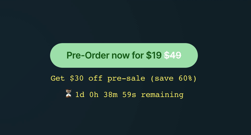
- ✅ Unlock creativity for only $19
Let’s take a look at what the big dogs are using:

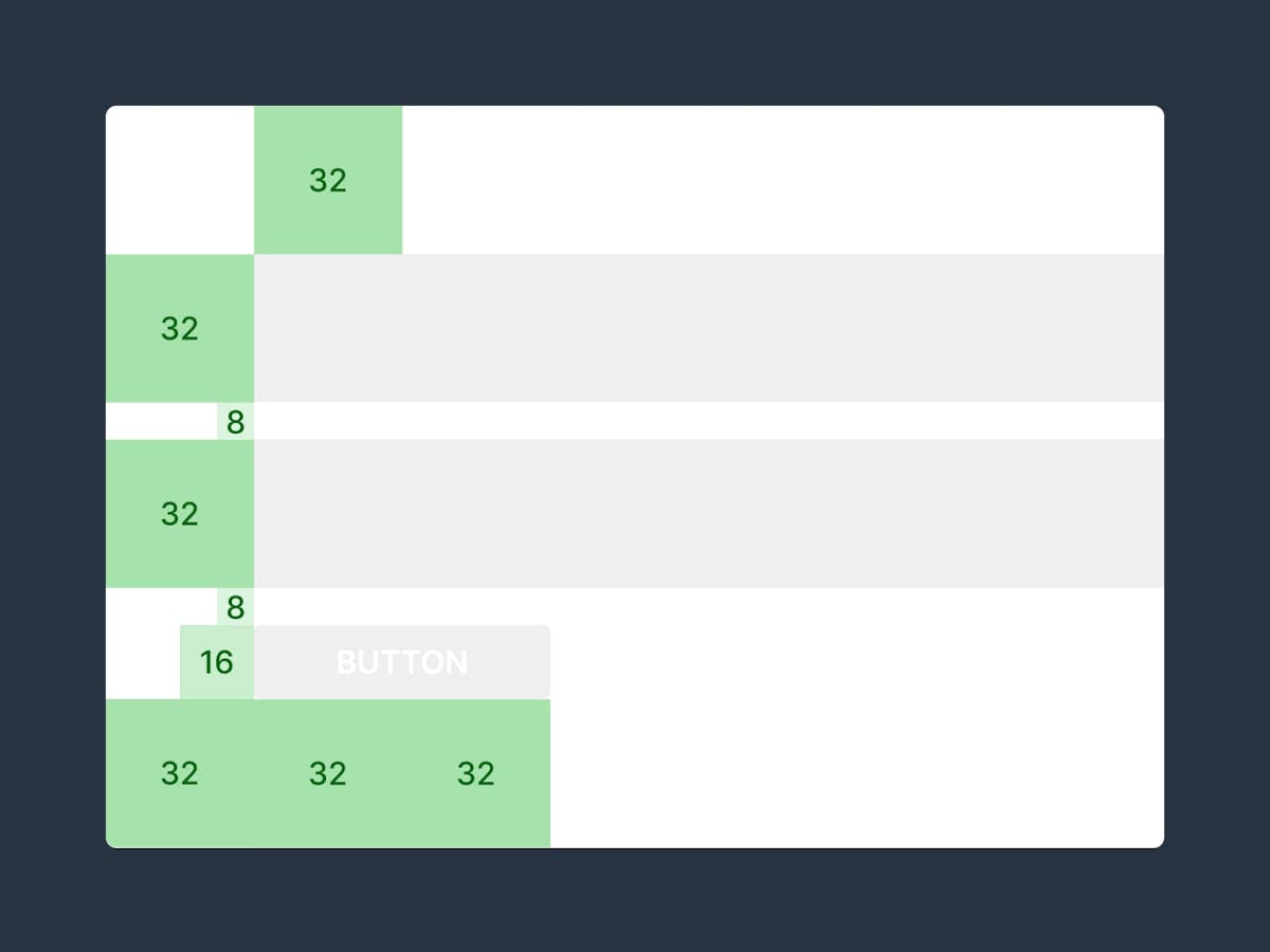
When in doubt, double the padding
Hot Tip #05 is when in doubt, double the padding.
Whitespace isn’t just breathing room for your content, it’s breathing room for your potential customer.
Digestible content improves focus and clarifies what you’re offering.
If your Landing Page feels overwhelming, double the padding and I think you’ll be pleasantly surprised.
- Whitespace Inspiration – A collection of 1000+ Landing Pages I’ve curated featuring healthy whitespace.
Empathize with the visitor’s problem
Hot Tip #06 is to empathize with the visitor’s problem using your intro copy.
Then explain exactly what your product or service does in the subtext, removing all verbose words or phrases.
The world’s most innovative invoice tracking software
XYZ Invoicing uses the cutting edge InvoAlgo algorithm to programmatically track unpaid invoices to send clients reminders using conversion-optimized email templates tested on 1000s of happy customers.
✅
Wasting time chasing late client payments?
XYZ Invoicing sends automated reminders to clients with outstanding invoices.
—
Remember, your Landing Page is there to impress with choice previews, highlights and testimonials.
So start by making the visitor feel your offering was destined for them, in the simplest way possible.
- Title Advice – A fun Landing Page title breakdown by Annie Maguire from Marketing Examples.
- Headlime – A headline generator to help brainstorm dozens of possibilities.
Avoid center-aligned or justified paragraphs
Hot Tip #07 is to avoid center-aligned or justified paragraph text.
When applied to long paragraphs, these two alignments can be difficult to read. This can result in fatigue while browsing Landing Pages with a lot of content.
Let Neil deGrasse Tyson take us through it:
- ✅ Center-aligned
- ✅ Left-aligned
- ✅ Justified
- ✅ Left-aligned
—
A good rule-of-thumb is that any paragraph with more than two lines should be left- or right-aligned.
- Rags, Widows & Orphans – Kinda inappropriate naming but a good read on certain paragraph shapes and styles to avoid.
Replace, don’t add
Hot Tip #08 is to replace old content when new content arrives.
Your Landing Page with 8 testimonials does not need a 9th. Kick out the weakest of the bunch. 
The 6 best examples of your wedding photography.
Your top 4 customer reviews.
The goal is to persuade your Landing Page visitor with as little as possible.
It Depends.
Ha! The best and worst advice one can give.
Context is everything when it comes to Landing Page optimization.
- Who is your target demographic?
- What is their problem?
- How does your offering solve it?
Every Landing Page has a different objective. So before we get going, you need answer those three questions and set them in stone.
Got your answers? Great.
Now what would your target demographic need to see and read in a Landing Page to be persuaded to go all the way?
Unsure? No problem. That's why I created this book.
One hundred tips can be overwhelming. So to get the most out of this book, I recommend reading a handful at a time, digesting the info, and then implementing the lessons that resonate the most with you.
The goal of the book is not to turn a Landing Page into a money-maker overnight. It's for you to strengthen your current and future Landing Pages through understanding.
And context.
Wishing you the strongest of Landing Pages.
Set a single objective
Hot Tip #09 is to set a single objective.
An effective Landing Page should only have one objective, not many.
Sell our eBook + promote our job board
✅ Sell our eBook

The beauty of a Landing Page is the single canvas to persuade the visitor to do one thing.
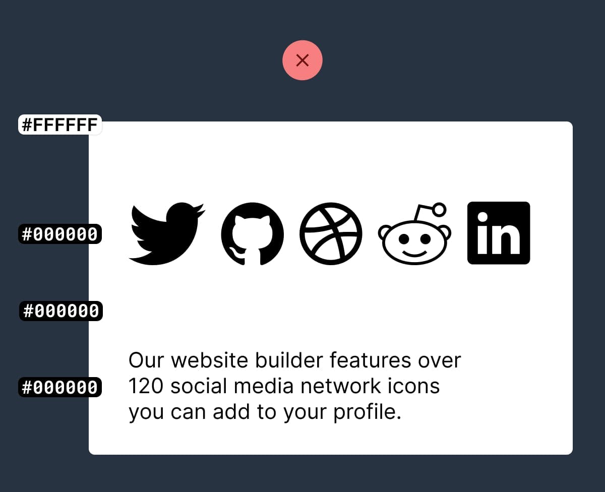
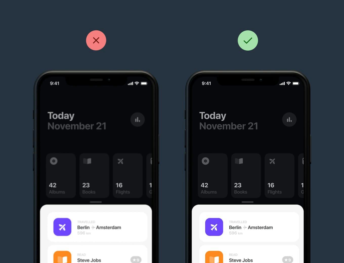
Create a text color hierarchy
Hot Tip #10 is to create a text color hierarchy.
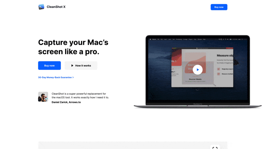
The biggest tell a Landing Page was built by someone with little design experience is black text with maximum contrast on a white background:
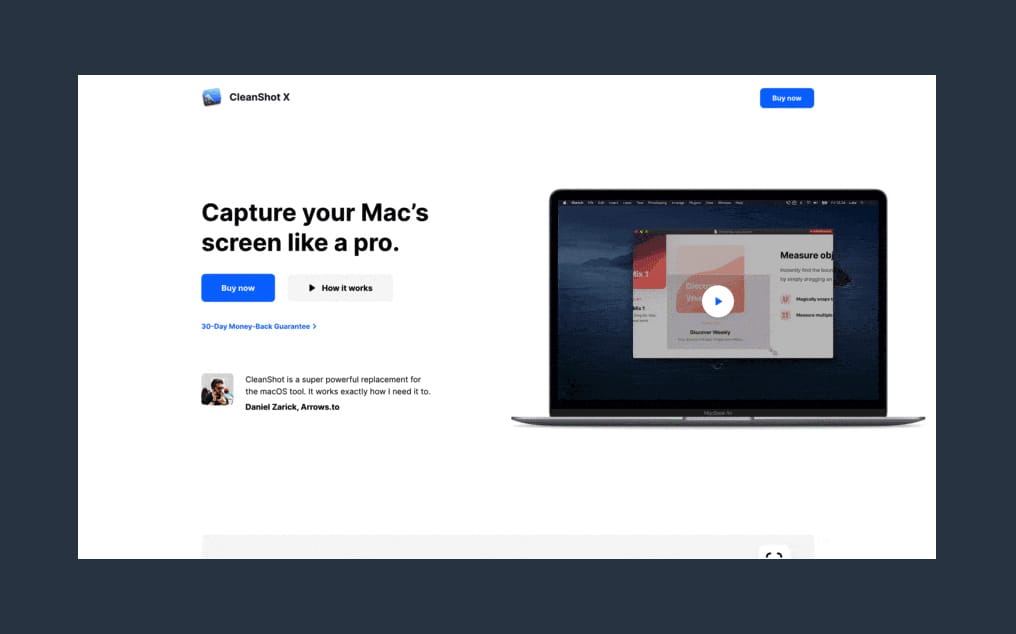
Soften the blow with an off-white background and a subtle grey/color text hierarchy:
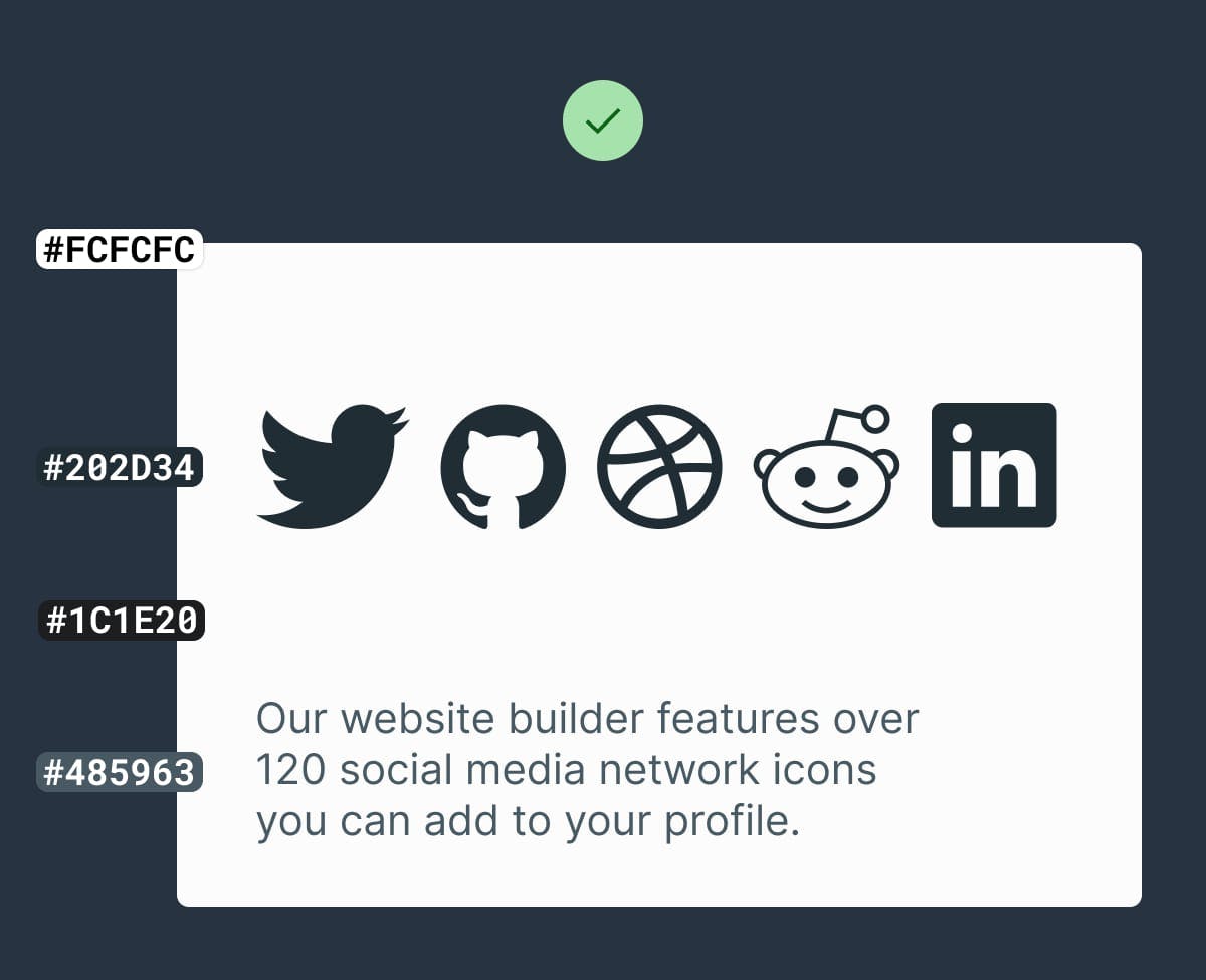
Some time spent here goes a long way towards creating a more pleasurable reading experience for your visitor.
- Contrast for Mac – Great tool I’ve been using to to ensure my text color hierarchies are within Accessibility standards.
- Accessible Color Generator – Useful to find the nearest accessible-passing color based on your color inputs (that are failing).
Remove your main nav
Hot Tip #11 is to remove your main website navigation.
If your Landing Page sits within a bigger website, hiding your navigation will prevent a potential customer from wandering.
Your Landing Page has only one objective — sending visitors to another page is not it.
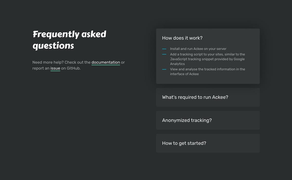
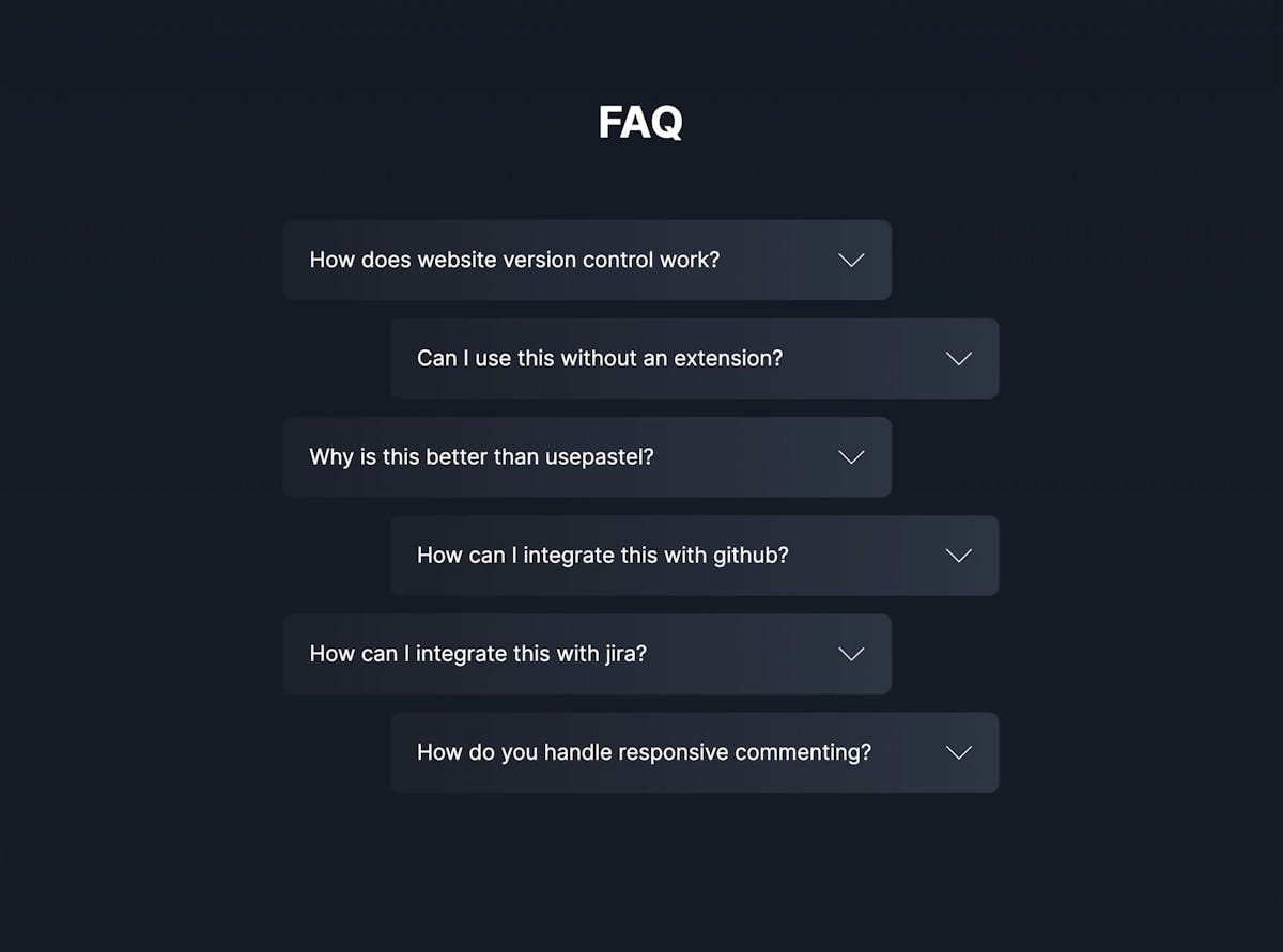
Use footer for pre-sale
Hot Tip #12 is to use your footer area for pre-sale support.
If your visitor has not committed by the end of the scroll, they still have doubts. Insert your FAQs, along with your support details:


This area could be the difference between a visitor and a customer.
- FAQ Inspiration – A collection of 70+ Landing Pages I’ve curated featuring helpful FAQs near the bottom.
- FAQ Examples – A more specific collection I’ve put together of well-designed or interesting FAQ sections in Landing Pages


What's Your Reaction?
 Like
1
Like
1
 Dislike
0
Dislike
0
 Love
0
Love
0
 Funny
0
Funny
0
 Angry
0
Angry
0
 Sad
0
Sad
0
 Wow
0
Wow
0


