
![[VIP] Unlimited Pass 2026.03.27](https://i.pinimg.com/1200x/d2/f8/2e/d2f82e903b9ca33b0f13704cc85a3d8a.jpg)


![[LS] ls.graphics Pass 2026.02.16](https://i.pinimg.com/1200x/8d/ca/7f/8dca7ff72d8b698f955649340d0ff398.jpg)

![[PRO] Craftwork Pass 2025.06.11](https://i.pinimg.com/1200x/98/d2/f0/98d2f0169226b431f4727441ecc6aa06.jpg)


![[VIP] Creovo: Creative Portfolio](https://i.pinimg.com/1200x/92/5d/39/925d39b614ae4e39adda25b73837f82b.jpg)


![[VIP] Voltz: Electric Car Website Template](https://i.pinimg.com/1200x/03/ba/41/03ba41513483727fcd26b95349750783.jpg)
![[VIP] Zyra: Coded Chat AI Dashboard](https://i.pinimg.com/1200x/ce/7b/92/ce7b926f22423fc046659dfe1dd7a604.jpg)
![[$] AlignUI: Code Library](https://i.pinimg.com/1200x/8d/91/1c/8d911c0a22483842cff69c130e80c37b.jpg)
![[VIP] The Grid Deck Template](https://i.pinimg.com/1200x/f2/df/6d/f2df6d865d31ed4400ddd74137a5a79e.jpg)

![[VIP] Solaris: Sales Forecast & Pipeline Review Deck](https://i.pinimg.com/1200x/ba/7c/48/ba7c485ac40a51054cf9074aead204e2.jpg)
![[VIP] Brand Guideline Presentation](https://i.pinimg.com/1200x/64/87/a7/6487a7c4da21072150a1664f83a6a234.jpg)


![[VIP] 44 Device Mockups: Metal Scene Pack](https://i.pinimg.com/1200x/96/0c/c4/960cc4d39f6f9f08c4ba4a40ae740a65.jpg)
![[LS] iPhone 17 Mockup](https://i.pinimg.com/1200x/18/42/c1/1842c11e3da971765bdcfbc5315f3df8.jpg)
![[LS] iPhone 17 Pro Max Mockups](https://i.pinimg.com/1200x/f0/2a/72/f02a724ed9f52ac4a1c66b5614809111.jpg)
![[LS] AE-Mockups, Apple Devices](https://i.pinimg.com/1200x/03/04/9b/03049ba79acaa546ae6389639f89bcc1.jpg)


![[VIP] Volnitsa: BLNDR MINI (2025)](https://i.pinimg.com/1200x/c3/f7/0a/c3f70ae1126be5c0af1977e58b56ba7a.jpg)

![[VIP] React Three Fiber: The Ultimate Guide to 3D Web Development](https://i.pinimg.com/1200x/78/02/1f/78021ffdfc8113cc8caba5b2c563ead4.jpg)
![[VIP] Ryan Hayward: Ultimate Framer Masterclass 3.0](https://i.pinimg.com/1200x/48/d6/3f/48d63f9723d7c49e6c34c182557c7431.jpg)


![[VIP] Whoooa! 156 vector Lottie animations](https://design.rip/uploads/cover/blog/whoooa-156-vector-animations.webp)


![[VIP] Staff Product Designer (ENG, RUS)](https://i.pinimg.com/1200x/0c/52/a0/0c52a08d8b0a25329806437933cf538f.jpg)


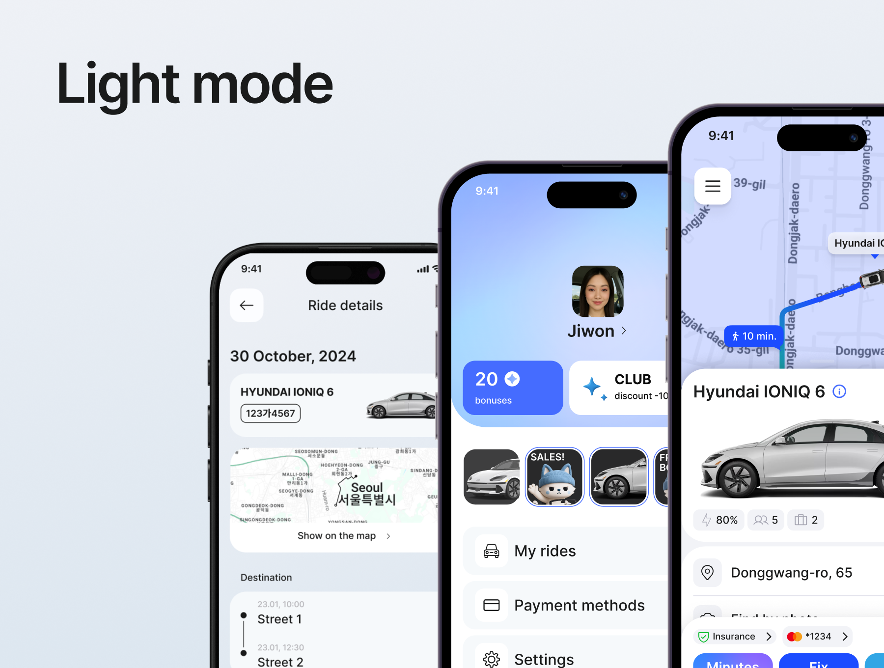
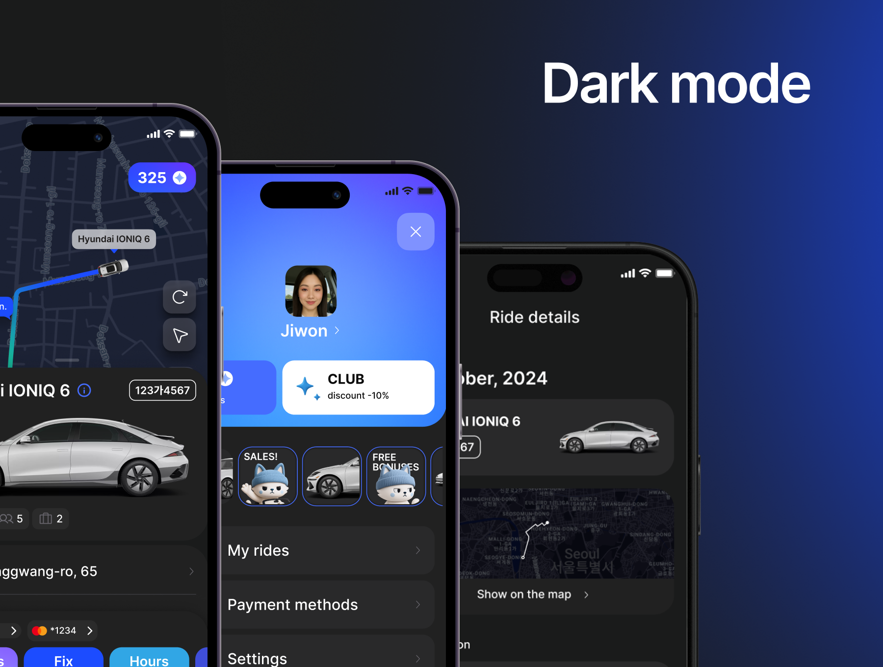
[VIP] FlowCar: Carsharing App Ui Kit
This is a design system for consistent carsharing app UI.
![[VIP] FlowCar: Carsharing App Ui Kit](https://i.pinimg.com/1200x/f4/ff/61/f4ff6156abc362247318445290344fdc.jpg)
Overview
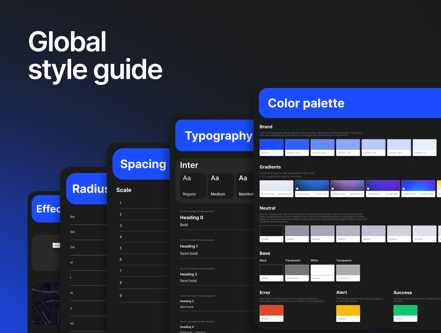
This design system is the single source of truth for building consistent, scalable, and user-friendly experiences across our mobile carsharing app.
It contains all the core foundations — colors, typography, spacing, shadows, components — carefully structured to ensure harmony between design and development.
Use this system to:
- Create new screens faster and with confidence.
- Maintain visual consistency across features and updates.
- Collaborate seamlessly with designers and developers.
- Evolve the product without breaking the user experience.
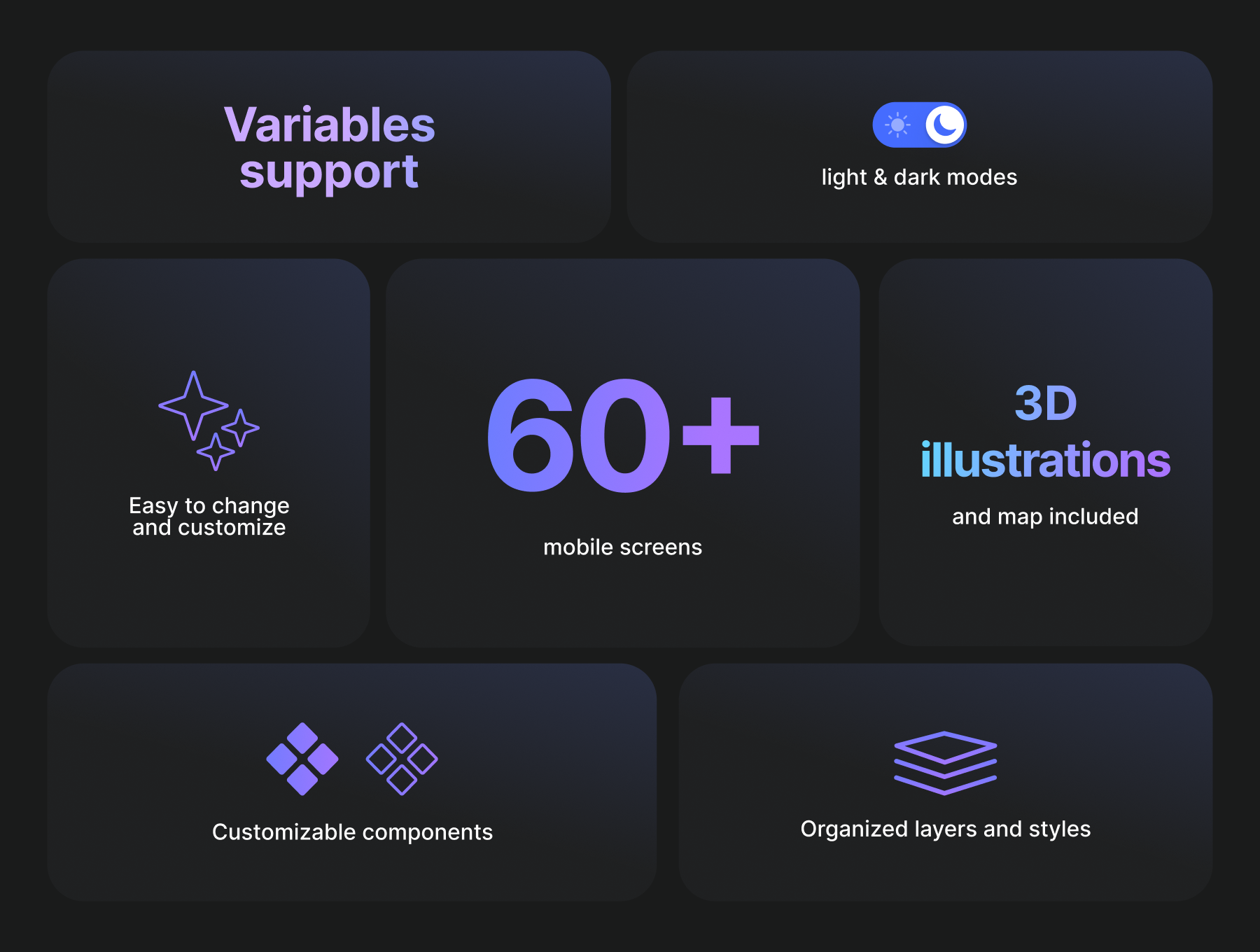
Key Features of the Design System:
Our design system is built to support a fast-moving product team with a scalable, themeable, and developer-friendly UI foundation.
1. Modular Components
Most components use nested instances. Key reusable components are built using variables and auto layout. Each supports multiple states (default, hover, disabled, etc.).
- Built with reusability and flexibility in mind.
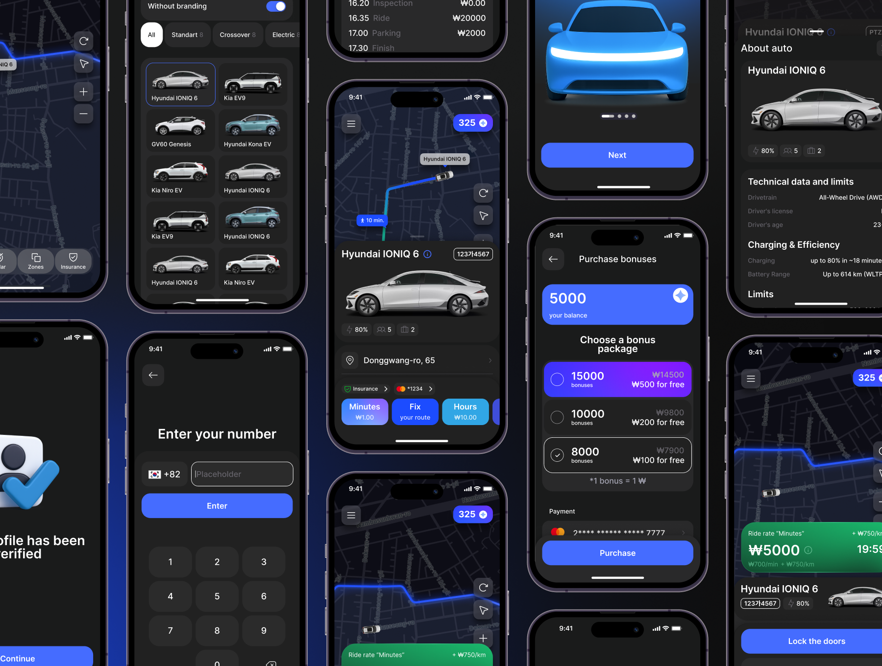
- Includes core UI patterns: buttons, inputs, modals, cards, list items, bottom sheets, and navigation elements.
- Supports states (default, hover, active, disabled, loading) and variants (sizes, icons, etc.).
- Follows auto layout and naming conventions for easy overrides and updates.
2. Light & Dark Theme
- Color variables are structured for seamless theme switching.
- UI adapts automatically to light or dark environments with minimal effort.
- Enables theme customization in future brand or B2B versions.
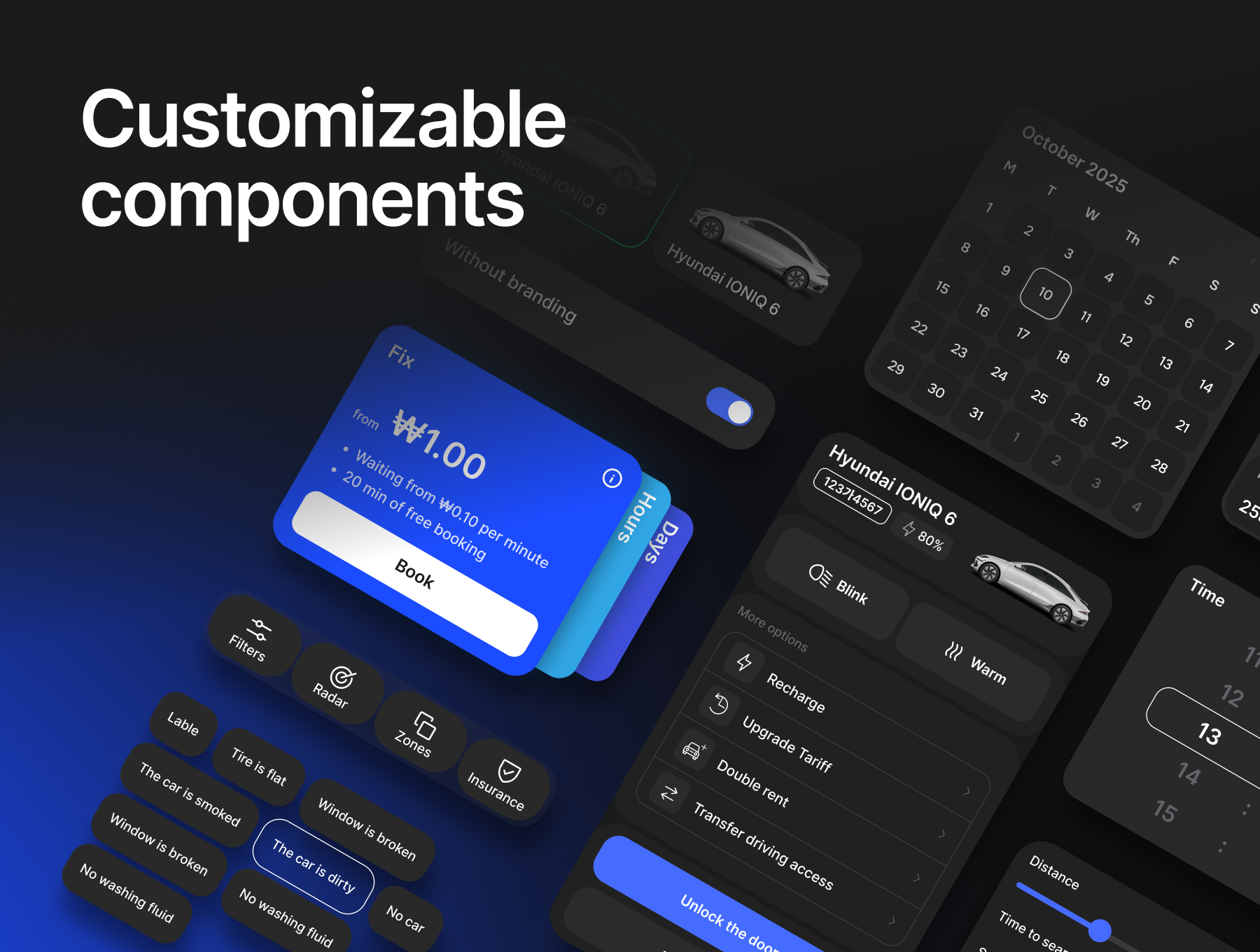
3. Flexible and Easy to Customize
All components in this design system are built to be easily adaptable to your specific use cases.
- Using Auto Layout, nested instances, styles and clearly structured variants, you can:
- Quickly adjust spacing, alignment, and layout behavior.
- Swap icons, change text, or hide elements without detaching.
- Create new combinations by reusing base components.
- Maintain consistency while staying flexible for unique screens or flows.
This flexibility allows you to move fast, stay on brand, and scale your designs efficiently — without starting from scratch.
How to use:
- Open the Library Manager and publish the FlowKit to your account;
- Press “Add to file”;
- Go to the Assets panel and start using the components;
Highlights
- Modular & reusable components
- Light & dark theme support
- Auto layout & variants
- Built for speed & consistency
- Easy to customize for any use case
- Dev-friendly & scalable
What's Your Reaction?
 Like
0
Like
0
 Dislike
0
Dislike
0
 Love
0
Love
0
 Funny
0
Funny
0
 Angry
0
Angry
0
 Sad
0
Sad
0
 Wow
0
Wow
0
![[VIP] Notely: AI Note Taking & Productivity Mobile](https://i.pinimg.com/1200x/bb/84/be/bb84beffed5e7213e2557650ef7bdec9.jpg)
![[VIP] NexoWallet Fintech App](https://i.pinimg.com/1200x/9d/ae/4b/9dae4bca1f323fb4d1d9bd5a5ff4116e.jpg)
![[VIP] Debtrix: Personal Finance Dashboard](data:image/png;base64,iVBORw0KGgoAAAANSUhEUgAAAcIAAAEYAQMAAAD1c2RPAAAAA1BMVEUAAACnej3aAAAAAXRSTlMAQObYZgAAACVJREFUaN7twQEBAAAAgqD+r26IwAAAAAAAAAAAAAAAAAAAACDoP3AAASZRMyIAAAAASUVORK5CYII=)
![[VIP] Neurox: AI Chatbot & SaaS Landing Page](https://i.pinimg.com/1200x/3c/85/03/3c8503ee7f4b84ddc80bb80387250ac8.jpg)


